Houzz Tours
Kitchen Tours
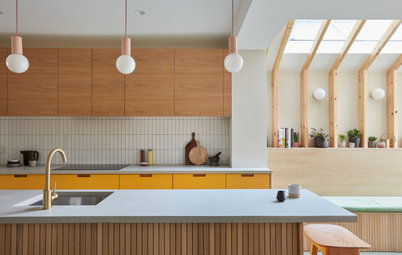
London Kitchen
Kitchen Tour: An Eclectic Design for a Creative Couple
Beautiful materials and earthy colours combined with a smart layout have taken this space from messy to fun and sociable

‘Eclectic and creative’ was the dream look for the owners of this kitchen, and when they searched on Houzz for a designer who would ‘get’ them, Zoe Willis jumped out. “They liked my style and the fact I have quite bold designs,” she says. “My USP is I tend to be a bit rebellious. I don’t really go for shades of greige and matchy-matchy; it’s all quite eclectic and that’s what they wanted. They’re real creatives and were looking for something that reflected their personalities.”
Zoe’s clever design streamlined and boosted the storage and prep space and brought in the fun the owners were looking for without overwhelming the room.
To see more great projects where the homeowner found their professional via Houzz, take a look at our Born on Houzz series.
Zoe’s clever design streamlined and boosted the storage and prep space and brought in the fun the owners were looking for without overwhelming the room.
To see more great projects where the homeowner found their professional via Houzz, take a look at our Born on Houzz series.
This is the dresser that needed replacing. “The old kitchen was all higgledy-piggledy, with different units cobbled together,” Zoe says. “The owners had lived here for about eight years and outgrown it.”
Find an interior designer for your project on Houzz.
Find an interior designer for your project on Houzz.
The sink area felt very cramped, with the fridge-freezer butting right up to the window above it.
The kitchen now feels much bigger. Zoe made a number of smart design decisions to streamline the space and improve its functionality. She moved the fridge-freezer to the opposite wall, giving the sink area more space, and tucked it right at the end of the run.
She moved the washing machine and tumble dryer outside. “We built a wooden outhouse on the patio on the right-hand side, so we used all the plumbing from inside that was already there,” she says. “That and extending the run [on the left, thanks to removing the dresser] meant the owners gained five extra cabinets.”
She also avoided wall cabinets, which could have made the space feel hemmed in, and added shelves instead. These are only 30cm deep to further boost the airiness.
As well as clever space planning, this shot reveals Zoe’s eye for design: the look is eclectic, but there’s a thread running through it and subtle pairings to help the scheme hang together.
“I used quartz with a marble-effect vein for the worktop on the sink side and then it was really important that I didn’t match it – it had to be eclectic, with lots of things butting heads against each other,” she explains. So the opposite side is a reclaimed science bench from a Victorian school. However, there are links across the room – the timber worktop on the left chimes with the wood cupboard opposite, while the white cooker hood links across to the white worktop.
“The couple wanted an artisanal look, where things don’t match, yet they match when they’re together,” she says.
Zoe’s team handmade the cabinets and painted them in a bold green. “The room isn’t very bright, so I went for this [sage] green, because it’s really rich and vibrant. It has enough depth that it really punches in a darker space,” she says.
The couple weren’t sure about the raw plaster walls initially. “Every day they were asking, ‘Are you sure this is going to be ok?’ and I said, ‘Just wait for it all to be in there, it will be fine.’ We had a really good working relationship. Everyone gets a bit nervous from time to time, but they did trust me with pushing the creative boundaries.”
The tiles around the sink do protect the wall, but they were principally added as a detail. “I wanted to get more pink into the kitchen and chose something sympathetic to the walls,” Zoe says. “There are imperfections in the tiles and each one is slightly different, running through creamy white, baby pink and darker pinks. The colours reflect the tones in the plaster, but they’re gloss, so a different texture. [The two surfaces] work really well together.”
All ceramics, Hackney Muse. Units in Calke Green, Farrow & Ball. Hoxton porcelain tiles in Pink Gloss, Mandarin Stone.
Zoe and the owners’ favourite part of the kitchen is this cabinet, created by the designer to hide the ugly boiler.
“There’s just a horrid big combi boiler with lots of pipes under it and, before, it sat in a wonky cupboard,” she says. “I wanted to strip that out and make [the new cabinet] look as if it was an old pantry that had been there forever.”
These carved panels were originally double doors in a Victorian school. “We got four doors then cut them so each side of the cabinet has ornate detailing on it, then reused hinges from other doors from the same collection,” Zoe says. The team also inserted useful shelves underneath the boiler.
The couple had a round table before and it wasn’t making the most of the space. “They needed square or oval to get in that funny little gap where the window is,” Zoe says.
Now there’s a rectangular table, which slots in perfectly and can easily be moved between the units for extra prep space or a view of the garden (as seen in previous photos).
Zoe suggested the owners hang a large mirror at the end. “It’s not a massive space and when you put a mirror at the end of a room like that, it reflects the outside, so it gives that illusion of space and boosts the light,” she says.
The light fittings here make the dining area a bit more glam. “The couple found the wall lights and I found them the pineapple chandelier,” Zoe says. The brass links with the cupboard handles for another subtle thread.
The flooring adds pattern amid the blocks of colour. “Originally, the owners wanted a flagstone floor, like a country kitchen, but when I did the 3D renders, it was too dark and too plain,” Zoe says. “So I went with tumbled marble checkerboard tiles and laid them in a harlequin pattern to create interest through a juxtaposition with the plain [blocks of] colour.”
Rococo wall lights, Shiny Things. Floor tiles, Mandarin Stone.
Zoe didn’t treat the plaster walls, except behind the hob, where she used beeswax to make it less porous to act as a splashback. “But we didn’t want to do that anywhere else,” she says, “as it does give the plaster a sheen and we wanted it to be a bit dusty and to age organically.”
Zoe made a large cooker hood to cover the new 900mm range and painted it white. “It was originally going to be green like the cabinets, but it was just a bit heavy – you noticed there was a great big green lump on the wall, which made it feel claustrophobic,” she says. The white has a tiny hint of pink in it, so it goes nicely with the walls.
Zoe also cut back the original style of the hood to be on an angle, so it lets in more light and you can see the shelves more easily.
Cooker hood painted in All White, Farrow & Ball.
The shelves are made from old flip-up desks that came from a school in west London. Zoe left all the graffiti – rude words included! “Interestingly – which made it quite a poignant thing – some of the kids had written ‘Covid 2021’, so there’s a bit of history in that, a seminal part of our history,” she says.
It’s fair to say Zoe ticked all of her clients’ boxes with this clever, unique design. As the couple say in their Houzz review, “We were so impressed by her attention to detail when it came to understanding our style and interests – and how she folded this into a practical and original design.”
Tell us…
What impresses you most about the way Zoe has transformed this modest kitchen? Share your thoughts in the Comments.

Sponsored
Reload the page to not see this specific ad anymore
Who lives here? A couple – one a fashion designer and ceramicist and the other an acrobat
Location Hackney, east London
Property A Victorian flat with three bedrooms
Kitchen dimensions Around 4m x 5m
Designer Zoe Willis of Zoe Willis Design
Project year 2022
Photos by Nick George
The couple like to cook and entertain, so the space had to be functional as well as fun and welcoming. Zoe didn’t need to do any structural work and decided to leave the three side windows as they were, because the kitchen is north-facing and can feel dark. However, this did make the design a challenge.
“Those three windows mean you can’t have a full run of cabinets across there,” Zoe says. “So we had to find a way to maximise the storage and add more prep space – they previously only had one area for chopping – as well as find somewhere for the items in an old dresser to go.”