Houzz Tours

Room Tours

Room Tour: An Elegantly Connected Kitchen-diner in a 1930s House
It took a designer’s eye to rework an awkward ground floor plan into a flowing, family-friendly space in this 1930s home

Architects and designers often talk about the importance of ‘flow’ when designing homes, but the alterations that had been made to this 1930s semi some decades ago were the exact opposite. An awkward layout wasted space and left rooms disconnected – especially the kitchen and dining room – and the family of five who bought the property realised they needed professional advice to untangle the problem.
Through Houzz, they contacted interior designer Josephine Lecoufle-Vinet of JLV Design, who suggested an idea that went beyond their hopes and has resulted in an elegantly connected kitchen, dining and living space.
Through Houzz, they contacted interior designer Josephine Lecoufle-Vinet of JLV Design, who suggested an idea that went beyond their hopes and has resulted in an elegantly connected kitchen, dining and living space.
As this ‘before’ plan shows, accessing the dining room from the kitchen involved a convoluted journey through two other rooms. Also, thanks to the protruding bathroom, which wasn’t really being used, and two doorways, the room next to the kitchen, which the owners had suggested as a potential dining room, had little useable space.
Find an architect in your area on Houzz today.
Find an architect in your area on Houzz today.
Aiming to knock down as few walls as possible, Josephine changed the flow of the ground floor so the kitchen and dining room are now connected. The dining room entrance from the hallway has been widened to make the hall feel lighter and more open, and give anyone entering the property a view through to the garden.
The little bathroom has been shortened and turned into a much more useful utility/cloakroom, which has left a good-sized space, now with only one doorway, into which Josephine has slotted a study.
The little bathroom has been shortened and turned into a much more useful utility/cloakroom, which has left a good-sized space, now with only one doorway, into which Josephine has slotted a study.
The dining room before the renovation was being used as a homework room, with books ranged across the table, as it was so separated from the kitchen. “The family had to eat [on a little peninsula] in a tiny corner of the kitchen – the kids were eating first, then the parents after, because they didn’t have the space,” Josephine says.
Anyone with homework – young or old – can now base themselves in the quiet study behind the kitchen and the table in the dining room can be used for proper family meals and entertaining friends.
Anyone with homework – young or old – can now base themselves in the quiet study behind the kitchen and the table in the dining room can be used for proper family meals and entertaining friends.
This shot, taken from the front door, shows the widened entrance into the dining room and the new opening into the kitchen.
Here’s a view looking the other way to the front door.
The project had a little set-back, as the floor was uneven and there was a big crack in an internal wall, so new concrete had to be laid, which needed time to dry. However, the timeline was still relatively short, with the work from initial contact to completion taking seven months.
The project had a little set-back, as the floor was uneven and there was a big crack in an internal wall, so new concrete had to be laid, which needed time to dry. However, the timeline was still relatively short, with the work from initial contact to completion taking seven months.
Once the base was sorted, Josephine chose oak herringbone parquet for the flooring, running it seamlessly through the dining room and into the kitchen, with underfloor heating for winter warmth.
Oak herringbone, Wood and Beyond.
Oak herringbone, Wood and Beyond.
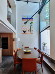
When it came to choosing colours and materials, Josephine was influenced by the family’s midcentury furniture. “I had a nice base with the furniture, which helped to make [the space] feel cosy. It was a starting point for bringing in the wood,” she says.
The elegant blue colour on the walls was picked to help both the features and furniture stand out. “The arch was already there, but as it was all white, you couldn’t really see it and the nice cosy nook it creates,” Josephine says.
Walls painted in De Nimes, Farrow & Ball.
The elegant blue colour on the walls was picked to help both the features and furniture stand out. “The arch was already there, but as it was all white, you couldn’t really see it and the nice cosy nook it creates,” Josephine says.
Walls painted in De Nimes, Farrow & Ball.
The owners bought this cabinet towards the end of the project, as it worked well with the other midcentury pieces and stood out so beautifully against the newly painted walls.
Josephine also helped the owners to position the artworks. “They already had the paintings, but they weren’t really being showcased,” she says. Now, each piece has its own space and is nicely framed by the blue background.
Josephine also helped the owners to position the artworks. “They already had the paintings, but they weren’t really being showcased,” she says. Now, each piece has its own space and is nicely framed by the blue background.
The bookshelves were already in place, but Josephine painted them, helping to highlight the books. This reading nook is perfectly positioned to offer a lovely view of the garden. “You get a real inside-outside feeling,” she says.
The old entrance to the kitchen (in the cream wall) was bricked up and a new opening created.
Across the new opening, Josephine fitted glazed bifold doors, so the family can contain cooking smells without losing shared light.
The door frame is natural oak. “We didn’t want to bring in too many wood finishes, and we already had the oak flooring and kitchen units, plus all the teak furniture,” she says.
The door frame is natural oak. “We didn’t want to bring in too many wood finishes, and we already had the oak flooring and kitchen units, plus all the teak furniture,” she says.
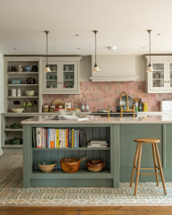
The window in the kitchen was enlarged, and the view of all the greenery helped to inform the cabinet choices. “I wanted to have a green kitchen with wood and texture; we wanted something with character,” Josephine says. She fronted Ikea carcasses with doors veneered in oak and a muted dark grey-green laminate.
The wall units are small, with plenty of room above. “We wanted to keep it open, as it’s such a small kitchen. [The owner] wanted it to breathe,” she says.
Kitchen carcasses, Ikea; unit fronts, Holte.
The wall units are small, with plenty of room above. “We wanted to keep it open, as it’s such a small kitchen. [The owner] wanted it to breathe,” she says.
Kitchen carcasses, Ikea; unit fronts, Holte.
White zellige tiles create a simple but subtly textured splashback. “Because we had the herringbone pattern on the floor, we wanted to make sure we didn’t have too many colours or patterns, so just went for something simple,” Josephine says. “Zelllige tiles bring some atmosphere.”
Zellige tiles, Mandarin Stone.
Zellige tiles, Mandarin Stone.
Blocking up the door into the room behind (now the study) meant Josephine could fit a full bank of units and appliances along this wall without them dominating the view from the dining room.
Not surprisingly, Josephine says she’s happy with how the work went and her design turned out. “It was a lovely project to work on,” she says.
And she isn’t the only one – the owners are delighted, saying, “[Josephine] offered innovative ideas which prevented us from wasting money on an unnecessary extension. We just needed help in seeing how the available space could be used more effectively.”
Tell us…
What do you think of Josephine’s redesign of this space? Share your thoughts in the Comments.

Sponsored
Reload the page to not see this specific ad anymore
Who lives here? A family with three teenagers
Location High Barnet, north London
Property A 1930s semi-detached house
Room dimensions Kitchen, 3.5m x 3.18m; dining room including reading area, 5.6m x 3.8m
Designer Josephine Lecoufle-Vinet of JLV Design
When the homeowners first contacted Josephine, they asked her to work a dining room into a small space off the kitchen, as the bigger, potential dining room was cut off. “I said, you know, you should open up the space and create the dining room [in the original area],” she says. “From a little idea, we ended up doing the whole ground floor.”