Houzz Tours

Kitchen Tours
London Kitchen

Kitchen Tour: A Long, Thin Room Gains Function, Storage and Light
The corridor-like kitchen in this Edwardian home just wasn’t working for the young family who live here

When asked for the defining characteristic of this kitchen, interior designer Gemma Fabbri says, “It’s very long!
“The house already had an extension to the outrigger when my clients – a young family – bought it,” she says, “but it was a bit crude – long and skinny and quite dark. The whole space was around 6.5m long and just 2.5m wide.”
Architect Rosie Craggs, of SS4 Architects, was already reworking plans for the building and she and Gemma, who joined the project early on, collaborated closely to create three family-friendly zones for playing, cooking and dining. The cat even got its own entrance…
The old, corridor-like kitchen wasn’t conducive to family life. There was no real zoning of the space, meaning a lot of it ended up being unused.
Find interior designers and architects in your area on Houzz.
Find interior designers and architects in your area on Houzz.
The space was 2.5m wide all the way along. “Once you’ve put in units either side, that’s not much space,” Gemma says. The new side extension bumps the room out on the left-hand side by 1.3m.
The widened section of the room is 4m long and Gemma opted to keep the brickwork exposed along the whole length. “It adds warmth with the colour and is also great for acoustics and muting sharp sounds – as is the wooden floor,” she says.
The skinny tip of the extension now houses bags of discreet storage, as well as being an area for the children to play in, with a lovely new window and seating.
White engineered ash flooring, The Wood Flooring Co. Parma 110 Classic wall lights, Astro.
The skinny tip of the extension now houses bags of discreet storage, as well as being an area for the children to play in, with a lovely new window and seating.
White engineered ash flooring, The Wood Flooring Co. Parma 110 Classic wall lights, Astro.
A new oriel window nook provides great circulation space and seating. The homeowners had originally imagined having the dining table in this spot and using the other end of the space as a playroom.
Gemma felt this wasn’t the best use of space and persuaded them to have this window zone as a play area. Here, the children’s toys can be stashed inside the bench seating when not in use, they’re close to the garden, and they’re also easily in sight yet away from the cooking area.
There’s also the perfect spot – underneath the bench seat on the left – to cater for another member of the family: the cat, who has a personal, to-scale doorway here.
More: 8 Ways Designers Have Incorporated a Contemporary Oriel Window
“We did look at corner bifold doors instead of a window here, but felt the space could be better used,” Gemma says. “When you live with children in a terraced house, every square metre is valuable and we purposely made the seat deep so the drawers were able to hold toys.”
Outside, Gemma and the architect settled on a solution for beautifying the brickwork of the existing extension – they clad it in blackened larch. The reveal is also (non-blackened) larch. It pops out to create an external seat, a mirror image of the interior one.
Windows and door, SunSeeker.
Outside, Gemma and the architect settled on a solution for beautifying the brickwork of the existing extension – they clad it in blackened larch. The reveal is also (non-blackened) larch. It pops out to create an external seat, a mirror image of the interior one.
Windows and door, SunSeeker.
“We specified a pivot and slice window so it could be completely open, but you can also open just one half,” Gemma says. “Because it has very slim frames, you get an uncluttered view of the garden.
“I’m a lover of window seats; you can sit in them all year round,” she continues. “The client sits here with a coffee first thing in the morning before anyone else is up.” It’s also good when friends with children come over. “They can sit here and watch the toddlers playing on the floor,” she says.
Gemma and Rosie also designed the family’s shed. “We kept it low and clad it in the same material as the exterior of the kitchen to minimise it, because the garden is small,” Gemma says. “There’s also a little house and play area for the kids up there, too.”
Gemma opted to keep the window end of the space worktop-free, partly because it was so narrow. “Also, it made more sense to think about all those other things you need in a house – as well as making space for the kids.”
As such, there’s an integrated fridge-freezer in the first tall cabinet at the kitchen end; the second one contains a full-height pull-out larder unit; next is a laundry cupboard, and next to that is a washing machine. The boiler is inside a bespoke cupboard made to butt up to the window seat. This also acts as a utility cupboard for brooms and so on.
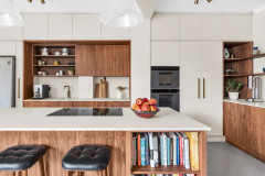
Most of the storage in the kitchen itself is drawers. For safety, with small kids running around, Gemma says: “We put all the potentially hazardous stuff against one wall. The sink and dishwasher and bins are all in the island, which acts as a bit of a barrier to the rest of the kitchen.
Voxtorp kitchen, Ikea. Sonny brass pendants, Gemma’s own design for WorkHouse. Brass tap, Olif.
As such, there’s an integrated fridge-freezer in the first tall cabinet at the kitchen end; the second one contains a full-height pull-out larder unit; next is a laundry cupboard, and next to that is a washing machine. The boiler is inside a bespoke cupboard made to butt up to the window seat. This also acts as a utility cupboard for brooms and so on.
Most of the storage in the kitchen itself is drawers. For safety, with small kids running around, Gemma says: “We put all the potentially hazardous stuff against one wall. The sink and dishwasher and bins are all in the island, which acts as a bit of a barrier to the rest of the kitchen.
Voxtorp kitchen, Ikea. Sonny brass pendants, Gemma’s own design for WorkHouse. Brass tap, Olif.
Gemma’s clients wanted a Scandi look that was relatively neutral, light and airy, but with a feature, hence these striking tiles. They also didn’t want a kitchen they would but feel too precious about. “The worst thing is a beautiful kitchen ruined when a child comes and draws all over it, so these are robust surfaces,” she says. “The worktops are microcement, as is the island. The tiles are encaustic cement, sealed for protection.”
Walls painted in Dutch White, Craig & Rose. Form bar stools, Normann Copenhagen.
Walls painted in Dutch White, Craig & Rose. Form bar stools, Normann Copenhagen.
Brass fittings and bare wood add warmth. The shelves and bench seating are pale oak and the engineered wood flooring is light ash. “We’d looked at Douglas fir for the floor, but this was sturdier,” Gemma says.
Kimono B handmade cement tiles, Marrakech Design. Brass switches and sockets, Buster & Punch.
Kimono B handmade cement tiles, Marrakech Design. Brass switches and sockets, Buster & Punch.
This floor plan shows the ground floor as it was before Gemma and Rosie started work.
The ‘after’ plan shows the how the relatively modest side extension allowed Gemma and Rosie to reshape the ground floor to create a zoned, functional and sociable space, with the middle room now open to the kitchen.
The back of the the original kitchen opened directly onto the hall, seen through the glass doors at the end. There was a door from the hallway into the middle room.
The middle room was used as a play space.
The middle room has now been incorporated into the kitchen and forms the dining area, seen here. The door at the end on the left leads into the hall.
“The dining room is quite simple,” Gemma says. “We kept it uncluttered, with the focus on the dining space, which is generous.” There’s a feature pendant above the table and a mix of open and closed storage either side of the alcoves.
“Although middle rooms are typically dark, it does still look out onto the garden,” she says. “We also didn’t darken it or make it snug-like. Instead, we deliberately painted it the same colour as the kitchen so it very much feels like one room.”
Gemma says her clients have filled the walls with art since the photos were taken.
Ambit pendant light, Muuto.
Gemma used to work in commercial design and spent a lot of time collaborating with social scientists. “So I have good training in how people use spaces and how to make spaces do what they need to do,” she says.
“That’s the thing I’ve really enjoyed about residential design – it’s about how can you make someone’s life at home easier and more enjoyable,” she says. “I have clients who say to me, ‘Every time I come home, it’s a delight – everything is just how it should be and that feels great.’ It can be life-changing.”
Tell us…
What do you think of Gemma’s reworking of this long kitchen-diner? Let us know in the Comments.

Sponsored
Reload the page to not see this specific ad anymore

Sponsored
Reload the page to not see this specific ad anymore
Who lives here? A couple with two young children
Location Walthamstow, east London
Property A Edwardian terraced house with five bedrooms and two bathrooms
Room dimensions 10.5m x 3.8m
Designer Gemma Fabbri of Studio Fabbri
Architect Rosie Craggs of SS4 Architects
Photos by Heather Hobhouse
With this project, the team made the sustainable decision to rework what was already there, rather than demolishing anything. To help the long room to function better, it was widened at the house end by 1.3m, giving the working part of the new kitchen more space.
Gemma and Rosie tweaked the plans as the design progressed, including adding an oriel window and incorporating the middle room into the space. “[The brief was] to create a room that included a kitchen, a dining spot and a play area for the kids, and generally [to create] an open, light and a sociable space,” Gemma says.