Houzz Tours

House Tours

Houzz Tour: A Period Home is Thoughtfully Updated for Family Life
The bones of this lovely Victorian home informed its new, classic design after a kitchen extension

The clients found interior design firm My Bespoke Room through Houzz and got in touch, initially for a design consultation. Designer Lucy Henderson came to survey the house, review the floor plans and suggest ideas – at which point the couple decided to go ahead with a whole house design.
“They were about to have an extension built and the internal layout wasn’t getting the best out of the space for them,” Lucy says. “They wanted to make the most of it, especially on the ground floor, get in plenty of storage and introduce as much natural light as possible.” They were also unsure about what do with the middle room, so that it didn’t just become a walk-through space.
Lucy also retained or restored many of the period features in the house and worked wonders on the owners’ bedroom and the home’s two bathrooms – and turned their downstairs loo into what’s now known as “the jungle room"…
To see more great projects where the homeowner found their professional via Houzz, take a look at our Born on Houzz series.
Restoring period features was a big part of the project and the timber floors throughout were repaired, sanded and sealed.
The owners weren’t sure when these unusual arched doors (seen here before the middle room had been painted) had been added, but knew they probably weren’t original. They discussed with Lucy whether or not to keep this feature at all. “In the end, we decided to refurbish and repaint them. It’s a nice arch,” she says.
A dramatic pendant highlights the high ceiling.
The walls the couple inherited were a muddy cream colour, so this soft, pale off-white has brightened up the room hugely.
The fireplace had a dark surround, which was not original and made from faux marble. Lucy’s simple fix was to paint it.
She embraced the darkness of the middle room, on the left, and encouraged the clients to go for bold, dark green walls.
She embraced the darkness of the middle room, on the left, and encouraged the clients to go for bold, dark green walls.
The owners liked the idea of the contrast between the two adjacent rooms. “In here, we put in a reading area, a bar cart and a piano and turned it into a bonus space for them,” Lucy says.
Thinking of renovating? Find everyone you need, from interior designers to builders, carpenters and decorators, on Houzz.
Thinking of renovating? Find everyone you need, from interior designers to builders, carpenters and decorators, on Houzz.
Before it was extended, the kitchen was in a classic Victorian narrow outrigger.
The kitchen was extended into the side return and out a little at the back by the owners’ architect.
Lucy helped them to create the best internal layout for the space. “They wanted an open-plan kitchen-diner and family space with plenty of storage and natural light, as well as room to entertain,” she explains.
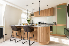
Style-wise, the brief was “a Shaker-style kitchen with some modern twists”.
Lucy helped them to create the best internal layout for the space. “They wanted an open-plan kitchen-diner and family space with plenty of storage and natural light, as well as room to entertain,” she explains.
Style-wise, the brief was “a Shaker-style kitchen with some modern twists”.
“The couple had originally been looking at a layout with a bigger island, but flipped the other way,” Lucy says. By orientating the island this way, Lucy gained the family more useable floor space.
“We convinced them to go blue on the island rather than grey,” Lucy says. “The brass fittings tie everything together, including the feature pendant light.
“[The herringbone tile splashback] adds interest and texture without going too crazy,” she adds.
“We convinced them to go blue on the island rather than grey,” Lucy says. “The brass fittings tie everything together, including the feature pendant light.
“[The herringbone tile splashback] adds interest and texture without going too crazy,” she adds.
There are now two entrances into the kitchen: the one on the right goes into the hallway, while the opening on the left leads into the middle living room.
A new roof window over the old side return area floods the space with light.
A new roof window over the old side return area floods the space with light.
At the back of the kitchen, Lucy created a cosy seating area. Originally, the plan was for the dining table to sit here, but Lucy felt that would block access and views. Instead, she put it on the other side of the room.
“Moving the dining table means you still have a clear walkway out to the garden,” she says. “And we were able to tuck a two-seater sofa in this corner with a little coffee table and circular rug to zone the area. It was a bonus that we were able to fit it in.”
The low table includes two cubes that can be pulled out for extra seating.
Lucy also suggested keeping this part of the wall natural brick to further define and warm up the area.
On the other side of the room, Lucy created a dining space using the owners’ original extending dining table.
She chose this pair of prints for them and added a tall plant to add texture, further colour and interest.
Wall lights provide soft illumination for dining. “And, by not putting a fixed pendant over the table, it allows for a level of flexibility,” Lucy says.
In time, the plan is to add bench seating and bespoke storage right along this side wall (see the floor plan, below).
Artworks, Oka.
The floor plan shows how all the ground floor spaces are connected.
The original cloakroom, which is tucked between the kitchen and the middle room, was rather tired.
Lucy wanted to create a fun, bold space. “It’s really dark,” she says. “And because the extension now wraps around it, it’s even darker, so we embraced that. The owners call it the jungle room.
“We went with blues, greens and a bit of blush, which are the colours we used throughout,” she adds.
The colours also tie in with the original stained-glass window. This now looks into the back of the kitchen space, but used to open onto the side return, hence the reduced light.
“We added some simple painted panel moulds and marbled splashback tiles,” Lucy says. The tiles link nicely to the kitchen worktops, while the blue links to the kitchen island and living room chairs.
The hallway was previously painted cream.
Lucy made subtle but effective changes. “The woodwork here is a nice clean, crisp white to keep things bright, but we added warmth with the grey below the dado,” she says.
The owners already had this console unit and Lucy added the mirror. “It’s lovely and large and has really brightened up the space,” she says. “The glass lantern and wall lamps let out lots of light, too. The lights also had a bit of a heritage look to them and tie into the pendant above the kitchen island.”
The owners already had this console unit and Lucy added the mirror. “It’s lovely and large and has really brightened up the space,” she says. “The glass lantern and wall lamps let out lots of light, too. The lights also had a bit of a heritage look to them and tie into the pendant above the kitchen island.”
The main bedroom on the first floor previously had no built-in storage.
“The room has a lovely high ceiling and original Victorian features,” Lucy says. She designed sympathetic alcove cupboards on this side of the room and painted the doors, along with the chimney breast, a rich dark blue-grey.
“It’s added real depth to the space,” she says. “It’s a large room, so it can take that kind of colour. We kept the fireplace pale to make it stand out.”
“It’s added real depth to the space,” she says. “It’s a large room, so it can take that kind of colour. We kept the fireplace pale to make it stand out.”
She’s also added in a little more pink to soften things up. “The couple love the blush and blue colour scheme,” she says. “We also went for a lovely timber bed to add the warmth of a natural material.”
Brass detailing and the mix of soft textures, including a velvet ottoman and cushions, add a touch of luxury. “They really wanted that boutique hotel feel to their bedroom,” Lucy says. “We added wall lights for low-level ambient lighting and to keep the bedside tables clear.”
Brass detailing and the mix of soft textures, including a velvet ottoman and cushions, add a touch of luxury. “They really wanted that boutique hotel feel to their bedroom,” Lucy says. “We added wall lights for low-level ambient lighting and to keep the bedside tables clear.”
There’s also new storage on the other side of the room, but it took a little ingenuity to fit it in.
“We had the luxury of space to play with, but it was a little awkward, as the position of the door meant you originally couldn’t run wardrobes right up to the wall,” Lucy explains. “So we very slightly moved the door along the wall. It’s made a huge difference.”
“We had the luxury of space to play with, but it was a little awkward, as the position of the door meant you originally couldn’t run wardrobes right up to the wall,” Lucy explains. “So we very slightly moved the door along the wall. It’s made a huge difference.”
The bedroom bay has shutters to match the ones in the living room below. “The couple went with shutters throughout to keep it light and bright,” Lucy says. “Here, particularly, it has kept the space even more open and allows room for a nice seating area.”
The main bedroom doesn’t have an en suite, but this shower room is on the same floor, while the couple’s daughter uses one on the second floor.
“We added brass lights and details in here, along with the marble-effect herringbone tiles,” Lucy says. “They wanted fairly timeless spaces, so it’s quite a classic design, but these details add interest and makes sure it doesn’t look clinical.”
“We added brass lights and details in here, along with the marble-effect herringbone tiles,” Lucy says. “They wanted fairly timeless spaces, so it’s quite a classic design, but these details add interest and makes sure it doesn’t look clinical.”
The black vanity unit provides generous storage and ties in with the black shower screen.
This floor plan shows the layout on the first floor of the house.
The top floor bathroom has a matching vanity unit, but an over-bath shower instead of a walk-in, plus simpler metro tiling, another nod to the era of the house.
It’s mainly used by the owners’ young daughter, but doubles as a guest bathroom.
It’s mainly used by the owners’ young daughter, but doubles as a guest bathroom.
There’s additional storage in here in the form of shelving with pull-outs for toys and bathroom accessories.
“The lovely patterned flooring is classic, but with a modern twist,” Lucy says.
And how did the owners feel about their reimagined home? Their review on Houzz says it all. “We love the result [and] Lucy was great to work with. She listened carefully and managed to translate our various (not always very straightforward) ideas into a cohesive and elegant design with a twist across the whole house.”
Tell us…
What’s your favourite part of this elegant family home? Let us know in the Comments.

Sponsored
Reload the page to not see this specific ad anymore
Who lives here? A couple with a young daughter
Location South-east London
Property A Victorian terrace
Size Five bedrooms and two bathrooms
Designer Lucy Henderson of My Bespoke Room
Year of project 2021
Photos by My Bespoke Room
The house has two living rooms and the owners wanted to make this one, at the front of the house, light, bright and airy, with just flashes of colour.
The two armchairs, rather than a second sofa, help to keep the bay window space open. Lucy commissioned joinery to provide storage and room for the TV in the alcoves.