Houzz Tours

House Tours

Houzz Tour: A Warm Scandi Scheme for a Newly Extended House
Considered lighting, earthy colours and an open-plan ground floor are the key ingredients of this sociable family home

“A nice, chunky project,” is how Karen Knox of Making Spaces describes this detached house in Wetherby, West Yorkshire. When she first laid eyes on it, it had a small, impractical kitchen and dated bathroom. “It was cottage style from the outside, more midcentury inside. It didn’t really know what it was,” she says.
With architect’s plans for a two-storey extension and reconfiguration already drawn up, Karen was brought on board to design an interior that would be light, sociable and harmonious – just right for family life and entertaining.
With architect’s plans for a two-storey extension and reconfiguration already drawn up, Karen was brought on board to design an interior that would be light, sociable and harmonious – just right for family life and entertaining.
On the left is the original layout of the house, before it was extended.
On the right, you can see the ground floor as reconfigured by the architect and redesigned by Karen internally. The pink area and everything on its left is the original house; on the right is the two-storey extension and adapted garage space (Karen designed a home office in the smaller part of the L-shape, bottom right).
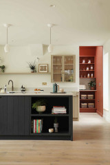
As for the main ground floor, this is essentially a single large, open-plan space, with the pantry and utility tucked behind the kitchen.
On the right, you can see the ground floor as reconfigured by the architect and redesigned by Karen internally. The pink area and everything on its left is the original house; on the right is the two-storey extension and adapted garage space (Karen designed a home office in the smaller part of the L-shape, bottom right).
As for the main ground floor, this is essentially a single large, open-plan space, with the pantry and utility tucked behind the kitchen.
Designing this house was hugely collaborative and Karen enjoyed a great working relationship with the owner. “We clicked,” she says. “She was a dream client, open to ideas, but she had preferences, of course.”
She loved colour and terrazzo tiles and had seen the Sebastian Cox kitchen by deVOL before Karen came on board and had already decided it was ‘the one’. “That gave me an anchor for the scheme,” Karen says. “Something with natural materials, quite Scandi feeling and open-plan. It made my job easier. We weren’t coming from a standing start.”
The Sebastian Cox kitchen, deVOL. Pendant lights, Original BTC.
The kitchen as it looked before. It was located in the space that is now the dining area.
The tap chosen for the utility room became the inspiration for the warm terracotta tone used here, in the pantry and also on the ceiling above the dining area.
“So it’s on both sides of the room,” Karen says. “The colour is bold but easy to be with; it doesn’t feel overpowering. It gives a foreground-background feel. If we’d painted the utility and pantry white, that sense of space behind the kitchen would have been lost. Now it looks inviting.”
Tap, ABI Interiors. Cabinets painted in Audubon Russet, Benjamin Moore.
The pantry features open shelves for food storage. “The owner was so excited about the pantry, she’d bought all these nice glass storage containers before we’d even broken ground on the build,” Karen says.
Elsewhere in the open-plan kitchen and living space, the walls are painted in an off-white, complemented by a pale worktop in London Grey Caesarstone.
Walls painted in Swiss Coffee, Benjamin Moore. Wall lights, Original BTC.
Walls painted in Swiss Coffee, Benjamin Moore. Wall lights, Original BTC.
Karen designed bespoke, solid ash joinery for the living space. It wraps around the big picture window by the dining table (seen clearly in the next photo) and continues into the seating area here.
“It would have been weird to have had all this timber and then buy a cabinet for the TV,” Karen says (referring to the screen masquerading as a Paul Klee artwork in this photo). “So we went for this enormous big wraparound design, which is seamless.
“I’m a massive advocate for making architecture provide a function,” she explains. “This joinery now works as seating, storage and side table. It’s versatile and will be there forever. It’s not about fads or picking up new bits of furniture here and there. It’s sustainable.”
To link the dining area with the kitchen on the other side of the space, Karen painted the ceiling above the table in the same rich terracotta used in the pantry and utility room. “It’s a slightly raised ceiling here,” she says. “That was the original kitchen ceiling.”
The bench is upholstered in a jacquard weave made from 100% PET recycled polyester yarns produced from waste plastic bottles. “It’s incredibly hard-wearing,” Karen says.
Ceiling painted in Audubon Russet, Benjamin Moore. Upholstery fabric, Kirkby Design. Uley chairs, Yesterhome.
The bench is upholstered in a jacquard weave made from 100% PET recycled polyester yarns produced from waste plastic bottles. “It’s incredibly hard-wearing,” Karen says.
Ceiling painted in Audubon Russet, Benjamin Moore. Upholstery fabric, Kirkby Design. Uley chairs, Yesterhome.
The owner worked with Karen to find new furniture to suit the newly designed house. “We visited Redbrick Mill, a huge interiors place, for some shopping and a spot of lunch,” she says. “We saw this sofa there. All the pieces move. You can take the backs off and configure it exactly as you wish, so if you’re in the kitchen, you can move the backs so people can sit facing you – or facing the garden. It’s amazing.”
The large island has seating at the far end, seen here, with a copper top to zone it as a space for relaxing and eating, as opposed to cooking and food prep.
Sofa, Ditre Italia.
The large island has seating at the far end, seen here, with a copper top to zone it as a space for relaxing and eating, as opposed to cooking and food prep.
Sofa, Ditre Italia.
Karen spent most time on the lighting. “It’s so crucial to making an open-plan space work,” she says. Rather than “rows and rows of downlights”, she instead included just a few, plus pendants and wall lights, and a large standard lamp, which is wired to the lighting plan, so you can put it on as soon as you come in via a wall switch.
Floor lamp, Lights & Lamps. Rug, Soho Home. Wide oak plank flooring, Ted Todd.
Floor lamp, Lights & Lamps. Rug, Soho Home. Wide oak plank flooring, Ted Todd.
To further complement the lighting scheme, Karen installed warm LED strips, including here in the little bar area off the kitchen.
LED lighting is also fitted behind the bench seating in the dining space, complemented by three striking pendant lights made from painted stainless-steel mesh.
Tempo Vivace pendant lights, Arturo Alvarez.
Tempo Vivace pendant lights, Arturo Alvarez.
Karen selected warm colours for the hallway, inspired by the original wooden floor. “The colour scheme was all down to that parquet floor,” she says. “You can’t deny the parquet it’s moment of Seventies glory, so I thought right, let’s add lots of caramel!”
Walls painted in Guesthouse; woodwork painted in Green Grove, both Benjamin Moore. Enigma wool carpet, Crucial Trading.
Walls painted in Guesthouse; woodwork painted in Green Grove, both Benjamin Moore. Enigma wool carpet, Crucial Trading.
“My favourite part of any job is the spatial planning,” Karen says. “I get the architect’s plans and think, right, can we move that a bit or this a bit?”
On the landing, she tweaked the plans so the bathroom window lined up with the landing and light could then flow through. She also added a few sun tunnels around the house, including one in the ceiling here, to draw light in from above.
Adrianne cluster pendant light, Made.com at Next.
On the landing, she tweaked the plans so the bathroom window lined up with the landing and light could then flow through. She also added a few sun tunnels around the house, including one in the ceiling here, to draw light in from above.
Adrianne cluster pendant light, Made.com at Next.
This space off the landing was originally designed as a small office. “But it’s north-facing and dark, and since everyone is drawn to the light, you’d just end up working at the kitchen island,” Karen says.
Instead, she suggested making it into a laundry room. “The utility room downstairs has an external door onto the garden. It’s long and thin, and was originally going to be a space for laundry but also for muddy boots, the dog coming in and out, a sink, and recycling,” Karen says. “Dirty with clean is not a good vibe.”
The utility room is also the furthest room from the stairs, so it would have been a long way to walk with armfuls of dirty clothes. Instead, Karen moved the laundry up here. “Both owners were really excited about this,” she says, laughing.
The old bathroom was in what’s now the laundry room and upstairs landing.
The new bathroom sits entirely in the new extension and is above the new kitchen (see the first floor plan below).
The room was designed for the owners’ two girls (the owners have an en suite off the main bedroom) and for guests to use when staying. “The owner wanted it to be fun,” Karen says. “We’d gone with terracotta-ish tones downstairs, and then she saw these tiles in a café and wanted them. They became the anchor for the space. I picked out colours from them for the bathroom furniture.”
The owner specified a bath and separate shower in here. The bath had to be posted in through the window by a forklift, as it was too heavy to carry upstairs.
Terrazzo tiles, Diespeker & Co. Bath, Aquaroc.
A before (left) and after (right) plan of the first floor. Again, the extended area can be seen to the right.
There is ample storage in the bathroom, and a large mirror bounces daylight from the rooflight around the space.
Bathroom furniture, Fiora.
Bathroom furniture, Fiora.
The site of the old bathroom, before its move to the new extension.
In the bathroom’s new location, there’s space for a generous walk-in shower.
Also in the extension on this floor is a new guest room, which sits above the TV and seating area in the space below.
The bold scheme in the guest bedroom began with this lamp. “I saw it in the sale, thought it was cool and bought two,” Karen says. “That became the inspiration for doing coral here, and then the look became quite Eighties, with the stripes and the black ash bedside cabinet.”
A bespoke headboard runs the full width of the room.
Table lamp, John Lewis.
The wardrobes are from Ikea, with bespoke fronts painted in a vivid coral. This colour has been run up the wall, too, in the same saw-tooth pattern as on the carpet, “just to annoy the decorator”, Karen jokes. “Actually, he loved this job,” she adds. “He paints a lot of rooms grey. Here, he got to flex some colour muscles.”
Wardrobe and wall detail painted in Fire Dance, Benjamin Moore.
Wardrobe and wall detail painted in Fire Dance, Benjamin Moore.
And what do the owners think of the transformation? Unsurprisingly, they are besotted.
“We now have the most beautiful family home that’s better than I could have imagined,” they wrote in their review on Houzz. “Karen came up with so many ideas and suggestions we would never have thought of, like [the] laundry area to avoid endless trips trailing washing up and down the stairs. Such a fantastic idea and one I am grateful for every day!
“Karen understands how to make a space really work for the people living in it, but also how to make it look beautiful, too.”
Tell us…
What do you like about this light, welcoming family home? Share your thoughts in the Comments.

Sponsored
Reload the page to not see this specific ad anymore
Sponsored
Reload the page to not see this specific ad anymore
Who lives here? A family of four
Location Wetherby, West Yorkshire
Property A detached house built in the 1970s
Size Three bedrooms and two bathrooms
Interior designer Karen Knox of Making Spaces
Architect Niche Design Architects
Photos by Katie Lee
The family had lived in this house for some time, saving up to complete the project, and remained on site during the build. The main objective behind extending it was to create a larger kitchen within an open-plan living space.
“The original kitchen was [fairly small],” Karen says. “You couldn’t fit more than four people around the table – if people visited, they would all end up eating off trays in the living room.”