Houzz Tours

Kitchen Tours
London Kitchen
Kitchen Tour: A Small Extension Adds a Utility and Boot Room
A thoughtful design retains the character of this Victorian home while adding space and great functionality

Side-return extensions on period terraced houses are pretty common, but the design of this space is a triumph. The owners were keen to retain the integrity of their Victorian home yet craved extra space for their growing family, so the side return was designed as a separate room. This means the kitchen keeps its characterful bay window and proportions, while the extension houses a utility and boot room, where muddy footwear and paws can be dealt with away from the cooking and dining areas.
Keen to bring in era-appropriate character, the owners found John Place of PlaceDesign Kitchens and Interiors on Houzz, liked his style – particularly his use of deep green in several projects – and asked him to make the most of their new space.
To see more great projects where the homeowner found their professional via Houzz, take a look at our Born on Houzz series.
The original room had a lovely bay at the end, which the owners wanted to keep. “They liked the original features and didn’t want to decimate the place,” John says. The dark colour of the window and door frames links to the kitchen cabinets.
The table, which is made from scaffolding boards, has a cosy, rustic look. There’s also a fireplace to the right of the table, and John says the owners are aiming to slot a couple of armchairs into the space to the left.
Find the right contractors to renovate your home in the Houzz Professionals Directory.
The owners knew they wanted Shaker-style doors in dark green, but John wasn’t sure how dark. “I had a feeling they wanted to go quite dramatic with that,” he says, so recommended this rich, deep shade.
“I suggested pairing it with brass handles,” he adds. “These are gorgeous handmade ones. They weren’t cheap, but they really make the kitchen. It’s things like that where you say to the client, ‘We could have cheap brass knobs, but it won’t have the impact.’ The owners recognised it was worth spending a bit more, because once you do it right, it will really stand out and pull the whole thing together.”
Cabinets designed by John and made by Davonport; painted in Obsidian Green, Little Greene. Handles, Armac Martin.
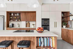
The initial kitchen design had all the units running down the long wall, but then John suggested having a bank of appliances to the right of the door, which meant he could keep the main cooking area light and open.
“I designed a larder at either end and no wall units in between,” he says. “[The owners] really liked that the storage was zoned and it kept everything really light and airy, as well as making a bit more of a feature of the splashback.”
The left-hand tall cupboard on the sink run is a pantry for food, with reduced-depth shelves to accommodate spice racks on the doors. “This also holds appliances such as the toaster,” John says, which keeps the worktops free.
The cupboard to the right (seen in the first photo) just has shelves and is designed for crockery.
The bank of units to the right of the hallway door groups the main appliances and extra storage into one area, while leaving the original side window in place, bringing valuable extra light into the back of the room.
The cornice style of the unit tops works nicely with the age of the property.
The cornice style of the unit tops works nicely with the age of the property.
The floor plans show how, rather than extending sideways to create a bigger room, the design cleverly adds on a separate utility/boot room and cloakroom.
There’s a door into the boot room from the garden and, because there’s still a pathway down the side of the house, a second door near the cloakroom that can be accessed from the front of the house.
The front of the house (not shown on this plan) protrudes as much as the extension, leaving a little courtyard space, seen bottom left, where the family can store their bikes. It also allowed them to keep the original window at the back of the living room, as well as the one towards the back of the kitchen seen in the previous photo.
The worktop and splashback are marble-patterned Dekton, which is very durable and stain-resistant. “This is a matt finish and, because of that, you notice the grain and colour of the marble veins,” John says. “With a gloss stone, the shine [can obscure] the beautiful grain – all you see is reflections of the windows and other things in the room.”
The shelf works nicely, as the owners like their plants and art. “There are some really nice pieces of art throughout the house, so they can lean pictures on this and create a changing display,” John says.
Aged brass tap, Perrin & Rowe. Matt Dekton Aura 15 worktops and splashback, Cosentino.
The shelf works nicely, as the owners like their plants and art. “There are some really nice pieces of art throughout the house, so they can lean pictures on this and create a changing display,” John says.
Aged brass tap, Perrin & Rowe. Matt Dekton Aura 15 worktops and splashback, Cosentino.
The flooring is engineered oak in a herringbone pattern over underfloor heating.
John included a built-in wine rack and slim wine fridge in the island. “We came upon this idea a bit later in the design, thinking about how [the owners] would use the island, and I wanted to get some texture in there, so it didn’t just look like a big block of green,” he says. “I said, ‘You’re going to have oak on the floor, so why don’t we have an oak accent?’”
The pendant lights above the island tie in with the brass handles and vintage feel of the cabinets.
The utility and boot room packs a lot into a relatively narrow space. Whether entering through this door from the garden or the one to the side (to the right of the camera), there’s plenty of room on the large oak bench for removing coats and footwear.
“They’re an outdoorsy family and have a nice big garden, which they use a lot, so they really needed it to be practical for the kids and dog,” John says.
“They’re an outdoorsy family and have a nice big garden, which they use a lot, so they really needed it to be practical for the kids and dog,” John says.
Along with a roomy butler’s sink, there’s another dishwasher plus a washing machine and tumble dryer in here. John went for pale grey units in this narrow space, but the Shaker design and the dark green splashback tiles link with the kitchen cabinets.
The walls and ceiling are a rose pink, along with everything in the cloakroom (not shown). “[The owners] have a good eye for colour and they’re not scared of having something bold,” John says.
Units in Stone Grey, Schuller. Matt Dekton Aura 15 worktop, Cosentino.
The walls and ceiling are a rose pink, along with everything in the cloakroom (not shown). “[The owners] have a good eye for colour and they’re not scared of having something bold,” John says.
Units in Stone Grey, Schuller. Matt Dekton Aura 15 worktop, Cosentino.
The tongue-and-groove wall and long hook rail add a traditional note. A run of alternating drawers and shoe shelves, high wall units above, plus two broom cupboards either side of the back door, offer plenty of room for outdoor paraphernalia as well as toys. The terrazzo tile flooring is both practical and attractive.
It’s safe to conclude John’s design has been a hit. As he says, “Every time I’ve been back, they’ve said, ‘We love it so much.’”
Tongue-and-groove panel, Schuller.
Tell us…
What do you like about John’s design of this kitchen and utility/boot room? Share your thoughts in the Comments.
It’s safe to conclude John’s design has been a hit. As he says, “Every time I’ve been back, they’ve said, ‘We love it so much.’”
Tongue-and-groove panel, Schuller.
Tell us…
What do you like about John’s design of this kitchen and utility/boot room? Share your thoughts in the Comments.

Sponsored
Reload the page to not see this specific ad anymore
Who lives here? A family of four with two late primary/early secondary school children
Location Walthamstow, north-east London
Property A Victorian terrace
Dimensions Kitchen, around 8.3m x 3.8m; utility/boot room, around 5m x 2m
Project year 2022
Designer John Place of PlaceDesign Kitchens and Interiors
The owners asked John to review their side-return extension plans, as they weren’t sure of a couple of architectural details and wanted a bit of advice before the build got underway – where the kitchen was going to go, the size of utility and cloakroom, and so on.
“They didn’t want to do it half-heartedly,” he says. “They wanted to make it something that would be for life.”