


Kitchen Tour: A Warm, Inviting Space Designed for Two Keen Cooks
This once cramped, chilly room is now a stylish kitchen where the owners can enjoy cooking and hanging out with friends
Sarah Alcroft
4 November 2022
Houzz UK Editorial Team
The kitchen is an important room for many of us, but when you’re a keen cook, it really is essential that it functions well and is inviting. So when a foodie couple moved into this Victorian terrace, knocking the narrow, chilly kitchen into shape was a priority.
“It was very basic and didn’t connect to the rest of the house at all,” says Ellen Cumber of Golden Design, who, along with business partner Alice Bettington, was brought in to create the couple’s dream space. “Being so keen on cooking, it was a problem for them, so when they bought the house, they knew that was going to be their main focus.”
“It was very basic and didn’t connect to the rest of the house at all,” says Ellen Cumber of Golden Design, who, along with business partner Alice Bettington, was brought in to create the couple’s dream space. “Being so keen on cooking, it was a problem for them, so when they bought the house, they knew that was going to be their main focus.”
Kitchen at a Glance
Who lives here? A professional couple in their late thirties
Location Dalston, east London
Property A Victorian terrace
Kitchen dimensions 4.8m x 4.5m
Designers Ellen Cumber and Alice Bettington of Golden Design
Photos by Tom Carter
The couple, who had been attracted by photos of Golden Design’s previous projects, asked Ellen and Alice to create a light, spacious kitchen with plenty of storage, worktop space and room to entertain.
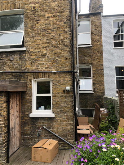
Before Photo
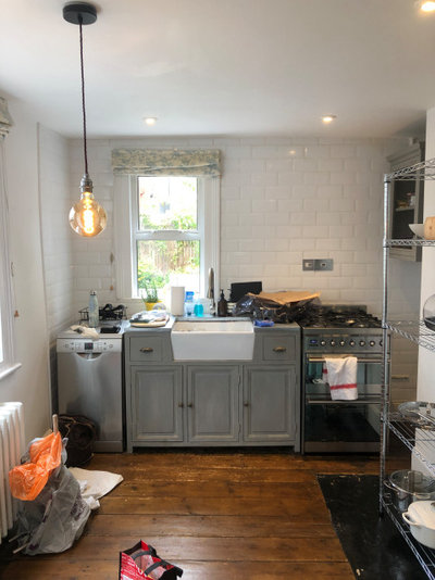
The kitchen was originally in the narrow outrigger at the back of the house and felt cramped and quite cold. Ellen and Alice extended into the side return, but not out at the back, as the couple wanted to preserve as much of the garden as possible.
Find interior designers in your area on Houzz.
Find interior designers in your area on Houzz.
The extra slice of floor space the extension gave them has created a much more usable, square room. Rather than going for glazing right across the back, Ellen suggested Crittall doors and an oriel window.
“We try to steer clients away from glass right across the back, as it can be very limiting,” she says. “With the amount of glazing we were already putting into the project, they didn’t need extra light, plus we also had in mind that we wanted to do the window seat.”
“We try to steer clients away from glass right across the back, as it can be very limiting,” she says. “With the amount of glazing we were already putting into the project, they didn’t need extra light, plus we also had in mind that we wanted to do the window seat.”
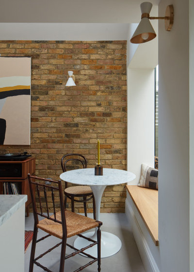
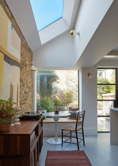
Having a bench seat in the oriel window takes up no extra floor space and allowed for the creation of a good-sized breakfast nook. “We’ve almost made another little room with the table and chairs,” Ellen says.
A record player on the sideboard also makes this a great place for friends to hang out.
Vintage sideboard, Etsy.
More: 17 Modern Oriel Windows With Wraparound Views
A record player on the sideboard also makes this a great place for friends to hang out.
Vintage sideboard, Etsy.
More: 17 Modern Oriel Windows With Wraparound Views
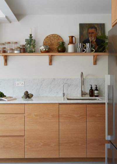
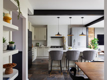
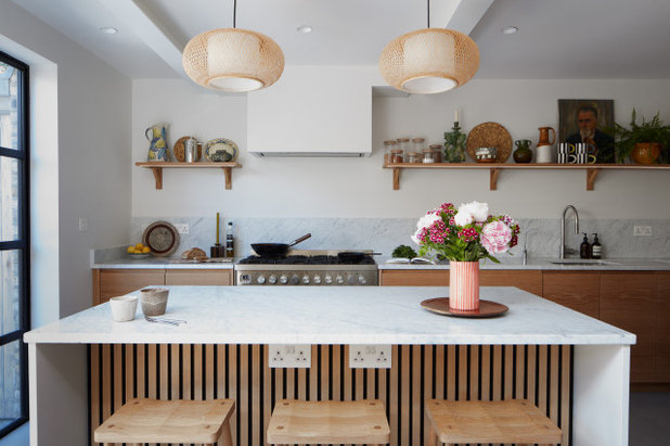
The kitchen cabinets are oak, lightly hand-finished with a white oil. “We worked with a really great joiner,” Ellen says. “The grain is lovely – he hand-selected every piece and made sure the grain was running in the right direction.” In this shot of the base units, you can see the grain running perfectly from door to door.
Joiner, Lawrence Goodwin.
Joiner, Lawrence Goodwin.
At the end of the run of base units, on the right, Ellen has incorporated a slot for chopping boards. “I first did this in my kitchen,” she says, “and found it so useful to not have to keep chopping boards stacked inside a cupboard or drawer, but being able to pull them out, like books on a bookshelf.”
The team have made the extractor fan as inconspicuous as possible. “There are two structural beams above and we didn’t have enough head height to drop the ceiling any more, so we had quite a headache trying to design everything to work together – the beams and the extractor and that T shape,” Ellen says, “but once it was all plastered and painted, it felt as if it really worked.”
The team have made the extractor fan as inconspicuous as possible. “There are two structural beams above and we didn’t have enough head height to drop the ceiling any more, so we had quite a headache trying to design everything to work together – the beams and the extractor and that T shape,” Ellen says, “but once it was all plastered and painted, it felt as if it really worked.”
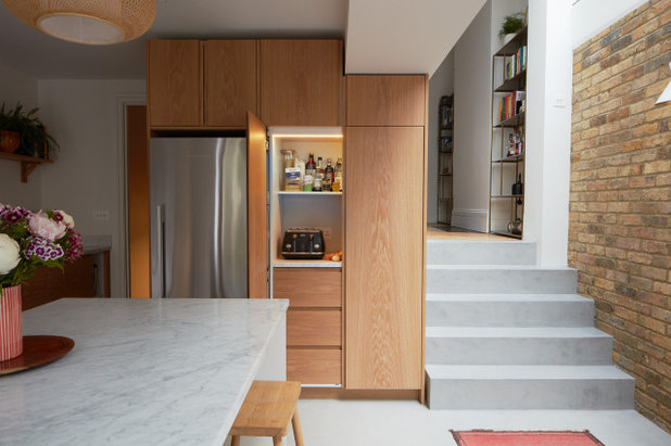
Opposite the garden is a bank of floor-to-ceiling units. A breakfast station sits behind the double doors. “A light comes on when you open it up,” Ellen says. “The doors slide back into the unit, which was really important for keeping them out of the way when the couple are cooking.”
The units stop just shy of the ceiling, creating a shadow gap. “Because it was such a modern kitchen, it didn’t feel right to have a cornice,” Ellen explains, “and we decided against having a filler piece in the end, partly because of having to drop the height down above the pantry for the big steel beam. So we decided if we skimmed around everything and had a shadow gap, it would look slick and modern.”
The door to the left of the fridge leads down to a small utility room, which was really helpful when it came to fitting in maximum storage. “There’s an original cellar down there,” Ellen says. “The ceiling is low – around 1.8m – but there’s a utility room, so we were able to get the washer and dryer out of the kitchen.”
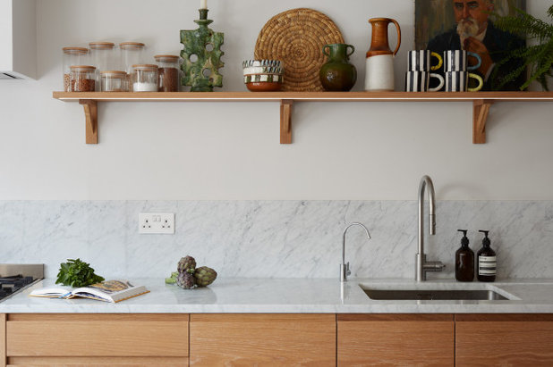
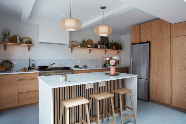
Having the full-height block of units meant Ellen and Alice could go for open shelves above the worktop, but they had to make sure the couple’s cookery equipment and crockery would all fit in before they went ahead.
“We had to work hard when we did the original drawings,” Ellen says. “We literally measured everything they owned, so we could be absolutely certain it would all fit, because it’s quite a big shout to not have wall cupboards.”
“We had to work hard when we did the original drawings,” Ellen says. “We literally measured everything they owned, so we could be absolutely certain it would all fit, because it’s quite a big shout to not have wall cupboards.”
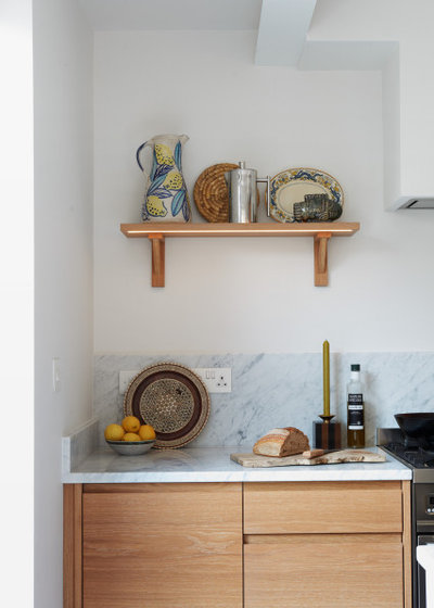
The joiner made the shelves. “That’s a design we’ve worked on with him over a couple of different projects and we’ve been finessing,” Ellen says. “The lights are LEDs, so you have to think where the driver will go (it’s hidden in the back of a base cupboard with the cable taken up through the wall).”
The couple have filled the shelves with interesting pieces, including lovely ceramics. “We knew they’d have lots of nice things they could put out on display,” Ellen says.
The couple have filled the shelves with interesting pieces, including lovely ceramics. “We knew they’d have lots of nice things they could put out on display,” Ellen says.
Before Photo
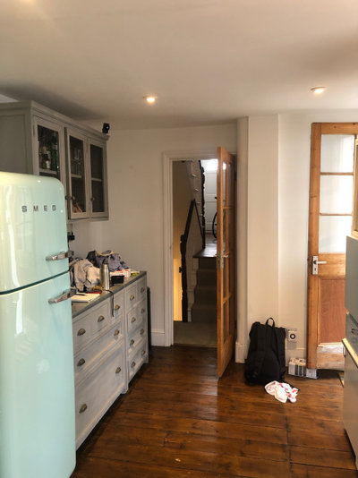
The old kitchen was disconnected from the dining room in the middle of the house.
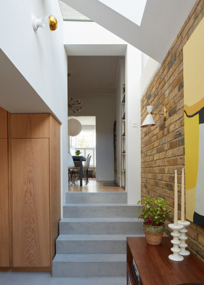
Now the spaces flow into one another. The old dining room window, which originally looked out into the side return, has been turned into a wide doorway, and the area behind it has been kept as a dining room.
“We went back and forth about whether they would have a dining table in the kitchen, but decided that if they did that, the dining room would becomes a bit redundant,” Ellen says. “Also, this way, there’s plenty of space [in the kitchen] for people to stand around having drinks.”
The flooring is microcement, which is about 2mm to 3mm thick. It’s applied by hand over a screed floor and underfloor heating.
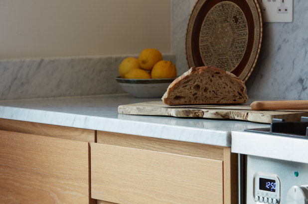
The worktop is marble. “There’s nothing that can touch real stone, but you do have to prepare yourself for it to develop a patina,” Ellen says. “The first scratch is a bit stressful, but then the whole thing gets a nice, lived-in look.”
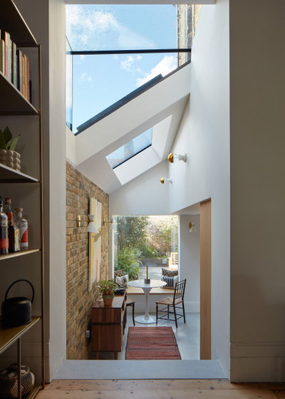
This shot, taken from the dining room, shows just how much glazing the team added to the extension. “The kitchen is north-facing, so the light is nice – it isn’t direct and sweltering,” Ellen says.
The wall of the new extension is London Stock brick, which is tactile and chimes with the oak. “It brings warmth to the cool marble and concrete,” she says.
There are two different styles of wall lights, which was a deliberate decision to keep things interesting. “It’s hard with a kitchen to get a lot of interest in, because so much of it is just a concrete floor or marble top – it’s not like doing a sitting room where you can have multiple cushions,” Ellen says. “We thought those bulkhead lights were so fun with the gold. You have to get quite creative when it comes to bringing interesting things into play.”
Peggy wall lights, Gong. Bulkhead lights, Schoolhouse.
The units on the kitchen side of the island are timber spray-painted white.
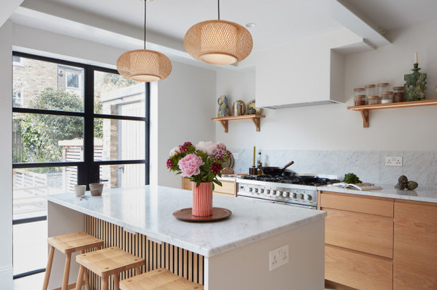
The pendant lights over the island add texture. “I think in kitchens, it’s so important to try to bring in things that feel soft, because they can become very hard,” Ellen says.
The back of the island has acoustic panelling made from oiled oak strips on black felt. “One of the owners is a sound engineer and he was focused on not wanting anything to sound echoey,” she says.
Pendant lights, Dyke & Dean. Bar stools, Pinch.
The back of the island has acoustic panelling made from oiled oak strips on black felt. “One of the owners is a sound engineer and he was focused on not wanting anything to sound echoey,” she says.
Pendant lights, Dyke & Dean. Bar stools, Pinch.
Before Photo
The back of the house before works.
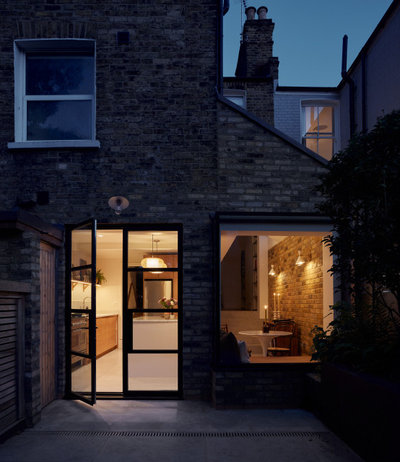
The modest extension has transformed the house. A level threshold creates a seamless transition through the Crittall doors to the newly laid blue moleanos limestone paving on the patio.
Unsurprisingly, the couple were thrilled with their new kitchen. “They were such wonderful clients,” Ellen says.
Tell us…
What do you like about the way Ellen and Alice have opened up the old kitchen and created a sociable space? Share your thoughts in the Comments.
Unsurprisingly, the couple were thrilled with their new kitchen. “They were such wonderful clients,” Ellen says.
Tell us…
What do you like about the way Ellen and Alice have opened up the old kitchen and created a sociable space? Share your thoughts in the Comments.


Related Stories

House Tours
Houzz Tour: A Midcentury Home With a Strong Indoor-outdoor Link
By Becky Harris
A nature-inspired renovation has given this ranch house a relaxed mood and a connection to the outdoors from most rooms
Full Story

House Tours
Houzz Tour: Warm Tones and Luxurious Surfaces in a City Townhouse
An earthy colour palette, hidden storage and well-placed texture add character and practicality to this London home
Full Story

Room Tours
Kitchen Tour: A Gorgeous Extension With a Leafy Glasshouse Feel
By Kate Burt
When the owners of this terraced house extended, they were keen to retain its period feel and highlight the garden
Full Story

Gardens
Garden Tour: A Bare Roof Terrace Becomes a Pretty, Sociable Space
By Kate Burt
A retired couple got help transforming their large rooftop into a gorgeous, welcoming, multi-functional retreat
Full Story

House Tours
Houzz Tour: A Smart Layout and Genius Storage in a Victorian Home
Flipping the standard layout and carving out excellent storage have turned this tired house into a brilliant family home
Full Story

House Tours
Houzz Tour: A Victorian House Brought Impressively Up to Date
By Jo Simmons
A cohesive layout and warm colours combined with energy-efficiency measures thoroughly modernise this terraced home
Full Story

Kitchen Tours
Kitchen Tour: An Open, Airy Space Made for Entertaining
Combining two separate rooms has improved flow and created a sociable open-plan kitchen, dining and seating space
Full Story

House Tours
Houzz Tour: A Family Home Inspired by its Seaside Location
Coastal colours and practical design combine to create a house that will adapt as the family grows
Full Story

Kitchens
5 Inspiring Before and After Kitchen Transformations
Whether you want to boost storage, incorporate original features or maximise your space, take ideas from these designs
Full Story

House Tours
Houzz Tour: An Airy, Scandi Finish for a Tall Victorian House
By Kate Burt
From a tricky inherited bath to a sticky-out staircase, on-site problem-solving led to a seamless update for an old home
Full Story
Thanks for the informative text - much better than usual, because it talks about specific, practical details, eg how/where to house an LED driver, and the importance of lighting choices, materials, and textures in softening a kitchen, which can easily (and often in Houzz kitchen story articles) end up feeling stark and cold. More than just seeing the usual pretty pictures, i have actually learnt something from this article. Thanks!
This is the best kitchen for a long time. Love the mix of wood/granite/brick, lots of light, practical, characterfull, great ceramics ❤
Love it, touches of genius in the well matched veneers/solid doors and the accoustic panel in the island. I also agree wholeheartedly with @helena who rightly said it's good to have some technical tips/details included for once - like the one about having to house LED drivers. So often these details are left out of these articles and far too many considerations are glossed over. I also really appreciate the warmth - we should enjoy more wood kitchens for the beauty of the grain/figure and/or the colour of the timber, instead of endless painted ones (usually dark blue or dark green which is SO impractical). If it was my kitchen, I'd be absolutely delighted - over the moon in fact. Also a great decision not to have a back wall entirely of glass. Great advice.