Houzz Tours

House Tours


Houzz Tour: A Tired Victorian House is Sensitively Revived
A restricted palette of colours and materials, but in a pleasing mix of textures, has given this home warm elegance

When the owners bought this Victorian terrace, the kitchen was squeezed into a narrow lean-to and not ideal for their young family, and the rest of the house was in desperate need of a refresh. The couple tasked architect Brian O’Tuama with replacing the two small lean-tos at the back with a wraparound extension, converting the loft, and refreshing the other rooms, but in a way that respected the heritage of the building.
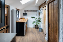
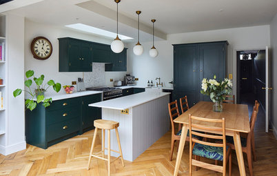
The same panelling is seen on the cabinets, but here painted a soft black. “One of the things we wanted to do, which the owners were very much up for, was to limit the colour palette and materials,” Brian says.
“We find it can often work nicely if you have the same material, but you use it in slightly different ways, so you still have a relatively small box of tools, but you’re playing around a little bit with them,” he says. “It might be that you vary vertically and horizontally; in this case, it was the surface treatment.”
The handles on the cupboards are discreet. “They kind of grow out of the tongue-and-groove,” Brian says. Brass handles might have been too much in addition to the brass pendant lights and tap. “You’d have a lot of ‘jewellery’, so to speak,” Brian laughs. “Coco Chanel always said, before you leave the house, look in the mirror and take one thing off.”
Cabinets painted in Black Blue, Farrow & Ball. Oak table, made by the contractor.
Make the challenge of finding the right people for your project easier by searching the Houzz Professionals Directory.
The kitchen was made to Brian’s design by the contractors. The wood is oak veneer – both natural and stained so the grain still shows through.
The worktops are white Carrara marble. “Some people, including these homeowners, are happy for a material to develop a bit of a patina, to tell the story of their lives over the years, rather than it having to look brand new,” Brian says. He also used the stone on the splashback in order to limit the materials.
There are a couple of short wall units, one of which contains an extractor fan over the range cooker. A natural oak shelf runs under the wall cabinets then along to the back doors as an open shelf (not seen), which creates display space and acts as a stopping point for the splashback.
On the back wall there’s a breakfast station that can be hidden from view thanks to pocket doors (see previous photo). Behind it, Brian has tucked a small cloakroom. A sliding pocket door to the right leads into the hallway.
The floor in here is polished concrete. There’s a dishwasher under the draining board in the island, but Brian relocated the washing machine and dryer to an upstairs landing.
Kitchen design, Brian O’Tuama Architects; construction, Evoke Projects. Sink, Franke. Tap, The Watermark Collection. Concrete flooring, Steyson.
Here’s the inside of the old kitchen, which was in a narrow lean-to (see next photo).
Here’s the old kitchen from the outside. There was also a lean-to in the side return, but it only extended along half of the outrigger.
Brian replaced both lean-tos to create the kitchen-diner extension. He chose London Stock brick to tie in with the original property.
Staggering the back elevation formed a natural ‘courtyard’ that’s perfect as a dining area. “The little set-back patio belongs within and without in a nice, low-key sort of way,” Brian says.
Everything aligns beautifully, such as the bottom of the door glazing with the benches both inside and out. “That’s the joy of spending time to design something properly,” Brian says.
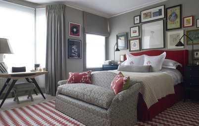
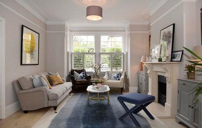
The living room was refreshed with oak chevron flooring, a new column radiator and a salvaged fireplace and slate hearth. The owners already had the sofa, but they added another module. The rug came from Ibiza.
Sofa, Hay. Engineered oak chevron flooring, Domus. Walls painted in Pigeon, Farrow & Ball.
Sofa, Hay. Engineered oak chevron flooring, Domus. Walls painted in Pigeon, Farrow & Ball.
The other end of the living room before work began.
Brian removed the doors and widened the opening, so this area can borrow more light from the kitchen.
The plan of the ground floor before work began.
The ground floor now.
The original hallway.
Brian closed off the door into the main, front living room to create a long stretch of wall for the sofa, then enlarged the door into the rear to create an entrance to the whole room.
It’s fitted with a sliding pocket door. “It’s there for Building Regulations compliance, so the room can be closed off with a fire-rated door,” Brian says. “It’s open most of the time, though, so it’s nicer having it disappear into the wall rather than just being ajar.”
Brian designed the tiles in the hallway as a nod to the Victorian era, but in a less complicated pattern. “For simplicity, we designed a pattern that would be more cost-effective than having a bespoke one made,” he says. “They’re unglazed porcelain mosaics and the contractor simply had to replace a circle of black tiles with a circle of white ones at a predetermined spacing.”
The stairs are original – Brian just had the handrail stripped and oiled and the balusters painted.
Balusters painted in Down Pipe; wainscotting painted in Black Blue, both Farrow & Ball.
The plan of the first floor before work began.
The first floor now. Brian has created a bedroom suite at the front of the house, with a dressing room and bathroom off the main bedroom. The family bathroom at the back is on a half landing.
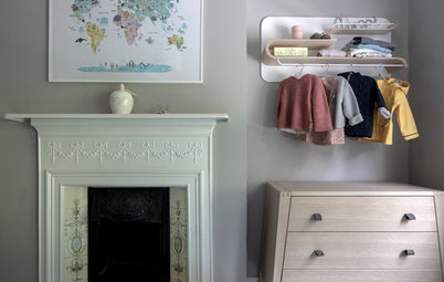
Brian had a wall of wardrobes built in the main bedroom. “There’s a combination of double and single hanging, which is supplemented with more in the dressing area (see next photo), so there’s quite an amount of storage,” he says.
The wardrobes and walls are painted in the same soft pink-grey to keep the palette simple.
Walls and woodwork painted in Peignoir, Farrow & Ball.
The wardrobes and walls are painted in the same soft pink-grey to keep the palette simple.
Walls and woodwork painted in Peignoir, Farrow & Ball.
The shower room and dressing area were previously two bathrooms, one of which had no natural light. Now, this dressing area is tucked between the main bedroom and an en suite shower room.
There’s a wall of wardrobes on one side (not seen), then low storage for folded items on the other. “We thought it would make it more enjoyable and homely to be able to have things like the lamp and counter space to put stuff on, so we stuck to low-level storage on this side,” Brian says.
The view back into the bedroom reveals another reclaimed fireplace and simple slate hearth.
Dressing room walls painted in Studio Green, Farrow & Ball.
The vanity unit was designed by Brian and built by the contractor. “The curvy shape lifts it a little bit,” he says. The counter is polished Carrara marble.
Wall painted in Light Peachblossom, Little Greene. Brassware, The Watermark Collection.
Wall painted in Light Peachblossom, Little Greene. Brassware, The Watermark Collection.
The roomy shower is lined with marble-effect, large-format porcelain tiles. Brian designed an alcove in the wall to keep the soap and shampoo stashed neatly.
The family bathroom is on a half landing above the kitchen. Brian designed the vanity unit (which now has a mirror above it), inspired by a vintage chest of drawers the owner liked.
“We talked about buying a vintage piece, but by the time you’ve tinkered with it, it costs less to make it,” he says. “You’re also then able to control the size exactly, so, in this case, we could get double the amount of drawers, so there’s room to the left of the basin to have set-down space.”
The counter is Carrara marble – part of the limited palette of materials.
Brian has introduced subtle pattern and texture through the tiling. Zellige tiles on the side walls catch the light beautifully, while on the floor and back wall of the shower, encaustic cement tiles in diamonds and zigzags add a graphic element. “We wanted them to be sort of the same, but slightly different,” Brian says.
The skylight illuminates the narrow shower beautifully, opening up the space. “We’re always looking for ways to optimise natural light,” Brian says. “When the sun is shining, you get that nice blue-sky moment above you.”
The skylight illuminates the narrow shower beautifully, opening up the space. “We’re always looking for ways to optimise natural light,” Brian says. “When the sun is shining, you get that nice blue-sky moment above you.”
The bath is set on narrow legs so the patterned floor can still be seen, creating a roomier feeling.
The daughter’s room on the second floor is one of the few areas where the brickwork was in good enough condition to simply be painted. The floorboards are also original – they were lifted and flipped over so the joints were good, then white-oiled.
The converted loft is now a guest suite. The stairs up to it are oak. “We try to make them as interesting as possible, Brian says, “as you’re up and down them quite a bit, so it makes it a bit more joyful to have something that’s nice to walk on.”
The front of the house is painted in a soft brown-grey that chimes with the original Victorian tiles on the path, which were in pretty good condition. “Luckily, they didn’t need a huge amount of attention,” Brian says.
A bike and bin enclosure to the right keeps the front garden neat for a smart welcome to the finished home.
Door and window surround painted in Charleston Gray, Farrow & Ball.
Tell us…
What do you like about Brian’s thoughtful redesign? Let us know in the Comments.
A bike and bin enclosure to the right keeps the front garden neat for a smart welcome to the finished home.
Door and window surround painted in Charleston Gray, Farrow & Ball.
Tell us…
What do you like about Brian’s thoughtful redesign? Let us know in the Comments.


Sponsored
Reload the page to not see this specific ad anymore
Who lives here? A family with two young children
Location Victoria Park, east London
Property A Victorian terraced house
Size Four bedrooms and three bathrooms
Architect Brian O’Tuama of Brian O’Tuama Architects
‘After’ photos by Siobhan Doran
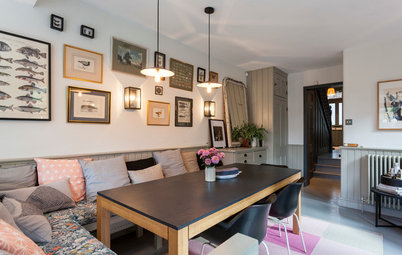
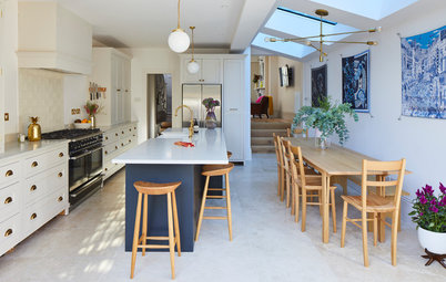
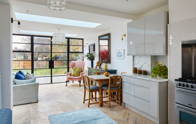
The new extension, which replaced the two small lean-tos (scroll down to see the before photos) has made room for an airy kitchen-diner.
While the look is light and modern, there’s lots of subtle texture that gives the room warmth. “We wanted to update the house for contemporary living, but not necessarily make it a white box world, so textures were quite important,” Brian explains.
The long wall seen here is a perfect example: the expanse is covered in pale oak tongue-and-groove panelling. “We do a lot of side return extensions and that wall can become a monotonous, featureless element unless it’s thought about,” Brian says. “This is timber [treated] with a white-tinted, hard wax oil, so you still see some of the grain and tone.”