


Houzz Tour: A Dark Victorian Corner House Gains Light and Space
This elegant period home was once a series of light-starved rooms. Look at it now...

“Like so many of these houses, it had endless corridors and small, boxy rooms,” architect Ana Martins of Martins Camisuli says, describing this Victorian corner house before she and her partner, Sebastian Camisuli, redesigned it.
As well as a layout that didn’t work for the homeowners, the building had wonky floors, ancient plumbing and electrics, old windows and a worn roof. “We pretty much rebuilt it from scratch inside,” Ana says.
As well as a layout that didn’t work for the homeowners, the building had wonky floors, ancient plumbing and electrics, old windows and a worn roof. “We pretty much rebuilt it from scratch inside,” Ana says.
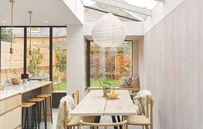
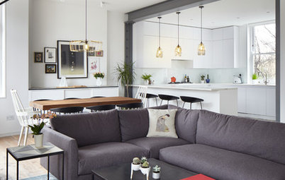
The glazed doors give onto the newly combined living, dining and kitchen areas of the house; this photo looks towards the garden from the open-plan living room. An expanse of polished concrete flooring helps to connect the spaces visually. Notice also the lack of visible supporting beams between the kitchen and dining area; it’s a subtle yet significant architectural detail that allows a seamless view through the rooms.
The owners always wanted two large mirrors they already owned to sit behind the dining table, opposite the entrance. These bounce light around the space.
Light switches and sockets, MK Electric. Floor (supply and laying), Lazenby. All other fittings, sourced by owners.
The owners always wanted two large mirrors they already owned to sit behind the dining table, opposite the entrance. These bounce light around the space.
Light switches and sockets, MK Electric. Floor (supply and laying), Lazenby. All other fittings, sourced by owners.
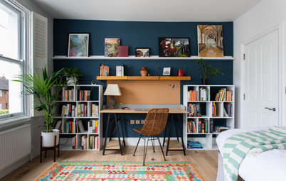
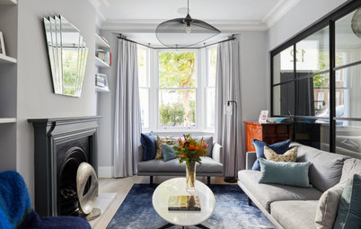
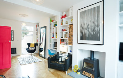
Coming into the house and turning left takes you into the living room, furnished by the owners with many pieces picked up while living abroad.
Lower walls painted in Marine Blue; upper walls painted in Slaked Lime, both Little Greene.
Lower walls painted in Marine Blue; upper walls painted in Slaked Lime, both Little Greene.
The homeowners had been living in Asia, something that influenced the design of their new home. “They came back with beautiful furniture they’d collected, so we knew, regardless of the architecture, [the house] would have beautiful pieces and interesting things in it,” Ana says, explaining this was part of what enthused her about the project at the outset.
“An interior needs to reflect the people who live in it,” she says. “You want to see their personality.”
“An interior needs to reflect the people who live in it,” she says. “You want to see their personality.”
Ana and Sebastian replaced the windows here and throughout with new, double glazed wooden sashes. The concrete floor is warmed by underfloor heating. “I always worry about stone flooring in this country, but this works really well,” Ana says.
“What I really like about this floor is that this is quite a long, narrow house and the light bounces off the polished concrete a lot,” she says. “Having these big sash windows in the front and the glazing at the back also really maximises the daylight.”
“What I really like about this floor is that this is quite a long, narrow house and the light bounces off the polished concrete a lot,” she says. “Having these big sash windows in the front and the glazing at the back also really maximises the daylight.”
Ana’s memory of the house when she first saw it is that it was very dark. Changing this is always something she and Sebastian focus on in their projects. “We try to push a building to be the best it can be,” she says. “There’s now loads of daylight and space – and if you can do that in a Victorian house, you’ve succeeded!”
A ‘before’ plan shows the original ground floor layout, with separate rooms.
Almost every internal wall at this level has now been removed, as you can see in this ‘after’ floorplan.
Find home renovation professionals in your area. Read reviews and look at project photos so you can hire with confidence.
Find home renovation professionals in your area. Read reviews and look at project photos so you can hire with confidence.
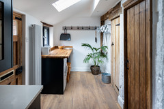
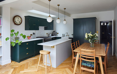
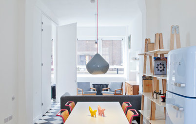
Ana and Sebastian designed the kitchen bespoke. The cabinets are Ikea carcasses with okoume wood veneer doors. “It’s a beautiful timber,” Ana says.
The worktops, island and splashbacks are quartzite. “We’d never worked with the material before,” she says, “but the client just loved the pattern and colour.” The stone wasn’t without problems during the project, though. “It’s a capricious stone, very porous – but beautiful. The first time it was fitted, the acid from the silicone came through and it all had to be stripped and redone.”
The worktops, island and splashbacks are quartzite. “We’d never worked with the material before,” she says, “but the client just loved the pattern and colour.” The stone wasn’t without problems during the project, though. “It’s a capricious stone, very porous – but beautiful. The first time it was fitted, the acid from the silicone came through and it all had to be stripped and redone.”
The kitchen also has metallic detailing throughout – the plinths and this side of the island are finished with brass sheeting. The other side contains storage cupboards.
It looks as if the cabinet run on the right abuts the glass, but in fact there’s a section of brick wall at this point, so the cabinet side is not visible from the exterior.
The other side of the kitchen has a soft, living room-y feel. The floor-to-ceiling wood and vintage armchair set the tone, but the breakfast cabinet is also designed to look beautiful inside, too. It has a brass-clad work surface and the insides are finished with the same wood as the exterior. “We like to make kitchens that don’t look like kitchens,” Ana says.
To the right of the breakfast bar, in the angled cupboard, is a larder. Next to this is the fridge-freezer. There’s additional storage in the unit behind the chair.
The lighting is very soft, too. “I don’t like seeing downlights,” Ana explains, going on to describe her choice of tiny spots flush to the ceiling with no surface plate. They’re almost invisible, but you get a flash of brass, which lines the inside of the fitting.
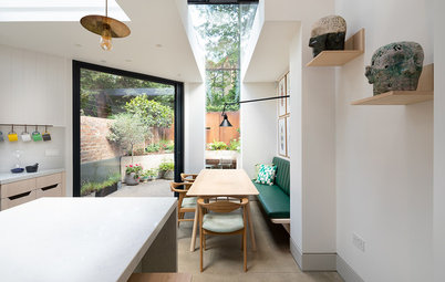
The extension was small and full width – there was no side return to fill in. Ana and Sebastian took the structure out by around one metre, mindful that the courtyard garden was already quite small.
Steel French windows fold back on themselves, maximising space outside, and a skylight in the new part of the building brings in additional daylight.
Doors, Crittall.
Steel French windows fold back on themselves, maximising space outside, and a skylight in the new part of the building brings in additional daylight.
Doors, Crittall.
Ana and Sebastian tweaked the location of the cloakroom, bringing it further forwards, and replaced the fittings and decor. They turned the understairs area into useful bespoke storage.
The hall walls are clad to half height in marble and topped with a matching dado.
Albany Wow (2015) Jungle wallpaper, Wallpaper Direct. Marble, Mandarin Stone. Upper walls painted in Slaked Lime, Little Greene.
The hall walls are clad to half height in marble and topped with a matching dado.
Albany Wow (2015) Jungle wallpaper, Wallpaper Direct. Marble, Mandarin Stone. Upper walls painted in Slaked Lime, Little Greene.
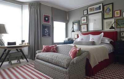
The rooms on the first floor were reconfigured to turn the entire space into a suite, containing the main bedroom, a walk-in wardrobe and an en suite bathroom.
The other side of the bedroom.
Oak parquet floor, Istoria by Jordan Andrews. Lower walls painted in Blue Gum, Paint & Paper Library.
Oak parquet floor, Istoria by Jordan Andrews. Lower walls painted in Blue Gum, Paint & Paper Library.
The en suite has minimal cabinetry, all designed by the architects. The worktop is terrazzo, along with the splashback, which clads a shelf topped with a piece of marble.
The mirrored cabinets are also bespoke and boost the sense of space in the room. The open storage below is a metallic frame sprayed black.
Terrazzo, Mosaic del Sur.
The mirrored cabinets are also bespoke and boost the sense of space in the room. The open storage below is a metallic frame sprayed black.
Terrazzo, Mosaic del Sur.
The other side of the en suite features a walk-in shower, with more terrazzo, a marble floor and a bespoke glass screen.
Marble floor tiles, Mandarin Stone.
Marble floor tiles, Mandarin Stone.
On the second floor, Ana and Sebastian moved the location of the door at the end of the corridor so there’s a view directly into the room and towards the window.
The first door on the right is the guest bathroom, followed by another bedroom.
The skylight is also new, adding yet more natural light.
The first door on the right is the guest bathroom, followed by another bedroom.
The skylight is also new, adding yet more natural light.
At the top of this short staircase is a small utility room. The staircase was brought forwards and the top landing was lowered to create more headroom for the laundry space.
There had previously been a small, low cupboard here. Now it has a useable doorway and space inside for a washing machine and dryer, a worktop and a Velux window.
There had previously been a small, low cupboard here. Now it has a useable doorway and space inside for a washing machine and dryer, a worktop and a Velux window.
The guest bathroom has a clean, simple design. “It was very much about taking the floor up the walls and wrapping it around. It keeps the lines streamlined,” Ana says.
Shower tray, Bette. Shower head, Bespoke Taps. Toilet, Aston Matthews.
Shower tray, Bette. Shower head, Bespoke Taps. Toilet, Aston Matthews.
“The new Velux means you can see the sky from the shower,” Ana says. “It’s really lovely.”
Tell us…
What’s your favourite detail in this home? Share your thoughts in the Comments.
Tell us…
What’s your favourite detail in this home? Share your thoughts in the Comments.

Sponsored
Reload the page to not see this specific ad anymore
Who lives here? A couple
Location North London
Property A late 19th century Victorian terraced house on a corner
Size Three bedrooms and two bathrooms
Designers Ana Martins and Sebastian Camisuli of Martins Camisuli Architects
Budget £300,000
Photos by Alex Maguire
Following Ana and Sebastian’s work, the ground floor is now completely open apart from the entrance and staircase, which are partitioned by this dramatic glazing with black-painted timber frames. “Building Control regulations mean you have to enclose staircases,” Ana explains. The glazing also allows more natural light into the entrance area.
The front door is one of the few remnants from the original building and it leads you in from the side of the house, which is on a corner. The staircase also remains, but has been repaired and repainted.