

Houzz Tour: A Family Home Much Improved by a Clever Layout Rejig
It’s amazing what smart design can do to make a house feel bigger and function better, as this Victorian terrace shows

The family who own this home had originally planned to enlarge their house with a basement dig, but had been deterred by council restrictions. Instead, they enlisted the expertise of Josie Harris-Taylor of Kia Designs to reconfigure the space they already had.
A four-month, whole-house renovation ensued, during which layouts were rethought, bedrooms were swapped around, a walk-in wardrobe magicked up and an unsatisfactory home office/children’s bedroom arrangement separated into two lovely spaces in their own right. See how clever design dramatically transformed this family home.
A four-month, whole-house renovation ensued, during which layouts were rethought, bedrooms were swapped around, a walk-in wardrobe magicked up and an unsatisfactory home office/children’s bedroom arrangement separated into two lovely spaces in their own right. See how clever design dramatically transformed this family home.
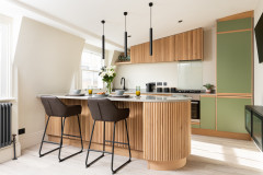
Josie changed the layout of the kitchen units from an L-shape. “The owners wanted the dining area to feel less ‘inside’ the kitchen and have its own zone,” she explains. “So we gave them a straight sink run and a larger island. This separated the dining area and kitchen nicely.”
As well as storage, the island houses a wine fridge, microwave, oven and hob.
Browse the Houzz Professionals Directory for reviewed interior designers in your area.
As well as storage, the island houses a wine fridge, microwave, oven and hob.
Browse the Houzz Professionals Directory for reviewed interior designers in your area.
The run on the left contains the sink, drawer space, a dishwasher and the bins.
For the main food storage, Josie installed a tall double pantry next to an American-style fridge-freezer the owners had chosen. Because the pantry is shallower than the fridge, there was some unused space behind it. Here, Josie saw an opportunity to create a hidden cleaning cupboard, accessed from the entrance to the kitchen.
For the main food storage, Josie installed a tall double pantry next to an American-style fridge-freezer the owners had chosen. Because the pantry is shallower than the fridge, there was some unused space behind it. Here, Josie saw an opportunity to create a hidden cleaning cupboard, accessed from the entrance to the kitchen.
The cleaning cupboard door is just before the step up out of the kitchen. It’s slim but deep, and it has an electrical point for a cordless vacuum. Adding it was possible partly because Josie fitted a sliding door at the entrance to the kitchen instead of a swing one, which would have blocked entry to the cupboard.
Dining table, clients’ own. Red dining chairs, Habitat. Island pendants, Hübsch. Walls painted in Cornforth White, Farrow & Ball.
Dining table, clients’ own. Red dining chairs, Habitat. Island pendants, Hübsch. Walls painted in Cornforth White, Farrow & Ball.
As seen more clearly in this plan of the room, the cupboard runs behind the pantry and goes up to where the fridge-freezer cuts off the space (the pantry is only 50cm deep, significantly shallower than the large appliance, and the cupboard is 40cm wide).
The floor-to-ceiling run of units “hides a lot of stuff. The boiler is in there, along with general shelving and cupboard space,” Josie says.
The long cupboard door handles in the middle of the run denote two ‘slide and hide’ doors, which conceal a utility area.
The kitchen also has three areas of open shelving. There’s a tall section filled with baskets at the end of the utility run (see the first image). “It allows the clients to just shove games and toys into them at the end of the day,” Josie says.
More open shelving was added at the back of the kitchen island, which has space for cookbooks and the children’s books and some of their craft materials. It also has plug and charger sockets.
Kitchen, Kitchen Stori. Tall kitchen units painted in Airforce; island and sink run painted in Parisian Blue, both Kitchen Stori shades. Quartz worktops in Eternal Statuario, Silestone.
Josie also added a long picture shelf above the sink run to allow the owners to display artworks and move them around easily.
“We wanted to create a home that didn’t feel too finished; a house that could grow with them and stand the test of time,” Josie says. The whole length of this wall is also covered with magnetic paint for putting up the children’s artwork.
“We wanted to create a home that didn’t feel too finished; a house that could grow with them and stand the test of time,” Josie says. The whole length of this wall is also covered with magnetic paint for putting up the children’s artwork.
At the far end of the kitchen, near the table, there’s a small seating area. “There used to be some built-in storage in this spot,” Josie says, “but the clients were keen to have a little drinks area and this is right by the doors to the garden.”
Josie also added some low-level lighting just above the skirting board (see the small slit to the left of the left-hand chair) to create a relaxed, evening glow. “[Visually], this also helps to separate the dining area further, so it feels like its own space rather than being squeezed into the kitchen, as it had been previously,” Josie says.
Armchairs, clients’ own. Drinks trolley; wall lights, all Nordal.
This was previously the living room, with the room behind it – the ubiquitous Victorian ‘middle room’ – left as somewhat of a corridor between this area and the kitchen.
“We’ve enabled this to work better as one large space,” Josie explains.
In this half of the double room, the new layout made space for the family’s new baby grand piano. Josie added a window seat and more new joinery in the alcove.
To boost a sense of unity around the house, the engineered oak flooring is the same throughout, apart from the carpeted stairs, and has underfloor heating.
Hanging planters, Bloomingville. Ceiling light, West Elm. Armchair, Gallery Direct. Walls painted in Wevet, Farrow & Ball.
More: How to Use a Formal Living Room When Your Kitchen is Open-plan
In the other half of the space, what had been a ‘corridor’ is now an inviting lounge area connected to the music room and also to the kitchen.
“Previously, the family had shallow, open shelving with some closed cupboards here,” Josie says. “The cupboards led up to the kitchen wall, making the space very narrow. So we removed all of that to open up that section of the room, giving it better usability and allowing us to put the sofa here.”
To replace the storage that was taken out, Josie designed new, shallow shelving and, because she made space for a new home office upstairs (scroll down to see it), a lot of the paperwork that had taken up space here could be moved.
Ceiling light, Anthropologie. Sofa and rug, clients’ own.
The fireplace didn’t have a surround, so Josie sourced an old cast-iron design and added new tiles, which tie in with those used in the top floor en suite (scroll down for photos).
A key decision was to relocate the master bedroom from the first to the top floor. This – formerly the master – is now a guest room and home office.
“This room had to work really hard,” Josie says. “It needed to be a home office that felt lovely to work in, but also a spare room for guests and family on extended visits that really felt like a bedroom.”
While the wardrobe in this room was previously needed for clothes, it can now store all the household paperwork and other things that had originally been living in the middle room downstairs.
There’s corkboard mounted on the wall behind the desk with a shelf above. Higher up is a slim frame shelf that runs along the whole wall, again providing flexibility for displaying artwork.
Bookshelves, Hübsch. Desk wall painted in Stiffkey Blue, Farrow & Ball. Rug, clients’ own. Desk, Maisons du Monde.
“The bed is a very flexible design – it’s a sofa, a single or a double bed. The headboard is bespoke,” Josie says.
Sofa-bed, Loaf.
Sofa-bed, Loaf.
This bedroom is now exclusively the territory of the family’s youngest child, having previously doubled as a home office.
“Originally, the decor had been plain white walls with a cot, but also a desk,” Josie says. “It looked like a hybrid room they kept meaning to sort out, but hadn’t had chance, rather than a kid’s room. They really wanted a lovely space for their daughter and for it to be a proper bedroom for her.”
Josie added a papered feature wall and painted the other walls in a soft grey.
Walls painted in Parma Gray, Farrow & Ball. Woods and Stars wallpaper, Cole & Son.
Josie brought in lots of sweet accessories, including cloud-shaped shelves and a ceiling-hung canopy. She also added a trundle bed, and a built-in wardrobe with a double rail system and flexible shelving to futureproof it.
Hopscotch rug; little table set; cloud shelves; bookshelf, all Bloomingville.
Hopscotch rug; little table set; cloud shelves; bookshelf, all Bloomingville.
Though this top floor room – originally a guest room – was smaller than the downstairs bedroom that had previously been the master, Josie could see the potential for creating a walk-in wardrobe and dressing area up here.
She also rejigged the adjacent bathroom layout to make it function better as an en suite.
She also rejigged the adjacent bathroom layout to make it function better as an en suite.
Josie removed an unused door and lots of boxing from the en suite and this freed up space to build in this bespoke, wood-veneer vanity unit. Its top is the solid surface, Durian. “It’s hardwearing and smooth with no joins, and any marks disappear with a scouring pad,” she says.
Josie swapped the swing door for a sliding one and replaced the loo with a corner design. “This all made more space for storage,” she says.
Vanity unit, bespoke. Basin, London Basin Company. Mirror, Zara Home. Wall light, Astro Lighting. Wall tiles, Topps Tiles.
Josie swapped the swing door for a sliding one and replaced the loo with a corner design. “This all made more space for storage,” she says.
Vanity unit, bespoke. Basin, London Basin Company. Mirror, Zara Home. Wall light, Astro Lighting. Wall tiles, Topps Tiles.
Of the bold floor tiles, Josie says, “We wanted to keep it looking sleek, but add some real interest and colour without it being overwhelming. Flooring is often the way to do that.”
Pentagon floor tiles, Popham Design. Shower, Grohe.
Pentagon floor tiles, Popham Design. Shower, Grohe.
The view from the shower room into what is now the master bedroom.
Bedroom shelves, Bloomingville.
Bedroom shelves, Bloomingville.
“The bed base is ottoman storage,” Josie explains. “The whole thing lifts up so the owners can maximise floor space in here.”
Central pendant, Etsy. Headboard fabric, Zoffany at Style Library.
Central pendant, Etsy. Headboard fabric, Zoffany at Style Library.
Pendant lights free up space on the bedside tables and the extra little shelves add space for a glass of water.
Bedside pendants, Bloomingville.
Bedside pendants, Bloomingville.
Josie removed the door to make the most of the space in this tiny room, which she turned into a walk-in wardrobe. Flexible shelving and storage were built in and can be reconfigured as needed.
The walk-in is ahead of you as you come up the stairs; the bedroom is on the left, and on the right is a dressing area on the landing (next photo).
The walk-in is ahead of you as you come up the stairs; the bedroom is on the left, and on the right is a dressing area on the landing (next photo).
This dinky dressing area used to be filled with a built-in cupboard.
The wallpaper continues all the way down to the first floor.
Pendant, Bloomingville. Dressing table, made-to-order from Etsy. Wallpaper, Charlotte Jade. Stool, Coach House. Mirror, Gallery Direct. Carpet, Alternative Flooring.
The wallpaper continues all the way down to the first floor.
Pendant, Bloomingville. Dressing table, made-to-order from Etsy. Wallpaper, Charlotte Jade. Stool, Coach House. Mirror, Gallery Direct. Carpet, Alternative Flooring.
Josie also revamped the family bathroom to tie in with the style in the en suite. The layout wasn’t changed, but everything was replaced.
Floor tiles, Bert & May. Shower curtain, H&M Home. Basin, Tikamoon. Light, Kichler. Mirror, Coach House. Vanity unit, bespoke.
Tell us…
What’s your favourite detail from this characterful renovation? Share your thoughts in the Comments.
Floor tiles, Bert & May. Shower curtain, H&M Home. Basin, Tikamoon. Light, Kichler. Mirror, Coach House. Vanity unit, bespoke.
Tell us…
What’s your favourite detail from this characterful renovation? Share your thoughts in the Comments.

Sponsored
Reload the page to not see this specific ad anymore

Sponsored
Reload the page to not see this specific ad anymore
Who lives here? A family of four with two small children
Location Wimbledon, south-west London
Property A Victorian terraced house
Size Four bedrooms and two bathrooms
Designer Josie Harris-Taylor of Kia Designs
Photos by Philip Raymond Photography
With the basement extension out of the picture, Josie’s brief was to make better use of the space the family already had.
The kitchen had been extended, but needed reworking internally to function better as the most-used room in the house. The owners also wanted better storage for the children’s things and a solution for the fact that one of their rooms was doubling as a home office.
As a musical family, they were keen for part of the living space to reflect that theme. “They also have lots of books and artwork and have collected things while travelling,” Josie says, “and they wanted to be able to add to collections and have the space to do so.”