Houzz Tours

House Tours

Houzz Tour: A Smart Layout and Genius Storage in a Victorian Home
Flipping the standard layout and carving out excellent storage have turned this tired house into a brilliant family home

We’re used to seeing rear extensions housing kitchen-diners, but with this project, designer Sybille Garnier Le Mené of Into interior design gave the usual layout a twist. She sited a smart kitchen in the reception room at the front of the house and created a gorgeously light living space with garden views at the back that works well for the young family of four who live here.
This is the first home the family have owned and they wanted to get it right. “They were seeking professional help so their future home truly felt like home,” Sybille says. “They found me on Houzz and we instantly connected – we had a lot in common in terms of taste and style preferences.”
As well as a family-friendly layout, the couple were keen to have plenty of storage and Sybille found some inventive ways to incorporate it, from slotting it under seating to stealing slivers of space from adjoining rooms.
To see more great projects where the homeowner found their professional via Houzz, take a look at our Born on Houzz series.
Though unmodernised, the house had masses of potential. It was a little wider than a typical Victorian terrace – 5.45m – and had high ceilings and some beautiful period cornicing, seen here in the front reception room before the renovation.
“Even though the ceilings were in poor condition, I thought we had to do our best to keep most of [the cornices] or at least reproduce them,” Sybille says.
Ready to renovate? Find and hire everyone you need, from interior designers to builders, carpenters and decorators, on Houzz.
“Even though the ceilings were in poor condition, I thought we had to do our best to keep most of [the cornices] or at least reproduce them,” Sybille says.
Ready to renovate? Find and hire everyone you need, from interior designers to builders, carpenters and decorators, on Houzz.
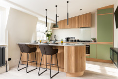
The front room now houses the kitchen. “[The couple] liked the idea of moving the kitchen to the front of the house and having a spacious and extended living room with a garden view at the back,” Sybille says.
While the overall style leans to the modern, she was careful the period features – like the now restored cornices – wouldn’t feel out of place. “I included some classic touches, such as the island pendant lights, combined with contemporary pieces,” she says.
She worked through colour ideas with the couple. “We agreed on using timeless blue tones as a thread throughout,” she says. “The wife also likes soft pink and terracotta shades, which we used [touches of] in some areas of the house.”
The kitchen offers lots of storage space, including a double larder cabinet and plenty of drawers.
Kitchen units in Triscombe, John Lewis of Hungerford. Dekton worktop, Cosentino. Engineered oak flooring (throughout), Havwoods. Drio pendant lights, Caravane. Walls painted in Slaked Lime, Little Greene.
Sybille chose fluted fronts for the base cabinets and the back of the island. “It was a nice way to add interest and it works well with the intricate period cornices,” she says.
The internal window was fitted primarily to increase light in the hallway, but it also expands the sense of space in the kitchen and gives a longer view for anyone working at the sink.
The internal window was fitted primarily to increase light in the hallway, but it also expands the sense of space in the kitchen and gives a longer view for anyone working at the sink.
This photo shows the former middle reception room, with French windows before the side return extension was built.
The same room (looking towards the front of the house in this shot) now contains a dining area.
The width of the room was reduced, as Sybille stole some floor space to create storage in the hallway, so it made sense to have bench seating on one side. “I could push the table close to the wall instead of having it in the middle, which would have blocked the circulation,” she explains.
Opposite the table, there’s a “coffee corner” (not seen) – a sideboard with all the equipment for making coffee, with shelves above.
Dining table, Adventures in Furniture. Fifties dining chairs, Calligaris.
Sybille slotted drawers under the bespoke dining bench for extra storage.
A graphic depiction of the Mediterranean coast covers the wall behind the bench. “The idea of the wallpaper was to give the dining room a distinct personality,” Sybille says. “I also wanted to create a link with the garden.”
Péninsule Sur Mesure wallpaper, Isidore Leroy.
A graphic depiction of the Mediterranean coast covers the wall behind the bench. “The idea of the wallpaper was to give the dining room a distinct personality,” Sybille says. “I also wanted to create a link with the garden.”
Péninsule Sur Mesure wallpaper, Isidore Leroy.
The back of the house originally contained a broken-plan kitchen-diner.
The whole of that original room has now been extended into the side return to create a lovely big family space that opens onto the garden. The glazing across the north-facing extension pulls in masses of light.
Sybille has included two good-sized sofas, so there’s plenty of room for the whole family. She’s positioned them away from the walls, which makes the room feel bigger and the seating area cosier.
Sybille has included two good-sized sofas, so there’s plenty of room for the whole family. She’s positioned them away from the walls, which makes the room feel bigger and the seating area cosier.
The TV can be switched to artwork mode when it’s not being watched. Sybille has also built lots of storage in here, though it sits lightly. “I wanted the bookcase to look very airy,” she says.
The long unit hides TV devices and toys, while the lacquered oak veneer shelves offer a space for display.
Feature wall (and the steel beam in the previous photo) painted in De Nimes, Farrow & Ball. Remaining walls painted in Slaked Lime, Little Greene.
The long unit hides TV devices and toys, while the lacquered oak veneer shelves offer a space for display.
Feature wall (and the steel beam in the previous photo) painted in De Nimes, Farrow & Ball. Remaining walls painted in Slaked Lime, Little Greene.
Next to the steps, Sybille designed yet more storage with decorative niches. The tall section is used as a broom cupboard.
The hallway before works, showing the former living room doorway and the solid front door.
Sybille changed the front door for one with glazed panels to boost the light. The internal window has also made a huge difference.
Rather than taking the oak flooring to the front door, Sybille has added a section of tiling. “Porcelain tiles are easy to clean and practical in a hallway,” she says. “I also wanted to include a different texture with a pattern.”
Below dado rail painted in De Nimes; front door painted in Red Earth, both Farrow & Ball. Above dado rail painted in Slaked Lime, Little Greene. Tiles, Claybrook Studio.
Looking through from the front door before works, the hallway was quite gloomy.
From this angle you can see how the internal window doesn’t just help with extra light, it provides an inviting view. “It gives a sense of space from entering the house,” Sybille says. “You’re immediately drawn to the wallpaper above the seating bench. It feels fresh and inviting.”
Opposite the staircase, Sybille has borrowed space from the adjoining dining room to slot in a bank of storage. “There’s a large wardrobe, drawers for gloves, hats, tennis rackets and so on, and a hand-held vacuum cleaner (and socket) hidden inside that’s easy to reach from the kitchen,” she says.
She also left room for a bench niche, painting it in the same terracotta as the back of the front door. “As it’s a strong shade, I used it as an accent colour for small areas rather than on an entire wall,” she says.
Bench niche painted in Red Earth, Farrow & Ball.
She also left room for a bench niche, painting it in the same terracotta as the back of the front door. “As it’s a strong shade, I used it as an accent colour for small areas rather than on an entire wall,” she says.
Bench niche painted in Red Earth, Farrow & Ball.
Sybille borrowed a small amount of space from the living room to fit in a cloakroom, which now contains access to a little storage cellar through a door on the left (not seen).
Walls painted in Railings, Farrow & Ball.
Walls painted in Railings, Farrow & Ball.
The ground floor plan before works.
The new layout. Note the space stolen from the middle room to create hallway storage; the slightly extended cloakroom that allows access to the little cellar, and the side return extension.
The house originally had four bedrooms, but Sybille combined two on the first floor to create an en suite dressing area and bathroom for the couple. The blue thread continues in here, now teamed with soft pink.
“My clients already had the soft pink bed and were thinking of replacing the headboard, but I liked it very much and advised them to keep it,” Sybille says. “The blue wallpaper works perfectly with it.”
So the couple have good illumination for bedtime reading, Sybille fitted two directional reading lights in brass. “I then added two small decorative pendants in bone china that look lovely in front of the wallpaper,” she says.
Orta mural, Les Dominotiers. Walls painted in De Nimes, Farrow & Ball. Throw, Caravane. Bone china pendant lights, Kathleen Hills. Brass reading lights, Astro Lighting.
Recessed mirrored cabinets and double basins make this a well-functioning bathroom for the couple.
Bathroom cabinets with bespoke brushed brass finish, Porter. Wall lights, ENOStudio. Ideagroup vanity unit, Alternative Bathrooms.
Bathroom cabinets with bespoke brushed brass finish, Porter. Wall lights, ENOStudio. Ideagroup vanity unit, Alternative Bathrooms.
The floor tiles bring in the blue and pink from the bedroom.
Floor tiles, Claybrook Studio.
Floor tiles, Claybrook Studio.
The son’s bedroom is also on the first floor. “With the blue theme in mind, I suggested the leopard wallpaper and my clients loved it,” Sybille says.
Lionel wallpaper in Stone, Scion. Lower walls painted in Oval Room Blue, Farrow & Ball.
Lionel wallpaper in Stone, Scion. Lower walls painted in Oval Room Blue, Farrow & Ball.
“[The couple] already had nice storage to use in this bedroom. We only added a couple of shelves and a green metal sideboard for toys,” Sybille says.
The little girl’s bedroom is on the second floor. She wanted pink and flowers in her room. “She even drew the flowers at the very early stage of the design to show her mother what she wanted. I had a lot of pleasure working on this scheme,” Sybille says.
Hope wallpaper, Caselio. Walls painted in Potted Shrimp, Farrow & Ball.
Hope wallpaper, Caselio. Walls painted in Potted Shrimp, Farrow & Ball.
Sybille designed a large wardrobe and a bespoke desk area with shelves above. The wardrobe doors have a rounded Shaker style for a softer look. “The girl says she loves her bedroom, which is the best compliment,” Sybille says.
The team replaced two UPVC windows for sash ones in the boy’s and girl’s bedrooms, plus a couple of existing sash windows that had rotted.
The team replaced two UPVC windows for sash ones in the boy’s and girl’s bedrooms, plus a couple of existing sash windows that had rotted.
Sybille located the washing machine and tumble dryer in a cupboard in the second floor guest bathroom. The folding door can be kept open when the machines are in use.
Out on the second floor landing, Sybille stole a little space from both the bathroom and the bedroom to fit in a bank of units. “One cupboard is for the boiler, water tank and so on,” she says. “The one with the cane doors hosts a handy pull-out drying rack, where the laundry can dry quickly, even behind closed doors.”
Up the stairs is a loft room that was originally one big space, but which Sybille split into two to create home offices for the couple. One also contains a bed and the other a sofa-bed, so guests can be accommodated when necessary.
So what do the owners think of the results? “We are very happy with the finished home,” they say. “Sybille helped us to find the right layout, storage, colours and furniture in order for us to have our dream house.”
Tell us…
What do you think of Sybille’s creative ideas for the storage and layout? Which is your favourite room? Share your thoughts in the Comments.

Sponsored
Reload the page to not see this specific ad anymore
Sponsored
Reload the page to not see this specific ad anymore
Who lives here? A couple with two young children
Location Clapham, south London
Property A Victorian terrace with three storeys and a converted loft
Size Three bedrooms and three bathrooms
Designer Sybille Garnier Le Mené of Into interior design
Project year 2023
Photos by Veronica Rodriguez
Faced with a house untouched for some 40 years, the new owners were looking for guidance on everything from colours to layout. “They wanted an informal, comfortable and cosy atmosphere – a house easy to live in with young children and, of course, very functional,” Sybille says.
“They weren’t scared of colour, either, and were keen on using wallpaper in some areas,” she adds.