
Kitchen Tour: A Gorgeous Extension With a Leafy Glasshouse Feel
When the owners of this terraced house extended, they were keen to retain its period feel and highlight the garden

As Lizzie Fraher of architecture practice Fraher & Findlay found when she first visited, this house was very much in need of modernisation, including a full rewire and replumb. The layout also wasn’t functioning for the owners. “It had a number of detached rooms on the ground floor, with the kitchen in a skinny outrigger [a narrower projection at the back], very typical of these houses,” she says. “There was also an underused side alley into the garden.”
The garden is small, so the only opportunity to expand the size of the kitchen was to build into the side return. “It had a nice width, which was quite an influence on our idea,” she says. And the idea? Think Victorian glasshouse…
The garden is small, so the only opportunity to expand the size of the kitchen was to build into the side return. “It had a nice width, which was quite an influence on our idea,” she says. And the idea? Think Victorian glasshouse…
“We wanted to create a kitchen that connected to the garden; that’s why it goes right up to the garden,” Lizzie says. The terracotta tiles add to the theme, as do the plants. A green-framed Crittall door is colour-matched to the window frames above.
The fully bespoke kitchen, painted the same colour as the walls, was designed in collaboration with a joiner. The worktop is black granite. On the exterior of the island there’s a wine fridge, a cupboard for glasses, and shelves for recipe books. The range cooker is electric.
The solid ceiling on the left indicates where the original building ended.
Door and windows, Crittall; painted in RAL 6003. Walls and kitchen units painted in Stock, Little Greene. Tetbury Terracotta Hexagon floor tiles, Artisans of Devizes.
The glass over the extension is positioned to ensure the space doesn’t get too hot or too bright. “It’s north-east-facing, so just gets the morning light,” Lizzie says.
As for artificial lighting, this is deliberately understated. Just three plastered-in micro spots are installed in the ceiling. The kitchen is otherwise lit by undercabinet lighting and the pendants over the island.
An original midcentury fitting near the back door (just visible behind the plant on the far left) washes the wall with warm light.
Although the newly extended area is generous, it wasn’t wide enough to fit in a dining table next to the kitchen, so Lizzie put the kitchen at the garden end of the room, with a good-sized peninsula, and pulled the dining area – just seen on the right here – towards the back of the space.
Radiohus pendant lights, Nest.
The view from the hallway into the kitchen. New panelled joinery – on the utility room, behind the right-hand door, and a cloakroom on the left – ties into the traditional aesthetic of the kitchen.
Thinking of renovating? Find the perfect architect for your project on Houzz.
Thinking of renovating? Find the perfect architect for your project on Houzz.
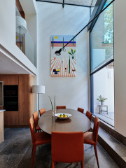
This is the view from the reception room behind the new dining area. Lizzie designed the opening to be wider than the original doorway, which had led into the side return.
The green column (painted to match the window frames) is a crucial structural support, as Lizzie removed a section of wall here to extend the internal window beyond the boundary of the old side return, wider than the French doors that were originally here. “Previously, this room was much darker,” Lizzie says.
The green column (painted to match the window frames) is a crucial structural support, as Lizzie removed a section of wall here to extend the internal window beyond the boundary of the old side return, wider than the French doors that were originally here. “Previously, this room was much darker,” Lizzie says.
On the other side of the opening, Lizzie had her joiner make an L-shaped panelled dining bench with storage below. It illustrates another reason for widening the internal window here. “If we hadn’t pinched that extra space, the dining room would have been too squished,” she says.
The owners chose all the art and had the bench cushion covers made.
Bench painted in Slaked Lime Dark, Little Greene.
The owners chose all the art and had the bench cushion covers made.
Bench painted in Slaked Lime Dark, Little Greene.
A moveable wall light illuminates the dining table. “We went for this because of the glazing,” Lizzie says. “And it’s important that it can flex – it’s quite a big table and if there were just two people eating at one end, the light could reach across. You can also lower it to create a more intimate light over the eating area.”
Tolomeo Mega wall light, Artemide.
Tolomeo Mega wall light, Artemide.
The use of colour extends into the garden and, along with the window frames, contributes to the blurring of the boundary between inside and out.
The owners found the garden designer, Ula Maria Bujauskaite, before they found Fraher & Findlay. “They came to us with her already on board. The design of the garden was critical to how the indoor spaces should feel,” Lizzie says, adding that the compact space had previously been a concreted yard with nothing but bamboo in it.
More: How to Renovate or Extend Without Destroying Wildlife Habitats
Intruding into the garden is the imprint of the neighbour’s garage (seen on the left), which is half the size of the garden and makes it an irregular shape.
Lizzie and Ula made the most of this, creating a cosy eating space by lining it up with the wall of the garage, while also screening that with vegetation. For orientation, the plant in the foreground on the left is the same one you can see in the previous photo, where the dining table is visible.
Lizzie and Ula made the most of this, creating a cosy eating space by lining it up with the wall of the garage, while also screening that with vegetation. For orientation, the plant in the foreground on the left is the same one you can see in the previous photo, where the dining table is visible.
Natural clay pavers complement rather than match the terracotta flooring used indoors.
There’s nothing that hasn’t been carefully considered here. Even the metal downpipe has been sprayed to match the other green paintwork.
And what did the owners think of the transformation? “They love it,” Lizzie says, “particularly the strong connection with the garden.”
Tell us…
What’s your favourite detail in this renovation? Let us know in the Comments.
And what did the owners think of the transformation? “They love it,” Lizzie says, “particularly the strong connection with the garden.”
Tell us…
What’s your favourite detail in this renovation? Let us know in the Comments.

Sponsored
Reload the page to not see this specific ad anymore
Sponsored
Reload the page to not see this specific ad anymore
Who lives here? A young couple
Location South-east London
Property A Victorian terrace with four bedrooms and two bathrooms
Room dimensions Around 5m x 7m
Designer Lizzie Fraher of Fraher & Findlay
Garden designer Ula Maria Bujauskaite of Ula Maria Landscape and Garden Design
Project year 2022
Photos by Chris Wharton
The extension you see here was one of two different concepts Lizzie put forwards to the owners of this indoor-outdoor kitchen. “The other idea had a more solid roof,” she says. “But the client was very interested in antique and midcentury furniture and likes a blend of contemporary with period details.”
This glass roof design, reminiscent of a Victorian glasshouse, won the owners over. Green-framed glazing sets the tone for a plant-inspired palette throughout, which enhances the theme.