


Houzz Tour: Bold Redecoration Transforms a Tired Terrace
This family home was a throwback to decades gone by until design inspiration brought a new palette, furniture – and life
Kate Burt
14 December 2019
Houzz UK. I'm a journalist and editor, previously for the Independent, Guardian and various magazines. I'm now excited to part of the editorial team at Houzz UK & Ireland, bringing the best of British and Irish design, interiors and architecture to Houzz.com.
Houzz UK. I'm a journalist and editor, previously for the Independent, Guardian and... More
The owners of this now colourful Victorian terrace were ready to overhaul its dated décor when they enlisted the help of interior designer Kate Lovejoy. “The whole house was beige – very much an 80s leftover,” Kate explains. “The owners had seen lots of photos of homes with dark or bold colours and wanted professional advice – and the confidence – to see if it would work in their house, which is not that light-filled.”
The project also involved tidying up the electrics, rusting pipework and the odd radiator that was hanging off the wall, but Kate’s job was chiefly to create the welcoming home the family wanted without reconfiguring the space.
The project also involved tidying up the electrics, rusting pipework and the odd radiator that was hanging off the wall, but Kate’s job was chiefly to create the welcoming home the family wanted without reconfiguring the space.
House at a Glance
Who lives here? A family with three children between the ages of eight and 16
Location South-west London
Property A Victorian mid-terrace
Size Four bedrooms and two bathrooms
Designer Kate Lovejoy of Kate Lovejoy Interiors
Photos by Fiona Walker-Arnott
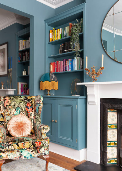
Less cluttered and more welcoming was pretty much the brief from the owners. “The functionality of the space didn’t change much,” Kate says. “The seating arrangement was pretty fixed. The fireplace is also the same, and the fitted cupboards and shelves, too.”
She did, however, make a small but clever tweak to the alcove storage, by fitting a sensor to the cupboard beneath the TV, so the family can activate the Freeview box inside without opening the door.
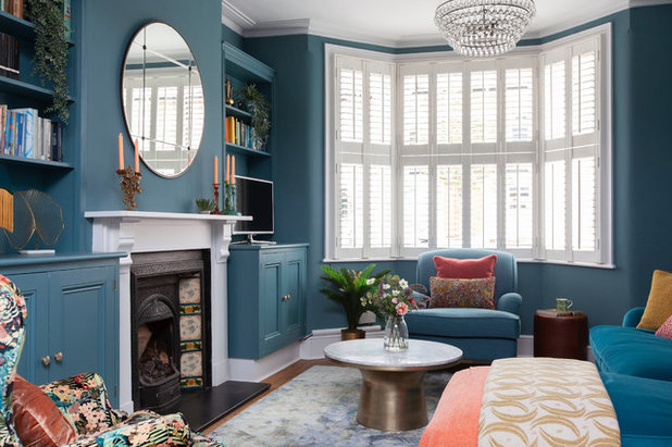
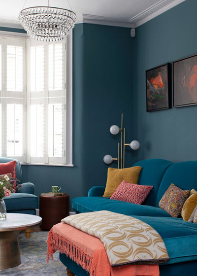
Decoratively, the colours (more of which shortly) were the biggest change. Kate also swapped an out-of-proportion mirror over the fireplace for a round one and expanded this circle theme to the pendant light and the coffee table. “The uniformity of echoing shapes simplifies the design and makes things look less busy,” she explains.
Glass Orb chandelier, The White Company. Armchair; sofa, both Love Your Home. Coffee table, West Elm.
Who lives here? A family with three children between the ages of eight and 16
Location South-west London
Property A Victorian mid-terrace
Size Four bedrooms and two bathrooms
Designer Kate Lovejoy of Kate Lovejoy Interiors
Photos by Fiona Walker-Arnott
Less cluttered and more welcoming was pretty much the brief from the owners. “The functionality of the space didn’t change much,” Kate says. “The seating arrangement was pretty fixed. The fireplace is also the same, and the fitted cupboards and shelves, too.”
She did, however, make a small but clever tweak to the alcove storage, by fitting a sensor to the cupboard beneath the TV, so the family can activate the Freeview box inside without opening the door.
Decoratively, the colours (more of which shortly) were the biggest change. Kate also swapped an out-of-proportion mirror over the fireplace for a round one and expanded this circle theme to the pendant light and the coffee table. “The uniformity of echoing shapes simplifies the design and makes things look less busy,” she explains.
Glass Orb chandelier, The White Company. Armchair; sofa, both Love Your Home. Coffee table, West Elm.
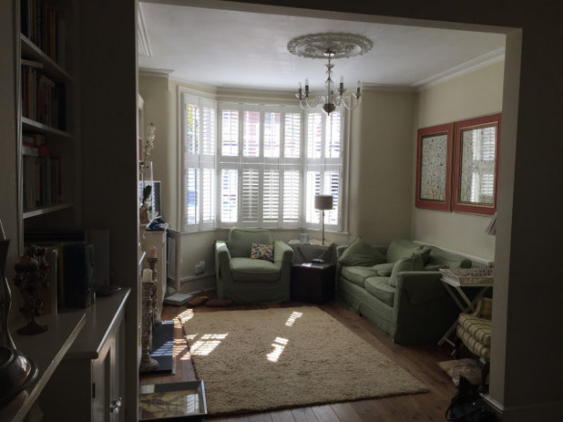
Before Kate got to work, the living room was “very safe, very tired. The owner also felt her living room was narrower than others in the same street,” Kate recalls.
She knew this wasn’t the case, but had to measure next door to prove it. “The problem was that the room had a very blocky sofa and chairs that went down to the floor, which made it look cramped,” she explains.
To resolve this, Kate specifically sought out furniture with legs. “The more you can raise things up and see beneath them, the better the sense of space you get,” she says.
“We built the scheme around this armchair,” Kate says. “It’s the key feature, so we wanted the rest of the room to echo those colours rather than compete with them.
“It was the owner’s granny’s chair and she remembers being read to in it as a child,” she continues. “It was just shoved in a corner and I said, ‘If it’s of such sentimental value, let’s make it a big feature.’ I found a Linwood print fabric for it and we had it reupholstered.” Kate then picked out the colours in the pattern and used them around the room, taking the blue as the dominant shade.
Kate also rearranged the owners’ books – with their blessing. “The books are a lovely feature, but they were absolutely packed in and the owner could see they were adding to the cluttered look, so we colour-coded them to make them accessories as well as books.”
Walls and woodwork painted in Burlington Arcade, Mylands. Bespoke lamp, Wild Lampshade Designs. Sculptural palm leaf ornament, John Lewis & Partners.
“I kept the large pieces of furniture the same colour as the walls, so they visually disappear and give more of a sense of space,” Kate says. “A great big corner sofa here does dominate, but having it the same colour sort of helps you to ‘lose’ it.”
Ball lamp, Rose & Grey. Throws, Zara and Next. Rug, Benuta. Cushions, a mix of the owners’ own, bespoke and John Lewis & Partners.
Ball lamp, Rose & Grey. Throws, Zara and Next. Rug, Benuta. Cushions, a mix of the owners’ own, bespoke and John Lewis & Partners.
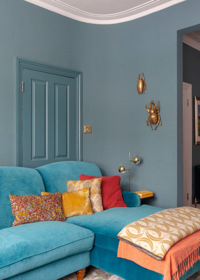
“We did talk about blocking up that door, as it was never used,” Kate says. Instead, the same colour trick helps it to ‘vanish’, while keeping the opening available for the future if needed.
Other woodwork and the ceilings in both rooms are painted white. “That’s unusual these days,” Kate says, explaining that she tends to colourmatch woodwork and walls. “There were some nice details in the plasterwork, though, and I felt white would highlight them better.
“These houses have this lovely curved wall you can see here, and artwork felt quite ‘shoved on’,” she continues. “Sculpture felt better, and these beetles work well.”
Wall beetles, Rockett St George. Table lamp, Wayfair.
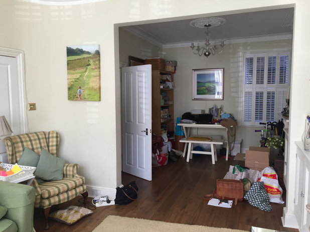
The office area and back part of the living room before work began. Here you can see the cherished armchair before it was reupholstered.
See surprising ways an interior designer could help you.
See surprising ways an interior designer could help you.
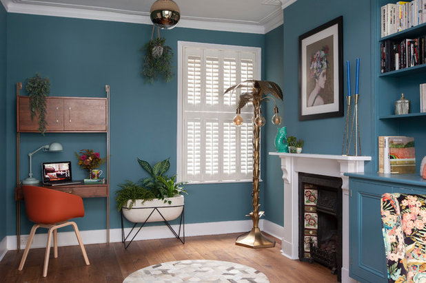
The back room is still used as a home office, but it’s far less cluttered. The reupholstered armchair (just seen) helps to connect the colours across the two rooms.
Desk; candlesticks; planter, all West Elm. Mirror Ball pendant light, Tom Dixon. Palm lamp, Rockett St George. Art print, Saatchi Art. Rug, Graham & Green.
Desk; candlesticks; planter, all West Elm. Mirror Ball pendant light, Tom Dixon. Palm lamp, Rockett St George. Art print, Saatchi Art. Rug, Graham & Green.
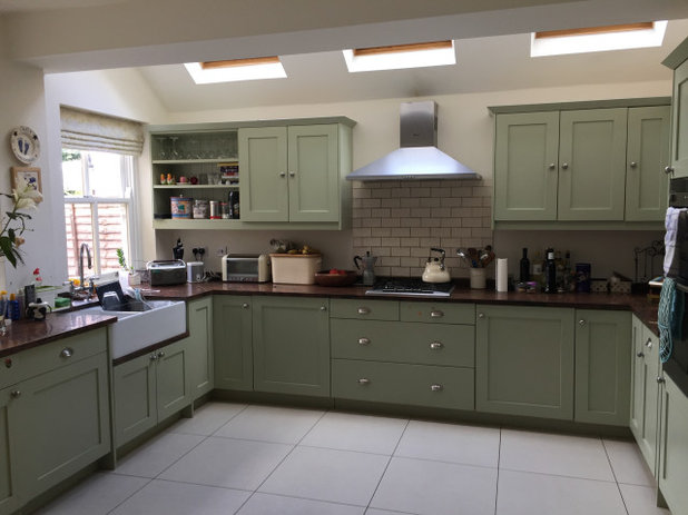
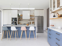
The pale green kitchen was made-over rather than being ripped out and replaced. It didn’t need a layout or function change, it was just about improving the look.
Check out the Houzz Professionals Directory to browse the portfolios of interior designers in your area and find someone whose style you love.
Check out the Houzz Professionals Directory to browse the portfolios of interior designers in your area and find someone whose style you love.
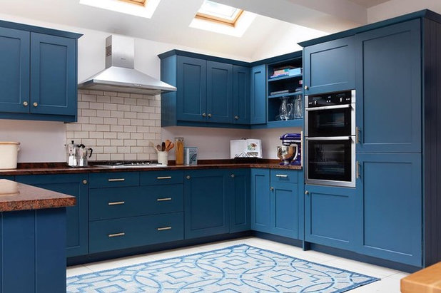
The kitchen’s transformation is another impressive one, given that it had very little done to it other than a paint job.
“We kept the worktops, changed the cupboard handles for brass ones, and added an easily cleanable indoor/outdoor rug, as the floor was a bit of a bare expanse, and this filled it up,” Kate says.
Handles, Dowsing & Reynolds. Kitchen units painted in Hicks’ Blue, Little Greene.
“We kept the worktops, changed the cupboard handles for brass ones, and added an easily cleanable indoor/outdoor rug, as the floor was a bit of a bare expanse, and this filled it up,” Kate says.
Handles, Dowsing & Reynolds. Kitchen units painted in Hicks’ Blue, Little Greene.
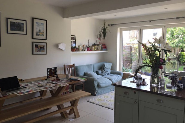
The back of the kitchen-diner in its previous incarnation.
The blue wall here matches the kitchen units. “The kitchen is a U-shape and this completed the space,” Kate says.
Bespoke curtains made from Romo fabric. Side table, Wayfair. Pendant light, Etsy.
Bespoke curtains made from Romo fabric. Side table, Wayfair. Pendant light, Etsy.
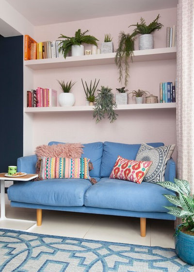
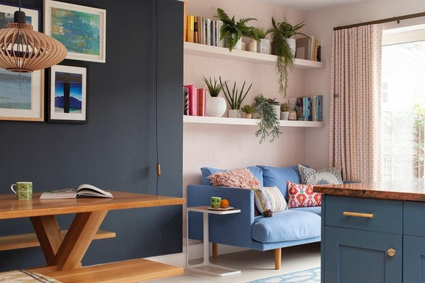
“There was a beaten-up old sofa in the same space here, and just one shelf, which had become a bit of a dumping ground,” Kate says. “I suggested adding another shelf and plants to link the area to the garden. We also hung curtains to make it a more inviting little living space.”
New Anaglypta wallpaper (behind the sofa) adds texture and further warms up the seating area against the flat surfaces of the kitchen.
Wall painted in Calamine, Farrow & Ball. Cushions, H&M, La Redoute and Zara.
New Anaglypta wallpaper (behind the sofa) adds texture and further warms up the seating area against the flat surfaces of the kitchen.
Wall painted in Calamine, Farrow & Ball. Cushions, H&M, La Redoute and Zara.
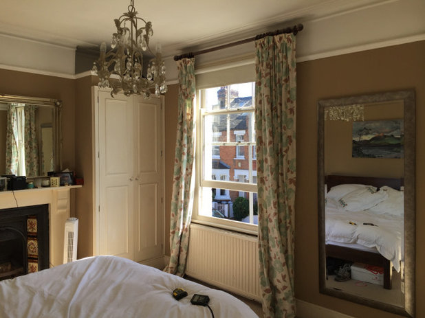
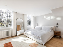
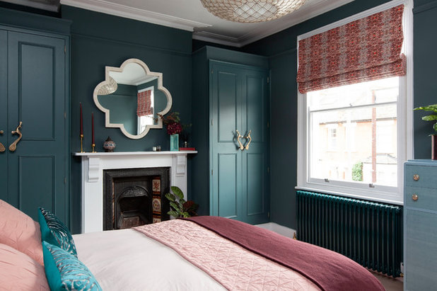
Upstairs, the brief was the same – to make the rooms feel less cluttered. In the master bedroom, Kate didn’t change the layout, but added a bespoke blackout window blind to replace the full-length curtains, which were adding to the busy look.
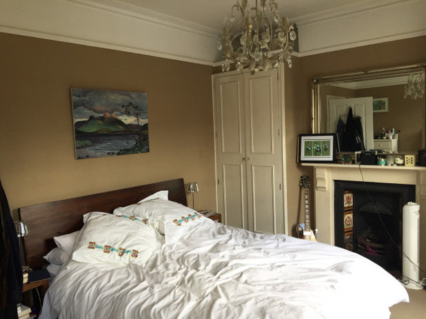
Another ‘before’ shot of the bedroom.
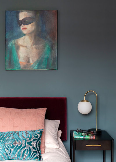
As with the heirloom armchair in the living room, the bedroom scheme started with something that had sentimental value – the painting over the bed. “I moved the artwork up here from downstairs and used it for my colour palette for the room,” Kate says. “The owners had had it for a while and loved it.”
Kate had the existing wooden headboard upholstered.
Bedside light, Rose & Grey. Bed linen, Made.com. Cushions made using Designers Guild fabric.
Kate had the existing wooden headboard upholstered.
Bedside light, Rose & Grey. Bed linen, Made.com. Cushions made using Designers Guild fabric.
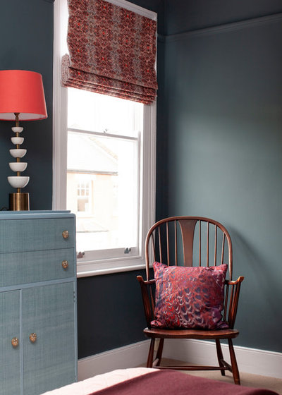
The owners already had this chair and it fitted perfectly in this corner.
Vintage upcycled tallboy, Muck N Brass. Lamp base, Pooky.
Tell us…
Which ideas from this revamped family home might you try in your own place? Let us know in the Comments section.
Vintage upcycled tallboy, Muck N Brass. Lamp base, Pooky.
Tell us…
Which ideas from this revamped family home might you try in your own place? Let us know in the Comments section.

Related Stories

House Tours
Houzz Tour: Warm Tones and Luxurious Surfaces in a City Townhouse
An earthy colour palette, hidden storage and well-placed texture add character and practicality to this London home
Full Story

Room Tours
Kitchen Tour: A Gorgeous Extension With a Leafy Glasshouse Feel
By Kate Burt
When the owners of this terraced house extended, they were keen to retain its period feel and highlight the garden
Full Story

Gardens
Garden Tour: A Bare Roof Terrace Becomes a Pretty, Sociable Space
By Kate Burt
A retired couple got help transforming their large rooftop into a gorgeous, welcoming, multi-functional retreat
Full Story

House Tours
Houzz Tour: A Smart Layout and Genius Storage in a Victorian Home
Flipping the standard layout and carving out excellent storage have turned this tired house into a brilliant family home
Full Story

House Tours
Houzz Tour: A Victorian House Brought Impressively Up to Date
By Jo Simmons
A cohesive layout and warm colours combined with energy-efficiency measures thoroughly modernise this terraced home
Full Story

Kitchen Tours
Kitchen Tour: An Open, Airy Space Made for Entertaining
Combining two separate rooms has improved flow and created a sociable open-plan kitchen, dining and seating space
Full Story

House Tours
Houzz Tour: A Family Home Inspired by its Seaside Location
Coastal colours and practical design combine to create a house that will adapt as the family grows
Full Story

Kitchens
5 Inspiring Before and After Kitchen Transformations
Whether you want to boost storage, incorporate original features or maximise your space, take ideas from these designs
Full Story

House Tours
Houzz Tour: An Airy, Scandi Finish for a Tall Victorian House
By Kate Burt
From a tricky inherited bath to a sticky-out staircase, on-site problem-solving led to a seamless update for an old home
Full Story
House Tours
Houzz Tour: A 17th Century Cottage Gains Warmth and Character
The clever use of colour and pattern has revived this old building while creating a 21st century family home
Full Story
I love this; not a fan of blue myself, but this is more blue.green and very vibrant to my eye. If you love a colour, I feel you should go for it, it is only paint and can be changed without too much work anyway. Most people go for very safe and boring, which I probably used to as well, until training as a textile designer mid life, then I really went for it - I hate grey and beige - please make your home your own, not anyone elses, use colours you love, fabrics you love, objects that mean something to you and see it all come together.
https://mylands.com/collections/shop-paint/products/burlington-arcade
Beautiful scheme, love it. Kate, would you still have details of the rug in lounge? I noted from Wayfair.