Houzz Tours

House Tours


Houzz Tour: A Long-untouched House is Lovingly Revived
A thorough but sensitive renovation made this neglected home suitable for modern life while retaining its character

When Kate Clare of LOUD Architecture & Interior Design first saw this house, it hadn’t been touched for years, as you can see from the incredible ‘before’ photos of the project. “My client wanted to update the whole house while respecting its history,” she says.
The renovation also reconfigured the layout, as Kate added a kitchen extension to replace an existing conservatory, converted the loft into a bedroom and bathroom for guests, boosted the size of the main bedroom, and added a utility room under the stairs. Every other part of the house required period-sensitive attention, too. Scroll down to see the dramatic transformation.
The renovation also reconfigured the layout, as Kate added a kitchen extension to replace an existing conservatory, converted the loft into a bedroom and bathroom for guests, boosted the size of the main bedroom, and added a utility room under the stairs. Every other part of the house required period-sensitive attention, too. Scroll down to see the dramatic transformation.
Kate explains a little of the history of the house and surrounding area, which was heavily bombed during World War Two.
“This is one of the only remaining [pre-war] houses,” she says. “It’s a standalone house on top of a hill, surrounded by more modern bungalows. [Inside, it was] very Art Deco. It had wonderful features – panelling up the stairs, arches, lovely switches… We kept as many of these as we could.”
The single door seen here led into what was the kitchen.
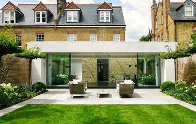
Here’s the back of the house as it looks now. The square arch indicates where the original house ended. The kitchen is where the rear of two reception rooms was (see the plan below).
Kate raised the floor so the inside and outside could be level. “There’s a big rear terrace now, so we made a feature of it and chose Moroccan tiles – something a bit ‘wow’. The client loved Moroccan style,” she says.
Inside, she also opted for era-appropriate solid oak chevron flooring – beautiful but, Kate advised her client, high maintenance. “There’s no underfloor heating,” Kate adds. “She wanted beautiful radiators everywhere.”
Industrial-style doors and windows, Govette Windows. Patio tiles, Reed Harris. Flooring, Direct Wood Flooring.
The choice of red bricks for the extension was down to the exterior of the original house at the front, which is also red brick.
“All the other houses are white rendered bungalows,” Kate says, “so it felt really important to keep it brick.” They debated whether to go for a muted brick or “something daring and orangey”. Kate felt the latter would complement the blue patio tiles. “I think it looks really good,” she says.
“All the other houses are white rendered bungalows,” Kate says, “so it felt really important to keep it brick.” They debated whether to go for a muted brick or “something daring and orangey”. Kate felt the latter would complement the blue patio tiles. “I think it looks really good,” she says.
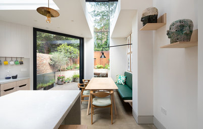
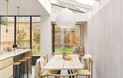
The client was keen to have a really sunny space here, so Kate installed two large skylights to bring in light, along with the glazed doors and two side windows.
The room gets light from the east and south, so it’s bright throughout the day. “It’s like a conservatory – something the client liked the idea of. It’s somewhere to enjoy the garden from, but it’s warm all year round,” Kate says.
“Normally, the glass at the side would need to be frosted for privacy, but that wasn’t the case here, as there’s a garage between the house and the neighbours’ place,” she says.
The client already owned the pale blue fridge and it’s where the idea for the colour of the radiators came from. The fridge is in a niche with a 25cm gap around it to allow for ventilation and to open the door.
The interior of the original conservatory.
Find an architect or building designer in your area in the Houzz Professionals Directory.
Find an architect or building designer in your area in the Houzz Professionals Directory.
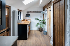
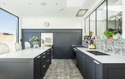
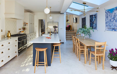
Downstairs, there’s a new kitchen, a bathroom (seen through the open door here and in the position of the original kitchen) and a living space. The original front reception room remains.
The hallway and front door are out of sight, to the left of this doorway. The wall mirror – just seen on the right-hand wall – faces the door. (Scroll down to photos of the pink carpeted staircase and you’ll see the same circular mirror on the wall ahead.)
The hallway and front door are out of sight, to the left of this doorway. The wall mirror – just seen on the right-hand wall – faces the door. (Scroll down to photos of the pink carpeted staircase and you’ll see the same circular mirror on the wall ahead.)
The ‘before’ floorplan. The ‘inner’ reception room is now the kitchen, and the area where the conservatory was is the new space, which extends 4m.
Originally, there was going to be a quartz worktop but, to keep costs down, Kate suggested this marble-look laminate. The tiles on the back wall, however, are real marble. “It makes the worktop look more expensive and you don’t notice it as much,” she says.
Kate went for pale grey units so they almost disappear. “Because the kitchen is part of the living space, the grey was chosen so you almost don’t see it,” Kate says. “The blue details do all the talking while the kitchen blends into the background.”
To the left, just out of shot, is a tall pantry cupboard, meaning there’s less need for lots of wall cabinets.
Kitchen, including worktop, Howdens. Lighting, Spark & Bell. Sink, Lusso Stone. Sockets, Dowsing & Reynolds. Marble tiles on splashback, Floors of Stone.
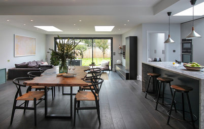
The client wanted a space where she could cook and have the grandchildren around. “She chose not to have a TV in here and put that in the more formal, original reception room at the front of the house,” Kate says.
The living space is flooded with light.
The original kitchen is now a bathroom.
The window is where the original back door was and the bath sits where the cabinets below the window were.
Basin, London Basin Company. Tiles, Porcelain Superstore. Bath, Lusso Stone.
Basin, London Basin Company. Tiles, Porcelain Superstore. Bath, Lusso Stone.
Kate says the look for the bathroom was “a hybrid between the blue plates and the Moroccan theme. The bowl beneath the basin was the owner’s and that was the inspiration. She had loads of blue and white plates.”
Several of these can be seen here on the bathroom walls and around the rest of the house.
Several of these can be seen here on the bathroom walls and around the rest of the house.
The hallway before the renovation, looking towards the front door. Kate retained and restored the original panelling.
The new front double doors echo what would have been there originally. “We wanted something in keeping,” Kate says. Here, you can see both halves, open, painted in a baby pink.
The wall panelling is original, but now painted in pale grey. Kate transformed the understairs area into a utility cupboard with a washing machine and dryer. Unfortunately, the original panelling here did not survive, so Kate had it replicated to keep the original look.
Door, London Door Company, painted in own-brand pink. Carpet, Off The Loom.
The back of the hallway previously, with a view into the old kitchen.
The front of the house before work started. Kate removed the storm porch.
The original first floor front room.
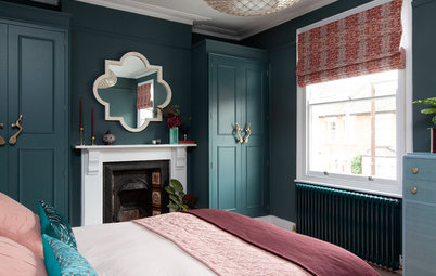
The room is now the main bedroom. The windows have been replaced to look like the originals, including the traditional ‘monkey tail’ handles.
The slim strip teak flooring is the original, which the client was very keen to retain. “It was taken up to put in new radiator pipes and then relaid,” Kate says.
In the redesign, the room was enlarged slightly, at the expense of another bedroom, which shrank accordingly.
The slim strip teak flooring is the original, which the client was very keen to retain. “It was taken up to put in new radiator pipes and then relaid,” Kate says.
In the redesign, the room was enlarged slightly, at the expense of another bedroom, which shrank accordingly.
As mentioned, the attic was designed so family could come to stay. “It was quite a small attic and this is a hip-to-gable conversion,” Kate explains. “The dormer to the rear is a dressing area.”
The loft bathroom is positioned within a dormer.
The client’s son, Alex, explains what the home meant to his mother. “The project gave Mum something to focus on,” he says. “She’d been a nurse for the NHS all her life, but was very creative and artistic, and the house has her stamp all over it – the pink carpets, the deep fern green tiles in the bathroom, the Italian radiators.
“She’d originally come from an impoverished south Dublin background,” he continues, “and when the house was finished, I think she thought, ‘Yes! Brilliant. The fruits of my labour.’”
Wall tiles, Artisans of Devizes. Floor tiles, Porcelain Superstore.
Tell us…
What do you love best about this transformation? Share your thoughts in the Comments.


Sponsored
Reload the page to not see this specific ad anymore
Who lives here? It’s owned by two brothers, but was originally designed for their late mother, who lived here alone
Location North-east London
Property A detached house built in the early 20th century
Size Four bedrooms and three bathrooms
Designer Kate Clare at LOUD Architecture & Interior Design
Budget £180,000 for a kitchen extension, loft conversion and full refurbishment
Photos by Chris Snook
This photo shows the back of the house as it looked before work began. The double doors are attached to a conservatory-type extension and the building on the right (see below) is a garage.
Kate’s client’s initial brief was to create an outhouse in the garden where her son and his children could stay. “I told her this wouldn’t end up being very big, and that she’d have to apply for special Planning Permission,” Kate says. In the end, Kate designed a loft conversion instead.
The client, who had been ill, has sadly passed away since the project was completed. She lived in the finished house for six months and her sons now own it, with one of them currently living here.
Her son Alex explains the background to the project. “When Mum said she wanted to move, we said to her, ‘Just get a nice, sensible, small terraced house, suitable for someone in their sixties retiring.’ She said, ‘No! I don’t want to live in a terraced house.’ It was me who found this place. I said, ‘Mum, if you want a detached house…’ I didn’t think she’d actually buy it.
“When we first saw it, it was derelict, and the chimneys had fallen in,” he continues. “Then she hired Kate, who was brilliant.”