Houzz Tours

House Tours


Houzz Tour: A Cosy Reboot for a Dated Victorian Terrace
A cleverly tweaked layout and the targeted use of bold colour helped to transform this period house on a set budget

This Victorian terrace in north-east London was a classic ‘fixer-upper’, with dated, dark red décor and some dodgy former building work. But far from wanting to do it up and quickly sell it on, the young couple who bought it were keen to make a cosy and sociable space they could settle into.
They entrusted the project to Michael Schienke of Vorbild Architecture, who introduced rich but restful colours, warm natural materials and extra glazing to bring in more light, turning the tired house into a warm, welcoming home.
They entrusted the project to Michael Schienke of Vorbild Architecture, who introduced rich but restful colours, warm natural materials and extra glazing to bring in more light, turning the tired house into a warm, welcoming home.
When the couple moved in, there was a cloakroom tacked onto the back of the house. “The original extension only went out by about a metre – you can see the gap by the back doors – but there was a downstairs loo as well, blocking the view of the garden, so we demolished that,” Michael says. The side-return extension had already been done, though Michael replaced a low-quality skylight.
The former cloakroom on the back impeded the connection to the garden.
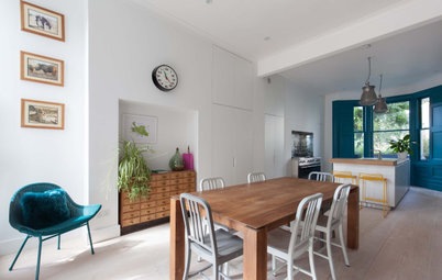
Taking off the cloakroom and opening up the back of the house has made the space much more usable and light. In this photo, you can also see the extended loft space, more of which shortly.
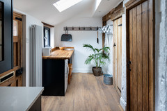
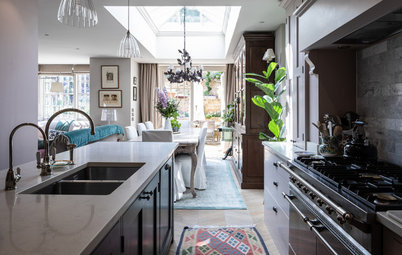
Although the kitchen-diner is relatively narrow, the couple asked for an island, so Michael fitted the narrowest design available. The unit is a paler colour than the deep green perimeter cabinets, though, so it sits lightly in the space. Even though it’s narrow, it provides space for extra storage, a slim wine fridge and a dishwasher.
In normal circumstances, the couple like entertaining, so creating an indoor-outdoor space was important, too. “The garden was very overgrown, so we redid all the fences and laid simple pavers to create a seating area around the fireplace,” Michael says.
In normal circumstances, the couple like entertaining, so creating an indoor-outdoor space was important, too. “The garden was very overgrown, so we redid all the fences and laid simple pavers to create a seating area around the fireplace,” Michael says.
The couple were keen for the room to feel open and airy, so Michael kept wall cupboards to a minimum. The area behind the hob is tiled with scallop-shaped marble mosaics, while the rest of the space has a simple upstand in the same quartz as the worktop.
The flooring is solid wood, laid in a herringbone pattern. “It was quite difficult to lay, as real wood is somewhat uneven, but it gives a natural feel and sets the whole vibe for the space,” Michael says.
Kitchen including handles, British Standard. Perimeter cabinets painted in Carriage Green; island painted in Lamp Room Gray; walls painted in Strong White, all Farrow & Ball. Worktop and upstand, Silestone.
As the budget was limited, the couple decided not to have underfloor heating in here, but wood is warmer than tiles, and the space is quite crowded. “There’s a lot on the floor and the more things you have, the less floor area you need to heat,” Michael says. “It’s not ideal under solid wood anyway,” he adds.
A large radiator keeps the room toasty. “The pipes angle into the wall [rather than running down to the floor], so you can easily clean underneath,” Michael says.
He created a spot to perch at the end of the island. There’s a usb socket under the worktop to make it easy to sit with a laptop or cook from a recipe on a tablet.
The couple sourced the midcentury dining set and had the chairs reupholstered.
Radiator, BestHeating.
The tall cabinet contains a fridge-freezer on the right and a pantry with a breakfast station on the left.
“Often, we’ll do a double-door pantry, but there just wasn’t space, as neither I nor the couple wanted to have a sink on the island,” Michael says, “plus it doesn’t make the kitchen feel too heavy.”
“Often, we’ll do a double-door pantry, but there just wasn’t space, as neither I nor the couple wanted to have a sink on the island,” Michael says, “plus it doesn’t make the kitchen feel too heavy.”
Between the kitchen and living room, Michael carved out a slim space to accommodate a cloakroom, behind the door at the far end, and a utility cupboard. A pulley-operated clothes airer above the corridor makes the most of the available space.
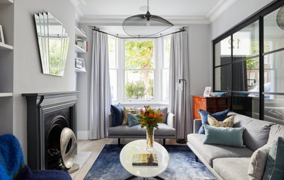
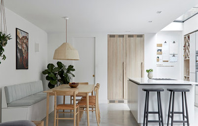
The two reception rooms were already knocked into one, though the opening was smaller and fitted with doors (see below), which the couple didn’t want. As the rear space is darker, Michael turned this into a TV area, with bookshelves surrounding the screen to link the space to the front room.
The shelving nook perpendicular to the main bookcase is where the original window was before the side extension was added; it had never been removed. “The window was still in, even though it didn’t look at anything,” Michael says.
Sofas, Sofa.com.
The shelving nook perpendicular to the main bookcase is where the original window was before the side extension was added; it had never been removed. “The window was still in, even though it didn’t look at anything,” Michael says.
Sofas, Sofa.com.
The original double room was dark, with doors between the two spaces and net curtains for privacy.
Now, shutters keep the privacy but let in more light. The walls in here had to be replastered and the cornicing replaced. “We had to gut this room completely,” Michael says. The joinery was all made by the builder.
Chiming with the dining set in the kitchen, the furniture has a midcentury vibe. The same flooring continues in here, too, adding the warmth of natural timber.
The rich blues and olive green work nicely with the parquet. “I’m really happy with the colours in here,” Michael says. “Sometimes when you’re on a budget, a project can end up being white on white, as colour costs more, so I’m really happy the couple went for that.”
Walls and fireplace painted in De Nimes; bookcases painted in Hague Blue; ceiling painted in Strong White, all Farrow & Ball. Plasterwork, Cornices Centre.
None of the fireplaces in the house work, as it was beyond the budget to refurbish them. “Otherwise, you have to line the chimney and pay for the wood-burner – and the couple knew they wouldn’t really use it,” Michael says.
The wooden surround was made and painted by the builder.
The wooden surround was made and painted by the builder.
The staircase and architraves were originally dark wood, while the hallway floor was carpeted, which wasn’t ideal.
The parquet laid in the other rooms has been extended into the hall, but a large mat has been set into the floor inside the door to protect it. The old second doorway into the living room (left of the mirror) has been blocked up, making more wall space for furniture.
This ‘before’ photo shows how the view of the garden had been blocked.
Now there’s a view right from the front door through to the garden.
Tempted to get the ball rolling on a renovation? Find professionals in your area, read client reviews and see project photos in the Houzz Professional Directory.
Tempted to get the ball rolling on a renovation? Find professionals in your area, read client reviews and see project photos in the Houzz Professional Directory.
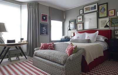
The main bedroom is on the first floor. The couple asked for a light but warm colour, and painting the walls and woodwork in the same soft, plaster-pink hue has created a visually calm space.
The flooring in here is the same as downstairs, but laid as straight boards. The sash windows were replaced throughout the house.
Walls painted in Setting Plaster, Farrow & Ball.
The flooring in here is the same as downstairs, but laid as straight boards. The sash windows were replaced throughout the house.
Walls painted in Setting Plaster, Farrow & Ball.
Next to the master bedroom is a smaller room destined to be the husband’s home office.
The wife’s home office is at the back of the first floor. It’s a lovely light space. “The room had a flat ceiling, but we removed it and added a skylight,” Michael says.
You might also like 6 Ways to Sneak a Desk into an Open-plan Space.
You might also like 6 Ways to Sneak a Desk into an Open-plan Space.
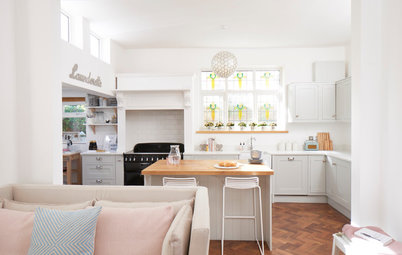
The family bathroom is next to the bright home office. To work within the budget, Michael kept things simple, but there is electric underfloor heating in here.
Appleby 1700 roll top shower bath with Screen & Chrome Leg Set, Victorian Plumbing.
Appleby 1700 roll top shower bath with Screen & Chrome Leg Set, Victorian Plumbing.
The house had an existing dormer loft extension, but it was too low. “I’m 6ft 4in and I couldn’t stand up at the ridge,” Michael says. He managed to gain more vertical height by exploiting a gap that had been left beneath the loft room floor.
He fitted a skylight above the stairwell and, to make the most of the light flooding down, added a glass panel on the turn of the stairs, seen here. “We negotiated with Building Control, as timber spindles would have blocked quite a lot of light,” he says.
The stairs are painted very dark grey from top to bottom to create a feature of the almost sculptural winding structure. “I like it that the couple were bold enough to go with a contrasting colour, because when you’re faced with a dark corridor like this, it’s tempting to go for all white to make it as light as possible, but I don’t think that’s always the best approach,” he says. “A little bit of colour helps, because you’re detracting from the fact it’s a dark corridor.”
Staircase painted in Railings, Farrow & Ball.
The loft room is for guests. Planning allowed for an L shape – protruding over the outrigger (see picture 4, taken from the garden) – so Michael created a sleeping area and a dressing area. The couple intend to position a wardrobe behind the half wall at a later stage, but as this is principally for guests, there’s no hurry.
“The space isn’t very wide, so the temptation was to put the bed where the mirror is, but if we’d done that, it would block quite a bit of the access to the back area [with the glazed doors],” Michael says.
“The space isn’t very wide, so the temptation was to put the bed where the mirror is, but if we’d done that, it would block quite a bit of the access to the back area [with the glazed doors],” Michael says.
The narrower area works nicely as a sleeping zone and guests have a leafy, rooftops view from the bed. The skylight seen on the sloping roof ahead is the one over the wife’s office.
Like the bathroom on the floor below, the shower room in the loft is simple, with inexpensive metro tiles, but the floor tiles elevate the scheme.
The flush, walk-in shower also adds to the stylish finish. “As the whole roof was being rebuilt, we could easily plan ahead to fit a flush shower,” Michael says.
The flush, walk-in shower also adds to the stylish finish. “As the whole roof was being rebuilt, we could easily plan ahead to fit a flush shower,” Michael says.
The whole project took seven months. Not surprisingly, the owners are very happy with the result. “They both had a passion for the project,” Michael says.
The work was finished just before the first Covid-19 lockdown in March 2020, which left the couple feeling fortunate to have a lovely home in which to hunker down.
Burlington Edwardian large basin with basin stand, Victorian Plumbing.
Tell us…
What do you like about this renovation? Share your thoughts in the Comments.


Sponsored
Reload the page to not see this specific ad anymore
Who lives here? A young couple, both solicitors
Location Walthamstow, north-east London
Property A Victorian end-of-terrace house
Size Four bedrooms (two being used as home offices) and two bathrooms
Architect Michael Schienke of VORBILD Architecture
Photos by Chris Snook
“The couple wanted the house to feel cosy and relaxed – they didn’t want anything that might look like a show home,” Michael says of the owners’ vision.