
Renovation Diary: How do we Create a Style for the Kitchen?
Catch up with Clare Zerny in part two of her diary about renovating a dated Victorian semi in Suffolk

One printer cartridge down, I’m knee-deep in kitchen plans scrawled with numbers and lines, and on the verge of my brain imploding, but, thankfully, it looks like we’ve finally cracked the layout (check out the architect’s floor plans below) so now it’s onto the mammoth task of the design. We decided to tackle the kitchen first as it’s the largest and arguably the most important room in the house. This is the space where we’ll spend most of our time and I’ve already learned the hard way (more of which below) that anything that’s not quite right – well, you’ll have to face it every day. Unless, of course, you fancy moving house and doing it all over again, and who in their right mind would do that?! Oh, ahem, hang on…
More in this series Renovation Diary: A Victorian Semi Full of Potential
More in this series Renovation Diary: A Victorian Semi Full of Potential
The kitchen in Clare’s old house in London.
With an architect on board and more time to devote to the build, I’m able to put more thought into planning each room thoroughly in a bid to avoid going off path.
As I learned previously, without a clear vision in mind from the start, it’s all too easy to lose focus and start doubting yourself in all the endless decision making. We’re not living in the house while the building work is underway, and one advantage of not living through the build is that the time away is vital for getting perspective, as well as keeping stress levels to a minimum.
Perhaps it was the white walls and pale porcelain floors that left our last kitchen in London (pictured here) a little more clinical than I’d hoped. I loved the layout, with the sink under the window for washing up with a view – something we’ll be repeating in the new kitchen – and there was colour, but the budget unfortunately didn’t warrant exposed brick, which we would have loved as it would have added texture and softened the look.
Clare’s new kitchen in Suffolk as it looked when she and Ben bought the house…
…and as it looked while Ben and friend Dom ripped out the cabinets.
The ‘before’ kitchen as seen from the other end…
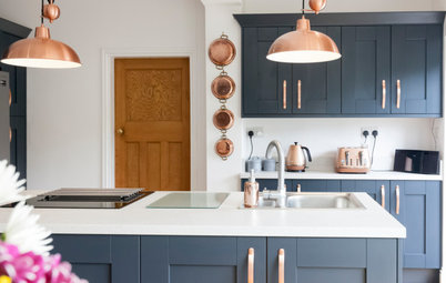
This time, as well as using and exposing beautiful reclaimed old red bricks to build the side and kitchen extensions to create a warm, homely atmosphere – like the one in the kitchen below from my ‘dream kitchen’ Ideabook – we also plan on restricting the spotlights to the kitchen zone only, with individual lighting in the dining and seating areas.
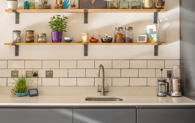
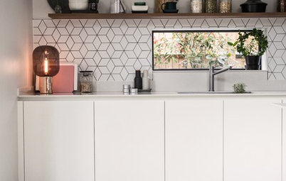
Classic metro tiles have made an appearance in every home I’ve renovated [see Clare’s old house and her first ever flat on her profile page] and are a firm favourite for their timeless yet retro quality, and will probably accompany us into the new home, too.
This time, as well as using and exposing beautiful reclaimed old red bricks to build the side and kitchen extensions to create a warm, homely atmosphere – like the one in the kitchen below from my ‘dream kitchen’ Ideabook – we also plan on restricting the spotlights to the kitchen zone only, with individual lighting in the dining and seating areas.
Classic metro tiles have made an appearance in every home I’ve renovated [see Clare’s old house and her first ever flat on her profile page] and are a firm favourite for their timeless yet retro quality, and will probably accompany us into the new home, too.
…and all that’s now left in the kitchen.
A photo from Clare’s ‘dream kitchen’ Ideabook.
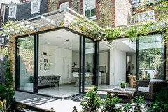
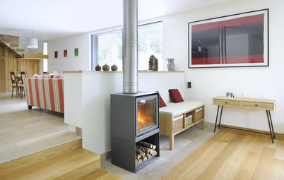
We’d also like to expose the steels in the new kitchen to bring about a more industrial feel – the visible wooden beams here are another thing I really like about this kitchen.
We’d also like to expose the steels in the new kitchen to bring about a more industrial feel – the visible wooden beams here are another thing I really like about this kitchen.
More from Clare’s ‘dream kitchen’ Ideabook.
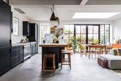
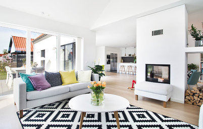
In a bid to prevent over styling the kitchen, we’re focusing on a more eclectic, vintage feel. One that still has impact, but without looking too ‘done’ and that isn’t about being on trend but simply true to what we like and will hopefully continue to enjoy for years to come.
While I’m keen to work with some bolder colours, the gorgeous palette in the kitchen above is a great example of how colour and texture can help to define a space. The pastels really ignite the 1960s chick in me, too (although I still have work to do to convince Ben of the virtue of pink walls like these ones), and its gentle wood floors and chandelier add vintage appeal while softening what is a pretty large space.
The architect’s proposed ‘after’ floor plan.
And, finally, here’s the layout for the downstairs, with the new kitchen at the heart of the plans. The kitchen measures 8.5m by around 4.9m (from the pantry) and is split into three clear zones of the kitchen units, dining space and seating area at the end.
And, finally, here’s the layout for the downstairs, with the new kitchen at the heart of the plans. The kitchen measures 8.5m by around 4.9m (from the pantry) and is split into three clear zones of the kitchen units, dining space and seating area at the end.
The current floor plan for the whole of the downstairs in Clare and Ben’s house.
As you can see from the existing layout here and the new floor plan above, we’ve stolen space from the kitchen for a bigger utility and this also uses up the old dining room. We were determined to rework the dining room into a space with real purpose and with the new, much larger living room housed in the new side extension and the original living room at the front becoming a snug, this utility room becomes a great, modern addition, transforming what was a dark, underused area.
As you can see from the existing layout here and the new floor plan above, we’ve stolen space from the kitchen for a bigger utility and this also uses up the old dining room. We were determined to rework the dining room into a space with real purpose and with the new, much larger living room housed in the new side extension and the original living room at the front becoming a snug, this utility room becomes a great, modern addition, transforming what was a dark, underused area.
Dream pantry: a beautiful storage space from Clare’s ‘dream kitchen’ Ideabook.
There’s also a pantry, which I’m pretty excited about. While ours will be a much more modest size than this example, floor-to-ceiling built-in storage will be perfect for housing my mountain of baking paraphernalia that I couldn’t even fit in my last Hackney kitchen.
In terms of a way into the pantry, I’m excited about the idea of repurposing our bathroom door – a classic glass panel Victorian that’s original to the house as far as we know. [See this and more before photos on Clare’s profile page.]
Parquet flooring features in this image, saved to Clare’s ‘dream kitchen’ Ideabook.
One big budget question we’re still debating is the kitchen flooring: we love herringbone parquet, as above – it looks incredible and will no doubt age beautifully, but I wonder if it’s a little too engineered for the look we want to achieve? Would more budget-friendly Victorian pine boards – also more in keeping with the rest of the house – create the softer, vintage feel we’re after, plus save a lot of money that could be put towards other areas?
I’m also not sure about which reclaimed wood flooring options are underfloor heating-friendly. That’s a must for us in such a big space, and surprisingly little more of a dent in the budget than traditional column radiators would cost to heat such a large space effectively.
An idea of how Clare and Ben’s garden doors may look… one day.
Speaking of dents in the budget, there’s no forgetting the all-important windows and doors. We will be right on trend when it comes to black-framed metal windows, which is what we have our hearts set on for the doors leading out to the garden.
It’s hard not to see their appeal and, again, they’ve been a firm favourite for years and something we couldn’t stretch to in our last home. While we’ll undoubtedly have to compromise on certain ideas, getting plenty of light in and having views of the garden is worth the extra spend.
More from Clare’s ‘dream kitchen’ Ideabook.
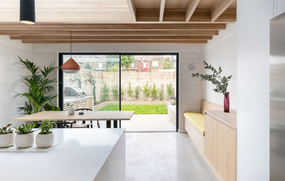
I also love the idea of this strip of glass in the kitchen above, instead of the Velux windows we had last time for added impact.
I also love the idea of this strip of glass in the kitchen above, instead of the Velux windows we had last time for added impact.
Also in the ‘dream kitchen’ Ideabook.
An idea the architect suggested, which we also love, is a glass box window in the end wall to form part of the end seating area. I love the dramatic effect it brings to the house pictured here, while also serving a useful purpose.
The black frame would tie in nicely with the outlines of the new patio doors we’re planning, too. It would also make a great spot to drink a morning coffee while observing the garden as it changes through the seasons.
Clare and Ben’s old kitchen, ripped out and ready to go!
And, finally, to the big money shot: the old kitchen units in all their current glory. As we’d imagined, this was to be the most fun we’ve had so far. It beats stripping wallpaper hands down.
For now, while we’re not stripping walls (I’ll have to do a whole story on the wallpaper…), I’m scouring high and low for examples of how to achieve an eclectic, vintage, bold yet soft industrial space. Any ideas are, as ever, most welcome and, in the meantime, anyone care to take a guess on how many skips you think we’ll get through?!
Have ideas to help inspire Clare and Ben’s project? Share your photos from Houzz or from your own home, and your tips, in the Comments section.
Clare battling with just some of the wallpaper she and Ben are stripping out.
Check out the couple’s progress on Clare’s Instagram feed @renovation_wreck and look out for her next diary instalment in about month!
Check out the couple’s progress on Clare’s Instagram feed @renovation_wreck and look out for her next diary instalment in about month!


Sponsored
Reload the page to not see this specific ad anymore
Houzz at a Glance
Who lives here Clare Zerny, a pastry chef, and Ben Sinclair, a sales and marketing director, plus Weanus the cat
Location Bury St Edmunds, Suffolk
Property A Victorian semi
Size 3 bedrooms and 1 bathroom
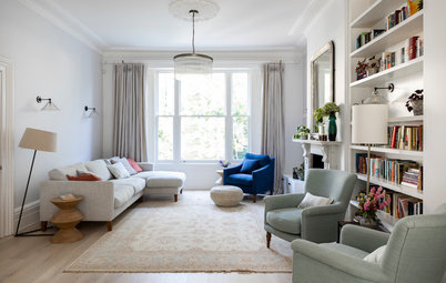
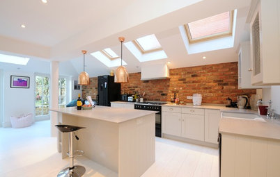
I have this thing about rooms not being overworked – by overworked, I mean like a show home than a real, lived-in home. So while we’ll be totally transforming our new house from its current neglected time-warp status, the focus of this project will still be about keeping this modest Victorian semi true to its roots – restoring features lost, while sensitively bringing other parts of the building up-to-date, enabling it to serve as a warm and inviting family home – a space with impact but not one where friends feel they can’t sit down for fear of spoiling the view.
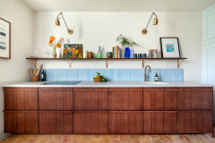
For me the kitchen above achieves this balance. It’s an eclectic space but clearly well thought out – the wood floors and panelling set the tone and you get the distinct impression dinner here would be a relaxed and hearty affair.