Houzz Tours

Kitchen Tours
Can You Guess Last Year’s Most Popular Kitchen Tours?
Will your favourite kitchen project on Houzz feature in our top 10 most viewed list? Read on to find out…

Looking at the kitchens that caught your attention last year, a few themes emerge: dark blue and grey are hugely popular, but white is still holding its own as a key kitchen colour, too; natural materials, such as wood and exposed brick, are featuring more; clever layouts and budget tricks are always appreciated, and it seems we all love kitchens that allow us to be sociable, whether that’s thanks to an island with a breakfast bar or a big table.
Take a look at the Houzz users’ top 10 – do any of them give you ideas for your own kitchen?
Take a look at the Houzz users’ top 10 – do any of them give you ideas for your own kitchen?
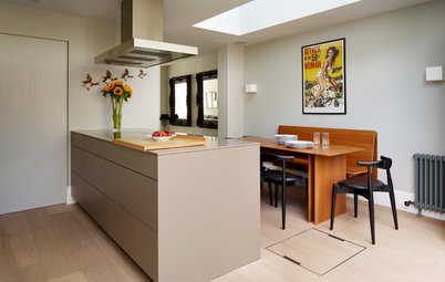
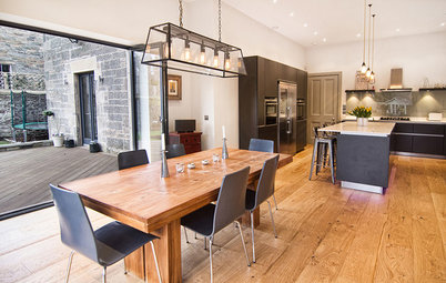
At number 9…
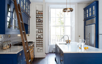
The owner of this kitchen was after a freestanding look, but without the possibility of crumbs falling down cracks. So the designers came up with a clever solution – a kitchen that’s fitted but looks freestanding.
The plinth underneath the units is set back and mirrored to look like an expanse of floor, while slim metal legs on each side add to the freestanding effect.
The rest of the kitchen is lovely, too, featuring just the right mix of old and new elements – and wait until you see the beautiful freestanding dresser.
Tour more of this foodie’s kitchen in a Georgian home
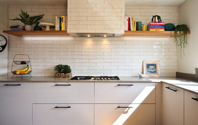
At number 8…
“This is an absolute gem of a kitchen, achieved with only a small side extension,” commented Houzz user nanabello. The designers certainly did a good job of packing in loads on a tight budget, and there were plenty of clever ideas to take away from this project.
In order to incorporate both a downstairs loo and a utility room in the space, the team decided to combine the two – a solution that got people talking in the Comments section.
Take a look and see what you think
Keen to make the most of the space in your renovation? Find professional kitchen designers in your neighbourhood on Houzz.
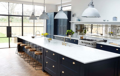
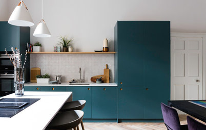
At number 7…
A stylish combination of dark blue and wood works well in this kitchen, and gives a classic look to the cool, modern scheme.
The designers were asked to turn a dark, cramped kitchen into a light, spacious room with bags of storage. To achieve this, they kept things simple by extending the back and designing flat-fronted plywood units with plenty of storage space inside.
To finish it all off, oak-framed windows add a wonderful connection to the back garden.
Visit the rest of this modern open-plan space
At number 6…
Many of our discerning readers are keen to retain the character of their period homes, so this project was a winner.
In order to extend the house while keeping the building’s beautiful features, the architects came up with an ingenious solution. They attached a glazed extension to the rear of the house, but kept the original back wall in place. The result is quite magical.
The unobtrusive white kitchen is tucked along the side of the extension, and the sink is perfectly placed beneath a window, so the owner can look out to the garden.
See more of this clever extension that preserves Victorian proportions
At number 5…
A side-return extension opened up this space by just 4 sq m, but that was enough to make a massive difference to the room.
Bespoke cabinetry in warm walnut was another key element in this kitchen-diner, and Houzz users particularly liked the lack of wall units – a layout style that’s becoming more and more popular in kitchens at the moment.
The best feature for us? The fantastic walk-in pantry, hidden behind a panelled wall.
Take a look at how a small extension transformed a dark kitchen
At number 4…
In February, interiors blogger Maxine Brady shared the ups and downs of her kitchen renovation story with us, revealing her budget-saving successes as well as some of the challenges she had to overcome.
Her builder came up trumps, providing a simple idea that brought in lots of much-needed daylight, and her kitchen designer devised a clever way to locate a cupboard door right next to a step.
Check out Maxine’s cost-friendly kitchen makeover
Browse a range of display and wall shelves in the Houzz Shop.
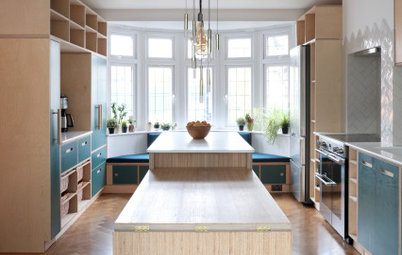
At number 3…
Storage ideas are something we’re all looking for in our kitchens, and this project had buckets of them. There’s a gorgeous breakfast pantry with space-saving pocket doors, a rather nifty utility cupboard, and even a cosy seat that doubles up as storage.
The kitchen is not only super-functional, it looks pretty good, too. Houzz user mrn_fusion sums it up well: “What a perfect blend of intelligent design and good looks…”
Take a look for yourself at this family-friendly Shaker kitchen
The runner-up at number 2…
This personality-filled kitchen, inspired by a New York loft apartment, features steel-framed doors, a micro-cement floor and exposed brickwork.
It belongs to stylist Laura Burkitt and her fiancé, Ben, who entered the project into the Houzz and ES London Home Design Awards. The thoughtfully designed space appealed to the judges, who gave it first prize in the kitchen category.
Readers were equally impressed, in particular pointing to the use of welcoming colours and materials, as well as the couple’s budget-savvy ideas.
And the winner is (drum roll please)…
There’s so much to love in this open-plan kitchen-living space – the black-framed doors, the beautiful antique lighting, and the subtle use of texture and colour to add warmth to the space.
It was designed by homeowner and blogger Susanna Hawkins, who wanted the room to be practical, with plenty of space for cooking and eating. The kitchen itself is white and streamlined, but the hexagonal tile layout on the splashback and the walnut shelves bring in that all-important touch of character.
Take a tour of the open-plan kitchen and living space and look out for the seating area, made extra cosy with a stylish wood-burning stove.
Tell us…
Which of these kitchens is your favourite and why? Share your thoughts in the Comments section.

Sponsored
Reload the page to not see this specific ad anymore
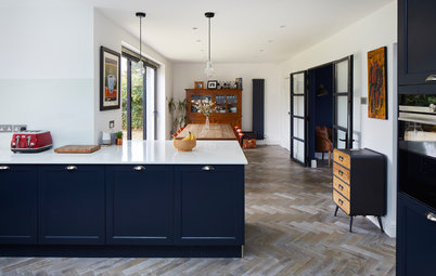
Dark blue kitchens are on many people’s wish lists at the moment, and this version is a good example of how to get the look right. Shaker-style cupboards in a deep blue shade were given a lift with light composite worktops, limestone floor tiles, and a wall of white metro tiles.
Perhaps one of the most surprising aspects of this project was the couple’s decision to remove their bifold doors and replace them with some rather beautiful French windows.
Check out the rest of this elegant kitchen