
5 Inspiring Before and After Kitchen Transformations
Whether you want to boost storage, incorporate original features or maximise your space, take ideas from these designs

It can be surprising just what a difference a clever designer can make to a seemingly unpromising layout. If your kitchen isn’t quite working in its current incarnation, take a look at the before and after photos of these creative transformations. They range from identifying dead areas to making the most of restricted wall space to simply modernising a dated scheme, but they all offer inspiring solutions.
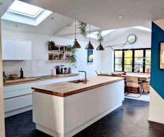
The key to giving the room far more functionality was swapping that small, rather lost island for a peninsula unit adjoining an additional run of cabinets under the window, creating a G-shaped kitchen.
Interestingly, not only has Sophia fitted in masses more storage, she’s managed to make the room look much bigger in the process. The crisp blue and white scheme, along with white walls and reflective wall cabinets, has helped to maximise the light.
The heavy curtains have been removed to ensure maximum light from the glazed patio doors and, in place of the messy noticeboard, there’s now a mirror to boost the light even further.
Check out more of this kitchen-diner.
Interestingly, not only has Sophia fitted in masses more storage, she’s managed to make the room look much bigger in the process. The crisp blue and white scheme, along with white walls and reflective wall cabinets, has helped to maximise the light.
The heavy curtains have been removed to ensure maximum light from the glazed patio doors and, in place of the messy noticeboard, there’s now a mirror to boost the light even further.
Check out more of this kitchen-diner.
2. Maximising restricted wall space
Having three windows along the kitchen wall in this Victorian flat made fitting in units tricky, and the previous arrangement wasn’t really working. The sink was squashed up against the fridge-freezer and had little worktop space around it.
There was also no getting away from the awkward position of the boiler. “There’s just a horrid big combi boiler with lots of pipes under it and, before, it sat in a wonky cupboard,” designer Zoe Willis says.
Easily find and hire kitchen designers through Houzz.
Having three windows along the kitchen wall in this Victorian flat made fitting in units tricky, and the previous arrangement wasn’t really working. The sink was squashed up against the fridge-freezer and had little worktop space around it.
There was also no getting away from the awkward position of the boiler. “There’s just a horrid big combi boiler with lots of pipes under it and, before, it sat in a wonky cupboard,” designer Zoe Willis says.
Easily find and hire kitchen designers through Houzz.
Zoe started by moving the fridge-freezer into a neat cabinet on the other side of the room, giving the sink area room to breathe. She then created a pleasing sense of symmetry with a row of cabinets, a pink-tiled splashback and reclaimed wood shelves.
The white, marble-effect quartz worktop crisps up the look and, as the drainer is neatly integrated, provides plenty of set-down space.
The genius touch here, though, is the carved wood cabinet that hides the boiler. Zoe created it from doors reclaimed from a Victorian school, turning it into a feature rather than a blocky unit. “I wanted to … make [the new cabinet] look as if it was an old pantry that had been there forever,” she says.
Learn more about Zoe’s many design ideas for this eclectic kitchen.
The white, marble-effect quartz worktop crisps up the look and, as the drainer is neatly integrated, provides plenty of set-down space.
The genius touch here, though, is the carved wood cabinet that hides the boiler. Zoe created it from doors reclaimed from a Victorian school, turning it into a feature rather than a blocky unit. “I wanted to … make [the new cabinet] look as if it was an old pantry that had been there forever,” she says.
Learn more about Zoe’s many design ideas for this eclectic kitchen.
3. Opening up an awkward area
Previously, everything in the entrance to this kitchen seemed designed to hamper the owners’ use of the space. The boxy units, the pillar cutting into them, and a large cloakroom on the right all cramped the area and made it awkward to work in or pass through.
Previously, everything in the entrance to this kitchen seemed designed to hamper the owners’ use of the space. The boxy units, the pillar cutting into them, and a large cloakroom on the right all cramped the area and made it awkward to work in or pass through.
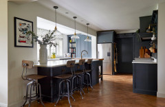
Now, several seemingly simple but incredibly effective changes by Julia Yong of York House Designs have transformed the area and made it into a useful part of the kitchen.
The boxy unit was swapped for a smaller one with rounded corners. That left enough space to extend the small window at the back downwards to bring lots more light into the area.
Julia also removed the pillar, putting in a steel instead, which freed up more worktop space. Fitting Crittall doors between the kitchen and living room has given the kitchen a firmer identity and helped to stop the area feeling like a corridor, while still allowing light to flow through.
But the biggest impact came from relocating the cloakroom to under the stairs and instead building a pantry cupboard on the diagonal. It’s a spacious home for the client’s baking equipment while leaving plenty of room to manoeuvre.
Discover more clever tricks in this kitchen renovation.
The boxy unit was swapped for a smaller one with rounded corners. That left enough space to extend the small window at the back downwards to bring lots more light into the area.
Julia also removed the pillar, putting in a steel instead, which freed up more worktop space. Fitting Crittall doors between the kitchen and living room has given the kitchen a firmer identity and helped to stop the area feeling like a corridor, while still allowing light to flow through.
But the biggest impact came from relocating the cloakroom to under the stairs and instead building a pantry cupboard on the diagonal. It’s a spacious home for the client’s baking equipment while leaving plenty of room to manoeuvre.
Discover more clever tricks in this kitchen renovation.
4. Refreshing existing units
If you’re on a budget and keen to make use of existing fittings, take inspiration from this project. Designer Emma Gurner of Folds Inside was asked to transform this kitchen, which is part of a large living space, in a budget-conscious and waste-free way.
The cabinets themselves were in good order, but they felt a little dated.
If you’re on a budget and keen to make use of existing fittings, take inspiration from this project. Designer Emma Gurner of Folds Inside was asked to transform this kitchen, which is part of a large living space, in a budget-conscious and waste-free way.
The cabinets themselves were in good order, but they felt a little dated.
Emma had the cabinets professionally sprayed in two tones of blue paint – this darker, grounding hue on the base units, and a fresher pale blue on a wall unit and tall cabinet (which can be seen in the full tour), which keeps the area at head height light.
She then fitted modern brass handles to add a luxurious feel and laid red, chevron-patterned encaustic tiles on the floor to chime with the sofa in the living area. She also refreshed the walls and window frames with crisp white paint.
The whole area now feels fresher, lighter and more welcoming.
Look around the whole of this kitchen and living room.
She then fitted modern brass handles to add a luxurious feel and laid red, chevron-patterned encaustic tiles on the floor to chime with the sofa in the living area. She also refreshed the walls and window frames with crisp white paint.
The whole area now feels fresher, lighter and more welcoming.
Look around the whole of this kitchen and living room.
5. Celebrating original features
This is a great example of making the most of classic features – in this case, big sash windows and the chimney breast complete with classic Aga.
The room was quite dingy, with yellow walls not helping matters, so designer Alina Tacutanu of Planet Furniture was keen to brighten it up and fit in as much storage as possible for the family of five without blocking any light.
This is a great example of making the most of classic features – in this case, big sash windows and the chimney breast complete with classic Aga.
The room was quite dingy, with yellow walls not helping matters, so designer Alina Tacutanu of Planet Furniture was keen to brighten it up and fit in as much storage as possible for the family of five without blocking any light.
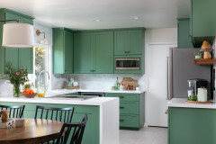
Alina designed an L-shaped kitchen with an island and a large dresser on the other side of the room, all painted green to connect with the foliage in the garden. White woodwork, walls and worktops help to maximise the daylight.
She also included pendant lights over the island, but chose a simple clear glass design so as not to block the view of the windows.
But the centrepiece of the room is the beautifully reconditioned Aga. Alina made a feature of it by adding a mantelpiece above, painted in the same rich green as the units to tie it into the scheme, and backing it with pale pink tiles to brighten the chimney niche and draw the eye.
See more of this kitchen and the adjoining utility room.
Tell us…
Have any of these ideas caught your eye? Share your thoughts in the Comments.
She also included pendant lights over the island, but chose a simple clear glass design so as not to block the view of the windows.
But the centrepiece of the room is the beautifully reconditioned Aga. Alina made a feature of it by adding a mantelpiece above, painted in the same rich green as the units to tie it into the scheme, and backing it with pale pink tiles to brighten the chimney niche and draw the eye.
See more of this kitchen and the adjoining utility room.
Tell us…
Have any of these ideas caught your eye? Share your thoughts in the Comments.

Sponsored
Reload the page to not see this specific ad anymore

Sponsored
Reload the page to not see this specific ad anymore
The original design of this kitchen was a wasted opportunity. The lack of storage and worktop space is apparent in this ‘before’ photo. The island in particular created dead space without offering much in the way of cupboards or a useful work surface.
The challenge for designer Sophia Fish of Golden Feathers Interiors was to pack in lots more storage while making the room feel brighter.