
Kitchen Tour: A Clever Layout Tweak Transforms an Awkward Design
Thoughtful planning and a fresh colour choice have given this kitchen extra storage and a cool, calm and collected mood

After six years of living with their kitchen, homeowners Garrett and Carolyn had a good idea of what they didn’t like about it. The cabinets were ageing and didn’t hold much; the square-tiled floor was out of date and had dirty grout, and the fridge jutted into the traffic flow.
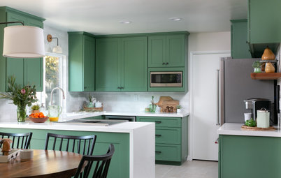
The couple hired designer Chandler Quarles to rethink the layout, add harder-working cabinets, and create a gentle white-and-grey scheme that would feel more at home in Tennessee farm country.
The couple hired designer Chandler Quarles to rethink the layout, add harder-working cabinets, and create a gentle white-and-grey scheme that would feel more at home in Tennessee farm country.
Chandler removed the walk-in pantry and created a new one on the back left side of the room. This meant she could locate the new fridge out of the main workflow and in a more efficient spot.
This move also allowed for more storage and worktop space flanking the range cooker. The work surfaces are marble-look quartz. “I wanted the perimeter counters to be completely durable and a workhorse for them,” Chandler says. Butcher’s block tops the new, larger island. “It’s a beautiful, classic material [that’s] sustainable and brings in the warmth of the natural wood,” Chandler says.
A soft palette of near-off-white walls (Alabaster by Sherwin-Williams) and warm grey cabinets (Dorian Gray by Sherwin-Williams) creates a soothing atmosphere. “I think it’s more peaceful and functional now,” Chandler says.

Need a pro for your complete kitchen renovation project?
Let Houzz find the best pros for you
Let Houzz find the best pros for you
Four rustic elm and metal bar stools complement the wooden worktop. The X detail on either side of the island base adds a bit of character to the design. Grey porcelain floor tiles in a matt finish coordinate with the new colour scheme. “I love the colour of it, and it hides dirt really well,” Carolyn says.
Two rustic pendants crafted from mouth-blown recycled glass hang over the island. (The ceiling lights were edited out of these photos by the photographer.)
Thinking of renovating your kitchen? Find a kitchen designer near you on Houzz, view images of their work and read reviews from previous clients.
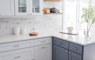
The part-bespoke, Shaker-style cabinets and drawers feature brushed satin nickel handles that complement the stainless-steel appliances. “Part of the benefit of going semi-custom was that we were able to add in some elements that make them look higher-end,” Chandler says. “We also included convenience items such as a lazy Susan, a pull-out trash can, a cookie sheet pull-out and spice racks.”
The gas hob has four burners and a griddle in the centre. A modern, wall-mounted, stainless-steel cooker hood with built-in lighting hangs above. “The gas range is so efficient and much easier to cook on than the electric range we had before,” Carolyn says.
One of her favourite details in the updated kitchen is the glazed white ceramic tile splashback. “It’s kind of like a subway tile, but the square shape makes it different and the variation in colour adds a little bit of subtle interest to the kitchen,” Chandler says.
Glass-fronted wall cabinets on either side of the range lighten up the cooking area and give the family a place to display favourite dishes and collectibles.
The microwave is located in the new walk-in pantry.
The two-bowl white quartz sink is under-mounted for a smooth finish, while the pull-out tap has classic styling that complements other farmhouse-inspired details in the space. Its stainless-steel finish coordinates with the appliances, including a new stainless-steel dishwasher in the island to the left of the sink.
A cabinet above the fridge holds seasonal items, while two baskets store the kids’ photos and toys.
The open doorway leads to a hallway that connects to bedrooms and bathrooms.
The open doorway leads to a hallway that connects to bedrooms and bathrooms.
Bespoke floating pine shelves display art, plants and other items. The drawers hold art and school supplies for the kids, creating a handy drop zone for the family.
These floorplans compare the kitchen layouts before and after the renovation. On top, you can see how the original location of the fridge (top centre) and walk-in pantry (top left) impeded traffic flow.
The new layout, bottom, shows how the new fridge and walk-in pantry locations (left) create a more open and spacious design. “It’s really the centre of the house,” Carolyn says. “It’s a lot more functional and family-friendly, and it makes you enjoy being in there.”
Tell us…
What do you like about this calm, welcoming kitchen? Share your thoughts in the Comments.


Sponsored
Reload the page to not see this specific ad anymore

Sponsored
Reload the page to not see this specific ad anymore
Who lives here? Garrett Keck, Carolyn Maxfield Keck and their two children
Location Spring Hill, Tennessee, USA
Room dimensions 260 sq ft (24 sq m)
Designer Chandler Quarles of Peach and Pine Home
‘After’ photos by Ruby & Peach
The previous kitchen, seen here, had basic oak cabinets, a small, central island with a short overhang, worn solid-surface worktops and a poorly installed tiled floor.
The couple disliked how the walk-in pantry, located behind the tall cabinets beyond the fridge, felt separated from the main work area and wasted space. “It was blocking off that whole side of the kitchen,” Chandler says.