Houzz Tours

Kitchen Tours
London Kitchen

Kitchen Tour: A Wraparound Extension Creates a Sociable Space
Earthy colours, beautiful materials and clever design tricks helped to create this cost-conscious but stylish kitchen

Extending at the rear and into the side return gave the owner of this Victorian house the kitchen she’d dreamed of, taking it from a small, dingy room to a light space that’s sociable and a pleasure to use.
Architect Richard Skinner of Archea worked closely with her to create the kitchen, keeping costs down while adding character. “The owner has a strong, eclectic taste and is excellent at styling,” he says. The result is a design that’s both functional and gorgeous.
Architect Richard Skinner of Archea worked closely with her to create the kitchen, keeping costs down while adding character. “The owner has a strong, eclectic taste and is excellent at styling,” he says. The result is a design that’s both functional and gorgeous.
This is the rear of the property before work began.
The extension wraps neatly around the ground floor, with reclaimed London Stock brick blending beautifully with the original house.
Make the challenge of finding the right people for your project easier by searching the Houzz Professionals Directory.
Make the challenge of finding the right people for your project easier by searching the Houzz Professionals Directory.
The before and after floorplans show how the small back room was extended. The sectioned-off space behind the new kitchen – in the top left-hand corner of what was the old room – is a utility/cloakroom (not featured in the photos).
This plan also shows how Richard left space for a courtyard garden at the house end of the old side return. The front rooms on this floor have been designed so they could be rented out as a standalone flat in the future, and the courtyard would provide outside space for tenants.
This plan also shows how Richard left space for a courtyard garden at the house end of the old side return. The front rooms on this floor have been designed so they could be rented out as a standalone flat in the future, and the courtyard would provide outside space for tenants.
This was the small room at the back of the house that now forms the utility room and the corridor into the kitchen.
The strip of wall to the left of the window is the corner of the original house that is now…
The strip of wall to the left of the window is the corner of the original house that is now…
…the brick pillar at the end of the island.
Richard likes to retain a trace of the original structure, so he left the brick exposed. “It’s always nice to have a reference to any original features, where the old building stops and the new starts,” he says. “We left some of the black-painted render at the bottom, too [see the external photo].”
Keeping this section of wall also had a significant impact on the amount of steelwork required – and therefore the cost. “This pillar is doing the most work in the house, as it’s going up three storeys,” Richard says. “Keeping it made the project both easier and cheaper, and it creates a nice feature aesthetically.”
The wooden floorboards are also a nod to the past. “We restored the flooring in the original room, so that also marks the old section,” he says. The kitchen flooring is micro-cement. “There’s a clear contrast between the gnarly timber in the old section and the very smooth cement in the new,” he adds.
The original room at the back mostly acts as an entrance to the kitchen. On the right of the corridor is the previously mentioned utility room/cloakroom. The other side has a boiler cupboard and shelving. Richard kept the original chimney (where the poster is), “so it didn’t incur a whole extra cost”.
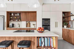
To keep work time and costs down, Richard used Ikea cabinets, but with customised doors for a more personalised look. The wall units are wood-veneered MDF and the base and tall units are basic Ikea doors spray-painted dark blue. Beautiful, diamond-cut metal handles and Carrara marble worktops add a luxe finish.
Storage-wise, along with the wall cabinets, there are drawer units on either side of the range cooker and a larder cupboard to the left, which has drawers low down and shelves above. The island contains a dishwasher, rubbish bins and general storage.
The owner wanted an American-style fridge-freezer. As it’s deeper than the units, Richard built a neat surround. He added cupboards above to close up the gap and make the most of the space.
Cross knurl metal pull-bar handles, Buster + Punch. Veddinge cupboard doors (spray-painted blue), Ikea. 1082 range cooker, Mercury.
The frosted door leads to the tiny courtyard in what was once the end of the original side return. If the front section of the house is rented out, the frosting will give the tenants privacy while still allowing light into this back corner of the kitchen.
The tap is a boiling-water design.
Kubus sink, Franke. Fusion boiling-water tap, Quooker.
The tap is a boiling-water design.
Kubus sink, Franke. Fusion boiling-water tap, Quooker.
The pendant lights over the island and the matching wall lights add touches of warm brass that work beautifully with the dark green, blue and ochre. The diamond-cut, cross-knurl finish matches the cabinet handles.
The bench behind the dining table is another cost-conscious idea. The wooden top sits on standard Ikea wall cabinets designed to go above a fridge, adding storage to this otherwise dead space. “Structurally, they’re fine,” Richard says. “They’re the right height, and you can have them as drawers or cupboards. Here, we’ve left a cabinet off the end so there’s access for the cat.”
Hooked pendant lights in Brass, Buster + Punch.
You might also enjoy How Much Does an Extension Cost?
Instead of a run of bifold doors, the back wall features modern French windows in the dining area and a smaller window on the kitchen side, which can be opened for ventilation.
Richard built in a window seat as an added feature. “It’s a snug perch from which to look into the garden,” he says, “and it gives the opportunity for someone to sit and socialise with whoever’s cooking.
“Not having glazed doors right across also saved money,” he adds. “And being able to look at a garden rather than opening up the back completely feels more relevant in Britain [where the weather isn’t always great].”
Tell us…
What do you like best about this extension and kitchen? Share your thoughts in the Comments.

Sponsored
Reload the page to not see this specific ad anymore
Sponsored
Reload the page to not see this specific ad anymore
Who lives here? A professional woman
Location North-east London
Property A Victorian mid-terrace house
Kitchen dimensions Roughly 5m x 5m, plus the corridor beside the utility room
Architect Richard Skinner of ARCHEA
Richard and the team designed the extension as a crisp, light space, partly to create the perfect backdrop for the earthy colours of the cabinetry and furniture. “The space is simple and white, so the integral architecture isn’t competing with the added bits,” he says.
As well as ensuring it wouldn’t fight with the rich colours and materials, creating a simple shell helped to keep costs down. “We see what we can get out of a design without it becoming really complex, testing what we can do with bricks, blocks and square windows,” Richard says.
He chose standard rooflights for just this reason. “They’re not cheap, but they’re really not expensive like bespoke glazing. We try to standardise as many elements as possible and keep things simple, and that helps to keep costs down, but also helps the coordination and management of the project, which helps everyone to feel a bit more sane during the process,” he says.