Houzz Tours

Room Tours
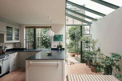
London Room Tour
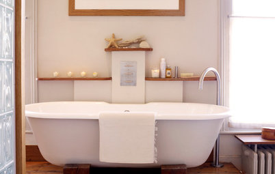
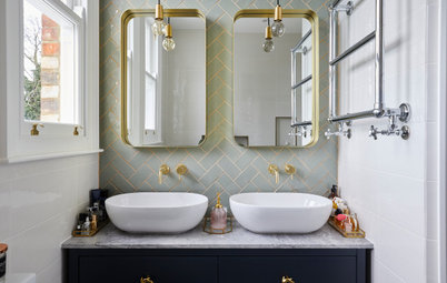
Room Tour: A Small Bathroom in a 1930s House Gets a Spacious Redo
This bijou bathroom in a period house lost a wall to gain a generous walk-in shower and a sleek freestanding bath

When interior designer Julia May Yong of York House Designs suggested the owners of this bathroom combined their previously separate loo and adjacent bathroom, they were hesitant. “It comes up a lot with 1930s houses,” Julia says, “and people can be daunted by knocking down walls, as they often can’t decide whether having a separate loo is valuable or not.” And is it? “I’d say a combined bathroom is almost always more valuable. I’ve spoken to estate agents about this, too, and they agree.”
Scroll down to see the transformative result of this decision and you may well be swayed, too.
Scroll down to see the transformative result of this decision and you may well be swayed, too.
The couple also wanted to incorporate colour into the new design while keeping the space feeling bright and airy. The room was going to have to work very hard… but without looking as if it was.
Julia’s clever spatial planning meant she was able to pull it all off: she created a colourful, light and spacious-feeling room with a luxurious freestanding bath, a statement basin and a 1m-wide walk-in shower.
Julia’s clever spatial planning meant she was able to pull it all off: she created a colourful, light and spacious-feeling room with a luxurious freestanding bath, a statement basin and a 1m-wide walk-in shower.
The bathroom was originally two adjacent rooms.
Ready to renovate? Find reviewed bathroom designers in your area on Houzz.
Ready to renovate? Find reviewed bathroom designers in your area on Houzz.
To maximise and square off the new space, Julia persuaded the couple to forfeit a small section of their landing, which she was then able to incorporate into the new bathroom. You can see the space taking shape here.
Julia’s 3D plan of the proposed design shows how she made room for the shower.
Notice how the shower screen has a secondary hinged panel. This makes a huge difference, as Julia explains. “The screen can be folded back, so it doesn’t extend too much into the room when not in use, but folded out for more splash protection when it is,” she says.
“They wanted the biggest shower possible without taking up too much of the room, and this allows for it to feel very generous when you’re showering. When you’re not, the room still feels really spacious. I use these shower screens a lot,” she says.
Julia has introduced strong colour without it dominating the space. “We were exploring two different colour schemes and wanted something a little bit fun but still very calm,” she explains. “It was either navy- or green-based. In the end, they were more drawn to this colour combination, which struck just the right balance.”
Julia wanted to create a look she describes as “modern with hints of the era of the property”.
This earthy red concrete basin, with its 1930s-esque fluting, leads the style perfectly. With great luck, Julia found it second-hand. “I’d been looking for that basin in that size and that colour for a while,” she recalls. “It was mind-blowing that I found it on eBay!” It was slightly damaged, but Julia was able to get it repaired – and the owners were delighted with the bargain.
As the basin is right in front of you as you walk in, the owners didn’t want to have storage below and liked the idea of it floating. There’s a mirrored cabinet on the opposite wall for storage.
Kast concrete basin, eBay. Brushed black chrome taps, Coalbrook.
The black-framed round mirror incorporates warm and cool lighting, which saves space.
“I like having the two mirrors opposite each other, reflecting the bathroom backwards and forwards to infinity,” Julia says.
“I like having the two mirrors opposite each other, reflecting the bathroom backwards and forwards to infinity,” Julia says.
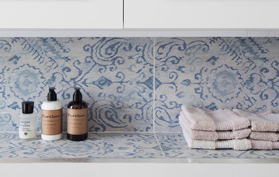
The limestone-look porcelain wall and floor tiles are slightly textured and feature flecks that pick out the red of the basin, the black of the taps and the blue of the feature tiles. “They have enough interest to be used everywhere – a completely plain tile could have been a bit stark,” Julia says.
Saint Stone White wall and floor tiles, Boutique Stone.
Saint Stone White wall and floor tiles, Boutique Stone.
Julia took the boxing for the loo up to the level of the window ledges and created flush windowsills, which gives a nice crisp, clean finish.
A matt black flush and towel rail tie in with the taps.
A matt black flush and towel rail tie in with the taps.
The slimline mirrored cabinet provides enough storage for bathroom essentials. The couple also have a decent-sized utility room on the ground floor, so don’t need to store much else in here.
There’s also storage for carefully chosen items on the shelf that runs along the whole of this wall and under the window. The shelf is very subtly sloping along this wall: the gradient allows any water to run back into the shower rather than pool on the shelf.
There’s also storage for carefully chosen items on the shelf that runs along the whole of this wall and under the window. The shelf is very subtly sloping along this wall: the gradient allows any water to run back into the shower rather than pool on the shelf.
Julia sourced a smaller-than-standard, freestanding, double-ended modern bath. “We needed to go slightly smaller than average for it to fit and feel to scale,” she says. “It’s 1600mm, which is a really uncommon size and took a lot of hunting for.” It’s fitted with enough space between the rim and the tiles to allow for cleaning.
“We spent some time contemplating how to lay out the blue tiles – whether to go for herringbone, stacked or brick formation,” Julia says. “We opted for a vertical stack. It gives the illusion of more height and feels playful and a little bit retro. It also ties in with the fluted details we’ve gone for elsewhere.”
Julia opted not to use a tile trim. “We used the raw edge of the wall tiles because it’s a really good-quality, full-bodied tile, so the edge is really neat,” she says. “The builder polished the edge, too, so it feels smooth to the touch.”
The neutral wall tiles are laid with a grout that blends as closely as possible for a streamlined effect. With the blue tiles, though, Julie specified a more visible grout – a mid blue-grey shade. “This highlights the pattern we’d spent a while thinking about,” she explains.
More: 8 Questions to Ask Your Tiler
So how do the owners feel about the transformation? “They love it,” Julia says. “Previously, it was just a shower over the bath and everything was quite compact – and when I first said that in knocking it into one room we’d be able to get in a separate shower, they didn’t quite believe me. So they were delighted when that became a reality!”
Tell us…
What do you like most about this clever bathroom transformation? Let us know in the Comments.
Tell us…
What do you like most about this clever bathroom transformation? Let us know in the Comments.

Sponsored
Reload the page to not see this specific ad anymore
Who lives here? A couple
Location Raynes Park, south-west London
Property A 1930s semi with three bedrooms and one bathroom
Bathroom dimensions 2.4m x 2.5m
Designer Julia May Yong of York House Designs
Project year 2022
Photos by Ben G Waller for Boutique Stone
When the owners described to Julia what they wanted from their new bathroom, a walk-in shower was top of the list. They didn’t want to lose their bath, though, nor the opportunity for a little storage – and there wasn’t much space to play with.