


Room Tour: A Clever Bathroom Rejig Squeezes in a Walk-in Shower
Previously, this family bathroom only had room for an over-bath shower and was short on storage. Look at it now...
Kate Burt
13 July 2020
Houzz UK. I'm a journalist and editor, previously for the Independent, Guardian and various magazines. I'm now excited to part of the editorial team at Houzz UK & Ireland, bringing the best of British and Irish design, interiors and architecture to Houzz.com.
Houzz UK. I'm a journalist and editor, previously for the Independent, Guardian and... More
Homeowner and interior designer Aysha Rahman had lived with a bathroom she didn’t love for some time when she asked architecture firm Model Projects to help her to create the spa-like space of her dreams.
Key practical needs for the small room were to squeeze in more storage and a separate shower, to replace the bath with something that felt bigger, and to swap the single sink for double basins. Aysha also wanted the room to have an opulent feel.
It was a lot to ask of a small space, but the results speak for themselves. See how the transformation took shape…
Room at a Glance
Who lives here? A family of five, with three boys aged 7, 13 and 16
Location North London
Property A four-bed Victorian terrace
Room dimensions 5 sq m
Architectural designer Fatimah Ishmael of Model Projects
Interior designer Aysha Rahman
Photos by Chris Snook
When Aysha and her family moved in, the first floor bathroom and loo were separate but adjacent. With three children plus Aysha and her husband using the small room, it wasn’t practical, so, as a quick fix, she simply had the partition removed. She did, however, have much bigger plans for the space.
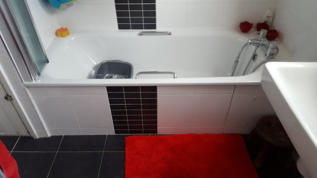
Originally, the newly unpartitioned room had a bath, a loo and a single basin. As seen in this ‘before’ photo, there was also a big cupboard containing the water tank. The tank took up so much space, the cabinet couldn’t even be used as an airing cupboard. “You could get a few bath toys in and that was it,” Aysha explains.
She scoured Houzz for ideas and also saved stories she’d read on small bathroom design. “That was really helpful,” she says.
She scoured Houzz for ideas and also saved stories she’d read on small bathroom design. “That was really helpful,” she says.
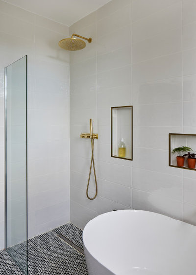
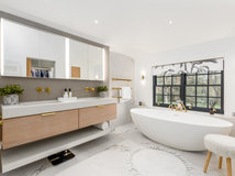
Removing the water tank – now located in the cellar – was key to unlocking the space, as you can see in this ‘after’ shot, taken from the same angle. A walk-in shower now occupies the space, and there’s room for a generous-sized bath.
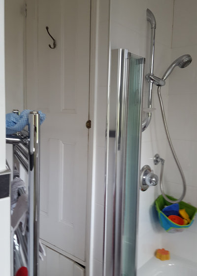
The shower is designed without a shower tray, wetroom style, in order to save space. The floor is angled slightly to allow water to flow into the large shower drain.
“I knew having a tray would make it look cluttered, because of the shape of the room and because we were squeezing quite a lot of functionality into a small space,” Aysha says.
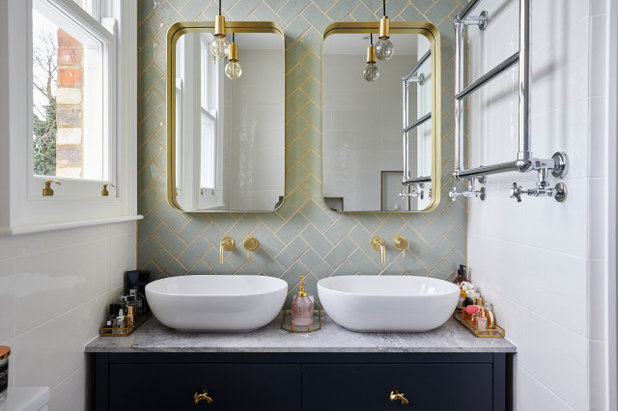
Moving the door was another significant layout change that allowed better use of the space – including making room for more sanitaryware. “I’d always wanted ‘his and hers’ basins,” Aysha says. “I got lots of ideas from Houzz, as well as inspiration for tiles and feature walls.”
The need was partly practical. “The double basin is good for the boys: two people can be brushing their teeth at the same time, and our youngest likes to be with us, so we do all that together,” she says.
Aysha’s seven-year-old in particular likes bathtime in here. “He loves it – it feels like a swimming pool to him because it’s so big,” she says.
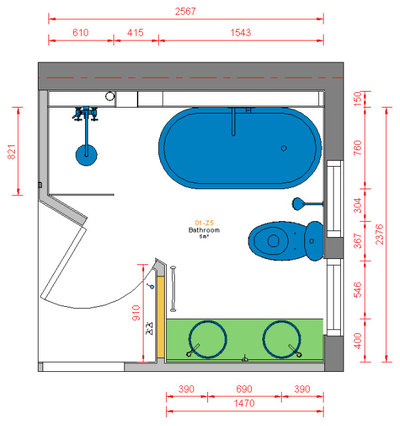
This ‘after’ floorplan shows the bathroom’s new layout.
Aysha says all the houses on the street have this unusual angled wall where the door now is. In fact, the door to the original bathroom was in this position, too, but Aysha had had it blocked up when the partition wall came down. For a while, entry into the room had been through the original door to the loo (see the next image). She simply closed this up and reinstated the original doorway – gaining a useable corner for the vanity unit.
Aysha says all the houses on the street have this unusual angled wall where the door now is. In fact, the door to the original bathroom was in this position, too, but Aysha had had it blocked up when the partition wall came down. For a while, entry into the room had been through the original door to the loo (see the next image). She simply closed this up and reinstated the original doorway – gaining a useable corner for the vanity unit.
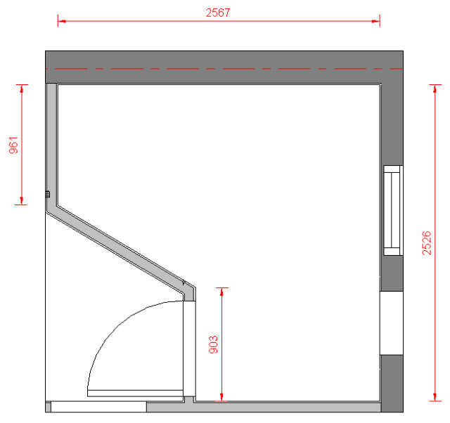
This ‘before’ floor plan shows the shape of the room and door position before the renovation.
As you walked through the door the loo was immediately in front of you and the original partition wall would have been on your left. Next to the loo, beneath the larger of the two windows, there was a single basin, and next to that a bath and over-bath shower. The airing cupboard and water tank would have been top left in this plan.
The plan also shows the disparity in window sizes in the room; the area that had originally been the stand-alone loo had a smaller window.
Architectural designer Fatimah applied for Planning Permission to change the window, as it affected the facade of the house. “The windows were mismatched; one was big and one was smaller and high up. It made the room look very odd,” Fatimah says.
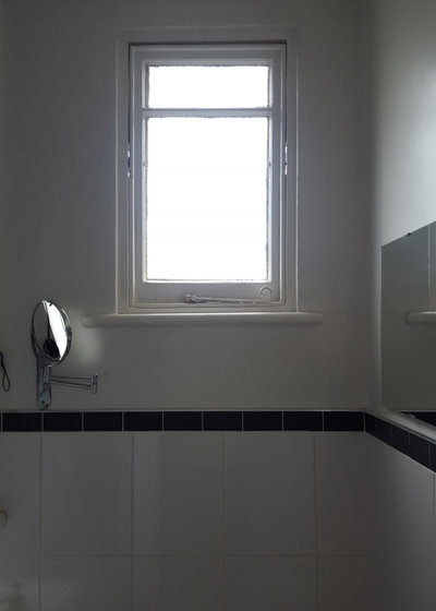
This ‘before’ photo shows the window before it was enlarged.
Browse reviews of architects and building designers in your area in the Houzz Professionals Directory.
Browse reviews of architects and building designers in your area in the Houzz Professionals Directory.
“I saw another house on our street had done the same [with the windows],” Aysha says, “so I thought, as there was precedence, it must be possible in terms of Planning Permission.”
See the kitchen extension in the same house.
See the kitchen extension in the same house.
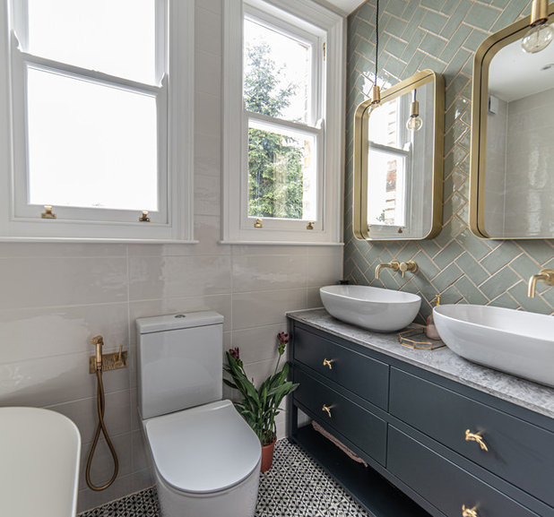
The loo was also moved along the wall from its original position, which had been directly beneath the right-hand window. As the loo’s new position wasn’t far away, connecting it to the existing waste pipe was fairly simple.
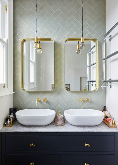
The vanity unit was a standard design, configured to fit perfectly in the space. It has four generously sized drawers, plus a shelf underneath for towels.
Aysha went for an almost-black colour for the unit. “Monochrome has been a big influence around the rest of the house,” she says. She added the gold, fish-shaped handles and a marble top for a dash of opulence.
Vanity unit, Harvey George; painted in Railings, Farrow & Ball. Gold fish handles, Anthropologie. Mirrors, Made.com. Lights, Not On The High Street. Floor tiles, Fired Earth. Wall Tiles, Topps Tiles. Brassware and sanitaryware, T Patton.
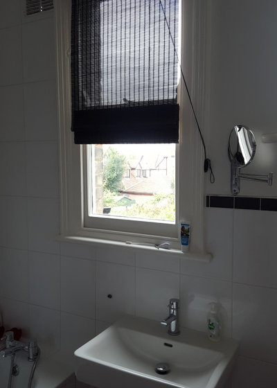
The window above the original basin, before the renovation.
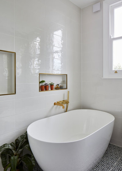
Previously, the shower was over the bath. Now this is no longer necessary, Aysha was able to choose a more decadent bath design, and this freestanding model combines elegance and luxury.
She initially wondered whether adding the shower and having a large bath would overload the room. “Though the bath is bigger than the one we had, it hasn’t taken much more space,” she says. “The design is tapered; it widens at the top. It’s a deceptive shape, as it looks huge, but doesn’t take up much space.
“We also have a high ceiling, which adds to the illusion of space, and two big windows now, too.” She also points out that the frameless glass shower screen is discreet and gives the impression of a more open room.
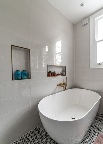
Fatimah created niches in the wall for handy storage near both the bath and the shower.
This was possible because the wall had to be built out by 20cm to accommodate the taps, so nooks could be fitted into the resulting hollow space behind.
This was possible because the wall had to be built out by 20cm to accommodate the taps, so nooks could be fitted into the resulting hollow space behind.
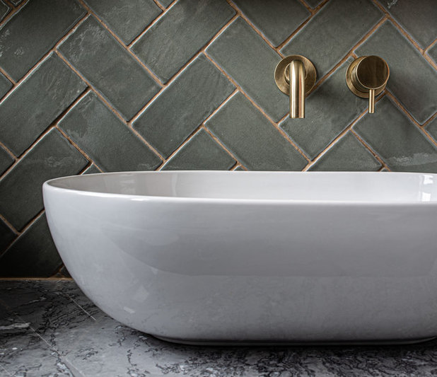
Aysha wanted a marble countertop, but saved money by sourcing an off-cut from a local stone merchant.
Off-cut marble, Granite Direct.
Tell us…
What’s your favourite element in this family bathroom? Let us know in the Comments.
Off-cut marble, Granite Direct.
Tell us…
What’s your favourite element in this family bathroom? Let us know in the Comments.

Related Stories

House Tours
Houzz Tour: A Midcentury Home With a Strong Indoor-outdoor Link
By Becky Harris
A nature-inspired renovation has given this ranch house a relaxed mood and a connection to the outdoors from most rooms
Full Story

House Tours
Houzz Tour: Warm Tones and Luxurious Surfaces in a City Townhouse
An earthy colour palette, hidden storage and well-placed texture add character and practicality to this London home
Full Story

Room Tours
Kitchen Tour: A Gorgeous Extension With a Leafy Glasshouse Feel
By Kate Burt
When the owners of this terraced house extended, they were keen to retain its period feel and highlight the garden
Full Story

Gardens
Garden Tour: A Bare Roof Terrace Becomes a Pretty, Sociable Space
By Kate Burt
A retired couple got help transforming their large rooftop into a gorgeous, welcoming, multi-functional retreat
Full Story

House Tours
Houzz Tour: A Smart Layout and Genius Storage in a Victorian Home
Flipping the standard layout and carving out excellent storage have turned this tired house into a brilliant family home
Full Story

House Tours
Houzz Tour: A Victorian House Brought Impressively Up to Date
By Jo Simmons
A cohesive layout and warm colours combined with energy-efficiency measures thoroughly modernise this terraced home
Full Story

Kitchen Tours
Kitchen Tour: An Open, Airy Space Made for Entertaining
Combining two separate rooms has improved flow and created a sociable open-plan kitchen, dining and seating space
Full Story

House Tours
Houzz Tour: A Family Home Inspired by its Seaside Location
Coastal colours and practical design combine to create a house that will adapt as the family grows
Full Story

Kitchens
5 Inspiring Before and After Kitchen Transformations
Whether you want to boost storage, incorporate original features or maximise your space, take ideas from these designs
Full Story

House Tours
Houzz Tour: An Airy, Scandi Finish for a Tall Victorian House
By Kate Burt
From a tricky inherited bath to a sticky-out staircase, on-site problem-solving led to a seamless update for an old home
Full Story
Very nice design.
If I might say. My experience from free standing baths is the plumber has to seal the bottom edge properly all the way around as water can get under and cause leaks. When the bath is pushed against a wall it’s impossible to gain access to seal it properly on that bottom edge. Just something to bear in mind. 🙂
Love it 😍 where are the tiles from please? They’re gorgeous!
Quite an achievement within the constraints of size/shape/brief!
I always feel that with a wet room shower some of the sudsy/dirty water will encroach on the bath area and mean cleaning the floor after every shower. The tiles behind the bath are awkward to access as well and splashes (soapy?) are inevitable with young children...
But it all works so Bravo!