Decorating
Room Tours
Room of the Week: A Modern Extension Links Elegantly With a Period Home
Timber wall cladding and a concrete floor add a vibrant modern spin to this new extension

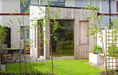
From the outside, this 1920s semi-detached property in East Belfast looks like any other house in the street. Once inside, however, it’s clear it isn’t like the others, because at the rear is a light-filled, modern extension that totally transforms the back half.
“The owners had a clear brief,” explains Paul Moore, architect at Belfast-based McCann Moore Architects, who was tasked with all aspects of the project – even designing the patio and planters. “They wanted to create a bigger, brighter kitchen and living area that connected with the large garden.”
“The owners had a clear brief,” explains Paul Moore, architect at Belfast-based McCann Moore Architects, who was tasked with all aspects of the project – even designing the patio and planters. “They wanted to create a bigger, brighter kitchen and living area that connected with the large garden.”
The owners wanted the space to be big, bright and modern, but link seamlessly with the older parts of the house. They were also keen that it have a strong relationship with the outside.
“The wooden cladding idea evolved during the project,” explains the architect. “We always wanted something to define this wall in some way. The wood was sourced by the builder from an old church on the north coast of Ireland. Behind it is a small cloakroom and utility room.”
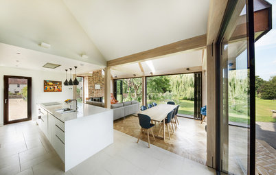
The folding ceiling detail was introduced primarily to deal with the different ceiling heights. In the original kitchen (now the dining room), the ceiling is around 2.5m high, but as the new extension has such a big volume, it required a taller ceiling height of just over 2.8m.
“It would have been easy to just butt the lower ceiling against the higher one at the junction between the two, but we used this as an opportunity to do something quite graphic,” he explains. “I wanted to make the wall alongside the kitchen look as if it’s folded over. I wanted it to become something monolithic and, I guess, sculptural.”
“The wooden cladding idea evolved during the project,” explains the architect. “We always wanted something to define this wall in some way. The wood was sourced by the builder from an old church on the north coast of Ireland. Behind it is a small cloakroom and utility room.”
The folding ceiling detail was introduced primarily to deal with the different ceiling heights. In the original kitchen (now the dining room), the ceiling is around 2.5m high, but as the new extension has such a big volume, it required a taller ceiling height of just over 2.8m.
“It would have been easy to just butt the lower ceiling against the higher one at the junction between the two, but we used this as an opportunity to do something quite graphic,” he explains. “I wanted to make the wall alongside the kitchen look as if it’s folded over. I wanted it to become something monolithic and, I guess, sculptural.”
Moore played with the existing layout to enhance the function and aesthetics of the entire ground floor.
“The former dining room became a study and has access to the rear extension through a sliding glass door,” says Moore. “The existing kitchen became a new dining area with bi-folding doors out onto a patio area. This small patio brings light into the dining area, the study and the kitchen and is a cool space to hang out in, both for a morning coffee and a late-night drink.”
The owners sourced the sliding glass door and simple, stainless-steel rail to complement the industrial aesthetic of the dining area.
Discover alternative ideas for internal doors
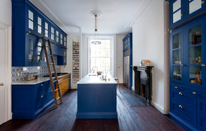
Period details and original fixtures are still in abundance in the downstairs study. “The room acts as a transition between the old and new,” Moore says.
There’s a mix of midcentury modern furniture and industrial accents in the new dining space.
“The dining area sits in the spot originally occupied by the (tiny) kitchen and an outside loo,” says the architect. “It utilises that ‘awkward’ area that used to be the kitchen in so many houses from this period.”
Dining table, Terry Design. Wishbone chairs by Hans J Wegner, available at The Conran Shop.
The cloakroom (which is located on the other side of the wall hung with artwork) is within the original footprint of the house.
“There’s no clear definition between old and new in the plan. The old layout ‘bleeds’ into the new one,” says Moore. “This seamless link is very important when it comes to extending houses.”
A steel beam needed to be fitted in this area to carry a floor above. “Rather than covering this up, we exposed it and it served as a design clue for this area,” says Moore.
More design tips to enhance an open-plan space
The timber cladding adds an authentic rustic touch to the modern silhouette. A pocket door slides neatly back to reveal an orderly utility room.
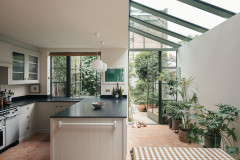
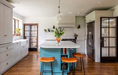
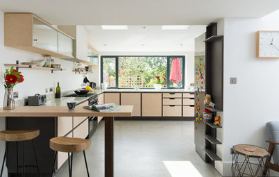
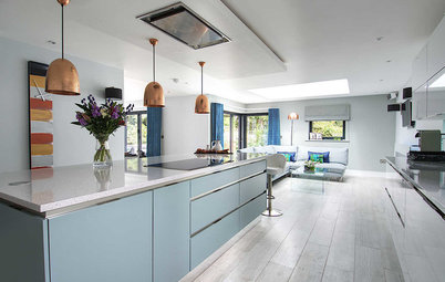
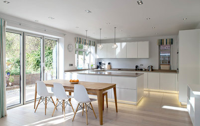
Clean and crisp, the new pale grey kitchen echoes the overall design ethos of the extension. “The original kitchen was a sink unit, a gas oven and a few wall units,” explains Moore.
A roof light ensures this space is nice and bright. “We use overhead lightwells often in kitchens to give another dimension and bring more light in,” he adds. “We also brought the window glass down to worktop level [see the first image] so the work surface runs right into the window recess. It’s a simple trick that gives the worktop a lot more depth.”
Worktop, Corian. Appliances, Siemens.
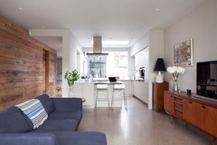
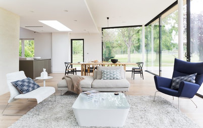
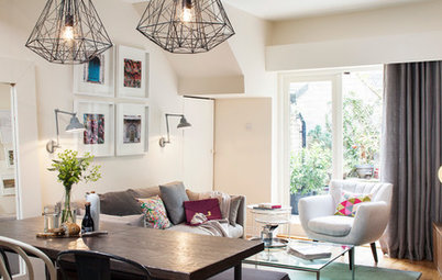
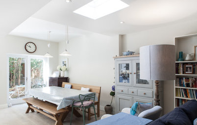
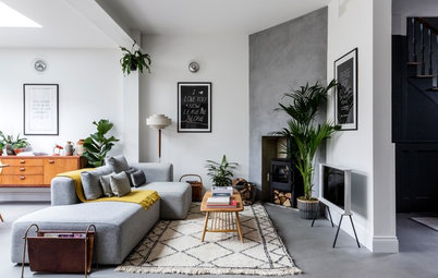
The light-filled living space leads directly into the garden. The sofa was an online find, while the clients sourced other objects from furniture reclamation stores.
“The owners always knew they were going to do this extension, so had been collecting stuff over a number of years,” explains Moore. “The original 1950s leather sofa that had been in storage prior to the extension became very popular with their dogs and didn’t stand up to the abuse!”
What do you think of this modern extension? Share your thoughts in the Comments below.

Sponsored
Reload the page to not see this specific ad anymore
Who lives here A family with two young children and three dogs
Location East Belfast
Room dimensions The extension is around 34 sq m; part of a 1920s semi-detached red brick house with 3 bedrooms and 1 bathroom
Architect Paul Moore of McCann Moore Architects
The extension blends seamlessly with the old property. “From entering through the front door, the house remains traditional both in form and appearance,” says architect Paul Moore. “The main changes happen at the rear, where the new kitchen and living area extend into the garden, built on the footprint of an old, detached garage. In reality, very little of the original garden was lost.”
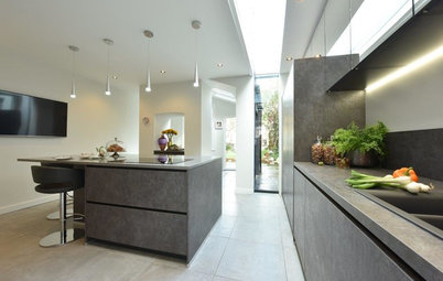
Polished concrete flooring creates a modern, industrial vibe and is both practical and good looking.