
Room of the Week: An Open-plan Living Area Gets a Clever Refit
A new layout and cleverly scaled furnishings filled the ground floor of a bijou terraced house in Dublin with light and personality

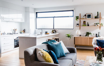
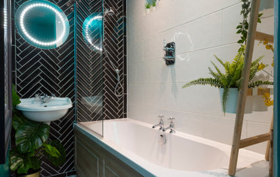
Karinda Tolland and husband Donnacha had rented their early 20th century terraced house in the historic heart of Dublin for around five years before they decided to buy it in 2013 and transform it into their perfect home. ‘They’d always planned to move out, but then the recession hit,’ explains designer Roisin Lafferty. ‘It was very much a rental property before they committed to it. There was little natural light and the layout didn’t make the most of the limited space.’
With friends and family visiting from all over the world – Karinda is originally from Australia and met Donnacha while travelling – the couple were keen to transform their dark, space-challenged house into a light, bright and sociable home.
‘When I first came on board to tackle the ground floor, they’d already spent some money refreshing the space – painting the walls white and tiling the kitchen – but they needed some help with the layout,’ says Roisin. ‘It’s a compact house, so we had to find a way to reflect their personalities and passion for travel without overpowering it.’ Karinda also had her heart set on a dining area, even though they didn’t think they could fit one in.
‘Dividing up the space was the biggest challenge,’ recalls Roisin. ‘I adopted a zoned approach to define the different living areas and we scaled back the size of the furniture and made it ourselves to fit the proportions of the room.’
The finished result is a triumph of small-space living that successfully marries quirky style and functionality.
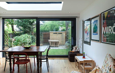
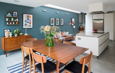
Roisin used clever tricks – such as placing full-length mirrors at either end of the dining table – to create the illusion of light and space. ‘It really gives the impression there’s another room and it’s a lovely way of bouncing the light from the garden into the back of the house,’ she explains.
Blackboard paint on the wall by the kitchen is a playful touch. ‘Karinda and her friends are very artistic, so we wanted to have a little fun as well,’ says Roisin. The cabinet on the wall was made bespoke and is inlaid with another mirror to contrast with the matt black paint.
Sculptural pendants above the dining table lend an industrial-style vibe to this zone. ‘I’ve used different lighting throughout the different zones downstairs in order to define each area,’ explains Roisin.
Hive pendant lights, Made.com.
Check out 8 smart ways to use oversized mirrors
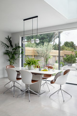
Roisin answered Karinda’s desire for a dining table with a space-saving design of her own. ‘The solid ash table is narrower than conventional dining tables,’ she says, ‘but it has a concealed extendable section, so it can seat up to 10 people if necessary.’
The ash was stained dark to give it a more ‘solid’ appearance and Roisin painted the wall at the back mid-grey to add depth to the scheme.
The ash was stained dark to give it a more ‘solid’ appearance and Roisin painted the wall at the back mid-grey to add depth to the scheme.
A mix of black and white chairs lines one side of the dining table, adding to the industrial vibe of the dining zone. ‘We opted for a bench on the living room side that can double up as extra seating for this area,’ explains Roisin. ‘It’s very versatile and stops the look becoming too homogeneous.’
Black chairs, Tolix.
Black chairs, Tolix.
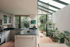
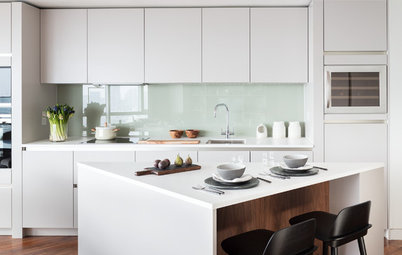
The small kitchen was already in good order and only required a few finishing touches. ‘It was important to maintain the sense of flow and continuity in the space, so we had a new breakfast bar made to complement the design of the dining table, and Tolix bar stools were chosen to reference the dining chairs,’ says Roisin.
Bar stools, Tolix.
Discover inventive ways to big up a compact living room
Bar stools, Tolix.
Discover inventive ways to big up a compact living room
A striking painting of two cows, by a friend of Karinda’s, takes centre stage in the living room, hinting at the couple’s love of travel and Karinda’s favourite destination – India. ‘It’s a personal touch that allows their personality to shine through without dominating the space,’ says Roisin.
Roisin added softness to the industrial-style vibe with a selection of quirky cushions and a vibrant rug that picks out the colour in the cow painting.
Angled wall lamps gently illuminate a quartet of graphic prints – from Roisin’s studio – on the wall in the living room area, helping to define this zone. ‘The lights are on different circuits,’ explains Roisin. ‘So the different zones can be lit up according to the mood you want to create.’
Wall lamps, House Doctor.
Wall lamps, House Doctor.
The graphic prints have an Indian theme, but were mainly chosen to add colour to the white wall.
The soft grey sofa was chosen for comfort. ‘Karinda wanted something she could snuggle up on,’ says Roisin. The turquoise rug adds depth.
‘When it came to choosing a coffee table, we didn’t want anything that would impact on the rest of the scheme,’ she adds. The simple metal and glass structure sits lightly in the space and helps to reflect daylight from the window.
Sofa, The Conran Shop. Rug, Bluebellgray.
‘When it came to choosing a coffee table, we didn’t want anything that would impact on the rest of the scheme,’ she adds. The simple metal and glass structure sits lightly in the space and helps to reflect daylight from the window.
Sofa, The Conran Shop. Rug, Bluebellgray.
Roisin had the armchair, from House of Fraser, reupholstered. ‘It was originally yellow, which wasn’t a good fit with the scheme,’ she explains. The colourful cushion echoes the graphic print – also by Roisin’s studio – on the sideboard.
The dark grey curtains were chosen to add warmth to the space and are actually two pairs of ready-made curtains that have been tailored and sewn together. ‘We were on quite a tight budget, but the curtains work beautifully,’ says Roisin. ‘It goes to show you don’t always have to spend a lot of money to achieve a “designer” feel.’
Armchair, House of Fraser. Cushion, Etsy.
‘Storage was a problem for the couple, so we designed this cabinet with style and function in mind,’ says Roisin. The raw walnut finish blends nicely with the scheme and the unit has been designed without legs, so it sits on the floor and doesn’t dominate the room.
Lamp, Habitat.
TELL US…
What did you like about this space? Share your thoughts in the Comments below.
MORE
Enjoy browsing inspiring Houzz Tours
Lamp, Habitat.
TELL US…
What did you like about this space? Share your thoughts in the Comments below.
MORE
Enjoy browsing inspiring Houzz Tours

Sponsored
Reload the page to not see this specific ad anymore
Who lives here Karinda Tolland with husband Donnacha and their baby girl
Location Smithfield in Dublin, Ireland
Size The open-plan, ground floor space is 35 sq m / 375 sq ft
Designer Roisin Lafferty of Kingston Lafferty Design
The ground floor of the couple’s house is essentially one open-plan room. ‘Before the renovation it was quite a gloomy space,’ recalls Roisin. ‘The doors leading out to the garden were in dark timber and the space didn’t flow very well.’
After painting the garden doors white, Roisin left the windows unobstructed to allow as much light as possible to filter into the space. ‘I created the pelmet for the curtain above the door frame and it extends over each side, so when the curtains are open, they’re not covering the window at all.’
Uncover more open-plan contemporary living rooms here.