

Houzz Tour: A Victorian Semi Gets a Clever Space-boosting Renovation
Twenty years after moving into this southwest London semi-detached house, its owner finally gave it the renovation of her dreams

When you wait 20 years to do a job, you’re likely to do it thoroughly. And that’s exactly the approach designer Veronica Lucey took in 2013 to the year-long project of updating the Victorian semi she and her family had lived in for two decades.
It’s a long time to be devising a to-do list – what did she want to change about the house? ‘My brief to myself,’ says Veronica, ‘was to bring in more light. Victorian houses tend to be long and thin and can be very dark.’ She also wanted to create more room for her teenage children, and to achieve both aims, she came up with some ingenious design tricks.
Along with major changes, including a new basement and a nifty loft expansion, she switched the direction of a new staircase to create the illusion of a wider house, installed tall, double internal doors to create a sense of grandeur and space, added internal windows, glass and mirror, plus laid out the kitchen to suggest the room is far bigger than it really is. ‘It’s like living in a different house,’ Veronica says.
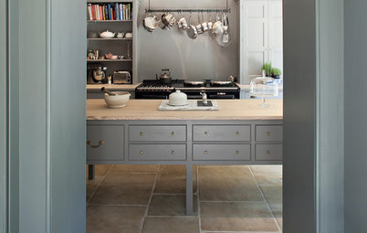
The marble fireplace was already in the house when Veronica moved in. ‘It’s obviously not original,’ she says, ‘it’s more French Regency, but the design of the house is all about mixing things up.’ So the fireplace stayed. ‘Previously, though, the room was never grand enough to match it.’
It is now, thanks in part to the Paint & Paper Library colours, which accentuate the classic detailing: the walls are painted in Lead V; the woodwork is Lead III, while the ceiling is Lead II. ‘All my ceilings are off-white,’ reveals Veronica, ‘and each is slightly different, depending on the paintwork in the room.’ The 1950s wheatsheaf coffee table and delicate antique console tables further boost the room’s glamour.
It is now, thanks in part to the Paint & Paper Library colours, which accentuate the classic detailing: the walls are painted in Lead V; the woodwork is Lead III, while the ceiling is Lead II. ‘All my ceilings are off-white,’ reveals Veronica, ‘and each is slightly different, depending on the paintwork in the room.’ The 1950s wheatsheaf coffee table and delicate antique console tables further boost the room’s glamour.
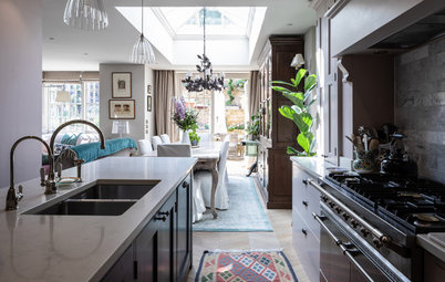
The view into the hallway reveals two of the home’s statement floors. The Victorian tiles in the hall were covered by blue shagpile carpet when Veronica moved in. ‘When we lifted it and found those it was amazing!’
The oak parquet is not original, but was added to give the living room a more formal look than the rest of the house. ‘It’s all stained greyish brown,’ says Veronica, who designed the pattern herself. ‘I didn’t want anything orangey and the grey tones keep it cool.’
Hall walls painted in Farrow & Ball Pavilion Gray above the dado, and Farrow & Ball Black Blue below. Chandelier, The White Company.
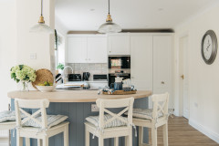
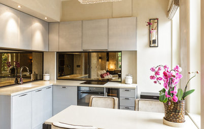
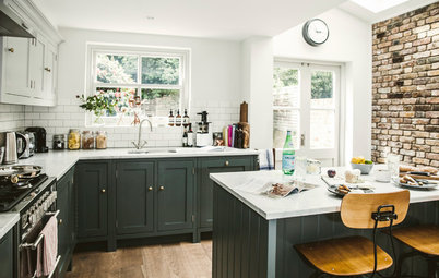
The two entrances into the kitchen allow views from the front all the way through to the back of the house. ‘That was key to the design and to opening things up,’ says Veronica.
120cm sq porcelain floor tiles, Capitol Designer Studio. Walls painted in Blackened, Farrow & Ball. Recess wall painted in Blue Blood, Paint & Paper Library. Left-hand wall in Antique Mirror wallpaper, Cole & Son.
120cm sq porcelain floor tiles, Capitol Designer Studio. Walls painted in Blackened, Farrow & Ball. Recess wall painted in Blue Blood, Paint & Paper Library. Left-hand wall in Antique Mirror wallpaper, Cole & Son.
‘Originally,’ says Veronica, ‘I was going to have the island pointing the other way – lengthways. But I didn’t want to put the sink on it, and so made a recess for that, along with the dishwasher and bin – the mirror means I can still look into the garden while washing up.’ There is also a strip of LED lighting under the shelf for after dark. ‘I have a lot of lighting and a lot of different circuits, so I can always get the right ambience. I’m very anal about getting lighting right!’
Veronica adds that the horizontal island arrangement also ticks her space-boosting box, as it makes the kitchen look wide, rather than long and narrow.
Pendant lights, Original BTC.
Veronica adds that the horizontal island arrangement also ticks her space-boosting box, as it makes the kitchen look wide, rather than long and narrow.
Pendant lights, Original BTC.
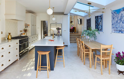
‘The table is brilliant,’ says Veronica. ‘It extends to three metres and takes the legs with it, so you can fit 14 people around it. It’s so durable, too; it’s laminate and you can have red wine on it all night and wipe it off in the morning. I needed it to be hard-wearing with three teenagers around…’
Dining table and leather chairs, Living Space.
Dining table and leather chairs, Living Space.
Hidden among the bank of floor-to-ceiling, handle-free cupboards are two tall fridges. Cleverly, Veronica arranged them to have the doors opening out opposite ways. ‘The effect is as though I have a huge American larder fridge,’ she says, ‘but much cheaper!’
Veronica had a 6m skylight fitted that not only floods light into the kitchen, but also onto the stairwell down to the new basement conversion.
Veronica’s Murano glass chandelier is a prized possession and she wanted to show it off. It hangs over the stairs to the basement, behind the double living room, which, at its far end, has the interior glass window seen here on the left. ‘If you look into the house from the street,’ she says, ‘you see the chandelier. It looks lovely at night.’
The door behind the glass panel straight ahead is a new cloakroom, built in the ‘dead space’ that was previously at the end of the side return. And it provides another trick that suggests more space. ‘It’s the downstairs loo, but because there’s a door,’ says Veronica, ‘it gives you the impression there’s another room there that could be big.’
The door behind the glass panel straight ahead is a new cloakroom, built in the ‘dead space’ that was previously at the end of the side return. And it provides another trick that suggests more space. ‘It’s the downstairs loo, but because there’s a door,’ says Veronica, ‘it gives you the impression there’s another room there that could be big.’
This is the view up to the landing where the chandelier hangs, as seen from the basement floor. Glass balustrades let as much light through as possible.
See more beautiful banisters that boost staircase style
See more beautiful banisters that boost staircase style
A bespoke, antique-effect mirror, echoing the similar kitchen wallpaper, hangs on the landing down to the basement and bounces light around. ‘I have lots of mirrors,’ says Veronica. ‘I love how they always give the impression of things being bigger than they are.’
The basement has a huge surround sound TV and units designed by Veronica. ‘This is the kids’ domain,’ she says.
Walls painted in Lead IV, Paint & Paper Library. Sofa, sofa.com.
Walls painted in Lead IV, Paint & Paper Library. Sofa, sofa.com.
The décor in Veronica’s bedroom, at the front of the house and with a tiny original balcony over the porch, is deliberately calm. ‘It’s my oasis space,’ she says, ‘to get away from the hustle and bustle elsewhere in the house.’
She particularly loves the new carpet. ‘It’s so soft – like walking on air. Everything was covered in sisal before – so 1990s! – and it was hard on the feet and knees.’
Light walls painted in Skylon Grey, Fired Earth. Dark alcoves painted in Squid Ink, Paint & Paper Library. Bed, sofa.com, covered in fabric by Designers Guild.
The walls of the master en suite are painted to match the bedroom. ‘All the woodwork is matt – it means the space is less broken up,’ explains Veronica. ‘Somehow, that makes it very calming.’
Lagoon resin bath, Bathstore. Walls painted in Skylon Grey, Fired Earth.
Lagoon resin bath, Bathstore. Walls painted in Skylon Grey, Fired Earth.
Veronica’s youngest daughter’s room is a double aspect ‘pod room’ added to the existing mansard loft conversion. ‘Grey is unusual for a child’s room,’ says Veronica, ‘but it’s very calming. The zebra rug and flamingo stickers jazz it up a bit… It’s not quite finished, but she just loves it.’
Walls painted in Dimpse, Farrow & Ball. Floor painted in Lead III, Paint & Paper Library.
Learn what to consider when planning a loft conversion
TELL US…
What do you think of this Victorian house? Share your thoughts in the Comments below.
Walls painted in Dimpse, Farrow & Ball. Floor painted in Lead III, Paint & Paper Library.
Learn what to consider when planning a loft conversion
TELL US…
What do you think of this Victorian house? Share your thoughts in the Comments below.


Sponsored
Reload the page to not see this specific ad anymore
Who lives here Veronica Lucey and her three children, aged 13, 16 and 18, plus Zola the dog
Location Fulham, southwest London
Size 7 bedrooms (one used as an office), 4 bathrooms
Designer Veronica Lucey at Magentapink Interiors
Type of house A Victorian semi-detached property renovated in 2014
‘When the kids were little, I was working full time in advertising and didn’t have a lot of time to spend on the house,’ says Veronica, explaining why it took her 20 years to do up her house. ‘Now they’re older, and four years ago I set up an interior design company.’ And last year, she finally got to complete her own project.
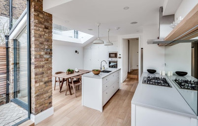
A lot had already been done to the house. ‘A photographer with a good eye had owned it,’ Veronica explains. ‘There was a loft conversion, a side return extension and the living room had been knocked into two, but it was very dated’ she says. ‘The house felt dark.’ The core design direction was about opening up the space. And the results are visible as soon as you walk through the front door. ‘I knocked down the hall/living room wall and put in glass doors. We lost the wall our sofa used to be against, but there’s lots more light.’ You also get more views of those stunning original floor tiles in the hallway.
Leather sofa, Old Boots.