


Houzz Tour: An Ingenious Courtyard Lightens a Victorian Extension
This terraced home was a warren of rooms with no coherent family zone until it was creatively transformed
Kate Burt
13 November 2020
Houzz UK. I'm a journalist and editor, previously for the Independent, Guardian and various magazines. I'm now excited to part of the editorial team at Houzz UK & Ireland, bringing the best of British and Irish design, interiors and architecture to Houzz.com.
Houzz UK. I'm a journalist and editor, previously for the Independent, Guardian and... More
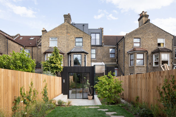
The owners of this home had lived here for around a year before they called in Fraher & Findlay Architects to redesign it from top to bottom. The staggered lower levels of the house, now containing a kitchen-diner and playroom, were the focus.
To avoid the extension making the home’s middle room dark, project architect Katherine Marshall came up with an ingenious idea, inspired by Japanese design – a ‘tsubo’ or miniature courtyard, which is visible from most parts of the house and brings in light to both the open-plan kitchen and the basement.
To avoid the extension making the home’s middle room dark, project architect Katherine Marshall came up with an ingenious idea, inspired by Japanese design – a ‘tsubo’ or miniature courtyard, which is visible from most parts of the house and brings in light to both the open-plan kitchen and the basement.
House at a Glance
Who lives here? A creative couple with one young child
Location Hackney, east London
Property A Victorian terrace
Size Five bedrooms and four bathrooms
Designer Katherine Marshall of Fraher & Findlay
Originally, the back of the house was level with the bay window, seen here and in the next image. Katherine designed a 3m extension that includes an internal courtyard and three additional glazed areas to flood the middle of the house with light. The garden was dug out, too.
Katherine also added a new, L-shaped dormer loft, providing two new bedrooms and an en suite bathroom.
Before Photo
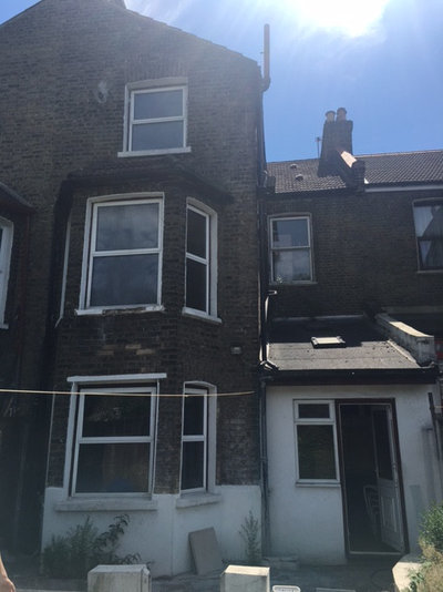
This is how the back of the house looked before the extension. The original main kitchen was behind the ground level bay window.
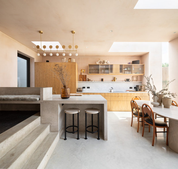
Previously, the kitchen had been disconnected from the rest of the house and the young family wanted an open space here instead. Now, a raised playroom (just seen here on the left), a dining area, and an oak kitchen are at the heart of the home.
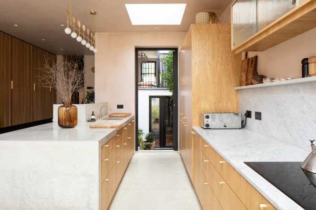
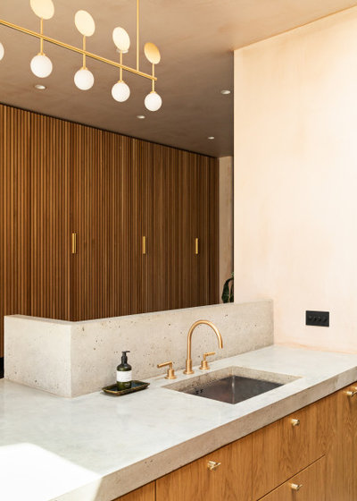
The island is concrete, the worktops, splashback and eye-level shelf are all marble, and the wall units, one of which contains an extractor fan, have fluted glass doors.
A pantry and an integrated fridge-freezer stand at one end of the kitchen run. Also inside these tall units are the ovens; doors slide into the cupboards when they need to be accessed, meaning everything can be hidden completely.
This photo probably explains the layout of the lower levels of the house most simply.
When you come into the house from the street, you go up steps to the front door. Once inside, you go down steps into the playroom area, down again into the kitchen, then down again into the tsubo garden, which is on the basement level.
This view from the kitchen looks across the garden, with the doors to the basement, under the front of the house, on the far side. You can also see a Juliet balcony, which is at the back of the sitting room; the other end of this room (its window visible here) overlooks the street.
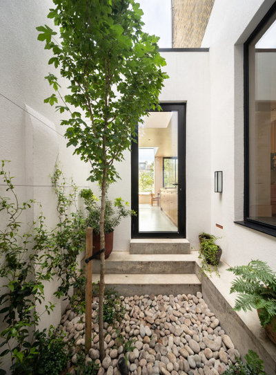
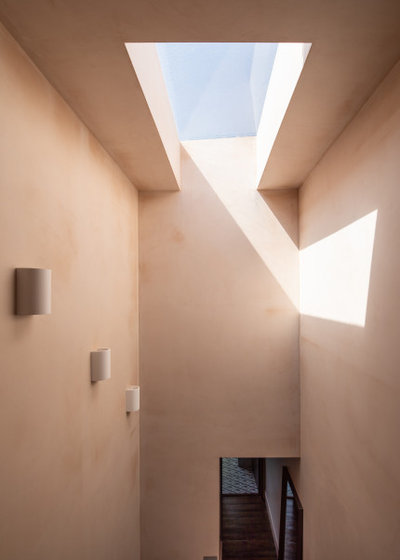
This view shows the tsubo courtyard. Up the steps is the other side of the kitchen door just seen in the previous photo.
“We painted it all white to reflect light and be as bright as possible,” Katherine says.
Make the challenge of finding the right people for your project easier by searching the Houzz Professionals Directory.
“We painted it all white to reflect light and be as bright as possible,” Katherine says.
Make the challenge of finding the right people for your project easier by searching the Houzz Professionals Directory.
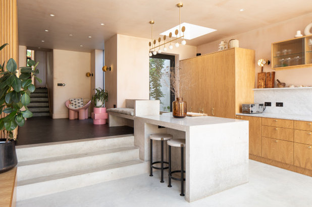
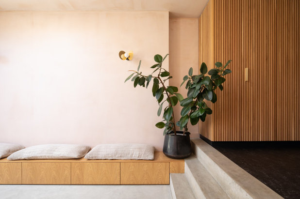
Here, you can see the steps from the kitchen up to the playroom area. Beyond that, there are six steps up to the original ground floor. “All the levels define the different areas, but they also feel connected as one space,” Katherine says.
As well as the daylight and air that flood in from the tsubo, extra light was brought into the space via two rooflights, one above the tsubo door, seen here, and one above the dining table, plus a dramatic, L-shaped glazed feature arching over the kitchen window seat, visible in the next photo.
As well as the daylight and air that flood in from the tsubo, extra light was brought into the space via two rooflights, one above the tsubo door, seen here, and one above the dining table, plus a dramatic, L-shaped glazed feature arching over the kitchen window seat, visible in the next photo.
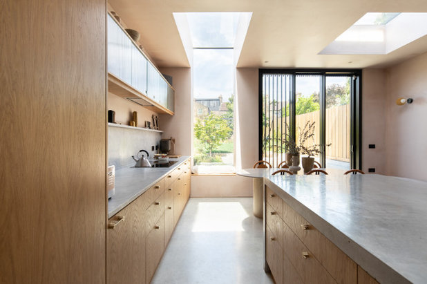
Most of the kitchen storage is in the form of drawers; there’s a dishwasher within the island. The cabinetry timber was also used to create a bench seat in the window. Underfloor heating warms the concrete floor.
Three aluminium sliding doors lead out into the garden. “We went for three rather than two panels to maximise the size of the opening,” Katherine explains.
Kitchen, made bespoke by a joiner. Cupboard handles, Swarf Hardware. Cero sliding doors, ODC Glass.
Three aluminium sliding doors lead out into the garden. “We went for three rather than two panels to maximise the size of the opening,” Katherine explains.
Kitchen, made bespoke by a joiner. Cupboard handles, Swarf Hardware. Cero sliding doors, ODC Glass.
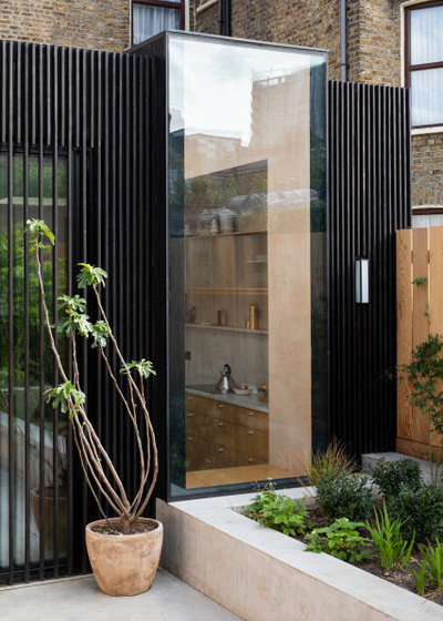
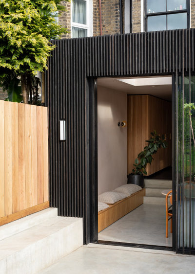
The kitchen bench seen from outside. A large planter ensures there’s always a green view from inside.
The tsubo garden can also be seen from the play area. The flooring in here is a durable, soft linoleum.
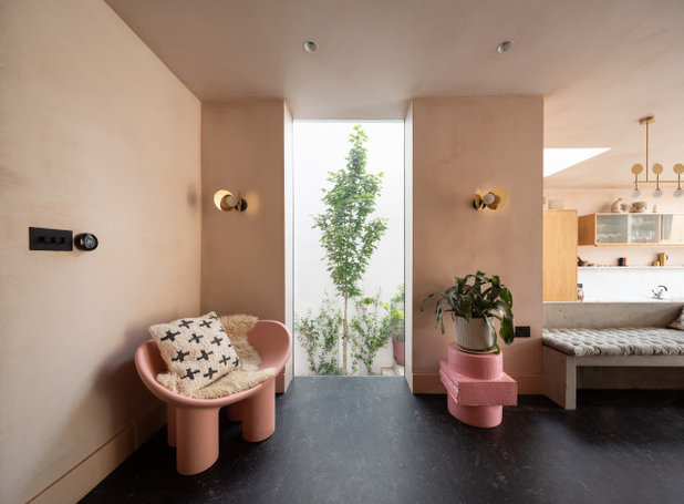
The walls and ceiling have been left at the plaster stage – so what you see here is simply gypsum plaster, sealed so as to appear matt and natural-looking. The skirting boards were painted in a similar shade to blend in.
The plaster finish means that any future repairs would be visible, but the clients were very positive about this idea. “The owners wanted to see the development of the building,” Katherine explains. “They like patina and different textures.”
Skirting boards painted in Setting Plaster, Farrow & Ball. Flooring (colour now discontinued), Forbo. Wall lights; kitchen pendant, all Atelier Areti. Light switches, Dowsing & Reynolds. Furniture, clients’ own.
Here, you can see the other side of the play area. The slatted joinery on the far wall is made from oak battens set vertically on a back board and provides room for toy storage among other things.
Low-level bench seating helps to link the playroom space to the dining area. “It works as additional seating if they’re having people over,” Katherine says. “There are lots of places to sit in this space, including the steps.”
The ‘inside-outside’ bench continues (though in concrete) into the garden.
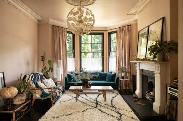
The living room at the front of the house is finished in the same bare plaster, with matching painted woodwork.
Pendant light, Etsy. Woodwork painted in Setting Plaster.
Pendant light, Etsy. Woodwork painted in Setting Plaster.
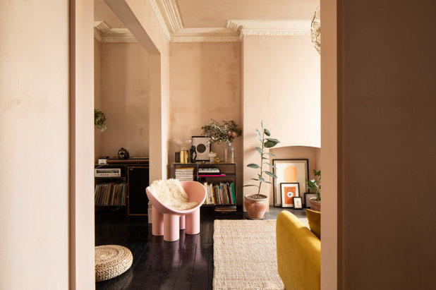
Katherine highlights the ceiling, explaining that in order to retain the original rose and cornicing, the rest of the surface had to be boarded over, as it was in a bad state. “If we’d replastered and taken down the whole ceiling, you’d have lost those details. This is why you can see a shadow gap,” she says.
The cornicing and roses were stripped. “That’s why they look a bit rustic,” she adds.
The cornicing and roses were stripped. “That’s why they look a bit rustic,” she adds.
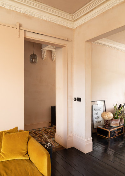
A sliding barn door painted to match the walls closes the living rooms off from the hallway. A second entrance, which was where the framed print is now, was closed up.
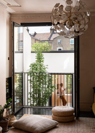
This is at the rear of the two living rooms. The Juliet balcony overlooks the tsubo courtyard and, beyond, the kitchen.
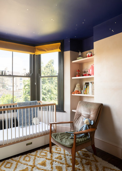
On the first floor, at the level of the first half-landing in the house, is the child’s room. “We didn’t do much in here,” Katherine says. “We put in new windows, repaired and stained the floorboards in a very dark brown, and replastered the whole room to echo the downstairs.”
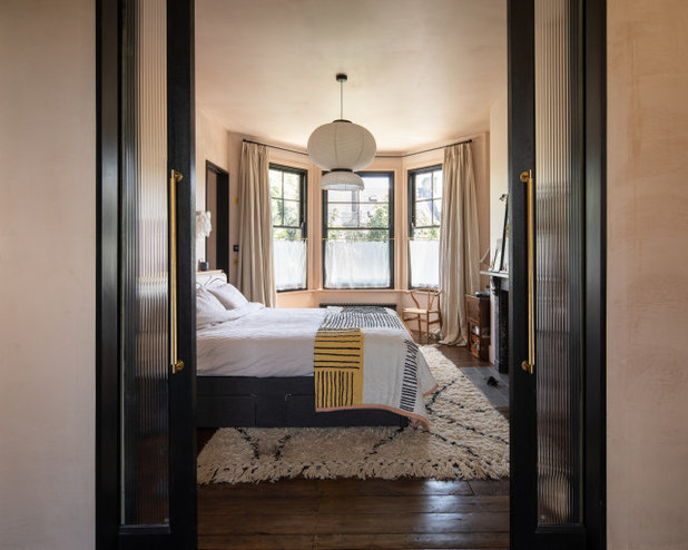
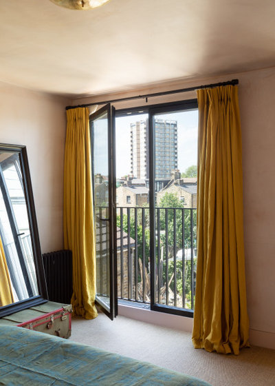
Half a landing up is the main bedroom, which is part of a new suite Katherine designed by combining two rooms.
The bedroom is at the front of the house and a dressing room (from where this photo is taken) is at the back, overlooking the tsubo below. Fluted glass doors, which tie in with the kitchen units, connect the two spaces.
The entrance to the bedroom is through a door on the nearside of the bed, in the headboard wall.
The fireplace is original, but Katherine added a new surround. The original floorboards remain, but they’ve been repaired and stained, and the sash windows are new, painted black to match the woodwork in the garden.
Sash windows painted in Black, Rustins. Window surround painted in Setting Plaster, Farrow & Ball. Door handles, Buster & Punch.
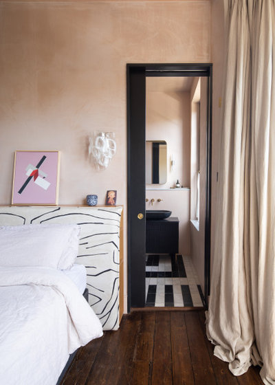
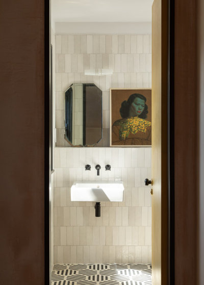
On the far side of the bed is an en suite bathroom.
A bespoke upholstered headboard includes hidden niches for books and glasses. The wall light is custom-made from Italian glass.
A bespoke upholstered headboard includes hidden niches for books and glasses. The wall light is custom-made from Italian glass.
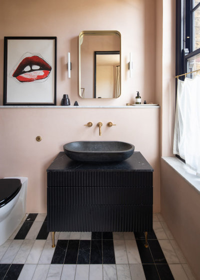
The unusual flooring is made up from two different marble tile ranges, put together in a design by the owner. Fraher & Findlay designed the vanity unit and had it made. The shelf and windowsill are topped with marble.
The walls, including the shower surround (out of shot), are finished in tadelakt to resemble the bare plaster elsewhere. Tadelakt, a Moroccan plaster typically found in hammams, is waterproof.
Wall lights, Dyke & Dean. Mirror, Made.com. Tap, Studio Ore. Black marble basin, eBay. Carrara and Nero Marquina floor tiles, Topps Tiles.
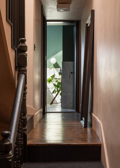
Half a landing up, this is the view from the main bedroom looking up to the family bathroom, which is directly above the child’s room.
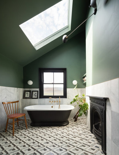
The family bathroom was previously a kitchenette/bedroom with a false, flat ceiling. “The house previously had a large, multi-generational family living in it and there were loads of kitchens and bedrooms,” Katherine explains.
The roof, now exposed to show the slope, is original and tops the outrigger – the dormer doesn’t reach across it – but the skylight is new. The original fireplace in here was refurbished.
Floor tiles, Ca’Pietra collection at Period Property Store. Walls painted in Ho Ho Green, Little Greene. Marble tiles, Topps Tiles. Wall lights, Dyke & Dean.
This skylight is over the new staircase to the loft. Downstairs you can just see the green family bathroom.
Lights, Garden Trading.
Lights, Garden Trading.
This is one of the loft bedrooms. It’s at the back of the house, with double doors opening onto a Juliet balcony. “The tsubo is beneath if you look over the balcony,” Katherine says.
This is the en suite in the loft. “We decided to end on a full tile, which is why the tiles don’t quite reach the ceiling,” Katherine says.
You can see here one of the new doors used throughout the renovation. “We needed fire-rated doors to meet Building Regulations, so we had to change the originals,” Katherine explains.
“These are 2.4m doors; we chose an oversized design to give a sense of space,” she says, “and also to mix and match new and old, contemporary and original.” It’s a concept that neatly sums up the ethos of the whole project.
Tell us…
What’s your favourite detail in this imaginatively redesigned family home? Share your thoughts in the Comments.


Related Stories

House Tours
Houzz Tour: A Midcentury Home With a Strong Indoor-outdoor Link
By Becky Harris
A nature-inspired renovation has given this ranch house a relaxed mood and a connection to the outdoors from most rooms
Full Story

House Tours
Houzz Tour: Warm Tones and Luxurious Surfaces in a City Townhouse
An earthy colour palette, hidden storage and well-placed texture add character and practicality to this London home
Full Story

Room Tours
Kitchen Tour: A Gorgeous Extension With a Leafy Glasshouse Feel
By Kate Burt
When the owners of this terraced house extended, they were keen to retain its period feel and highlight the garden
Full Story

Gardens
Garden Tour: A Bare Roof Terrace Becomes a Pretty, Sociable Space
By Kate Burt
A retired couple got help transforming their large rooftop into a gorgeous, welcoming, multi-functional retreat
Full Story

House Tours
Houzz Tour: A Smart Layout and Genius Storage in a Victorian Home
Flipping the standard layout and carving out excellent storage have turned this tired house into a brilliant family home
Full Story

House Tours
Houzz Tour: A Victorian House Brought Impressively Up to Date
By Jo Simmons
A cohesive layout and warm colours combined with energy-efficiency measures thoroughly modernise this terraced home
Full Story

Kitchen Tours
Kitchen Tour: An Open, Airy Space Made for Entertaining
Combining two separate rooms has improved flow and created a sociable open-plan kitchen, dining and seating space
Full Story

House Tours
Houzz Tour: A Family Home Inspired by its Seaside Location
Coastal colours and practical design combine to create a house that will adapt as the family grows
Full Story

Kitchens
5 Inspiring Before and After Kitchen Transformations
Whether you want to boost storage, incorporate original features or maximise your space, take ideas from these designs
Full Story

House Tours
Houzz Tour: An Airy, Scandi Finish for a Tall Victorian House
By Kate Burt
From a tricky inherited bath to a sticky-out staircase, on-site problem-solving led to a seamless update for an old home
Full Story
Blimey! What a cornucopia of design! I like the split levels downs, and the low-key sitting room, but my favourite feature is the pair of fluted glass doors.
It’s certainly creative! Not sure about the safety of all those concrete surfaces and steps in and around the playroom though... we’d have been at A&E every week if we’d had that when my son was small!
Personality and character galore! What a gorgeous, interesting home. It just proves that rules are meant to be broken even if it wouldn’t be everyone’s choice. I bet they have lots of friends who love to visit..