Houzz Tours

House Tours

Houzz Tour: A Modest Extension Transforms an Edwardian Villa
Before and after shots show how a full refurb and new layout have upgraded this beautiful conservation area home

The homeowners had lived in this house in a west London conservation area for more than two decades before embarking on a top-to-toe renovation. With their two children now teenagers, they felt the time was right to create a family home that included space for the youngsters to hang out with friends, as well as room for everyone to enjoy a little more privacy.
Caroline Milns of Zulufish took on the project and explains her clients also wanted to draw in more natural light and create plenty of storage. The reconfigured property now has a side-return extension containing a large kitchen-diner, plus a new internal courtyard with space for bikes, a snug, and reconfigured bedrooms upstairs. Throughout, period features have been rescued, restored and shown off.
Caroline Milns of Zulufish took on the project and explains her clients also wanted to draw in more natural light and create plenty of storage. The reconfigured property now has a side-return extension containing a large kitchen-diner, plus a new internal courtyard with space for bikes, a snug, and reconfigured bedrooms upstairs. Throughout, period features have been rescued, restored and shown off.
Caroline designed the extension to match the line of the original bay window at the back, so as not to protrude further than the original building.
The room above the extension is now a study/spare room. Caroline replaced the original window with French doors and a Juliet balcony.
Doors, Crittall. Exterior lantern lights, Original BTC.
The room above the extension is now a study/spare room. Caroline replaced the original window with French doors and a Juliet balcony.
Doors, Crittall. Exterior lantern lights, Original BTC.
In this floorplan of the original layout, you can see a dogleg kitchen had previously been in the middle of the ground floor. At the back, there was a study room, and a cloakroom was squeezed between them.
You might also enjoy A Beginner’s Guide to Kitchen Extensions.
You might also enjoy A Beginner’s Guide to Kitchen Extensions.
This is the ground floor layout now. Moving the kitchen to the newly enlarged back of the house allowed for a generous dining area and space for lots of storage.
The room where the kitchen used to be is now a cosy snug; there’s also a more formal living room at the front of the house.
Caroline left the end of the side return nearest the house open to create a courtyard – seen at the top-centre of the drawing – and fitted in bike storage.
Unseen in these images, the previously dark, dank cellar got a practical boost, too. By digging it out to create more head height, Caroline was able to create a large utility room and storage area, which, in turn, gives more space to the kitchen.
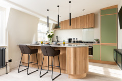
Caroline designed in a large skylight above the worktop; it fills the length of the run, providing generous natural light for daytime food prep.
On the right is a double pantry cupboard and there are under-counter fridges below the worktop. On the other side of the island, beneath the hob, is an under-mounted double oven.
The choice of materials helps to give the kitchen a luxury feel. “The huge splashbacks are bespoke cut pieces of marble, book-matched in the middle,” Caroline says. There’s also a dark walnut chevron floor, crystal pendants and aged brass handles. A flush ceiling extractor helps to keep lines clean.
Pleated Crystal pendant lights, Marc Wood Studio. Calacatta marble worktops and splashback, JRS Stone Consultants. Brass handles, Armac Martin.
The original kitchen was dark and cramped.
The new space allows for plenty of storage. “They’re a real foodie family, so we did a bespoke kitchen design to hide all their gadgets,” Caroline says.
In addition to the main kitchen area, Caroline designed this floor-to-ceiling cabinetry on the right. The glazed part houses the owners’ cookbook collection and glassware. Bulky equipment, such as mixers, juicers and casserole pots, can be hidden out of sight below.
The rich blue of the cabinetry is carried around the whole house, and even into the garden – here you can see the back wall is painted to tie in, visually bringing it into the kitchen.
Units painted in Hicks’ Blue, Little Greene.
Look closely and you might also spot the concealed TV, hidden behind the sliding glazing in the centre of the cabinetry.
You may also notice some period-style cornicing in this new part of the old house. “We wanted the new kitchen space to match the back of the house – not just to feel like a modern extension – so we brought through the cornicing,” Caroline says. “We found a lovely Edwardian style to match the original architecture.”
You may also notice some period-style cornicing in this new part of the old house. “We wanted the new kitchen space to match the back of the house – not just to feel like a modern extension – so we brought through the cornicing,” Caroline says. “We found a lovely Edwardian style to match the original architecture.”
The original kitchen door onto the side return.
The original door has been replaced by a Crittall door to the newly created courtyard, which has bike storage (not seen) on the right.
Framed prints, Juliana Loveday.
Framed prints, Juliana Loveday.
At the house end of the kitchen, more Crittall doors lead into the hallway (left) and the snug.
1920s Odeon rectangular chandelier, RH. Dining table and chairs, Poliform.
1920s Odeon rectangular chandelier, RH. Dining table and chairs, Poliform.
Caroline designed panelling to cover the walls of the snug and painted it in a warm, cocooning grey, which blends with the sofa.
Broken Maze rug, Jennifer Manners. Walls and joinery painted in Sharkskin, Paint & Paper Library.
Broken Maze rug, Jennifer Manners. Walls and joinery painted in Sharkskin, Paint & Paper Library.
Here’s the snug window before the renovation.
At one end of the room, there’s a newly installed wood-burning stove.
At the other is a concealed television.
The living room at the front of the house also got a decorative facelift – but it had great bones to begin with, including an original fireplace and beautiful windows.
A wall of bespoke shelving for the owners’ books also houses their separates sound system, which they wanted hidden away.
Hogarth sofa, The Sofa & Chair Company. Rug, Jennifer Manners. Emile chandelier, RH.
A wall of bespoke shelving for the owners’ books also houses their separates sound system, which they wanted hidden away.
Hogarth sofa, The Sofa & Chair Company. Rug, Jennifer Manners. Emile chandelier, RH.
Here, the old living room is stripped and ready for its facelift.
Caroline converted the fireplace to gas and re-clad the sides with blue tiles to tie in with the overall palette of the house.
The unusual bay window in this room was not the focal point it is now.
“The bay is beautiful,” Caroline says. “The style is unique to the area.”
To highlight the unusual shape, Caroline put a huge tropical plant in the central section and an elegant sofa in front.
“Curtains were tricky,” she admits. “We got advice from our curtain-maker and decided on a pelmet that went into the window in the end.”
The curtains also had to come right out of the bay and open onto the adjacent walls, otherwise they’d have blocked light.
The room is reflected in the hallway mirror – an antique chosen to fill a shallow alcove. Here, Caroline chose encaustic tiles with an inky blue motif and clad the bottom half of the walls with a textured weave paper.
“Halls can feel quite shiny and hard with mirrors and tiles, so this really softens the space,” she says. “The brass lights warm things up too.”
Light, Bert Frank.
“Halls can feel quite shiny and hard with mirrors and tiles, so this really softens the space,” she says. “The brass lights warm things up too.”
Light, Bert Frank.
The old hallway was dark and functional.
Now, it feels fresh and bright. The door is original to the house. From this angle, it’s easier to see the mirror is inside an alcove.
To tie in with the graphic artwork on the left, Caroline had the family photos printed and framed to coordinate.
To tie in with the graphic artwork on the left, Caroline had the family photos printed and framed to coordinate.
The hallway from the front door.
The loft had already been converted into a bedroom and en suite, but was entirely redone by Zulufish. It’s now the couple’s bedroom. On the right, Caroline has designed in a full wall of floor-to-ceiling storage.
A little bookcase makes great use of the space on the landing outside the main bedroom.
This bedroom, on the first floor above the kitchen, which has French windows opening onto a Juliet balcony, is a used as a spare room/shared study.
“We designed joinery across one whole wall to hide clutter and make it comfortable for two people,” Caroline says.
“We designed joinery across one whole wall to hide clutter and make it comfortable for two people,” Caroline says.
The family bathroom got an overhaul, but occupies the same space as before. The soft, natural palette is set by the pinky-grey marble tiles.
Vanity unit, Duravit. Tundra marble tiles, Mandarin Stone.
Vanity unit, Duravit. Tundra marble tiles, Mandarin Stone.
The owners’ teenage daughter has the lovely big bedroom with the bay window at the front of the house. It got a neutral makeover to let its period features shine.
Walls painted in Cotton II, Paint & Paper Library.
Walls painted in Cotton II, Paint & Paper Library.
A bespoke dressing table sits in the room’s pretty bay window.
The room also has a lot of discreet built-in storage, panelled in the same style as the snug.
Woodwork painted in All White, Farrow & Ball.
Woodwork painted in All White, Farrow & Ball.
The room also has a newly carved out en suite.
“To create it, we took a window and a chunk of bedroom,” Caroline says.
Marble tiles, Mandarin Stone.
“To create it, we took a window and a chunk of bedroom,” Caroline says.
Marble tiles, Mandarin Stone.
The ‘before’ plan of the first floor.
In this ‘after’ plan, you can see how the en suite was carved out of the front bedroom.
The exterior of the house.
Tell us…
What do you like best about Caroline’s redesign of this period home? Share your thoughts in the Comments.
Tell us…
What do you like best about Caroline’s redesign of this period home? Share your thoughts in the Comments.

Who lives here? A couple and their two teenage children
Location Chiswick, west London
Property A semi-detached Edwardian villa
Size Five bedrooms and three bathrooms
Designer Caroline Milns of Zulufish
Joinery throughout Hux London
Photos by Guifré De Peray
The kitchen was the focus of the most significant structural work in this refurbishment. Caroline gained Planning Permission to extend across a generous side return, giving the owners a full-width kitchen-diner, which now opens onto the garden through Crittall doors.
Find an interior designer on Houzz to help you to reimagine your home.