Houzz Tours
House Tours


Houzz Tour: A Bloomsbury Mews House Sees the Light
The quest for space and more natural light persuaded this homeowner to transform his dated London mews house

Richard’s Bloomsbury mews house had plenty of character when he bought it in 2012 but it needed an update to maximise space and the distribution of light. For instance, the entrance to the property opened directly into the living room from the street, and the location of the staircase at the rear of the house created unnecessary corridor space upstairs. ‘Essentially, we’ve released floor space and allowed more light into the main areas,’ explains architect Andrew Bell, who masterminded the renovation. ‘Richard does a lot of entertaining so we actually cut down the number of rooms in the house but increased the size of the ones that remain – it’s a much more efficient use of space this way,’ he says.
Richard has a keen interest in graphics and design and the contemporary refresh serves as the perfect backdrop for his eclectic collection of objects d’art.
Houzz at a Glance
Who lives here Richard, a London-based professional
Location Bloomsbury, London
Architect Andrew Bell, Stiff and Trevillion
Size 2 bedrooms, 2 bathrooms
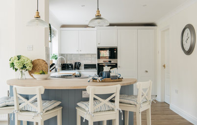
A garage on the left-hand side of the property provided Andrew with the perfect solution to Richard’s concerns regarding the front door. ‘We created a hallway where the garage used to be and moved the door so it’s much less intrusive,’ he explains. ‘There was even enough room to move the laundry to this new extension which has freed up more space in the main part of the house.’ The new hallway is accessed by a large pivot door, seen here on the right, that leads into the spacious sun-drenched living room. ‘It’s a very sociable and uncluttered space that’s perfect for entertaining,’ says Andrew. The gleaming white walls and minimalist Minotti furniture are a nod to Richard’s penchant for art and graphic design.
‘It feels very much like a gallery,’ admits Andrew. ‘The house is a blank canvas for Richard to showcase his art collection.’ Richard was very involved in the design process and discovered the white oiled oak flooring himself in Harrods’ technology suite. ‘It’s actually commercial flooring but it works really well in this space, enhancing the semi-industrial feel of the property,’ says Andrew.
‘We narrowed the opening to the corridor on the right and created a glass screen on the left to give the dining room and kitchen more definition,’ explains Andrew. Clear glazing on the screen allows plenty of natural light to filter into the back of the living area, which is vital given its deep proportions. Richard can be seen working in his favourite spot in the house. ‘From this vantage in the dining room you can see the garden, the living room, the kitchen and upstairs, but it’s still a very cosy space,’ says Andrew.
Tom Dixon pendant lights and a collection of Aram CH20 Elbow Chairs add depth to the minimalist scheme in the dining room. A white built-in bookshelf almost disappears into the background, allowing Richard’s collection of design books to take centre stage as they appear to float against the pristine white wall.
Find out how you can maximise a small dining space
Find out how you can maximise a small dining space
The sculptural aesthetic of the new staircase enhances the art gallery feel of the house, with natural light pouring in from above via a skylight – another new addition. ‘We wanted to use industrial material for the staircase. It’s actually constructed using folded metal sheets and we’ve used the same white oiled oak as the flooring on the treads and risers,’ says Andrew. ‘It’s a very artistic part of the house without being shouty,’ he says.
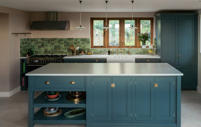
The crisp, clean lines elsewhere in the house are echoed in the elegant bulthaup kitchen, which sits directly opposite the dining room. Slabs of marble on the island were selected personally by Richard, providing a textural contrast to the Imola Ceramica Concrete Project floor tiles. Richard ran the tiles up the walls to enhance the industrial vibe in this part of the house.
See thousands more contemporary white spaces for more inspiration.
See thousands more contemporary white spaces for more inspiration.
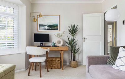
A small office area sits in a corridor upstairs. This part of the house was originally hidden away from downstairs, but a glass balustrade now allows light to pour in and dance on the floor below.
Take a look at another unique home office
Take a look at another unique home office
Light reflects off the glass balustrade to create a playful effect on the top floor of the house too. Meanwhile, the simple lines of the Eames Office Chair reference the crispness of the kitchen and dining room, which lie directly beneath.
Texture and light dominate the new guest bathroom. Porcelain grey tiles from Strata are juxtaposed with ceramic slate tiles in the shower cubicle and the recess above the sink, adding depth and a touch of drama to the scheme. ‘Light from the skylight washes down the uneven surfaces of the tiles creating a wonderful effect,’ explains Andrew.
Richard was keen to update the balustrade on the upstairs balcony but planning permission was denied on aesthetic grounds as the mews house is one of a pair.
BEFORE: the deep proportions of the room prevented natural light filtering through.
What clever ways have you found to maximise space and natural light in your home? Share your tips in the comments section below.
What clever ways have you found to maximise space and natural light in your home? Share your tips in the comments section below.


Sponsored
Reload the page to not see this specific ad anymore