How to Confidently Choose Colours for Your Home
Learn how to identify the shades you like and which ones should work well in your interior

Using colour in our homes can instantly cheer us up, make a drab corner cosy or magically lift a tired space. Yet many of us still feel daunted by it. Perhaps we forget which shades we really like, worry we’ll change our minds in the future, or just aren’t sure which shade goes with which.
With that in mind, three interior designers on Houzz explain how to confidently choose colours for your home, from using base colours and accents to layering them with neutrals, and the effects of changing light conditions.
Professional advice from: Debbie Blott of Decorbuddi; Rosie Au of My Bespoke Room; Emilie Fournet of Emilie Fournet Interiors
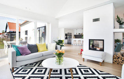
Create a mood board
An obvious starting point is to identify which colours and tones you actually like, and towards which you naturally gravitate. “A good approach is to create an inspiration moodboard, where you pin pictures of interiors that create an emotional reaction without thinking about it too much,” Emilie says. “When you look at it, you should start to see a recurring theme of hues, schemes and styles.
“You can then get an idea of whether you gravitate towards warmer tones, bolder colours or cooler hues,” she says. “This self-editing exercise should help you identify your base colour, or a palette.”
Consult your clothes
“A quick glance at your wardrobe will tell you what colours you’re naturally drawn to and which colours suit you,” Rosie Au says. “If you don’t have a hint of green in your wardrobe, for example, it might be wise to steer clear of it.”
This strategy is also useful when choosing neutral tones. “Do you tend to choose warm-toned cashmeres or cool greys as your ‘go-to’ neutrals?” Debbie says. “If you have a strong preference, it’s likely you’ll be happiest if you also choose a neutral base from the same colour family for your home.”
Factor in the psychology of colour
One of the best things about using colour in your home is how uplifting, energising or calming it can be. “Think about how you want to feel in a space,” Rosie says. “If you’re inspired by bright colours and patterns, you could surround yourself with these in your home office, for example. Equally, if these colours stress you out or are distracting while you work, opt for muted colours and warm neutrals.”
“It’s no secret colour can massively affect people’s moods, and colour psychology shouldn’t be ignored,” Emilie adds. “Think about how you want a room to make you feel. If you want it to energise you, go for bold colours; to feel relaxed, go for neutrals or warm hues. Saying that, it’s important to have a personal approach – some people feel cocooned in a red bedroom, whereas others will feel deflated in a white or neutral scheme.”
Build in a sense of cohesion
“It’s important when you think about a colour scheme for a whole house that you have a common thread running throughout,” Emilie says. “It could be your ceiling or door colours, for example, or an accent that you can find in every room in different accessories or furnishing. This gives a cohesion to the space that you can build on.”
Key here is identifying your base colour. “Consider which colours will complement it,” she says. “If you’re going exclusively for a neutral palette, it’s doubly important that you build up textures and create contrasts to lift it and add new dimensions.”
Feel you’d benefit from some guidance? Find reviewed interior designers in your area on Houzz and see photos of their previous work.
Think about the period of your home
The era of your house can offer helpful clues as to what might work. “The architectural style of your property can help you identify a base colour,” Emilie says. “For example, midcentury houses can handle deep greens and bold oranges; period properties might be more suited to muted colours or yellow- or red-based neutrals, whereas modern properties suit cool and sharp base colours with strong accents.
“Going all primary colours in a Georgian house, for example, will probably look out of place,” she says, “so take cues from your house, adapt it to your personal taste and embrace it.”
“Many paint brands provide colour palettes linked to the heritage of homes – Georgian or Victorian for example,” Debbie adds. “This can also be a great place to start. If you stay with one brand’s heritage palette throughout your house, the colours are much more likely to work together and not jar. Then you can consider which architectural features you’d like to highlight.”
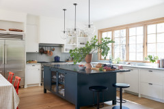
Adopt a less is more strategy
“Personally, I’m a big fan of simplifying a palette in a room,” Emilie says. “I advise going for two or three colours max, unless you’re colour blocking or highlighting a specific architectural feature.”
If you need colour guidance, Rosie says, “Look at the colour wheel. As a rule, opposite colours on the wheel work really well together: for example, blue and yellow or green and pink.
“Also, look at light-to-dark contrast in colours,” she continues. “For example, pairing a deep grey or blue with an accent of turquoise or teal.”
Embrace the idea that pale isn’t always best
“A mistake people often make is to play it safe with pale colours,” Debbie says. However, these might not work behind a TV or certain pieces of furniture, for example. “It can be much better to choose a dark blue that will disguise a black screen or confidently pull assorted pieces into a theme,” she says.
“People often shy away from opting for darker colours in small rooms for fear of it feeling smaller,” Rosie adds, “but quite often it can have the opposite effect by adding depth to the space.”
Remember, you have the power to change anything you don’t like. “We find clients often worry about certain colours dating, so they’re reluctant to use them,” Rosie says. “But paint isn’t permanent – it can always be painted over in a few years if you’re no longer in love with it.”
You might also enjoy 26 Dark Walled Bedrooms to Inspire Your Decorating Project.
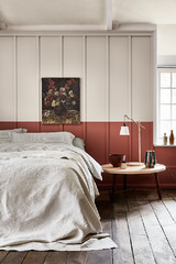
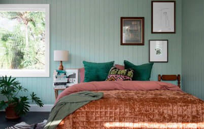
Consider the impact of light on colour
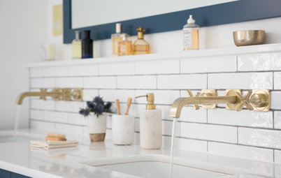
“Lighting can completely transform a colour. Peignoir by Farrow & Ball (seen in the image here), for example, can look pink in some rooms and purple in others,” Rosie says. “It all depends on the quality of light; south-facing rooms get lots of natural light, so the yellow and red undertones in a colour will be emphasised.
“This is why we always recommend getting samples, so you can see the colour in the room throughout the day as well as in artificial light,” she continues. “Paint on large bits of card rather than straight onto your walls. You can then move them around the room at different times of the day to see how they react to the light.”
“Whether it’s artificial lighting or daylight in a room, you must know what you’re working with in order to pick the right colour,” Emilie says. “North- and east-facing rooms get a bad press, as they receive less sun, but I say they should be embraced rather than feared. North-facing rooms can still look warm and cosy if you choose red-based neutrals or darker colours.
“For east-facing rooms, sharper, cooler shades, such as aquamarines, greens and blues (not the muddier tones) work well,” she continues. “South- and west-facing rooms are where you can have a bit more freedom, but be careful with neutrals in a south-facing room – they can often be too light and end up looking bleached out, so don’t be scared to add a bit of an undertone.”
Start with one piece
Debbie says many people feel they’d like to “inject more fun and adventure” into their home, then get overwhelmed. “An easy way to get started is to choose a favourite decorative element within your room and use it as your guide,” she suggests.
“This may be a beautiful piece of artwork, a rug, fabric or wallpaper design. Study the balance of colours within the item and pull them out into the room,” she says. “You can choose a shade lighter or darker, but if you stay within the palette and follow the general colour proportions, you can be confident of the outcome.”
Tell us…
How have you used colour in your home? Share your advice and photos in the Comments.

Sponsored
Reload the page to not see this specific ad anymore
If you find using colour tricky, you’re definitely not alone. “Some people know what their favourite colours or undertones are, but a lot of us struggle,” Emilie Fournet says.
“Many clients who are quite comfortable with colour in other areas of their life are relatively nervous when it comes to choosing it for their homes,” Debbie Blott says. “This is understandable when you consider the costs and timescales involved. The consequences of choosing the ‘wrong’ dress colour are less problematic than choosing a paint colour that doesn’t work.
“People see colours differently,” she continues. “Every individual has a very personal relationship with it. This will depend on their tastes, cultural background and deep-rooted memories and associations. Practical aspects, such as the location of the property, amount and direction of light, proportions and existing décor, also affect the way colour appears. It’s really no wonder people lack confidence!”