

Room Tour: A Ground Floor Goes From Functional to Fabulous
Warm tones, wood and the owner’s midcentury treasures transform the kitchen and adjoining living spaces in this new home

Rated purely on space and location, this house in East Sussex would have scored a solid 10 out of 10. It had great bones and sat on a gorgeous plot overlooking the sea, in a village on the edge of the South Downs. Inside, though, the slightly industrial look of its ground floor didn’t suit the new owners, and the open-plan layout, while super spacious, lacked useful zones.
So Susie Pfeiffer, director at Pfeiffer Design, and her team were asked to design a new kitchen and then reconfigure the adjoining living space. Adding warmth, texture and colour was a priority, while also creating a home for the treasured midcentury modern furniture, vases and artwork the owners had collected.
“Our brief was to create an aspirational home that felt luxurious and creative, but was also functional,” Susie says. “We wanted to use the available rooms efficiently, while adding some much-needed personality without compromising on the open, light and airy feeling of the space.”
The owner loves natural wood and earthy tones, particularly green. “That was the colour and material palette she wanted for the kitchen,” Susie says. “We then took inspiration from the surroundings of the home, the sea views and beachy feel, to determine the right tone and wood.”
Brushed brass handles, Buster & Punch.
Find reviewed architects and interior designers in your area on Houzz today.
Brushed brass handles, Buster & Punch.
Find reviewed architects and interior designers in your area on Houzz today.
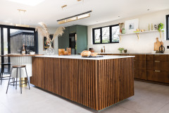
The cabinets were made bespoke from oak with a smoked stain, and the joinery team also created the slatted wall panelling.
“We incorporate sustainability into every project,” Susie says. “Using locally sourced materials, particularly the timber, was an important aspect for us and the owner. In addition, we made sure all our craftspeople and bespoke makers were local for a reduced carbon footprint.”
The door next to the pantry leads to the guest bedroom and bathroom. There’s also a handy utility room behind here. The owner’s wine fridge is on the far side of the pantry, and is incorporated neatly into the joinery.
This is the room before the redesign, looking towards the entrance. The old kitchen was beautiful and everyone involved was keen to ensure it didn’t go to waste and the whole thing was either recycled or sold, including the appliances.
In fact, the bulk of it – cabinetry, work surfaces and dishwasher – went to one of the Pfeiffer designers, who was refitting her own kitchen at home.
In fact, the bulk of it – cabinetry, work surfaces and dishwasher – went to one of the Pfeiffer designers, who was refitting her own kitchen at home.
Another ‘before’ view, looking out to the garden.
The new island is bigger than the original one, a substantial
2750mm x 1200mm. This helps it to fill out the plan and also provides ample storage and worktop space.
Together with green and timber, brushed brass is another motif in the kitchen, appearing on the base of the breakfast bar, as well as the lights, tap, handles and shelf brackets.
Ceiling lights, Bert Frank.
The owner had some treasured pieces of midcentury furniture that she wanted included throughout the ground floor space, including this cabinet. “This was one of the original pieces she showed us at our first meeting,” Susie says. Its soft shape and warm colour provided inspiration for the scheme.
More: How to Curate Ideas for Your Kitchen Project
More: How to Curate Ideas for Your Kitchen Project
A large picture window overlooks the entrance hall at the front of the house. Below is a slim breakfast bar, designed as a homework space for the owners’ daughter to use.
The same Dekton composite surface was used on the worktops and splashback for a seamless finish. “It looks like natural stone, but is practical, making it ideal for this busy family kitchen,” Susie says.
The same Dekton composite surface was used on the worktops and splashback for a seamless finish. “It looks like natural stone, but is practical, making it ideal for this busy family kitchen,” Susie says.
The original layout of the ground floor. You can see how the snug and living area were originally one large, long room. “The whole ground floor felt sparse, with no flow to the spaces,” Susie says.
The redesigned ground floor, showing how it’s been zoned. “We added a false wall to create a light, formal lounge and a more tucked-away snug,” Susie says.
There’s also a dining area (not photographed). “We gave the owner options around how she could arrange the spaces,” she adds. “She opted for the layout where the dining area and kitchen would ‘talk’ to one another, and the living room and snug felt like more of a separate entity, while still being a part of the overall scheme.”
There’s also a dining area (not photographed). “We gave the owner options around how she could arrange the spaces,” she adds. “She opted for the layout where the dining area and kitchen would ‘talk’ to one another, and the living room and snug felt like more of a separate entity, while still being a part of the overall scheme.”
The owner wanted to incorporate a pantry, so Susie created one in what had been a corridor to the guest bedrooms. “It was an extra bit of the kitchen that felt like dead space,” she says.
A new wall separates the kitchen from the bedroom behind, and the pantry sits in the alcove that was left over. “We then added a sliding door with obscured glazing that allowed any mess to be partially hidden, while still creating an aesthetically pleasing pantry space.”
A new wall separates the kitchen from the bedroom behind, and the pantry sits in the alcove that was left over. “We then added a sliding door with obscured glazing that allowed any mess to be partially hidden, while still creating an aesthetically pleasing pantry space.”
The pantry has room for vegetable storage boxes, shelving for beautiful jars and space both on the worktop and below for storing large appliances.
Tiles, Solus Ceramics.
Tiles, Solus Ceramics.
The oak cabinetry and Dekton worktop are the same as in the kitchen.
Open shelves, visible when the pantry door is open, bring character to the kitchen space.
To break up the expansive living area, Susie designed a dividing wall that houses a fireplace and has nooks and shelving for displaying the owner’s midcentury pieces.
The fire was another sustainable choice. “It runs on bioethanol, a renewable fuel source that produces no harmful emissions compared to a gas burner, and is more efficient at heating than an electric fire,” Susie says.
The fire was another sustainable choice. “It runs on bioethanol, a renewable fuel source that produces no harmful emissions compared to a gas burner, and is more efficient at heating than an electric fire,” Susie says.
All the rooms at the front of the house are south-facing and bathed in light. The snug was decorated with dark colours and rich textures to help it feel cosy, while the living space is lighter.
A TV is mounted on the snug side of the dividing wall, which is fronted with the same oak slat panelling as in the kitchen. “This adds aesthetic value, but also helps to dampen the noise between the spaces, as it was originally quite echoey in here,” Susie says.
More: 7 Ways to Design a Cosy, Comfy Snug
More: 7 Ways to Design a Cosy, Comfy Snug
This lamp is one of the owner’s Murano glass pieces, and provided inspiration for the colour scheme.
More Murano glass vases line the windowsill in the snug, their blue and amber tones feeding into the colours in here. This room, with its clear function as a place to relax together, is one of the elements the owners are overjoyed with.
“Those practical and spatial parts of the project really made an impact on this family’s life,” Susie says. “Now they have zones that have a clear function, and any dead space has been maximised.”
In addition, the owner’s passion for midcentury design is fully visible and her collections have space to shine. “She felt the finished design reflected her love of that period and brought in both the natural environment and warmth to this home.”
Wallpaper, House Of Hackney.
Tell us…
What do you like about this stylish kitchen and living space? Share your thoughts in the Comments.
Who lives here? A couple and their young daughter
Location Rottingdean, East Sussex
Property A new-build detached house
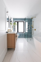
Size Three bedrooms and two bathrooms
Interior designer Susie Pfeiffer and the team at Pfeiffer Design
Joinery Wood Works
Photos by Bee Holmes Photography
The kitchen was completely redesigned and custom-made from scratch. “This gave us a fantastic opportunity to really create something wow,” Susie says. It includes a large island with a breakfast bar at one end where friends and family can gather. “We put it on the garden side of the room, so anyone sitting here can enjoy the indoor-outdoor feel of the home and the sprawling views,” she says.
Its circular shape brings soft, organic lines to the kitchen, which before had felt rather angular. The worktop on the breakfast bar is made of the same oak as the cabinets. Below, it’s finished in tiles with a brass base.