Houzz Tours

Room Tours

Room Tour: A Smart Extension Transforms a Tired Victorian House
A crowded family home is made lighter, greener and far more functional thanks to a thoughtful redesign

A good extension does so much more than just add square footage to a property; a clever remodel can totally transform the way a family lives in a space, and this addition has done just that.
By reconfiguring the ground floor of this Victorian terrace and extending out into the garden, Daniel Rees of Rees Architects, who the owners found on Houzz, has carved out a bright new space in which each member of the family can comfortably live and work.
To see more great projects where the homeowner found their professional via Houzz, take a look at our Born on Houzz series.
“The owners contacted us through Houzz, as they’d seen and liked a previous project of ours and wanted to talk about how we could help them transform their own home,” Daniel says.
“I started by asking them a lot of questions about how they live, how they use the space, what their jobs are, etc. We then did a survey at the property, looked at relevant planning policies, and put together a concept design based on the results,” he says.
“We wanted to keep some existing features and bring as much light into the house as possible,” he adds.
Rather than rip down the existing extension and knock out the back wall of the house to create a totally open space, Daniel took a more careful approach that worked with the existing structure and preserved some of the property’s charm.
By removing the window from the existing back wall and building the extension around this, Daniel created the feeling of an open-plan space while actually retaining two individual rooms.
This decision was practical as well as an aesthetic. “It costs quite a lot to demolish [walls] and put extra structure in,” he says, “and we had a budget to stick to, so we came up with this solution to remain within budget but also ensure the two spaces still felt connected.”
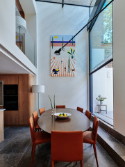
A rooflight above the dining table draws light down into the new and existing rooms.
A bank of cupboards runs floor to ceiling along the wall on the right, hiding away all the everyday clutter, such as the vacuum cleaner, as well as two big bins, a fridge-freezer and a pantry.
Looking for help to create your own dream home? Make contact with architects in your area on Houzz.
This decision was practical as well as an aesthetic. “It costs quite a lot to demolish [walls] and put extra structure in,” he says, “and we had a budget to stick to, so we came up with this solution to remain within budget but also ensure the two spaces still felt connected.”
A rooflight above the dining table draws light down into the new and existing rooms.
A bank of cupboards runs floor to ceiling along the wall on the right, hiding away all the everyday clutter, such as the vacuum cleaner, as well as two big bins, a fridge-freezer and a pantry.
Looking for help to create your own dream home? Make contact with architects in your area on Houzz.
Daniel also kept the foundations and side wall of the existing extension (next to the neighbour’s property), then rebuilt the space to form a home office, which connects to the new dining room.
Before the redesign, a kitchen was squeezed into this narrow space, but it’s now a light and inviting study for the whole family to use. “Both of the children can sit here after school to do homework,” Daniel says, “and the husband uses the space to work from home during the day, too.”
A flowerbed was designed just in front of the picture window to create a leafy view.
As this ‘before’ photo shows, the kitchen was squashed into the existing small extension.
By moving the kitchen into the old dining room and positioning it underneath the internal ‘window’, it now feels much more spacious and connected to the rest of the house.
“We wanted to create different sections that were all interconnected,” Daniel says of the new layout.
“When you build an extension, you always create a dark area in the middle of the house,” he continues, “so we try to ensure the more liveable spaces are positioned next to the garden. Having glass doors leading outside connects the dining area and garden and makes the room feel bigger.”
To make the indoor and outdoor connection as seamless as possible, Daniel lowered the floor of the extension to meet the outside ground level. He then laid a brick patio, which runs right up to the extension. A slim drainage channel divides the two flooring zones.
Beat Wide pendant light, Tom Dixon. LED light bulbs, Tala.
The exposed brick wall is a lovely feature, but it took quite a bit of work to get it back to this condition. “The builders had to strip the paint off the bricks with wire wool, then we had them repointed,” Daniel says.
Because the house is in a conservation area, the planning application process was a bit different,” Daniel adds. “It’s not a listed building, but the whole estate is part of a conservation area. This mainly affected the external aspects of the build, such as the height and scale of the extension and the type of brickwork used.”
Because the house is in a conservation area, the planning application process was a bit different,” Daniel adds. “It’s not a listed building, but the whole estate is part of a conservation area. This mainly affected the external aspects of the build, such as the height and scale of the extension and the type of brickwork used.”
At the back of the kitchen, a glass door leads into a utility space. Locating this ‘service room’ in the darker part of the house allowed Daniel to move the dining, cooking and working areas out into the light-filled extension.
Under-cabinet LED strips bring much-needed light into the utility room, as does the internal glass door.
“We chose reeded glass for the door, as it gives an obscured look but still brings in light,” Daniel says. “Because this type of glass doesn’t have a pattern as such, it works well with many different styles, and it has a nice elegance to it as well.”
More: 8 ways to use reeded glass.
“We chose reeded glass for the door, as it gives an obscured look but still brings in light,” Daniel says. “Because this type of glass doesn’t have a pattern as such, it works well with many different styles, and it has a nice elegance to it as well.”
More: 8 ways to use reeded glass.
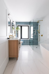
A cloakroom is also tucked into the centre of the house, leaving all the new ‘extension’ space for living and eating.
Walls and cabinets painted in Sage Green, Little Greene. Mode Tate wall-mounted basin filler tap, VictoriaPlum. Scandi round mirror, John Lewis. Statuario worktop in suede finish, Silestone.
Walls and cabinets painted in Sage Green, Little Greene. Mode Tate wall-mounted basin filler tap, VictoriaPlum. Scandi round mirror, John Lewis. Statuario worktop in suede finish, Silestone.
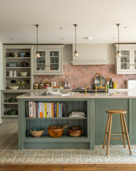
The homeowners asked Daniel to design the kitchen at the same time as the extension. “We do this quite often,” he says, “as, particularly in a small space, we like to design the architecture around the kitchen.”
The team used Ikea cupboard carcasses to keep costs down and had cabinet doors made bespoke by a joiner and painted in a soft blue. They specified the handles and worktops, too.
Walls and kitchen cabinets painted in Air Force Blue, Little Greene. Butler & Rose Dream 1.5 bowl white ceramic fireclay kitchen sink; Crosswater Cucina Tropic side lever mono kitchen mixer in brushed stainless steel, both Tap Warehouse. Worktop in 5141 Frosty Carrina finish, Caesarstone.
“There are a few different layers of light designed into the space,” Daniel says. “There are pendant lights over the table and above the sink, as well as strip lighting under the kitchen cabinets and over the office shelving.
“The strip lights bring light onto a surface without the shadows that spotlights can cast,” he adds. “They also give a nice warmth to the space.”
Natural light is maximised through the inclusion of two large, triple-glazed rooflights, as well as the glazing on the back of the extension.
“The strip lights bring light onto a surface without the shadows that spotlights can cast,” he adds. “They also give a nice warmth to the space.”
Natural light is maximised through the inclusion of two large, triple-glazed rooflights, as well as the glazing on the back of the extension.
A large wall light above the office area provides targeted light for studying and can be positioned to focus on either side of the desk.
Chicago wall light, It’s About Romi at Made in Design.
Chicago wall light, It’s About Romi at Made in Design.
“One of my favourite elements of this space is the amount of natural daylight in it,” Daniel says, “and I think the way the space is divided up now works really well.
“The homeowners told us they feel as if they have space to do what they need to do now, and they have a lot more people round to visit than they used to,” he adds. “They also said their heating bill has unexpectedly reduced by half, thanks to the new glazing and insulation!”
Tell us…
What’s your favourite element of this redesign? Let us know in the Comments.

Sponsored
Reload the page to not see this specific ad anymore
Sponsored
Reload the page to not see this specific ad anymore
Who lives here? A family with two children, plus a lodger
Location Bow, east London
Property A Victorian terrace in a conservation area
Designer Daniel Rees of Rees Architects
Project year 2018
When architect Daniel Rees first saw this Victorian terraced home, it was in need of a redesign. The owners had lived here for a number of years and the existing ground floor space had started to feel cluttered and tight, as it was being used as a kitchen, dining room, office space, and storage room for kids’ toys.
“There was a small existing extension with a kitchen in it,” Daniel says, “but the owners wanted to upgrade this space, get a new kitchen, create a home office, and fit in a cloakroom and a utility space.”