Houzz Tours

House Tours

Houzz Tour: An Edinburgh Flat Gains a Light and Bright New Layout
An open layout, clever use of colour and show-stopping bespoke bookshelves have transformed the feel of this flat

The owners of this Edinburgh tenement flat had spent six years living in Australia, where they’d got used to light, contemporary interiors. This prompted them, under the guidance of Justine Fernandes of Fernandes-Binns Architects, to change the layout of their new home, opening it up and moving the small, north-facing kitchen into a large, south-facing room.
This switch enabled Justine to design a bigger kitchen with room for a dining area. The owners also took the opportunity to refurbish the rest of the flat; Justine worked with them on the hallway and bathroom, while they did the bedrooms. “The main works were genuinely collaborative,” Justine says. “The owners are very creative and we had fun exploring different ideas. Together we came up with something I think is much more successful than anything we’d have done individually.”
This switch enabled Justine to design a bigger kitchen with room for a dining area. The owners also took the opportunity to refurbish the rest of the flat; Justine worked with them on the hallway and bathroom, while they did the bedrooms. “The main works were genuinely collaborative,” Justine says. “The owners are very creative and we had fun exploring different ideas. Together we came up with something I think is much more successful than anything we’d have done individually.”
Opening up the main living space and kitchen was a priority for the couple, but they weren’t clear how best to go about it.
Justine helped them to create a clear connection between the two spaces, not only with the addition of the bookcases framing the view, but also by creating a clear line of symmetry between the living room fireplace (see next photo) and the new opening. “It helps to make the two rooms feel more connected, although they are still separated by a doorway.
“This was already a very large, sunny room with a fantastic bay window and original features,” Justine says. “The bones were already there, but an all-white colour scheme made it feel a bit bland. The existing flooring had also been badly damaged over the years.
“The owner had to nudge me away from dark grey – typical architect!” she says. “However, the deep blue makes all the colours really sing. It works particularly well against the tans and browns of the midcentury furniture.”
Living room painted in Marine Blue, Little Greene. Coffee table, Ikea. 1960s Norwegian leather chairs, Jimmy’s Retro Furniture.
The clean lines and bold colour provide a strong canvas for the couple’s collection of midcentury furniture, much of which they got from vintage dealers in Melbourne and Sydney. One of these finds was the large bookshelf on the left.
In case you’ve spotted the absence of an overhead light fitting, Justine explains: “The owners ran out of money! When they did finally place an order, it was on a three-month lead time.”
Bookshelf painted in Duck Egg Blue, Annie Sloan. Rug, James Scott Antiques. Zen Marble Scallop tiles (in fireplace), Ca’ Pietra at Edinburgh Tile Studio. Cornice and ceiling painted in Loft White, Little Greene.
This is the living room fireplace before the renovation.
Find the right local architect or building designer for your project in the Houzz Professionals Directory.
Find the right local architect or building designer for your project in the Houzz Professionals Directory.
“The owners found a kitchen supplier who could deliver an affordable design,” Justine says. “Working with Norfolk-based Naked Kitchens, we were able to design cabinetry that allowed every inch of space to be used, and preserved the all-important line of symmetry – something just not possible with standard kitchen carcasses.
“This room already had great architectural features and strong lines of symmetry set up by the large bay window,” she continues. “We centred the island on the bay, and also aligned with the fireplace in the living room.”
The island contains bin storage and deep drawers for pans, crockery and utensils. On the other side are open shelves easily accessible from the dining table.
The tall units contain a 60cm fridge and a 60cm freezer.
The cupboard on the left of the worktop run is tucked into an ‘Edinburgh press’ – a cupboard generally set into a wall and positioned to one side of a fireplace.
“Historically, the fireplace wall had to be made much thicker to incorporate the flue,” Justine explains. “Where fireplaces were back-to-back, you thickened up the whole wall and inserted a press to one side of the fireplace in each room, making use of the extra wall thickness. It also allowed ceiling cornices to run straight through rather than having to run round a projecting chimney breast.
“As it’s a nice historical detail, we chose to retain the architraves and use the space by inserting a cupboard at high level. Below, the worktop returns into it, giving a deeper space for appliances.”
Kitchen, Naked Kitchens. Walls painted in Slaked Lime; walls above picture rail painted in Shirting; cornice and ceiling painted in Loft White, all Little Greene.
The handleless kitchen has inky-coloured base units and pale wall units, plus lime-finished oak shelves.
There’s just one original ceiling rose, which dictated the idea of having just one light over the island (see previous photo). “There’s more atmospheric lighting provided by the picture lights and LED tape light hidden behind the wall cupboards and kitchen shelves to wash down the tiles,” Justine says. “There are also lamps within the large bookshelves.”
Louis Poulsen Above pendant light, available at The Conran Shop. Base units painted in Off-Black, Farrow & Ball. Wall units painted in Slaked Lime, Little Greene. Quartz worktop in Statuario Nuvo, Caesarstone.
“The owners loved this vintage rosewood table, which they’ve had for years. However, the surface wasn’t practical for kids, so they’ve since replaced it with the Ebbe Gehl ceramic top table,” Justine says.
Mondrian 600 picture lights in Bronze (over bookshelves), Astro. Nova vertical radiators, Eucotherm. Oak Studioline Natural Wide Plank vinyl flooring, Parador.
Mondrian 600 picture lights in Bronze (over bookshelves), Astro. Nova vertical radiators, Eucotherm. Oak Studioline Natural Wide Plank vinyl flooring, Parador.
The dining room as it was, closed off from the former kitchen. The press can be seen on the right in its previous incarnation.
The en suite bathroom features a Japanese-style bath. At 125 x 105cm, it’s almost square and is extra deep. “We had to check the floor joists to make sure they’d support the weight of the water when it’s full,” Justine says.
T4 toilet, VitrA. Vero wall-mounted basin, Duravit. Duo Plus bath, Omnitub.
T4 toilet, VitrA. Vero wall-mounted basin, Duravit. Duo Plus bath, Omnitub.
“The bath allows you to sit shoulder-deep in warm water and is a great solution for small bathrooms,” Justine says. “The shower gives it additional flexibility.”
Jenna had been keen on these tiles for some time, but it was a trip to Morocco during the project that inspired the tiling pattern.
Tempest Blue tiles, New Terracotta.
Jenna had been keen on these tiles for some time, but it was a trip to Morocco during the project that inspired the tiling pattern.
Tempest Blue tiles, New Terracotta.
The bathroom before the renovation.
The hallway as it used to look.
Elsewhere in the flat, a neutral cream palette was used, including Little Greene Flint in the hall.
Here, all that was done was to refresh the paint, put in a new radiator and take up the existing carpet to put down new flooring.
Walls painted in Flint, Little Greene. Bell Lamp pendant light, custom-painted in RAL 2009 Traffic Orange, Normann Copenhagen.
Here, all that was done was to refresh the paint, put in a new radiator and take up the existing carpet to put down new flooring.
Walls painted in Flint, Little Greene. Bell Lamp pendant light, custom-painted in RAL 2009 Traffic Orange, Normann Copenhagen.
The owners designed and decorated the bedrooms themselves. This view from the hall shows the guest room.
Daughter Matilda also has a colourful room.
The blues and reds were inspired by a length of Ikea fabric Jenna spotted in a Poole florist and then hunted down.
Furniture, Little Folks Furniture.
Furniture, Little Folks Furniture.
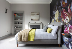
The serene master bedroom.
Tell us…
What do like most about this bright and colourful Scottish home? Let us know in the Comments section.
Tell us…
What do like most about this bright and colourful Scottish home? Let us know in the Comments section.

Sponsored
Reload the page to not see this specific ad anymore
Who lives here? A young family: Jenna, James and their daughter, Matilda
Location Inverleith, Edinburgh
Property A first-floor tenement flat
Size Three bedrooms and one bathroom
Architect Justine Fernandes of Fernandes-Binns Architects
Photos by Angus Behm of SquareFoot
“Typical of many older Edinburgh flats, the original kitchen in this home was in a small room with no real space for a dining area,” Justine says.
Here, you get a glimpse of the new kitchen, looking along the island towards the living room, through the bespoke wall-to-wall bookshelves Justine designed. “Part of the brief included an enormous amount of storage for books,” Justine explains. “There were some nice ideas on Houzz for bookshelves around doorways.”
The living room is deliberately painted as a dark counterpoint to the kitchen. “Jenna has a fantastic flair for colour,” Justine says. “She created a lovely progression from the more muted monochrome tones of the kitchen, via the colourful books in the new shelving, to the intense marine blue of the living room.”