


Houzz Tour: An Unusual Side Extension Reinvents a 1950s Home
The owners of this home had to push for Planning Permission for their bold extension idea, but the results are stunning
Kate Burt
22 November 2020
Houzz UK. I'm a journalist and editor, previously for the Independent, Guardian and various magazines. I'm now excited to part of the editorial team at Houzz UK & Ireland, bringing the best of British and Irish design, interiors and architecture to Houzz.com.
Houzz UK. I'm a journalist and editor, previously for the Independent, Guardian and... More
“It didn’t really have much kerb appeal,” Dene Happell says of the house he and his wife, Debbie, who run a design and build company together, bought 18 years ago. But they loved the street and location and added an extension to the back as their family grew. Nearly two decades later, though, the house got a much bigger upgrade – and a lot more kerb appeal.
House at a Glance
Who lives here? Dene and Debbie Happell, directors of design and build company Nest, and their 12-year-old twin daughters
Location Jordanhill, Glasgow
Property A semi-detached 1950s house
Size Four bedrooms and two bathrooms
Designer Dene Happell of nest in collaboration with cameronwebster architects
Photos by Ross Campbell and Douglas Gibb
Dene explains that his family had outgrown the home they’d lived in for many years. “There was a lack of storage and a very small kitchen – and not enough space for everything as the kids got bigger and got more stuff,” he says.
Although that was the main driver for the project, Dene and Debbie were also tired of the look of their house. “We wanted to transform the exterior. I wasn’t a big fan of it aesthetically as it was,” Dene says.
And transform it they did. In the next photo, their house is almost unrecognisable…
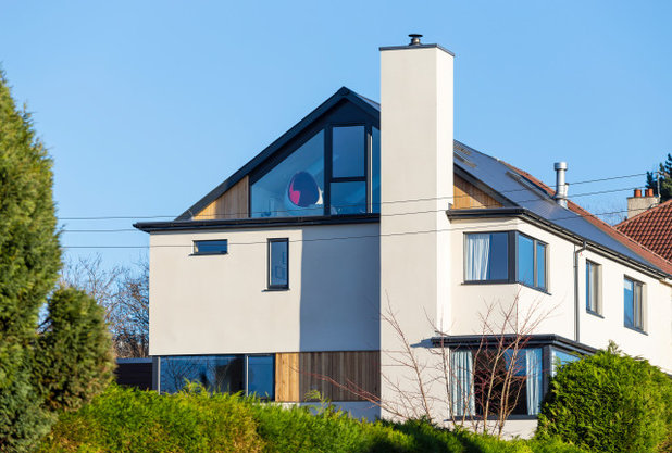
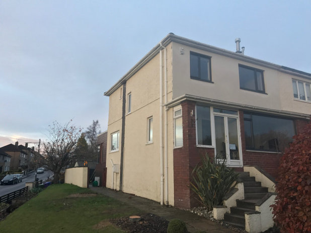
This is the house as it looks now, from almost the same angle.
The new, full-width, four-storey (including a storage basement) extension comes out from the cream-painted side wall seen in the previous photo. The front of the house (where the steps are in the previous photo) is on the right of this photo, parallel to the tall hedge.
A big challenge was how to connect the new part of the house to the old, architecturally. Rendering the whole house and painting it white, as well as changing all the doors and windows to match, was a big part of this.
Another key was the addition of a feature chimney for a new wood-burning stove. “We used that to ‘wrap’ the extension around the building,” Dene says. “This detail also echoes some of the older houses on the street.
“The whole house reads as a uniform property – you can’t see the extension,” he continues. This was at the heart of the couple’s initial disagreement with their local planning department, which wanted the extension to be visually distinct from the original house. How did Dene and Debbie persuade them? “I made a couple of CGIs to show them,” Dene says, “and it showed that the design they wanted would look awful.”
To the back of the house (on the left here) the original cedar-clad rear extension can just be seen. This is now a cosy dining room.
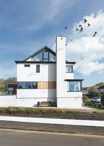
The new, open-plan loft space with triangular windows is one of the couple’s favourite additions. “The views are amazing and it’s a really flexible space,” Dene says. It’s variously been used as a homework spot for the girls, an office for Debbie, a place to socialise with friends, somewhere for kids’ sleepovers and a yoga studio.
The couple’s bedroom is on the floor below, to the right of the chimney. It has a large window at the front of the house and an en suite and sauna at the back.
On the floor below is the kitchen/living space; the long window is the kitchen and the window at the front is the living space. There’s also a new utility room, a cloakroom, a boot room, and some overflow kitchen storage.
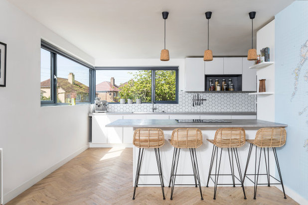
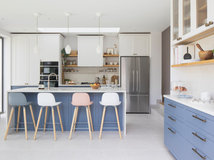
Inside the kitchen you can see the long window just mentioned on the left. The window at the back overlooks the garden.
White units and a concrete-effect laminate worktop create a pale backdrop. Natural elements, such as the cork pendants, bleached grey oak parquet floor and rattan chairs, add texture and warmth. A giant map of Scotland adorns the wall on the right.
“We love nature, and we love Scandinavian, midcentury modern and a lot of contemporary Scottish design, so our house is a real blend of all of the above,” Dene says.
Bar stools, Rockett St George. Tiles, CTD. Pendants, New Works. Kitchen, Nolte.
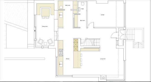
This floorplan gives a clear picture of how the space fits together.
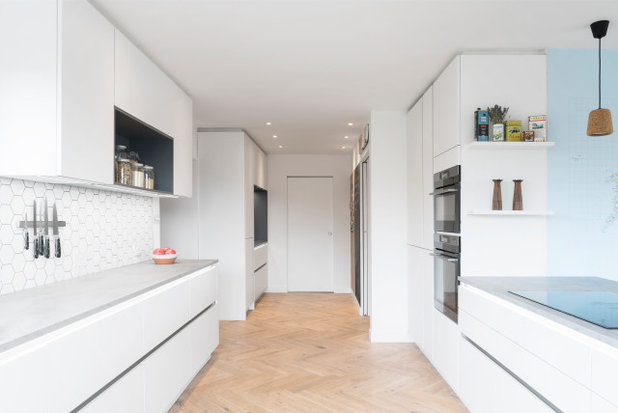
This long view of the kitchen shows a pocket door at the end, which leads to the new utility room.
Two more doors, level with the end of the worktop, go off left and right. To the left is the dining room, down some steps; to the right is the hall, separated by a sliding pocket door.
The kitchen features heaps of storage, including Dene’s “gadget area” in the alcove at the far end, where blenders, juicers and so on are kept. Just in front of this is a full-height, integrated freezer. The fridge is to the left of the oven.
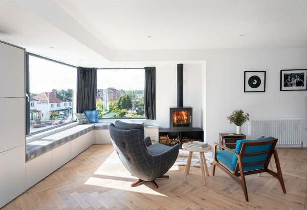
If you were sitting on one of the bar stools and turned around 180 degrees, you’d look right out of these windows in the living area.
A bench seat with more storage wraps around the edge of the room, butting up to the new wood-burning stove.
Chairs, vintage.
Find an architect or building designer in your area in the Houzz Professionals Directory.
A bench seat with more storage wraps around the edge of the room, butting up to the new wood-burning stove.
Chairs, vintage.
Find an architect or building designer in your area in the Houzz Professionals Directory.
The room is separated from the hallway by this black sliding pocket door. “This makes the whole space really flexible,” Dene says. “It can be cosy around the wood-burner in the winter with it closed, or open in the summer and lovely and light and bright.”
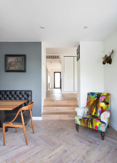
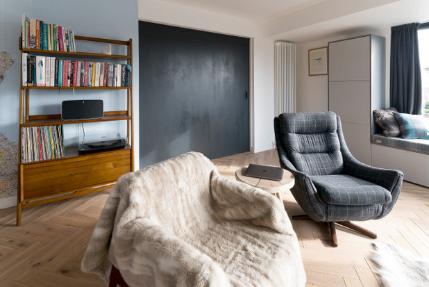
From the back end of the kitchen there are steps down to the dining room, situated in the original rear extension. Straight ahead is the hallway, leading past the living area and up to the front door. The moose head, made from fabric, is a fun touch.
Walls painted in Pavilion Gray, Farrow & Ball. Chair, Timorous Beasties. Vintage Danger signage, Vinterior.
Walls painted in Pavilion Gray, Farrow & Ball. Chair, Timorous Beasties. Vintage Danger signage, Vinterior.
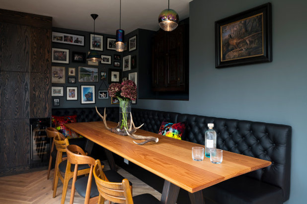
The 16-seater table was made by a friend and has a Douglas fir top. There’s built-in banquette seating in black leatherette on one side and newly reupholstered vintage midcentury Scandinavian chairs on the other.
The dark wood storage at the back is for drinks and glasses.
Pendant lights, Tom Dixon.
The dark wood storage at the back is for drinks and glasses.
Pendant lights, Tom Dixon.
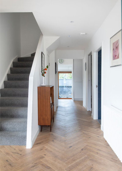
The hallway as seen from the front door. On the right there’s an entrance to a sitting room and, beyond that, a sliding door into the boot room and cloakroom.
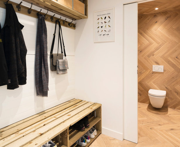
The boot room and cloakroom continue the wood and white Scandi theme.
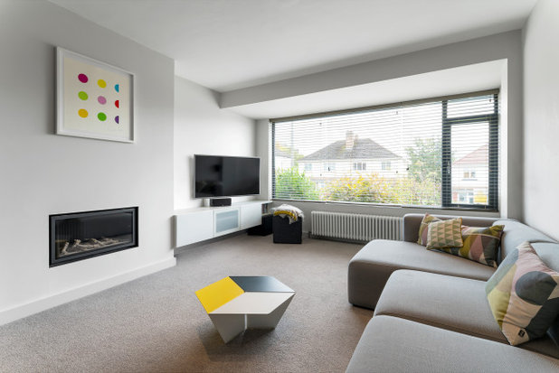
This sitting room at the front of the house is used as somewhere to relax and watch television (the open-plan living room has no TV).
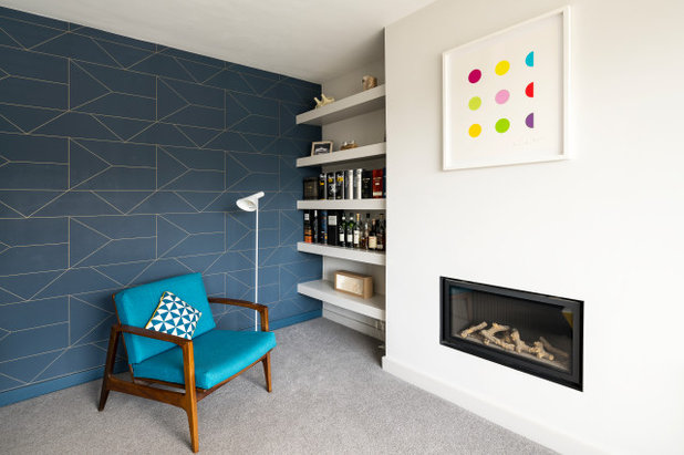
The other end of the sitting room.
Framed print, Damien Hirst. Wallpaper, Hay. Chair, vintage. AJ floor lamp by Arne Jacobsen, available from Aram Store.
Framed print, Damien Hirst. Wallpaper, Hay. Chair, vintage. AJ floor lamp by Arne Jacobsen, available from Aram Store.
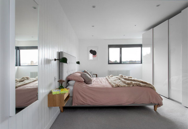
The couple’s bedroom in the extension features floor-to-ceiling Ikea storage opposite the bed. Bespoke cantilevered bedside tables save space.
Artwork, Claire Barclay. Wall lights, vintage. Bed, Feather & Black.
Artwork, Claire Barclay. Wall lights, vintage. Bed, Feather & Black.
At the right-hand end of the wardrobes is a bespoke dressing table with storage.
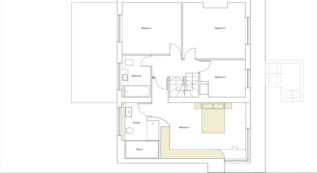
A plan of this floor clarifies the layout of the bedrooms and bathrooms.
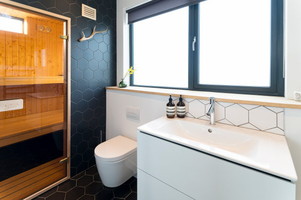
This is the en suite to the main bedroom, complete with sauna. “We do a lot of sport and it’s great for aching muscles,” Dene says.
Black wall tiles, CTD. Sauna, Saunashop.com.
Black wall tiles, CTD. Sauna, Saunashop.com.
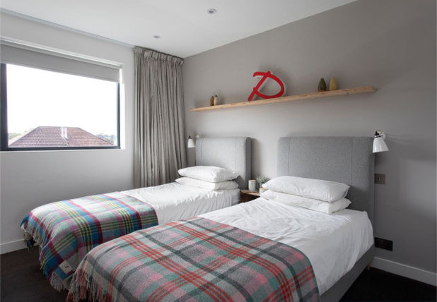
On the same floor is a twin guest bedroom.
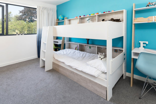
The girls have bunk beds and a desk each.
Walls painted in St Giles Blue, Farrow & Ball. Tam Tam bunk beds, Happy Beds.
Walls painted in St Giles Blue, Farrow & Ball. Tam Tam bunk beds, Happy Beds.
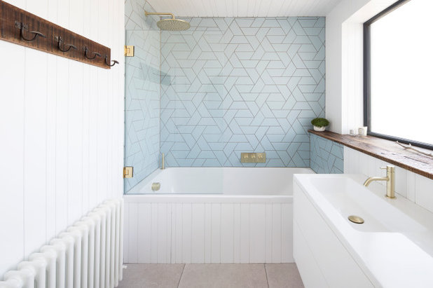
This is the girls’ bathroom and features a reclaimed wood windowsill and matt brass fittings.
Tiles, Solus. Tapware, Crosswater.
Tiles, Solus. Tapware, Crosswater.
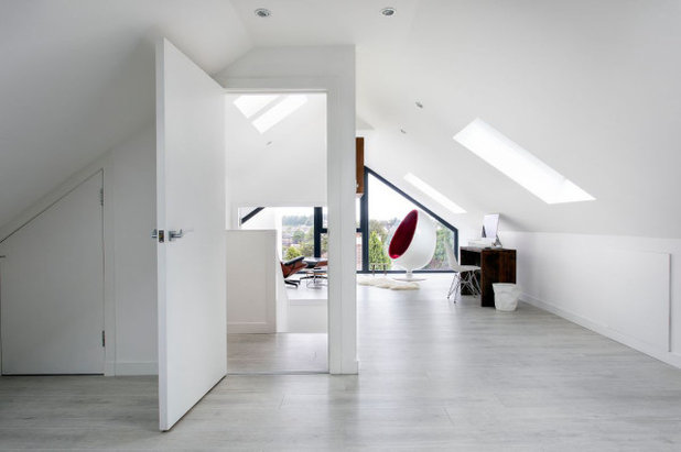
The new open-plan loft spans the old house and the new extension.
The enclosed staircase can be seen coming up to the left of the doorway; there are two skylights to flood it with light. It’s not clear in the photo, but there is a solid wall at the top of the steps; the other side of the stairwell has wide double doors (see next photo).
The enclosed staircase can be seen coming up to the left of the doorway; there are two skylights to flood it with light. It’s not clear in the photo, but there is a solid wall at the top of the steps; the other side of the stairwell has wide double doors (see next photo).
“The doors were the architect’s idea,” Dene says, “to make it easier to get furniture up here.”
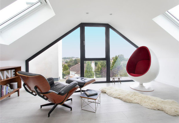
The stunning views were largely what inspired the creation of this high-up room.
Eames Lounge chair; Eero Aarnio Egg Pod chair; Eames occasional table; shelving unit, all vintage.
Eames Lounge chair; Eero Aarnio Egg Pod chair; Eames occasional table; shelving unit, all vintage.
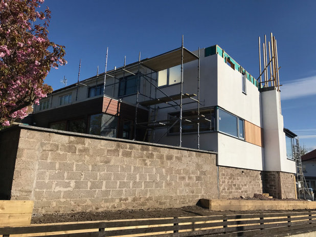
This photo of the back of the house, taken during construction of the extension, shows the layout more clearly.
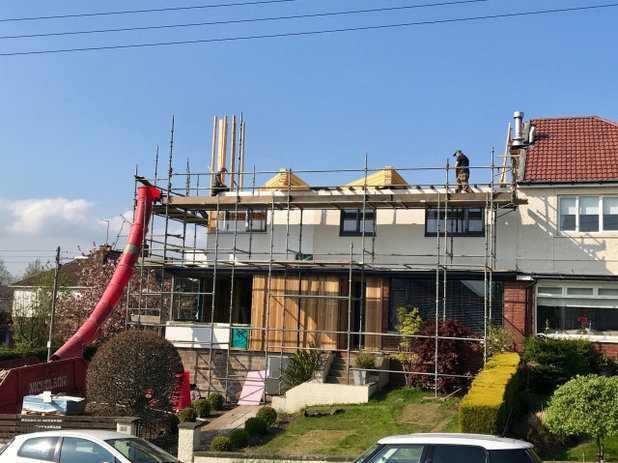
This is the front of the house during construction.
Tell us…
What’s your favourite part of this unusually extended home? Let us know your thoughts in the Comments.
Tell us…
What’s your favourite part of this unusually extended home? Let us know your thoughts in the Comments.

Related Stories

House Tours
Houzz Tour: Warm Tones and Luxurious Surfaces in a City Townhouse
An earthy colour palette, hidden storage and well-placed texture add character and practicality to this London home
Full Story

Room Tours
Kitchen Tour: A Gorgeous Extension With a Leafy Glasshouse Feel
By Kate Burt
When the owners of this terraced house extended, they were keen to retain its period feel and highlight the garden
Full Story

Gardens
Garden Tour: A Bare Roof Terrace Becomes a Pretty, Sociable Space
By Kate Burt
A retired couple got help transforming their large rooftop into a gorgeous, welcoming, multi-functional retreat
Full Story

House Tours
Houzz Tour: A Smart Layout and Genius Storage in a Victorian Home
Flipping the standard layout and carving out excellent storage have turned this tired house into a brilliant family home
Full Story

House Tours
Houzz Tour: A Victorian House Brought Impressively Up to Date
By Jo Simmons
A cohesive layout and warm colours combined with energy-efficiency measures thoroughly modernise this terraced home
Full Story

Kitchen Tours
Kitchen Tour: An Open, Airy Space Made for Entertaining
Combining two separate rooms has improved flow and created a sociable open-plan kitchen, dining and seating space
Full Story

House Tours
Houzz Tour: A Family Home Inspired by its Seaside Location
Coastal colours and practical design combine to create a house that will adapt as the family grows
Full Story

Kitchens
5 Inspiring Before and After Kitchen Transformations
Whether you want to boost storage, incorporate original features or maximise your space, take ideas from these designs
Full Story

House Tours
Houzz Tour: An Airy, Scandi Finish for a Tall Victorian House
By Kate Burt
From a tricky inherited bath to a sticky-out staircase, on-site problem-solving led to a seamless update for an old home
Full Story
House Tours
Houzz Tour: A 17th Century Cottage Gains Warmth and Character
The clever use of colour and pattern has revived this old building while creating a 21st century family home
Full Story
I'm from Australia. I quite understand extensions looking separate if the original house has some heritage or architectural value - but this house! I find it hard to imagine why the planners thought it merited that. Looks great.
I agree with Little Jem and Kath.
The renovation and extension are terrific as are the precise descriptions given. Well done all round.
I'm in Glasgow and even today in mid February i.e. winter we have bright blue sunny skies, despite Little Jem's concerns.
My question is the wood burner, you have large rads and another electric fire, was the burner appropriate, necessary and how did you get permission in a city for this? Are you on the fringe e.g. Renfrewshire / Dunbartonshire?