

Houzz Tour: A Thoughtfully Modernised Victorian House in North London
Period features share the stage with sleek, modern lines and luxe materials in this reinvented Victorian family home

When the owners of this split-level house in north London first bought the property, it was in dire need of an update. Peeling back the wallpaper, they found layer upon layer of history and toyed with the idea of preserving everything, but after considering their needs, they decided to reconfigure the existing spaces with help from architect Trevor Brown. ‘Sometimes you think you should restore a house, then you realise it might work for one little area but not necessarily for the entire project,’ Brown says. So walls were removed, modern and functional spaces were created, and select period features were retained and restored to maintain the home’s Victorian character.
Where the period features could be retained and restored, they were, but where major work needed doing (such as in the kitchen and bathrooms), the spaces were given a more modern look.
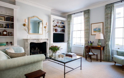
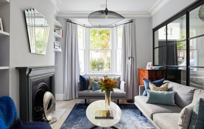
The fireplaces throughout the house are original. ‘The previous owner hadn’t taken out any of the original features, but there was 100-year-old plasterwork that had to be patch-repaired in places,’ Brown says. ‘The mantelpieces had probably been replaced 30 to 40 years ago; we just replaced the tiles.’
Walls painted in Cornforth White, Farrow & Ball.
Discover 10 ways to style a period fireplace
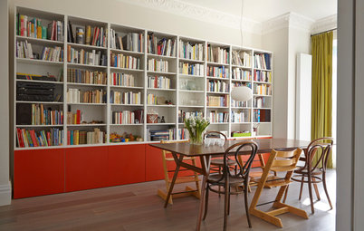
The front living room is quite grown-up, while this central area serves as a playroom. Brown installed double doors between the spaces. ‘We find clients who have children are always searching for a way to create a place that can be uncluttered,’ Brown says. ‘Now when they’re entertaining in the main living room, they can just close the doors on this space.’
The homeowners wanted the playroom to look as presentable as possible while being a comfortable and open space for their son. The sideboard is ‘where the plastic lives’, according to Brown. ‘They had originally considered using the space as a snug with a TV, but it’s been taken over by children’s things.’
Walls painted in Purbeck Stone, Farrow & Ball. Radiators throughout, Coventry Demolition Company.
Walls painted in Purbeck Stone, Farrow & Ball. Radiators throughout, Coventry Demolition Company.
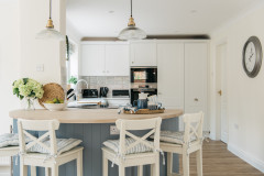
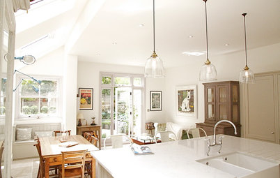
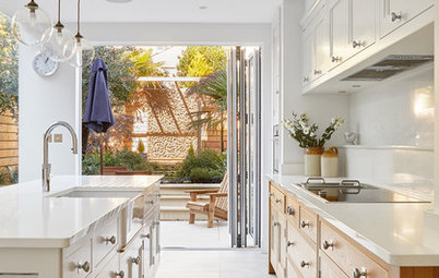
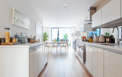
The kitchen-diner, which originally consisted of three smaller spaces, is one of the rooms that have been totally redesigned. Brown extended it out to the side and to the rear of the house. ‘Kitchens and bathrooms are tricky spaces to restore, and sometimes it’s easier to remove everything and start again,’ he explains.
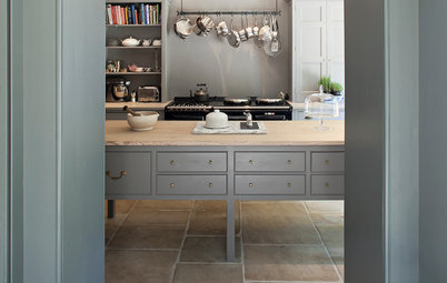
The area behind the fridge-freezer contains a utility room and larder, while a cloakroom is tucked under the stairs. ‘We moved all the chunky and bulky kitchen items and tucked them away in the utility,’ Brown says. ‘And it’s really good to have a walk-through larder when you come down the hallway with shopping.’
Having the utility room and larder where items can be stored out of sight means there’s no need for wall cupboards, which would detract from the minimalist feel of the scheme. The island, which measures 1.6m x 1.2m and has 800mm wide drawers, provides ample additional storage space.
‘One of the great things about the homeowners is they didn’t want the kitchen-diner to try to be too much,’ Brown says. ‘It’s a lovely, generous space, and we didn’t have to fight the plan and worry about squeezing in a sofa.’
The plinth under the Ikea units is just 8cm tall. ‘We thought a small kickboard would work in this space – bigger ones can look clumsy.’
The budget wasn’t excessive, so the kitchen fittings were competitively priced, but with some standout features – notably the marble and antique glass splashbacks.
Kitchen units, Ikea. Stainless steel worktop, Stainless Direct UK.
The budget wasn’t excessive, so the kitchen fittings were competitively priced, but with some standout features – notably the marble and antique glass splashbacks.
Kitchen units, Ikea. Stainless steel worktop, Stainless Direct UK.
‘We had the chance to do something really spectacular and beautiful here,’ says Brown of the marble and antique glass splashbacks. The hob is shallower than the worktop, so he built out the wall and used the antique glass to fill the void; it creates a nice complement to the marble. ‘When you’re stood at the cooker, you can see people at the table. A big sheet of glass without the antiquing would have looked a bit flat, though.’
Antique mirror splashback, Saligo.
Discover 10 ways to work antique mirror into your décor
Antique mirror splashback, Saligo.
Discover 10 ways to work antique mirror into your décor
Instead of using poured concrete for the kitchen floor, Brown chose 1m sq concrete tiles so the grout lines would add subtle texture to the space. He also laid underfloor heating in this room, so the concrete is nice and warm on chillier days.
Concrete tiles, Paul Davies Design.
Concrete tiles, Paul Davies Design.
By the time the building works were finished, Brown says the garden was in bad condition and looked ‘a bit like a war zone’. So the homeowners called in a local landscape gardener to smarten it up. They wanted to use raised beds because the tall fences made the space feel too enclosed. The lawn is artificial grass.
Upstairs, the homeowners wanted an en suite bathroom in the master bedroom, so Brown stole space from this room and the second bedroom behind it and slotted the en suite in-between the two. ‘It’s a little bit busy with doors at the entrance to the room, but from inside you don’t feel as if there’s a bathroom just sitting in the room.’
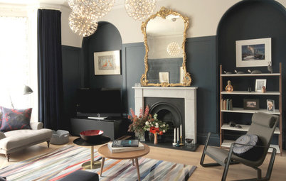
The recess next to the chimney breast was deliberately left as is to make the fireplace stand out. ‘If we’d filled it out, you wouldn’t read it as a feature in the room,’ explains Brown.
The recess next to the chimney breast was deliberately left as is to make the fireplace stand out. ‘If we’d filled it out, you wouldn’t read it as a feature in the room,’ explains Brown.
Column radiators in standout black complement the Victorian sash windows. There are also built-in wardrobes and a dressing table on the wall to the right of the bed.
The en suite measures 1.2m x 3.6m. ‘It’s generous – you can stand back from the sink,’ Brown says. The shower area is 1.2m sq. ‘I suggested to the owners they put a seat in there and they thought it was a neat arrangement.’
Floor and wall tiles, Solus Ceramics. Rain shower; basin; tapware, all QS Supplies. Toilet, Victoria Plum.
Floor and wall tiles, Solus Ceramics. Rain shower; basin; tapware, all QS Supplies. Toilet, Victoria Plum.
To accommodate the cost of creating the en suite bathroom and ‘make the budget agree at the end’, Brown used competitively priced tiles and unfussy sanitaryware for the main bathroom.
Floor and wall tiles, Solus Ceramics. Rain shower; basin; tapware; bath, QS Supplies. Toilet, Victoria Plum.
Floor and wall tiles, Solus Ceramics. Rain shower; basin; tapware; bath, QS Supplies. Toilet, Victoria Plum.
These tiles are different to those in the en suite, which was a deliberate move by Brown. ‘We don’t like doing the same thing twice, otherwise there’s no hierarchy,’ he says. ‘Each space needs to feel special.’
To the rear of the house, half a level lower than the master bedroom and en suite, is this guest room. Above this room is another bedroom and bathroom.
The end result of a project that took 14 months to complete is an elegant and simple house that retains its period character but with a modern twist. ‘The homeowners find it comfortable and easy to live in,’ Brown says. ‘When you finish a project and people are content, you know you’ve done what you needed to.’
TELL US…
What do you think of this north London house? Share your thoughts in the Comments below.
TELL US…
What do you think of this north London house? Share your thoughts in the Comments below.


Sponsored
Reload the page to not see this specific ad anymore
Who lives here A couple and their young son
Location Haringey, north London
Property A three-storey, split-level, late Victorian house
Size 4 bedrooms, 3 bathrooms
Renovation completed Early 2014
Total cost £140,000 (excluding furniture)
Architect Trevor Brown of Trevor Brown Architect
Photos by Adelina Iliev Photography
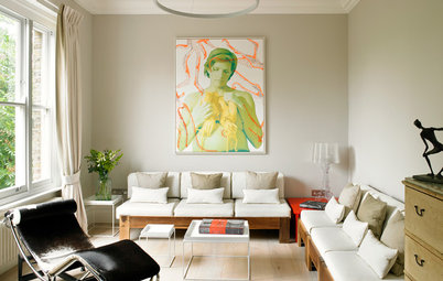
The design that carries through this house is simple and understated. The owners have a ‘revolving collection’ of furniture, art and accessories, and a clean background is perfect for showing off their pieces of the moment, such as the slippers on the mantelpiece. ‘Architecture and interior design have to last 10-15 years – you can’t impose them on a space that’s always changing,’ Brown says.
The light background also allows the rich materials of the furnishings – wood, marble, leather – to sit against it without fighting for attention. The homeowners sourced most of the furniture from second-hand shops, Gumtree and eBay, and salvage yards; some pieces are family heirlooms.