


Houzz Tour: A Rundown Victorian House is Completely Transformed
A side-return extension and redesign have turned a dark Victorian property into a bright, comfortable home
Amanda Pollard
5 January 2019
Senior Editor at Houzz UK and Ireland. Journalist and editor specialising in interiors and architecture.
Senior Editor at Houzz UK and Ireland. Journalist and editor specialising in interiors... More
When the owners of this Victorian house bought their property, it was in need of a full restoration. “The house was in a terrible condition, and it took eight months to refurbish it,” says Natalia Rusak of Hampstead Design Hub. Cue a glazed side-return extension to create a light, bright kitchen-diner and a total refresh of the rest of the house.
House at a Glance
Who lives here? A couple in their 40s
Location North London
Property A Victorian house
Size Three bedrooms, two bathrooms and a cloakroom
Designer Natalia Rusak of Hampstead Design Hub
Photos by Anna Stathaki
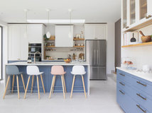
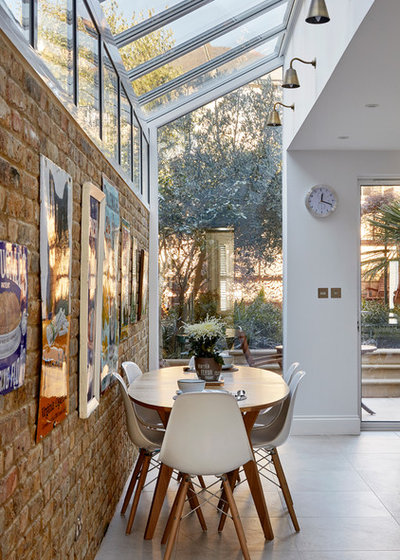
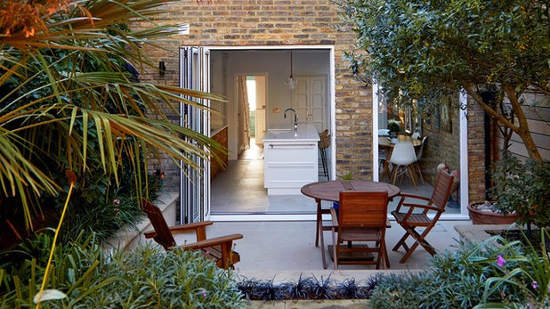
A glazed side-return extension was key to the redesign of this Victorian home’s kitchen. “It improved the indoor-outdoor connection, and turned an existing small kitchen into a generous, open-plan space,” Natalia says.
The pitched glass roof and frameless floor-to-ceiling window provide a view upwards to the sky and out to the garden beyond.
Who lives here? A couple in their 40s
Location North London
Property A Victorian house
Size Three bedrooms, two bathrooms and a cloakroom
Designer Natalia Rusak of Hampstead Design Hub
Photos by Anna Stathaki
A glazed side-return extension was key to the redesign of this Victorian home’s kitchen. “It improved the indoor-outdoor connection, and turned an existing small kitchen into a generous, open-plan space,” Natalia says.
The pitched glass roof and frameless floor-to-ceiling window provide a view upwards to the sky and out to the garden beyond.
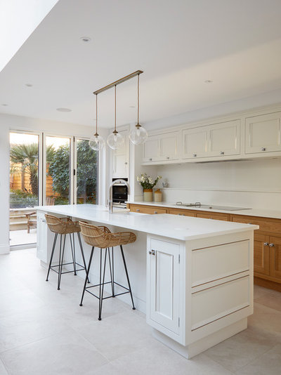
The extra width allowed the team to incorporate an island into the kitchen design, alongside the dining table that fits neatly in the side return.
The white and wood cabinetry gives the space a simple, natural look and ties in with the fresh feel the couple were going for in the rest of the house.
Kitchen, Martin Moore. Cabinets painted in Slaked Lime, Little Greene. Pendant lights, Jim Lawrence.
The white and wood cabinetry gives the space a simple, natural look and ties in with the fresh feel the couple were going for in the rest of the house.
Kitchen, Martin Moore. Cabinets painted in Slaked Lime, Little Greene. Pendant lights, Jim Lawrence.
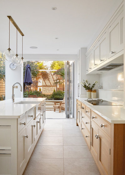
Pale stone floor tiles add to the light feel of the room, and their large format with limited grout lines helps the space feel bigger.
Outdoor versions of the same porcelain tiles were laid on the patio.
Slab khaki porcelain floor tiles, London Stone.
Outdoor versions of the same porcelain tiles were laid on the patio.
Slab khaki porcelain floor tiles, London Stone.
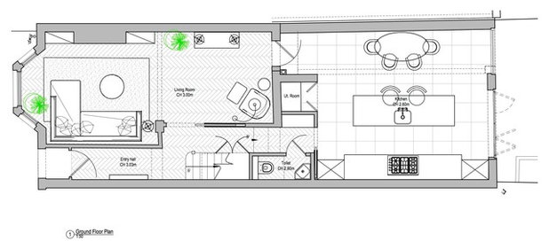
The floorplan shows the new layout of the ground floor and illustrates how the designers have fitted a utility room at the back of the kitchen.
The double doors behind the island lead to the utility room, and are designed to blend in seamlessly with the kitchen units.
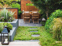
Natalia and the team hired their partners at Refolo Landscape Architects to redesign the garden. “Our clients asked for a beautiful and naturally aged garden, with a feature tree visible from the hall and kitchen,” she says.
Natalia and the team hired their partners at Refolo Landscape Architects to redesign the garden. “Our clients asked for a beautiful and naturally aged garden, with a feature tree visible from the hall and kitchen,” she says.
Before Photo
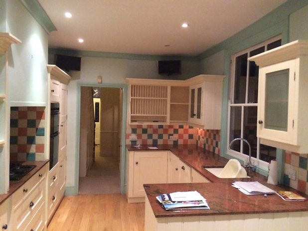
The previous kitchen was smaller and darker than the new space.
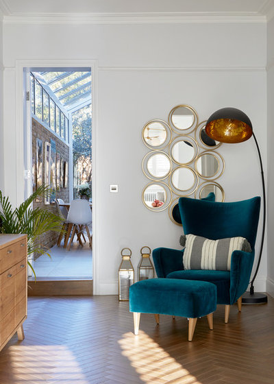
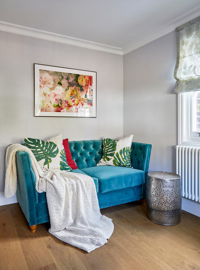
The double reception room was divided into two zones – the front is the living room, while this back section is a reading nook.
“We kept the storage quite minimal, choosing only what was necessary,” Natalia says. “The house has good proportions, and we didn’t want to overload it with furniture.”
Colourful Canopy wall art, Trowbridge Gallery.
Colourful Canopy wall art, Trowbridge Gallery.
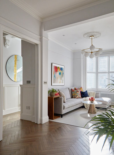
The living room is at the front of the house and is accessed from the hall via a wide doorway.
“Victorian houses tend to have very narrow entrances, so we widened the doorway to bring in more light,” Natalia explains. “The flooring is unbroken between the two rooms, so it works as one space.”
“Victorian houses tend to have very narrow entrances, so we widened the doorway to bring in more light,” Natalia explains. “The flooring is unbroken between the two rooms, so it works as one space.”
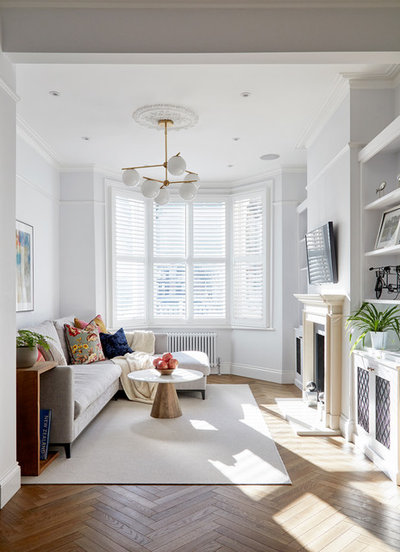
The light colour palette continues in this room. “We chose a neutral colour scheme with a few bright accents to keep the interior spacious and light,” Natalia says.
A natural oak parquet floor complements the character of the house. Natalia’s team designed bespoke storage either side of the newly installed limestone fireplace.
Bespoke bookcases and all other joinery, Three Bells Furniture. Light coffee stained oak herringbone parquet flooring, Fairfax Flooring.
Before Photo
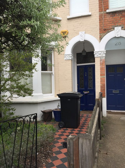
The home’s exterior was previously painted a beige colour.
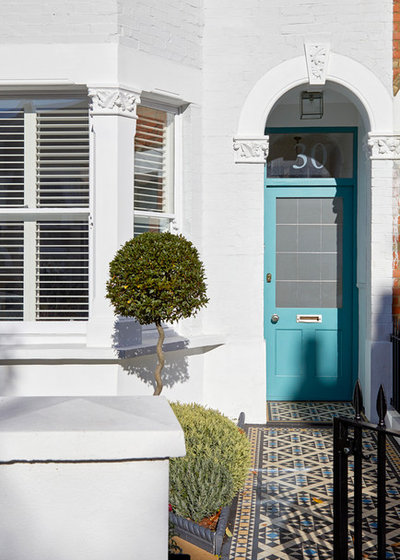
The team revamped the front of the house by restoring and repainting the façade, fitting a new door and laying classic Victorian-style Grasmere tiles along the path.
The front garden was landscaped by the team at Refolo.
The front garden was landscaped by the team at Refolo.
Before Photo
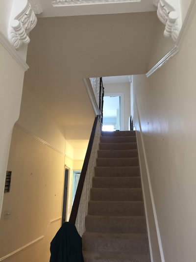
The hallway was quite dark and rundown, but it benefited from some beautiful period features.
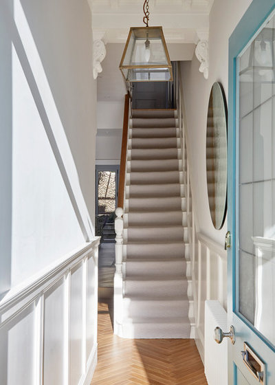
The designers restored the cornicing and ceiling, and installed decorative wall panelling along the hallway, stairs and landing.
As the space is narrow, Natalia decided to keep the entrance area free from shoes, coats and furniture. Instead, she created a niche beneath the stairs with space for coats and outerwear.
As the space is narrow, Natalia decided to keep the entrance area free from shoes, coats and furniture. Instead, she created a niche beneath the stairs with space for coats and outerwear.
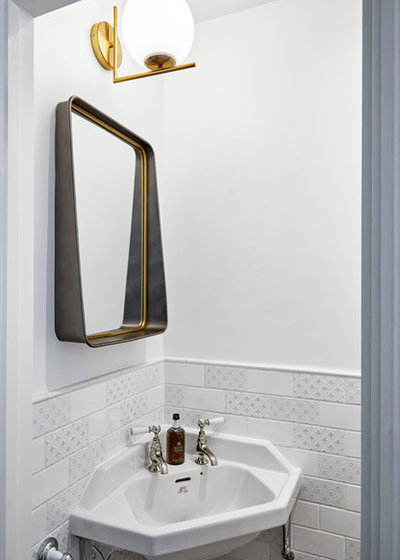
At the end of the hallway, and to the right, is a small cloakroom.
A space-saving corner basin has an ornate design that’s in keeping with the style of the house, while patterned metro tiles add texture.
A space-saving corner basin has an ornate design that’s in keeping with the style of the house, while patterned metro tiles add texture.
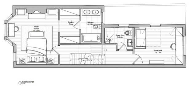
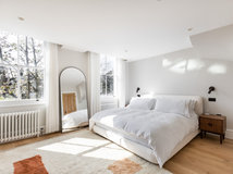
On the first floor, the master bedroom is located at the front, while the back bedroom is now a study.
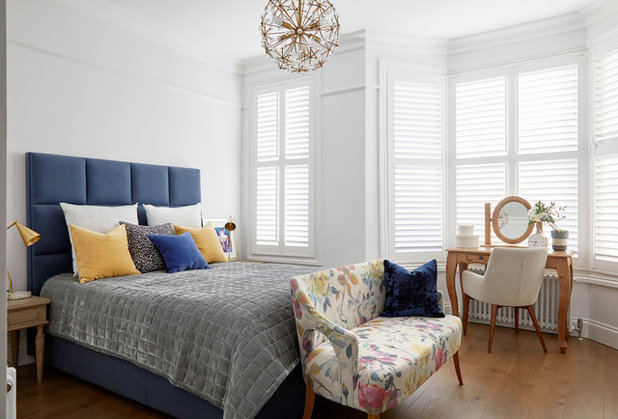
The master bedroom features an engineered oak floor and a cosy upholstered bed and bench seat.
“We chose fabric for the bench that tied in with the textiles on the bed,” Natalia says. “The colours help to break up the monochrome navy and white scheme.”
Light coffee stained oak engineered floorboards, Fairfax Flooring. Bed; bench, both Love Your Home. Bench upholstered in fabric from Designers Guild.
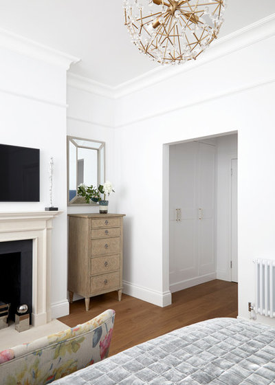
A recess between the bedroom and en suite provides space for a bespoke walk-in wardrobe.
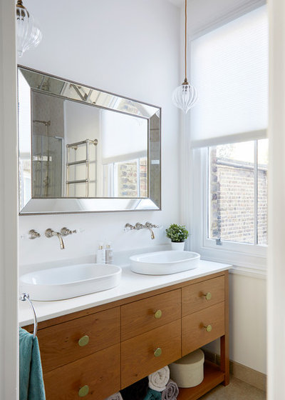
The couple were keen to have a lot of storage in the bathroom, so Natalia had this vanity unit custom-made with plenty of drawers beneath twin basins.
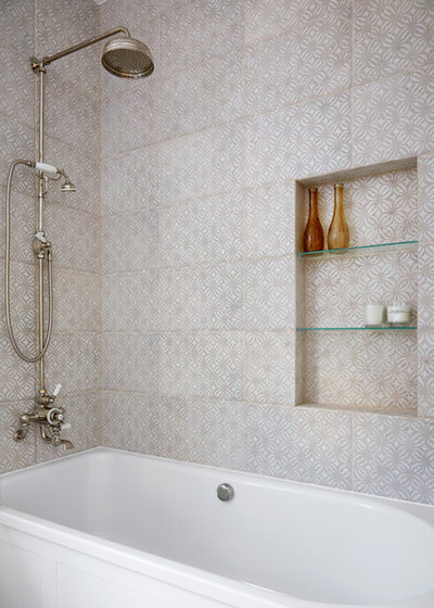
Handmade tiles add warm texture to the bath area, and a handy recess is fitted with glass shelves.
Bath, Lefroy Brooks. Hand-glazed tiles by Pecchioli, Via Arkadia.
Bath, Lefroy Brooks. Hand-glazed tiles by Pecchioli, Via Arkadia.
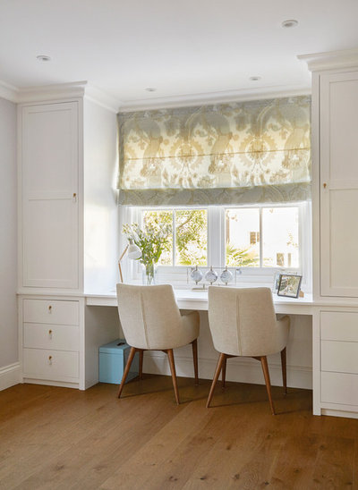
In the study, the designers created a larger window to increase the view to the garden. “We also designed a workstation with drawers, units and extra wardrobe space,” Natalia says.
A sofa-bed provides a comfy place to sit, and turns the space into a guest room when needed.
Sofa bed, Love Your Home. Fabric on Roman blinds, Designers Guild.
Sofa bed, Love Your Home. Fabric on Roman blinds, Designers Guild.
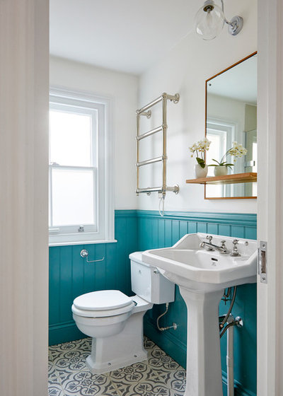
Natalia added personality to the guest shower room with patterned floor tiles and panelling painted in a similar turquoise shade to that used on the front door.
Floor tiles, Tower Ceramics.
Floor tiles, Tower Ceramics.
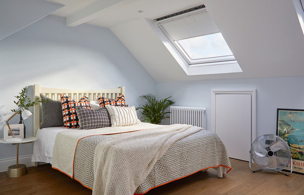
The design team replaced the existing loft rooflight with a bigger one and added a second to increase the amount of light coming into the room.
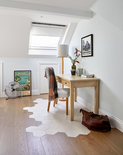
“We’d originally thought of having a freestanding bath in this space, but realised it wasn’t practical,” Natalia says. To accommodate a bath, they’d designed a tiled area. When the idea was dropped, they kept the tile design and used it to zone the desk.
“Every floorboard was cut to the size of the tile. We did the drawing and calculated the number of tiles,” Natalia says. “Then the contractor followed the drawings and levelled it out to overcome the difference in thickness. It was very delicate work.”
Although the couple share a study, this desk provides a separate spot. “We designed the home to give them their own space when needed,” Natalia says, “as well as plenty of areas where they can spend time together and with friends.”
Desk; chair, both Houzz.
Tell us…
What do you like about this light Victorian home? Share your thoughts in the Comments section.

Related Stories

House Tours
Houzz Tour: Warm Tones and Luxurious Surfaces in a City Townhouse
An earthy colour palette, hidden storage and well-placed texture add character and practicality to this London home
Full Story

Room Tours
Kitchen Tour: A Gorgeous Extension With a Leafy Glasshouse Feel
By Kate Burt
When the owners of this terraced house extended, they were keen to retain its period feel and highlight the garden
Full Story

Gardens
Garden Tour: A Bare Roof Terrace Becomes a Pretty, Sociable Space
By Kate Burt
A retired couple got help transforming their large rooftop into a gorgeous, welcoming, multi-functional retreat
Full Story

House Tours
Houzz Tour: A Smart Layout and Genius Storage in a Victorian Home
Flipping the standard layout and carving out excellent storage have turned this tired house into a brilliant family home
Full Story

House Tours
Houzz Tour: A Victorian House Brought Impressively Up to Date
By Jo Simmons
A cohesive layout and warm colours combined with energy-efficiency measures thoroughly modernise this terraced home
Full Story

Kitchen Tours
Kitchen Tour: An Open, Airy Space Made for Entertaining
Combining two separate rooms has improved flow and created a sociable open-plan kitchen, dining and seating space
Full Story

House Tours
Houzz Tour: A Family Home Inspired by its Seaside Location
Coastal colours and practical design combine to create a house that will adapt as the family grows
Full Story

Kitchens
5 Inspiring Before and After Kitchen Transformations
Whether you want to boost storage, incorporate original features or maximise your space, take ideas from these designs
Full Story

House Tours
Houzz Tour: An Airy, Scandi Finish for a Tall Victorian House
By Kate Burt
From a tricky inherited bath to a sticky-out staircase, on-site problem-solving led to a seamless update for an old home
Full Story
House Tours
Houzz Tour: A 17th Century Cottage Gains Warmth and Character
The clever use of colour and pattern has revived this old building while creating a 21st century family home
Full Story
i love the room so much so beautiful
I love it the house us wonderful but it's a crying shame they replaced the beautiful, original stained glass front door with a horrid out of character one.
GOBSMACKED by the decision to replace the original front door... Beautiful renovation otherwise!