Houzz Tours

House Tours

Houzz Tour: A New-build Home With a Modern Farmhouse Vibe
Sage green Shaker kitchen cabinets, tongue-and-groove panelling and lots of natural wood give this new build a cosy mood

Interior designer Judith Balis wanted to create a new home that felt as if it had history. “We wanted this home to feel like a cottage,” she says of the house in Idaho, in the US, that she designed and built in collaboration with Tradewinds General Contracting.
Using soft arches for openings and niches, choosing earthy and handmade elements, and balancing off-whites with dark tones and wood created a pleasingly homely feel in the new house. She gave it an updated look by minimising mouldings, designing simple fireplaces and using floating vanity units and shelving. Here’s a look at how she created a balanced mix.
Using soft arches for openings and niches, choosing earthy and handmade elements, and balancing off-whites with dark tones and wood created a pleasingly homely feel in the new house. She gave it an updated look by minimising mouldings, designing simple fireplaces and using floating vanity units and shelving. Here’s a look at how she created a balanced mix.
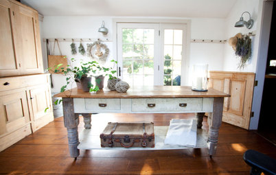
An arched niche in the hall gives a sense of the style inside. Judith used arches to add character and simple curves throughout the house.
She chose Benjamin Moore’s Silver Satin, an off-white with just a hint of grey to it, for the walls. The white oak floor and floating shelf contrast with the walls, while a vintage rug adds warmth.
She chose Benjamin Moore’s Silver Satin, an off-white with just a hint of grey to it, for the walls. The white oak floor and floating shelf contrast with the walls, while a vintage rug adds warmth.
Judith used a range of textures to add character, warmth and an earthy feel. The floor, mantel, ceiling beams and built-in cabinets are white oak.
The large light fixture overhead is iron with a matt black finish that plays off the front doors. “I needed something dark for contrast because the walls are so light,” she says.
Woven accessories and branches bring in more natural textures.
The large light fixture overhead is iron with a matt black finish that plays off the front doors. “I needed something dark for contrast because the walls are so light,” she says.
Woven accessories and branches bring in more natural textures.
The fireplace is a great example of how Judith kept things simple yet not sterile. “I used an oversized, exaggerated fireplace box, and I didn’t want to junk it up with a bunch of stuff,” she says. Instead, there’s a plain black metal surround with a clean white oak mantel floating over it.
She also added texture in key places throughout the house with panelling composed of individual planks of MDF. Another detail she repeated was illuminating different features with library lights, seen here above the arched niches. Repeating design features created a sense of cohesiveness from room to room.
She also added texture in key places throughout the house with panelling composed of individual planks of MDF. Another detail she repeated was illuminating different features with library lights, seen here above the arched niches. Repeating design features created a sense of cohesiveness from room to room.
The living room, dining room and kitchen are open-plan. Judith tied them together with materials, such as black iron on the light fixtures.
The doors next to the dining room lead to an expansive deck with an outdoor kitchen.
The doors next to the dining room lead to an expansive deck with an outdoor kitchen.

Need a pro for your home renovation project?
Let Houzz find the best pros for you
Let Houzz find the best pros for you
The dining area enjoys a view of the living room fireplace and arched niches.
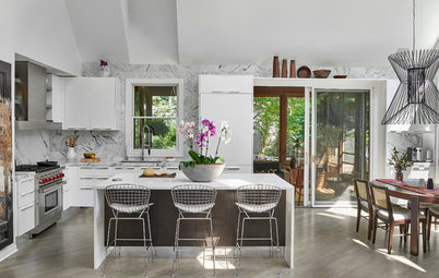
The kitchen occupies a corner of the room. Judith created a focal point with a bespoke extractor hood. She accentuated it by using symmetry around it with the cabinetry and pendant lights. She placed the fridge off to the side within the work triangle.
Posts on the white oak island give it a furniture-like feel, while the bar stools add a modern touch. In the back corner, Judith used white oak floating shelves rather than running the cabinetry right up the wall. This helped to keep a lighter feel in the kitchen.
Posts on the white oak island give it a furniture-like feel, while the bar stools add a modern touch. In the back corner, Judith used white oak floating shelves rather than running the cabinetry right up the wall. This helped to keep a lighter feel in the kitchen.
“On the [splashback], we used tiles with a really rough and uneven look that feels very handmade, and an earthy sage green on the cabinetry. Then we chose polished nickel accents, so it didn’t feel too casual,” Judith says. “It was always about balancing that mix.”
Glazed cabinet doors provide a lighter look in the windowless kitchen space. Judith backed them in white oak.
Glazed cabinet doors provide a lighter look in the windowless kitchen space. Judith backed them in white oak.
Another vintage rug adds warmth, softness and a sense of age to the room. To the left of the fridge, Judith created a little bar area. The opening to the right of the fridge leads to a walk-in pantry.
The right side of the photo offers a good look at the lack of architrave around the door opening. This is called a kerfed door jamb and Judith used them throughout the house. “There’s no decorative wood trim – the [plasterboard] wraps around for a really clean look,” she says.
The right side of the photo offers a good look at the lack of architrave around the door opening. This is called a kerfed door jamb and Judith used them throughout the house. “There’s no decorative wood trim – the [plasterboard] wraps around for a really clean look,” she says.
The designer continued the sage green cabinetry, white oak floating shelves and black accents in the pantry. The space also contains a beverage fridge and a small farmhouse sink.
This boot room is off the garage entry and has a cloakroom located off it. Judith added well-worn texture to the floor by using tumbled brick in a herringbone pattern.
In the cloakroom, Judith repurposed a chest of drawers with an antique look as a vanity unit to add character. Panelling painted in Sherwin-Williams’ dark Iron Ore add depth to the space, while the brass sconces and mirror frame bring in some brightness.
In the home office, Judith repeated the use of Iron Ore paint on the built-in cabinets that flank the window seat. The brass library lights over them add warmth and make the room extra cosy after dark.
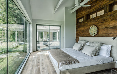
Another simple sloping fireplace is a wonderful asset in the homeowners’ bedroom. The vaulted ceiling has one wood beam that runs along the ridge. A chair placed between the fireplace and large windows provides a toasty and bright spot for reading.
Board-and-batten woodwork adds a casual touch behind the iron bed’s headboard. A hide bench, flatweave rug and a mix of textiles for the bed linens make the room inviting. The doorway leads to the bathroom.
“I designed the house around this tumbled travertine mosaic floor tile,” Judith says. “It was so earthy, and a sample of it rode around in the car with me for about six months as I chose everything else. It set the tone for the entire house.”
The mirrors hang from hooks with square backplates, adding character to the space. “I didn’t want to use basic mirrors; I wanted to add something interesting and artistic,” Judith says. Floating the white oak vanity unit added a modern touch, while using polished nickel finishes brought in timeless elegance.
The mirrors hang from hooks with square backplates, adding character to the space. “I didn’t want to use basic mirrors; I wanted to add something interesting and artistic,” Judith says. Floating the white oak vanity unit added a modern touch, while using polished nickel finishes brought in timeless elegance.
Judith repeated the arch and floating white oak shelves next to the bath. The panelled look of the walls and the freestanding tub lend a sense of age.
The shower cubicle has another arched opening. Judith used handmade tiles on the shower walls. A long bench runs along the back wall of the cubicle. The French doors to the right lead to a private hot tub patio.
In the guest suite, French windows open to a patio. Judith used Iron Ore paint behind the bed.
The guest bathroom is a play of light and dark. Judith plucked colours from the patterned floor – Iron Ore on the woodwork and a range of whites and creams on the zellige-like shower tiles. The handmade tiles and white oak vanity unit warm up the space.
Judith designed the vanity unit. Drawers on the bottom make the most of storage space. “These drawers are great for storing toilet paper. And the legs on the unit give it a furniture-like look,” she says.
Tell us…
What’s your favourite feature in this fresh yet cosy home? Share your thoughts in the Comments.


Sponsored
Reload the page to not see this specific ad anymore
Who lives here? A couple
Location Eagle, Idaho, USA
Size Three bedrooms and three bathrooms; 3,371 sq ft (313 sq m)
Designer Judith Balis Interiors
Builder Tradewinds General Contracting
Photos by Andi Marshall
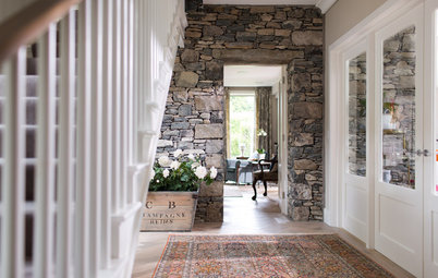
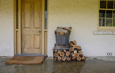
Judith created a balanced mix of old and new throughout the home that starts at the entrance: overgrouted limestone lends a sense of age to the home’s exterior, while steel-framed glass doors add a modern touch and fill the hallway with light.