katerinacoghlan87

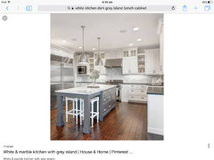
Looking for advice for kitchen colour scheme

Kathy
6 years ago
Hi! Only recently heard about this app. I'd appreciate a bit of guidance here.

Kitchen is going in at the end of the month. Benchtop is locked in but I've got to give my final colour choices for joinery and tiles this week. Tiles will have to have white grout.

I'll attach the inspiration photos and our kitchen layout will be similar to the one with the herring bone backsplash.

We're having a Frosty Carrina stone bench top, based on advice here I'm going to look at Dulux Wairakei Qtr or Snowy Mountains.

I would like to hear opinions on the two colours above and also suggestions for the colour I should use for the island?

For tiles, I've seen Sonoma - Bossy Grey subway tiles suggested and think they look good. But I'm not sure where I could find this type of tile in Sydney.

How do you think this will all come together?

Thanks in advance.

Comments (38)

  • Kathy
    Original Author
    6 years ago
    **just to clarify, the Dulux whites are for the joinery. The walls will be Tranquil Retreat 1/2 strength.
  • annb1997
    6 years ago

    And your flooring to be?

  • Kathy
    Original Author
    6 years ago
    Floating floorboards but unsure exactly whether to go dark or a warmer tone. Pretty much deciding between the fkoors in those two photos. Husband likes the dark but I'm not sure I'm bold enough to do that!
  • annb1997
    6 years ago

    Well, I've looked at both whites, although couldn't find the Quarter strength, just full strength. I think either of them for your joinery will complement your Frosty Carrina bendhtop beautifully.

    The tiles are a lovely colour and tie in well with your scheme. I'll do some checking and see where in Sydney they might be available.

    Of the two floors (both are beautiful) I'm with you on lighter timber. But, here's what I'm wondering and it might help as a compromise with your husband. Would you be brave enough to your island cabinet in a dark grey or even black?


  • annb1997
    6 years ago

    Sorry I mean Quarter strength Wairakei

  • Kathy
    Original Author
    6 years ago
    Thanks so much for your input. It's nice to share ideas with someone who's interested. I'm definitely with you on a darker island. Black seems a bit too much for me but I'd look at some dark greys.
    Do you think I should look for a grey that has a brown tone to it? Is that even a thing!?
  • annb1997
    6 years ago

    I'm not sure what that would look like, I'll have to have a look at some colours. I have just seen some blacks (Resene paint brand) with distinct brown tones that I thought looked kind of dirty, not true black. Are you thinking grey with brown undertone to tie in with flooring?

  • annb1997
    6 years ago

    I love the island bench cabinet in a dark colour. These just happen to be black or navy. I wish I'd thought to do this in my kitchen when we built a couple of years ago. I was so conscious to stay within budget that I didn't explore all the different styles and options. It's great you have a firm idea of what you want.

    what style is your kitchen, overall? And the cabinets? Are they Shaker by any chance?

  • Kathy
    Original Author
    6 years ago
    Yes. I've read the Frosty Carrina is comparatively a warm toned bench even though it has the grey veins through it so I guess that's another reason. Really, though, I'm not confident those are the best reasons for picking a colour. In no sure what's important and I don't want it to be jarring to look at!
  • annb1997
    6 years ago


    Dark grey island cabinets and dark timber flooring - it does look great!

  • Kathy
    Original Author
    6 years ago
    Yes, they are shaker doors. Sorry I had a bit of a lag replying there and didn't see your photos until now. Thanks for that. I prefer the darker islands.
    I only have these ideas because I can search around for photos. None of my ideas are original, I'm afraid ;)
  • Kathy
    Original Author
    6 years ago
    Perhaps a really dark grey (almost black) is the way to go, looks great against both floors?
  • annb1997
    6 years ago

    Have you seen any lighter timber flooring you like? And would timber floor just be in the kitchen or are you extending it to include other rooms/areas.

    yes, it is good to talk about these things! I've been enjoying this Houzz app.


  • annb1997
    6 years ago

    Oh that's ok! I ran off to the kitchen to do the dishes and feed a dog!

  • annb1997
    6 years ago

    Haha, very few ideas are truly original, so you are in plenty of good company! :)

    i do the same thing, look through magazines and photos on internet. I know what I like when I see it, but not usually before!

  • annb1997
    6 years ago

    Yes, I think a dark island cabinet will be striking on dark flooring, but it will also look beautiful on lighter. Maybe think about what other finishes you want in the room. Are you also looking for lighting or bench stools? Is this a new house or are you renovating?

  • Kathy
    Original Author
    6 years ago
    We are renovating our house before moving in. It was a bright orange laminate kitchen!
    The flooring will extend into the surrounding dining and lounge room spaces and down the hallway to the bedrooms (which will be carpeted).
    I'm going to head out this morning and pick up some paint swatches for the island. I'll snap a photo of all the colours together and pop them here.
    We are going to shop around for flooring this upcoming week. I do really enjoy the lighter floors in the inspiration photo so I guess I'll see how much my husband really insists on the dark timber and what our budget allows for.
  • annb1997
    6 years ago

    Sounds like you will have a fun day out, Kathy! Looking forward to your photos. it's not always easy when there are differing preferences for particular features. It is a big decision about the flooring and you both want to be content with the decision. Best wishes!

  • Kathy
    Original Author
    6 years ago
    So I went and collected these samples today and took photos both in natural light and under the down lights I'll have in the kitchen.

    The Wairakei colour is a NZ paint so they prepared a sample pot which I'm yet to look at.

    The Frosty Carrina looks warmer in the down light photos than it appeared to me.

    We both really like the Knight Grey and my husband is happy with that, which is good!

    Natural White caught my eye as it had been mentioned elsewhere as a good choice for Frosty Cartons and as a warmer option.
    Snowy Mountains looked good too, though I think a half strength would look best and not too dark overall.

    That's all for now, opinions and suggestions welcome!
  • Kathy
    Original Author
    6 years ago
    Sure, I'll check out the Dulux Timeless Grey too. Thank you.
  • PRO
    Creative Style Interior Design
    6 years ago
    Hi Kathy if you’re after a lovely warm dark grey, check out Dulux Raku. BTW if you go with a dark grey island on a dark floorboard, the island will ‘sink’ into the floor as there will be less contrast. If you put the same dark grey island on a light to mid floor, the island will be much more obvious because of the higher level of contrast.
  • annb1997
    6 years ago

    Good point Creative Style. I just looked at the first photo I posted above of black island on light-mid colour flooring and black island stands out much more than when black is on dark floor. Same was true with grey islands in next lot of photos, although I noticed the lightest grey contrasted well with the dark timber floor.

  • annb1997
    6 years ago

    Kathy, Knight Grey looks good next to Snowy Mts in natural light and kitchen lighting. Does half strength mean a lighter shade with half the pigmentation?

    Knight Grey looks good with Natural White also in natural and kitchen lighting.

    thx for sharing photos!

  • antonia_d
    6 years ago
    I have a Frosty Carrina benchtop and splashback with dark coloured cabinetry - african wenge. I do prefer the darker coloured cabinetry. Our walls are also in Tranquil retreat, however 1/4 strength.
  • annb1997
    6 years ago

  • PRO
    Creative Style Interior Design
    6 years ago

    Hi Annb1997 sorry but you’ve misinterpreted my previous comment. Just to clarify, if the island and flooring are around the same depth of colour eg.both dark they will tend to merge into one another and the island will be less of a feature due to a lack of contrast.

  • annb1997
    6 years ago

    Nope, I understood.

  • Kathy
    Original Author
    6 years ago
    Hello again, thank you for the input. I've taken it all on board.

    Regarding the island, we will be sticking with Knights Grey but if we choose a very dark floorboard, we will then switch to Timeless Grey (which happened to be one of the swatches I'd picked up anyway!) to avoid that sinking effect. Thanks for the tip. I won't be able to get back out this week to check the Dulux Raku colour, did I mention that I'm getting around with a 1 month old and 2 year old? They are totally dictating my schedule!

    Ann I'm not sure exactly how they get half strength. I just have the understanding that paint looks darker on a wall than it does on the sample card so to always opt for a lighter shade to counter that effect. So to avoid the Snowy Mountains colour looking too dark, I will go for a half strength. Worst case, I figure, is that it will just be a touch lighter than what I'd expected. There wasn't consistency between the three separate Snowy Mountains cards that I ended up with so I guess it's to be expected anyway.

    Thanks for sharing your experience Antonia, it's good to know it works.

    Today I went out to Beaumont Tiles to try and find a tile like the one I attached to my original post. This was surprisingly difficult to match and I've borrowed a sample of the closest match from the store to mull it over. The colour seems to work quite well against all my samples but I'm worried about the wavy edge and how it will appear on the wall when grouted.
    On the one hand I'm worried it will look too busy or untidy, on the other hand I think it could be a winner because it could add some depth or interest to an otherwise boring subway tile splash back.

    I've attached the tile against my samples and also Tranquil Retreat (half strength) wall with Vivid White trim.

    Please tell me what you think :)
  • Kathy
    Original Author
    6 years ago
    My mum sent me this example of what it looks like and I think it's scared me right off it. I need to make final decisions by tomorrow night so I've got by work cut out tomorrow trying to figure this out!
  • PRO
    Creative Style Interior Design
    6 years ago

    I think the tile will look very country style. Have you thought about using Frosty Carina on the splashback. It’s a lovely classic look!

  • annb1997
    6 years ago

    Some images of that type of tile. From a practical standpoint, I have to wonder how easily it is to wipe clean as kitchen backsplash, but I have not personal experience. May be someone else does. Having said that, it has an interesting texture, shadowing and reflective qualities that are appealing. For me, I could easily have it in say a powder room and be happy with it.

    If you are having doubts about using subway tiles, perhaps keep looking - try other suppliers and look through Houzz photos to see if something else catches your eye. I agree with Creative Style Interior Design that you won't go wrong using the same material as your benchtop.

  • Kathy
    Original Author
    6 years ago
    I don't mind the stone splash back but it is too late to do that now. I am locked into some sort of tile with white grout. I just have to give my final decision first thing tomorrow morning. I've been looking but time and time again, a subway tile seems to be the way to go. I might try and find one with a clean edge as I'm not sure that wavy look will be what I want.
    I spoke to my husband and we decided if it looks horrible or is too difficult to keep clean, we will update it in a couple years.

    I'll let you know how I go today.
    Does anyone know if the longer version of the subway tile has a different name or if it is just a long subway tile?
  • annb1997
    6 years ago

    Don't know but I would think the people at tile store would have idea about that. Good luck, Kathy.

  • Kathy
    Original Author
    6 years ago
    I've narrowed down to two sample titles and will be able to finalise my decision when the kitchen is in, as was suggested.

    We've had a last minute change of heart on flooring and will now be installing a gorgeous brown/black floorboard so the island will now be white likes rest of the kitchen.

    So here are some pictures. One rule is a neautral grey subway tile with an uneven edge and the other is a larger plain white tile. The second image is in the tile shop with a white grout sample. It's harsh fluorescent lighting but you can get an idea.

    I'll post photos of the kitchen next month when it's getting installed. Thanks for your helpful responses everyone. Please don't hesitate to add more in the meantime.
  • Kathy
    Original Author
    6 years ago
    Excuse the typos! Sorry a bit short on time.
  • PRO
    Creative Style Interior Design
    6 years ago

    I’d suggest the white tile and let the Frosty Carina benchtops be the hero in the space. Love to see photos when you’re finished!

  • annb1997
    6 years ago

    Looks like the uneven edged ones are matte, whereas the earlier ones you were considering were glossy. The matte looks like it will blend much better than the glossy and not compete for attention as much, but I agree with Creative re the white tiles. Go with your gut and choose the ones that sing to you. Best wishes Kathy!

Ireland
Tailor my experience with cookies

Houzz uses cookies and similar technologies to personalise my experience, serve me relevant content, and improve Houzz products and services. By clicking ‘Accept’ I agree to this, as further described in the Houzz Cookie Policy. I can reject non-essential cookies by clicking ‘Manage Preferences’.