Scandinavian Kitchen with All Types of Ceiling Ideas and Designs
Refine by:
Budget
Sort by:Popular Today
161 - 180 of 1,576 photos
Item 1 of 3
Sopra la cucina è stata creata una veletta in cartongesso, utilizzata come continuazione della libreria che ospita la televisione a sinistra del blocco a parete.
This 90's home received a complete transformation. A renovation on a tight timeframe meant we used our designer tricks to create a home that looks and feels completely different while keeping construction to a bare minimum. This beautiful Dulux 'Currency Creek' kitchen was custom made to fit the original kitchen layout. Opening the space up by adding glass steel framed doors and a double sided Mt Blanc fireplace allowed natural light to flood through.
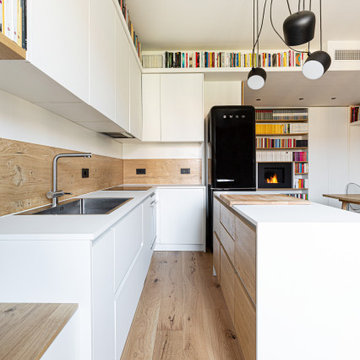
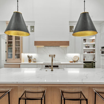
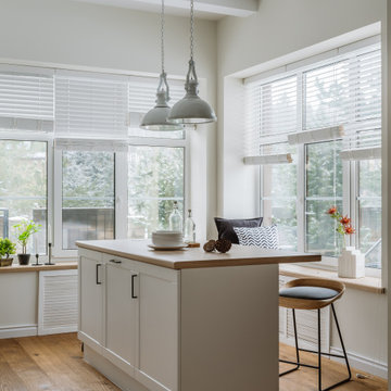
In this kitchen remodel, the door to the pantry/laundry room was relocated to give the owner more countertop space, but the kitchen is otherwise using the same basic kitchen layout. Everything in this kitchen is new, including all cabinets, appliances, lighting, etc. The homeowner wanted light, wide-plank wood floors for a Scandinavian feel, so they opted for Westover Oak throughout the home and removed the old laminate flooring.
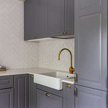
Die ruhige Anmutung der kleinen Küche entsteht durch die wenigen Fronten. Hinter Ihnen verbergen sich Kühlschrank, Spülmaschine, innenliegende Schubkästen sowie ein Apothekerauszug in der Trennwand zur Treppe.
La cucina bicolore con parte basse in rovere chiaro e parte alta avorio trova spazio in un ambiente che funge anche da sala da pranzo. Il piano di lavoro e lo schienale paraschizzi in Dekton permette di realizzare la vasca lavello dello stesso materiale e di poter cucinare in un ambiente perfettamente sicuro e funzionale.
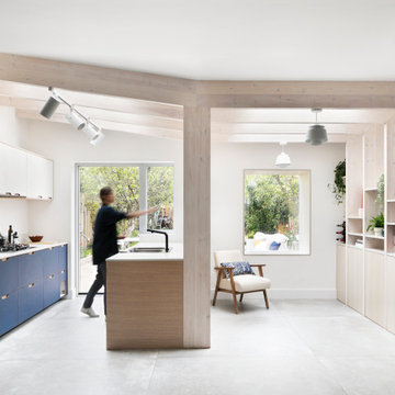
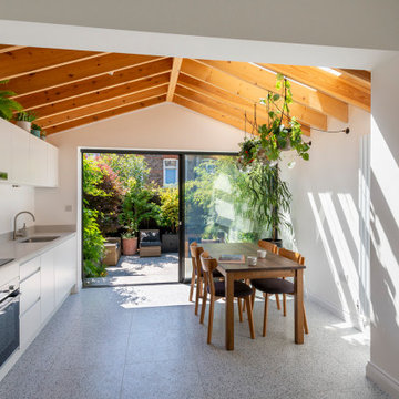
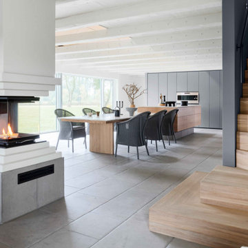
Amos Goldreich Architecture has completed an asymmetric brick extension that celebrates light and modern life for a young family in North London. The new layout gives the family distinct kitchen, dining and relaxation zones, and views to the large rear garden from numerous angles within the home.
The owners wanted to update the property in a way that would maximise the available space and reconnect different areas while leaving them clearly defined. Rather than building the common, open box extension, Amos Goldreich Architecture created distinctly separate yet connected spaces both externally and internally using an asymmetric form united by pale white bricks.
Previously the rear plan of the house was divided into a kitchen, dining room and conservatory. The kitchen and dining room were very dark; the kitchen was incredibly narrow and the late 90’s UPVC conservatory was thermally inefficient. Bringing in natural light and creating views into the garden where the clients’ children often spend time playing were both important elements of the brief. Amos Goldreich Architecture designed a large X by X metre box window in the centre of the sitting room that offers views from both the sitting area and dining table, meaning the clients can keep an eye on the children while working or relaxing.
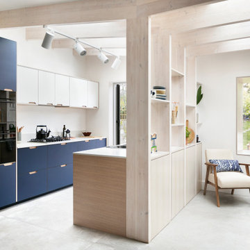
Amos Goldreich Architecture enlivened and lightened the home by working with materials that encourage the diffusion of light throughout the spaces. Exposed timber rafters create a clever shelving screen, functioning both as open storage and a permeable room divider to maintain the connection between the sitting area and kitchen. A deep blue kitchen with plywood handle detailing creates balance and contrast against the light tones of the pale timber and white walls.
The new extension is clad in white bricks which help to bounce light around the new interiors, emphasise the freshness and newness, and create a clear, distinct separation from the existing part of the late Victorian semi-detached London home. Brick continues to make an impact in the patio area where Amos Goldreich Architecture chose to use Stone Grey brick pavers for their muted tones and durability. A sedum roof spans the entire extension giving a beautiful view from the first floor bedrooms. The sedum roof also acts to encourage biodiversity and collect rainwater.
Continues
Amos Goldreich, Director of Amos Goldreich Architecture says:
“The Framework House was a fantastic project to work on with our clients. We thought carefully about the space planning to ensure we met the brief for distinct zones, while also keeping a connection to the outdoors and others in the space.
“The materials of the project also had to marry with the new plan. We chose to keep the interiors fresh, calm, and clean so our clients could adapt their future interior design choices easily without the need to renovate the space again.”
Clients, Tom and Jennifer Allen say:
“I couldn’t have envisioned having a space like this. It has completely changed the way we live as a family for the better. We are more connected, yet also have our own spaces to work, eat, play, learn and relax.”
“The extension has had an impact on the entire house. When our son looks out of his window on the first floor, he sees a beautiful planted roof that merges with the garden.”
Zona cucina contemporanea, impreziosita dalla presenza di un materiale pregiato come il marmo che la rende elegante e pulita nelle forme e nei materiali.
Il suo abbinamento al legno, scalda l effetto freddo del marmo andando a creare un giusto equilibrio all'interno del nostro ambiente.
Amos Goldreich Architecture has completed an asymmetric brick extension that celebrates light and modern life for a young family in North London. The new layout gives the family distinct kitchen, dining and relaxation zones, and views to the large rear garden from numerous angles within the home.
The owners wanted to update the property in a way that would maximise the available space and reconnect different areas while leaving them clearly defined. Rather than building the common, open box extension, Amos Goldreich Architecture created distinctly separate yet connected spaces both externally and internally using an asymmetric form united by pale white bricks.
Previously the rear plan of the house was divided into a kitchen, dining room and conservatory. The kitchen and dining room were very dark; the kitchen was incredibly narrow and the late 90’s UPVC conservatory was thermally inefficient. Bringing in natural light and creating views into the garden where the clients’ children often spend time playing were both important elements of the brief. Amos Goldreich Architecture designed a large X by X metre box window in the centre of the sitting room that offers views from both the sitting area and dining table, meaning the clients can keep an eye on the children while working or relaxing.
Amos Goldreich Architecture enlivened and lightened the home by working with materials that encourage the diffusion of light throughout the spaces. Exposed timber rafters create a clever shelving screen, functioning both as open storage and a permeable room divider to maintain the connection between the sitting area and kitchen. A deep blue kitchen with plywood handle detailing creates balance and contrast against the light tones of the pale timber and white walls.
The new extension is clad in white bricks which help to bounce light around the new interiors, emphasise the freshness and newness, and create a clear, distinct separation from the existing part of the late Victorian semi-detached London home. Brick continues to make an impact in the patio area where Amos Goldreich Architecture chose to use Stone Grey brick pavers for their muted tones and durability. A sedum roof spans the entire extension giving a beautiful view from the first floor bedrooms. The sedum roof also acts to encourage biodiversity and collect rainwater.
Continues
Amos Goldreich, Director of Amos Goldreich Architecture says:
“The Framework House was a fantastic project to work on with our clients. We thought carefully about the space planning to ensure we met the brief for distinct zones, while also keeping a connection to the outdoors and others in the space.
“The materials of the project also had to marry with the new plan. We chose to keep the interiors fresh, calm, and clean so our clients could adapt their future interior design choices easily without the need to renovate the space again.”
Clients, Tom and Jennifer Allen say:
“I couldn’t have envisioned having a space like this. It has completely changed the way we live as a family for the better. We are more connected, yet also have our own spaces to work, eat, play, learn and relax.”
“The extension has had an impact on the entire house. When our son looks out of his window on the first floor, he sees a beautiful planted roof that merges with the garden.”
La cucina presenta un blocco a parte attrezzato e un'isola, che si può utilizzare anche come piano snack.
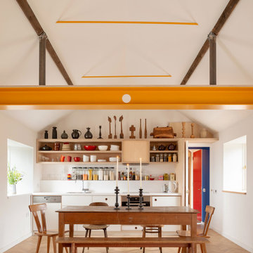
In this kitchen remodel, the door to the pantry/laundry room was relocated (and replaced with a metal door) to give the owner more countertop space, but the kitchen is otherwise using the same basic kitchen layout. Everything in this kitchen is new, including all cabinets, appliances, lighting, etc. The homeowner wanted light, wide-plank wood floors for a Scandinavian feel, so they opted for Westover Oak throughout the home and removed the old laminate flooring.
Scandinavian Kitchen with All Types of Ceiling Ideas and Designs
9