Kitchen with a Submerged Sink and Terrazzo Flooring Ideas and Designs
Refine by:
Budget
Sort by:Popular Today
161 - 180 of 827 photos
Item 1 of 3
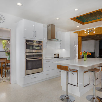
Nearly two decades ago now, Susan and her husband put a letter in the mailbox of this eastside home: "If you have any interest in selling, please reach out." But really, who would give up a Flansburgh House?
Fast forward to 2020, when the house went on the market! By then it was clear that three children and a busy home design studio couldn't be crammed into this efficient footprint. But what's second best to moving into your dream home? Being asked to redesign the functional core for the family that was.
In this classic Flansburgh layout, all the rooms align tidily in a square around a central hall and open air atrium. As such, all the spaces are both connected to one another and also private; and all allow for visual access to the outdoors in two directions—toward the atrium and toward the exterior. All except, in this case, the utilitarian galley kitchen. That space, oft-relegated to second class in midcentury architecture, got the shaft, with narrow doorways on two ends and no good visual access to the atrium or the outside. Who spends time in the kitchen anyway?
As is often the case with even the very best midcentury architecture, the kitchen at the Flansburgh House needed to be modernized; appliances and cabinetry have come a long way since 1970, but our culture has evolved too, becoming more casual and open in ways we at SYH believe are here to stay. People (gasp!) do spend time—lots of time!—in their kitchens! Nonetheless, our goal was to make this kitchen look as if it had been designed this way by Earl Flansburgh himself.
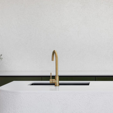
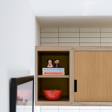
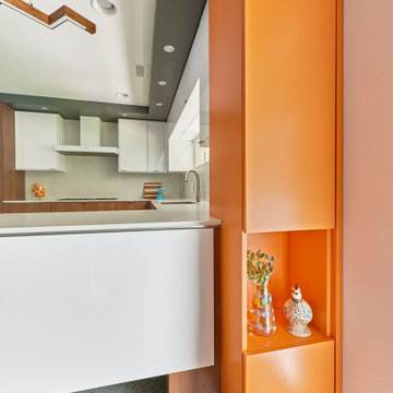
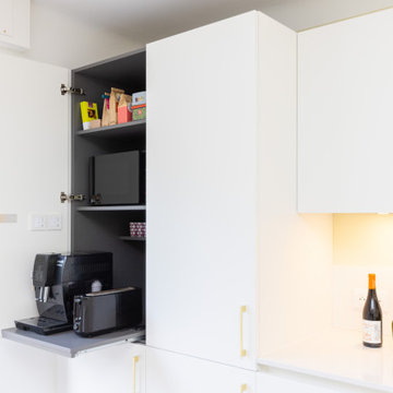
The house came to us full of bold, bright color. We edited out some of it (along with the walls it was on) but kept and built upon the stunning red, orange and yellow closet doors in the family room adjacent to the kitchen. That pop was balanced by a few colorful midcentury pieces that our clients already owned, and the stunning light and verdant green coming in from both the atrium and the perimeter of the house, not to mention the many skylights. Thus, the rest of the space just needed to quiet down and be a beautiful, if neutral, foil. White terrazzo tile grounds custom plywood and black cabinetry, offset by a half wall that offers both camouflage for the cooking mess and also storage below, hidden behind seamless oak tambour.
Contractor: Rusty Peterson
Cabinetry: Stoll's Woodworking
Photographer: Sarah Shields
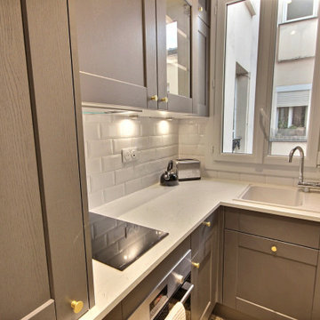
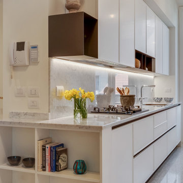
Une cuisine épurée et spacieuse, qui se veux lumineuse, l'électroménagers et intégré de façon discrète.
Le modèle sans poignées apporte un visuel parfait.
Quelques touches de dorées contemporaine ajoute un petit quelque chose !
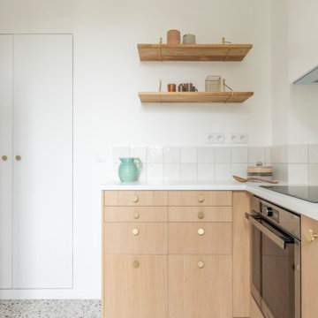
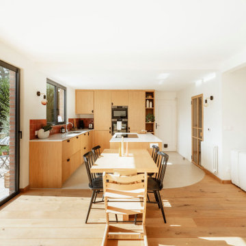
Direction le nord de la France, à Marcq-en Baroeul. Ce projet a été conçu par l’architecte d’intérieur Sacha Guiset et réalisé par notre agence Lilloise.
Dans cette jolie maison rénovée partiellement, l’objectif était de donner un nouveau souffle au rez-de-chaussée en l’inscrivant dans l’air du temps et en apportant un maximum de lumière. La circulation de l’entrée, la pièce de vie et la cuisine ont été repensées dans leur globalité afin que chaque pièce ait une fonction bien précise.
Dans l’entrée, l’accès direct au séjour a été condamné et remplacé par une jolie fenêtre avec cadre en chêne qui donne sur le séjour et laisse passer la lumière. L’imposte qui se trouvait à proximité de la cuisine a été récupéré et utilisé pour créer une superbe porte verrière réalisée sur mesure par notre menuisier.
Sacha a pensé la cuisine comme un espace familial et agréable en L. L’îlot central avec plaque et hotte intégrée permet de fluidifier la circulation et de cuisiner tout en gardant un œil sur le séjour. Quant au coin repas réalisé dans le prolongement de l’îlot il apporte un côté convivial et pratique à la pièce.
On aime l’association des modules IKEA et façades en MDF plaqué chêne, du plan de travail en quartz silestone et de la crédence effet zellige rouge terreux qui vient réchauffer l’ensemble. Sans oublier l’attention accordée au détail des poignées de placards en demi-lunes noires, qui font échos aux cadres des fenêtres, aux chaises en bois et aux appliques Zangra.
Dans le séjour, Sacha a remplacé l’initial poêle à bois par un insert d’angle axé sur le salon, intégré à une banquette basse réalisée sur mesure pour ajouter du rangement. Côté déco, Sacha a opté pour des objets et coussins aux teintes terreuses qui contrastent avec le blanc et apportent de la chaleur à l’intérieur.
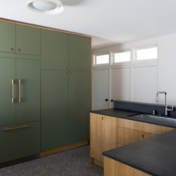
In a home with just about 1000 sf our design needed to thoughtful, unlike the recent contractor-grade flip it had recently undergone. For clients who love to cook and entertain we came up with several floor plans and this open layout worked best. We used every inch available to add storage, work surfaces, and even squeezed in a 3/4 bath! Colorful but still soothing, the greens in the kitchen and blues in the bathroom remind us of Big Sur, and the nod to mid-century perfectly suits the home and it's new owners.
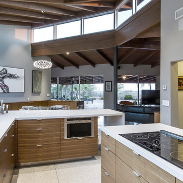
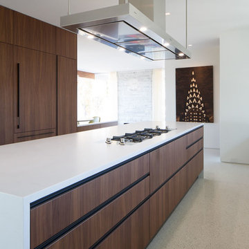
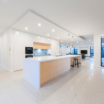
A major kitchen remodel to a spectacular mid-century residence in the Tucson foothills. Project scope included demo of the north facing walls and the roof. The roof was raised and picture windows were added to take advantage of the fantastic view. New terrazzo floors were poured in the renovated kitchen to match the existing floor throughout the home. Custom millwork was created by local craftsmen.
Photo: David Olsen
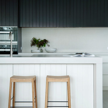
In a federation-style brick home by the beach, dark wood and walls made the kitchen + dining space dark and pokey. A renovation saw walls removed, spaces opened up and a dated kitchen re-vamped. A feature curved stone effect on the island was strip-lit for ambient night-time dining, and a secret door installed for extra storage. New floors, custom cabinetry, new furniture, lighting and a feature fireplace rejuvenated with kit-kat tiles created an entirely different, more functional and more stylish space.
Kitchen with a Submerged Sink and Terrazzo Flooring Ideas and Designs
9