Decorating
Renovating
Why Do We Love Colourful Kitchens in the UK?
Our 2023 UK Kitchen Trends study revealed a surprising trend...

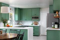
Would your dream kitchen be classic white, or does a rich shade of green or blue cabinetry call to you? If you voted for the latter, you’re not alone. When quizzed on the colour of their kitchen cabinets as part of the 2023 Houzz UK Kitchen Trends study*, UK homeowners were more likely to choose grey, green or blue for their kitchen cabinets than any other country surveyed.
Conversely, the survey showed that, while white was the overwhelmingly popular choice in every other country surveyed, UK homeowners were less likely to choose white than any other country.
Here, three Houzz professionals dig into why this might be and discuss the history of our relationship with colour.
Professional advice from: Rebecca Nokes of John Lewis of Hungerford; Merlin Wright of Plain English; Anthony Earle of Artichoke
They reference nature
While grey was the most popular choice of cabinetry in the UK at 21% of respondents, it was closely followed by blue at 17% and green at 13%, a higher percentage than any other country surveyed. By comparison, in Spain, only 3% of respondents chose blue and 4% chose green, while in Germany, only 3% of respondents chose blue and 3% chose green.
This use of blue and green could be linked to our growing need to reference nature in our design choices. Biophilic design, where interiors reflect and are inspired by nature, has been a rising trend in the UK for several years, and rich forest greens and soothing sea blues are colours that provide an immediate link to the outdoors.
“[Our colour choices] are mostly based on trend forecasting and what we see interior designers doing,” Rebecca Nokes says. “We launched a palette based around sage greens not that long ago, as we noticed those types of shades were becoming very popular.”
We’re influenced by our climate
While white painted units were the leading choice for countries with a Mediterranean climate, richer tones are often more suited to UK light, which could also explain their popularity.
“Our climate, as well as the wide selection of buildings we design for, certainly has influence over colour choice,” Merlin says. “In high-ceilinged, open spaces with floor-to-ceiling windows, all whites can look fabulous. In a London basement or Grade II listed building with mullioned windows and a rough stone floor, something more inviting is often called for. A dusty brick red paint colour teamed with a chestnut-toned worktop looks as much at ease in natural sunlight as it does on a damp November afternoon.”
Find a kitchen designer on Houzz today.
They lift our mood on a cloudy day
Referencing the UK climate again, Anthony suggests that colour can cheer up a kitchen on a gloomy day. “Because of our climate, we’re indoors a lot,” Anthony says, “and therefore brightly painted furniture cheers things up.”
Rebecca agrees with this need to choose colours that will have a positive effect on our mood. “People want to feel really cheerful in their homes, so want to add colour into one of the rooms they probably spend the most time in,” she says. “I feel as if people are much braver with colour now, particularly if it’s a forever home.”
Having said that, there are still limits when it comes to some of the brighter colours on the spectrum. “Neutrals are still super-popular,” Rebecca says, “and if clients do want to include a bold colour, such as a bright orange or red, then they tend to want to use it on an island and keep the rest of kitchen in a more neutral or darker shade.”
Colour can showcase our creativity
We place a lot of value on our homes in the UK says Anthony, who links our “ownership obsession” with our desire to decorate our homes in a personal way. “It could be that British people are more self-conscious about what their home says about them, so it makes them braver,” he says. “Colour choice becomes a statement of who they are.”
“You can have a lot of fun with colour,” Merlin agrees. “One beauty of a hand-painted kitchen is the colour can be changed in a few days with a paintbrush.”
More: What Colour Should I Paint My Kitchen Cabinets?
*The 2023 Houzz UK Kitchen Trends study is a report of homeowners who are in the midst of, are planning or have recently completed a kitchen renovation. The online survey was fielded to Houzz UK users in November to December 2022. n=1,085.
Tell us…
What colour would you paint your dream kitchen? Share your thoughts in the Comments.
Tell us…
What colour would you paint your dream kitchen? Share your thoughts in the Comments.

Sponsored
Reload the page to not see this specific ad anymore

Sponsored
Reload the page to not see this specific ad anymore
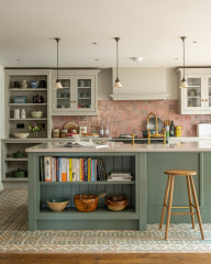
When it comes to modern colour palettes, many UK kitchen companies look to the past for inspiration, in particular the Georgian era, when kitchen cabinets and walls were typically painted a muted shade of grey or blue.
“When the Georgians first adopted this style of painted furniture, they typically favoured ‘cake icing’ colours,” Anthony Earle says. “Think duck-egg blues, pale pinks and greens, which were easier to produce at the time. The Regency period followed, with richer, more opulent cupboard paint colours, which instantly caught the attention of high society, gradually catching on among the fashion-forward in the lower classes.”
Anthony takes the age and history of a property into account when choosing a modern colour palette. “We [at Artichoke are] influenced by both the age of the house and the style of the kitchen,” he says. “As specialists in bringing historical joinery into a modern setting, we’re sensitive to what would have been a likely colour palette of the time. This helps to keep our schemes feeling authentic.”
Merlin Wright also cites the influence of historical kitchen colours on Plain English’s modern paint ranges, which reference many of the historic distempers found in Georgian, Regency and Victorian country houses. “We wanted … a range of colours that can be played with and enjoyed while reflecting the classical English details of our cupboards and designs,” he says.