Houzz Tours

Room Tours
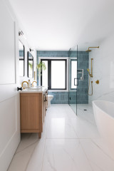
Room Tour: Scandi Tiles and a Clever Layout Transform a Bathroom
A less-is-more approach to this space – from the layout to the fittings – resulted in a room that’s a pleasure to use

Just because you can squeeze all of your wish-list features into a room doesn’t necessarily mean you should. “It’s easy to get blinded by the idea that if it will fit in the space, it’s ok to put it in,” says Karen Knox of Making Spaces, who designed this gorgeous family bathroom. “You have to actually think about how you’re going to use the room.”
The owners wanted a bath and walk-in shower, but had also asked for a luxury-feel space, and Karen suggested they couldn’t have both. “We talked through the logistics,” she recalls. “I said, ‘Open up a towel. Right, you’ve just banged your hand on the shower screen.’”
The owners were happy to trust Karen, and compromising with an over-bath shower has actually made the room feel far more indulgent and a pleasure to use.
In the previous bathroom, there was nowhere for the owners to bathe their young daughter, so they’d resorted to sitting her in this purple tub – not ideal.
Now a deep bath means the little girl can splash happily. If the owners had gone with their original design, it would have meant kneeling in the shower area to bathe their daughter, so Karen’s layout is far more useable.
The team built a stud wall behind the tub to hide the pipework. “We lost a little floor space, but there was a soil pipe in the right-hand corner, so it was a good way of making the wall symmetrical rather than just blanking that off,” Karen explains. It also gave them the chance to create a niche for shampoo and shower gel.
Having the shower over the bath means the handheld attachment can be used easily when bathing, too. It was supposed to click into a wall bracket, but rather than have the pipe dangling into the bath, Karen designed a clever slot in the niche. “We had to put the hose into a container, which then runs into the drain, so that was quite a challenge,” she says.
Duo bath, Kaldewei. Bespoke shower screen with brass hinges, Livinghouse. Vilto stool; Fladis basket, both Ikea.
“Originally, we were going to go with black taps,” Karen says, “but then the owner and I had a bit of a wobble, as it might have looked too contrived to have a monochrome scheme with black brassware, so we had a look at brass, and we liked it. It’s a little bit of glam with the very Scandi tiles – it just lifted the look and made a nice contrast.
“This brushed brass range is lacquered, which doesn’t tarnish,” she adds.
So as not to spoil the effect, Karen searched for a bath that didn’t have chrome fittings, and found a steel enamelled one with an unobtrusive white waste and overflow.
Moca brushed brass tapware, Livinghouse.
“This brushed brass range is lacquered, which doesn’t tarnish,” she adds.
So as not to spoil the effect, Karen searched for a bath that didn’t have chrome fittings, and found a steel enamelled one with an unobtrusive white waste and overflow.
Moca brushed brass tapware, Livinghouse.
There was originally a second doorway to the left of the basin, which led to the master bedroom, but it wasn’t necessary…
…so Karen had it blocked up and designed this stylish birch plywood unit for the space. “As the walls of the house are thick Yorkshire stone, the old doorway offered good depth for the unit – about 30cm,” she says.
Cupboard, made and fitted by Bare Joinery.
Cupboard, made and fitted by Bare Joinery.
The birch ply is sealed with a matt waterproof varnish.
The laundry basket flips open to reveal two sections to make sorting clothes into lights and darks easier.
The washing machine is actually in the boiler cupboard just outside the door, so this is the perfect spot for a laundry box.
The washing machine is actually in the boiler cupboard just outside the door, so this is the perfect spot for a laundry box.
Karen worked out the design for the wall tiles. “We did a mock-up of the wall behind the vanity unit, took a photo, and the owner showed that to the tiler. The owner then felt confident enough to work out the design for the floor,” she says.
“When we were designing this wall, we were trying not to have straight edges where the vanity unit ended – we didn’t want to ‘frame’ the unit, but instead have the tiles fade out a little on either side,” she says.
The vanity unit has a lovely chunky top showing the layers of the plywood. “Certain design elements come about almost through necessity,” Karen says. “The unit in the recess needed a double layer of plywood all around, so we decided to replicate that on the vanity unit.”
Basin, Lusso Stone. Mirror, La Redoute. Koza wall light, Bluesuntree.
The porcelain tiles look encaustic, but cost far less. They’re also easier to fit, as they have straight edges.
“Because the owners wanted the whole room covered, I was concerned about handmade tiles,” Karen says. “Uneven edges make them really difficult to lay. In fact, I was advised to have a back-up tiler, as I’d likely have the first one walk out on the job!” she laughs.
Monochrome Décor Porcelain tiles, Mandarin Stone.
The window opposite the vanity unit shows how thick the walls are. The tiles have been cleverly shaped around the opening and lead the eye out to the gorgeous view.
Looking for a tiler in your neighbourhood? Search in the Houzz Professionals Directory
Looking for a tiler in your neighbourhood? Search in the Houzz Professionals Directory
The old bathroom was a mishmash of colours and styles. The shower screen was on the left, so very close to the basin.
Moving the shower screen to the other side has made the basin area feel more open.
Find bathroom wall lights in the Houzz Shop
Find bathroom wall lights in the Houzz Shop
The loo was in a slightly awkward, central position…
…so Karen had it moved to behind the door, which also means it isn’t visible from outside when the door’s open.
She had the bathroom door painted black to link with the tile design.
Toilet, bathandshower.com.
She had the bathroom door painted black to link with the tile design.
Toilet, bathandshower.com.
The owners aren’t keen on downlights, but the room is quite dark, so Karen fitted neat, trimless spots with no bevel into the ceiling.
As well as the towel radiator, there’s underfloor heating for warm feet on even the coolest of days.
Towel radiator, Feature Radiators.
Tell us…
What do you think of this revamped bathroom? Share your thoughts in the Comments section.
As well as the towel radiator, there’s underfloor heating for warm feet on even the coolest of days.
Towel radiator, Feature Radiators.
Tell us…
What do you think of this revamped bathroom? Share your thoughts in the Comments section.

Sponsored
Reload the page to not see this specific ad anymore
Sponsored
Reload the page to not see this specific ad anymore
Who lives here? A family with one young daughter
Location Leeds
Property A house with two bedrooms and one bathroom within a neo-gothic college building converted into several homes
Room dimensions 1.8 x 2.8m
Designer Karen Knox of Making Spaces
The key words in the brief for this bathroom were Scandi-inspired, monochrome, with some wood, plus plenty of storage.
So Karen chose black and white tiles and birch ply furniture, with brass fittings for that touch of luxury the owners were looking for.