Houzz Tours
Room Tours
Room Tour: An Awkwardly Shaped Living Space is Cleverly Reworked
This family spent 10 years in a poorly configured apartment until professionals offered a bespoke solution
Even though this family with two teenagers had been living in this large duplex apartment in Paris for almost 10 years, they wondered whether it would be better to move out of the property. This was because of the unusual configuration of the living area, which was awkwardly designed. The cluttered entrance and kitchen, which was far too small for the occupants, were a particular issue.
After seeing the agency Atmosphères Design’s expertise in transforming tricky layouts in several stories on Houzz, they contacted interior designers Patricia Coignard and Audrey Pacaud. Their help would be life-changing.
After seeing the agency Atmosphères Design’s expertise in transforming tricky layouts in several stories on Houzz, they contacted interior designers Patricia Coignard and Audrey Pacaud. Their help would be life-changing.
A prominent feature of the property was its living area, which was surrounded by windows and had no right angles, making decorating a challenge.
Two blocks containing service ducts, an entrance cupboard and a toilet were the main elements. Aside from a structural nib wall by the kitchen, there were no partitions against which to place furniture.
Finishes also showed signs of significant wear, such as the cracked flooring and waxed-concrete island.
Ready to renovate? Start the conversation with professionals in your local area.
“It was a great space and, in the best sense of the word, atypical, but not ideal for a family with kids,” Patricia Coignard says. “The different areas were not defined, the kitchen was definitely not suited to the space, and the entrance was a problem. We needed to completely renovate it without [being able to make any structural changes].”
The designers cleverly used a built-in bench seat both to separate the entrance from the kitchen and to provide storage for shoes, which constantly used to clutter the space. “This functional and relaxing area has become the kids’ favourite,” Patricia says.
Feeling inspired? Find an architect on Houzz today
Feeling inspired? Find an architect on Houzz today
Now, a cabinet and clothes rack, made to measure by the team, shuts off the pathway. It also hides the fuse box.
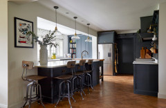
Although a softer colour palette – light-coloured wood, white and pale grey – was chosen for the living area, the designers suggested opting for bolder tones in the entrance to create a visual separation.
“We paired an anthracite unit with metallic champagne paint to mimic the strong presence of the aluminium on the room’s door frames,” Audrey Pacaud says. “We also painted the ceiling in Gris Plomb by Ressource for a box effect.”
The homeowners, who are keen cooks, wanted to close off the path between the kitchen and the entrance to streamline the spaces. So the designers partitioned the corridor with a supporting column that reaches the ceiling on the kitchen side, complete with a wood veneer shelf that can store recipe books.
Rotated by 90 degrees, the island frames the bench seat with shoe storage inside. The other side also has a breakfast bar. “It was a specific request from the owner, who wanted a bar area/breakfast nook with a high table,” Patricia says.
Rotated by 90 degrees, the island frames the bench seat with shoe storage inside. The other side also has a breakfast bar. “It was a specific request from the owner, who wanted a bar area/breakfast nook with a high table,” Patricia says.
This part of the room was an enormous challenge, since the family had a radical transformation in mind. Designed entirely to measure by the agency due to the non-standard dimensions, the kitchen was built by Italian manufacturer Lineaquattro.
To use the space in the best way possible, the U shape was preserved and finished with an island that extends into the bench seat. The designers doubled the amount of storage, as some units go up to the ceiling and the lower cabinets now have drawers installed for even more space.
“The passageways are still convenient: 107cm along the window and 87cm across the kitchen,” Audrey says.
An array of high-quality materials were recommended by the designers: lacquered cupboard doors; marble-effect Dekton worktops; veneered wood on the upper units, and stone-look porcelain tiles on the floor.
“A pale tone was chosen to add light, whereas the wooden [units] above exude warmth,” Patricia says. She decided to bring in the wood to complement the long-standing wood panels between the windows, which were kept and restored.
Find all you need to know about starting a kitchen renovation in our planning section.
The couple also wanted a sharper separation between the kitchen and living room. A custom-made window wall, placed along the existing support section, offers a visual partition between the living area and kitchen.
“The Mondrian-style aluminium posts match those on the existing windows,” Patricia says. “We provided a fairly high frame to integrate a splashback and limit views of the kitchen from the living room.”
A Bora induction hob with an integrated extractor fan was installed to solve the issue of the old, unattractive hood. This appealing and convenient solution circumvents the problem of mounting an overhead hood.
Curved tiling in the kitchen area meets the solid oak floorboards covering the rest of the living space.
“We wanted this curved shape to highlight this zone and counterbalance the straight lines all over this modern property,” Patrica says. “To achieve this, Audrey [and I] had to plan the kitchen installation ahead. It was completed at the very end during a dedicated project meeting. We had to draw the actual size of the kitchen blocks on the floor, so we could place the tiles in advance and not make mistakes in the final result. A brass section marks the transition between the two flooring textures for a perfect finish.”
“We wanted this curved shape to highlight this zone and counterbalance the straight lines all over this modern property,” Patrica says. “To achieve this, Audrey [and I] had to plan the kitchen installation ahead. It was completed at the very end during a dedicated project meeting. We had to draw the actual size of the kitchen blocks on the floor, so we could place the tiles in advance and not make mistakes in the final result. A brass section marks the transition between the two flooring textures for a perfect finish.”
The designers suggested moving the dining area to this previously under-utilised space.
The table now butts up against the kitchen partition. The designers ensured enough space was left behind the table to replace it with a longer model if needed.
The designers also considered how to dress the large, floor-to-ceiling windows. “On this side, you’re by the street and opposite a building, and this building doesn’t have shutters. The family used to have thick linen curtains that were constantly closed due to the building opposite,” Audrey says.
“We replaced them with very light curtains and added three double blackout curtain sections, all made to measure by our upholsterer with quality textiles. You can close one or more sections when it’s sunny,” she continues. “The family love films, so [this means] they can also watch during the daytime.”
“We replaced them with very light curtains and added three double blackout curtain sections, all made to measure by our upholsterer with quality textiles. You can close one or more sections when it’s sunny,” she continues. “The family love films, so [this means] they can also watch during the daytime.”
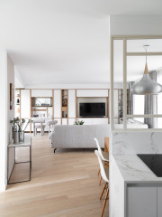
With remote working becoming more common, the family had added an office to the room. “It was non-retractable and was set up out of necessity, but it didn’t really find its true place or aesthetic,” Patricia says. The couple, who also had plenty of books and DVDs, needed to gain more storage space.
“Unfortunately, we couldn’t adjust any structural elements to actually push the walls back. So we suggested replacing the sideboard with a custom-built unit across the entire wall, which was the only way to extend the lines and integrate even more storage,” Patricia says.
The new cabinetry – comprising the TV area, office and storage – was made to fit comfortably under the beam on the left to reach the floor-to-ceiling window and give the impression that the room had been extended.
The new cabinetry – comprising the TV area, office and storage – was made to fit comfortably under the beam on the left to reach the floor-to-ceiling window and give the impression that the room had been extended.
Now it fits neatly within the media unit. “This bespoke unit is a gem,” Audrey says. “Our carpenter built it using lacquered panels enhanced by open oak plywood compartments [that punctuate] the unit. The interior is made of melamine (Alpine White by Egger with a Smoothtouch Matt finish) and metal plating (Champagne Brushed 4051 Skin by Pure Paper) for a velvety touch and no fingerprint marks.”
The L-shaped sofa was originally a very dark grey, which darkened the living room. It was replaced by a premium model made in Italy.
The L-shaped sofa was originally a very dark grey, which darkened the living room. It was replaced by a premium model made in Italy.
The bespoke unit increased space and features details tailored to the family’s needs and lifestyles as much as possible.
The owner wanted a working space that could be tucked away in the evening. This integrated desk does the trick nicely. “We added sockets for the computer and phone and included a wooden shelf and metal inserts to store letters,” Patricia says.
The owner wanted a working space that could be tucked away in the evening. This integrated desk does the trick nicely. “We added sockets for the computer and phone and included a wooden shelf and metal inserts to store letters,” Patricia says.
The customised natural wood nooks, which have metallic laminate boards at the back to maximise light, were designed to display two cherished family heirlooms: a marble bust and a model boat. The entire unit is backlit with dimmable LED lights.
“The homeowners first met us with a view of reselling the property, but after the project, they were completely convinced not to leave Paris,” Patricia says. “This renovation brought unprecedented comfort, easy living and plenty of Zen.”
As philosopher Gaston Bachelard once said, “Our home is our corner of the world.”
The lesson is clear: don’t wait until a badly configured property disrupts your day-to-day life before consulting a design professional.
Tell us…
Which ideas would you take away from this clever renovation? Share your thoughts in the Comments.


Who lives here? A couple with two teenagers
Location Paris, France
Property An apartment built about 20 years ago, located on the third and fourth floors overlooking the street and garden
Project duration 2021 to 2022
Size 55 sq m
Interior designers Patricia Coignard and Audrey Pacaud of Atmosphères Design
Budget €115,000 (around £101,500)
Photos by BCDF Studio