Decorating
Pantone Launch a New Colour... and it's a Tribute to Prince
Inspired by one of music's boldest artists, this new purple hue rocks

The colour gurus at Pantone have raised a goblet to Prince, with the introduction of a new standardized custom colour – Love Symbol #2, which was inspired by the artist’s custom-made Yamaha purple piano. If you’re not sure about using purple in your own home, these stunning rooms will change your mind.
Layer up for cosiness
The welcoming seating area here has been created by layering various shades of purple. Two sofas are upholstered in dusky hues, while the velvet cushions give the space a bolder, more sumptuous feel. To make the whole scheme stand out even more, the designers have added a bright rug, while the pale lilac on the footstool tones everything down.
The welcoming seating area here has been created by layering various shades of purple. Two sofas are upholstered in dusky hues, while the velvet cushions give the space a bolder, more sumptuous feel. To make the whole scheme stand out even more, the designers have added a bright rug, while the pale lilac on the footstool tones everything down.
Paint a piece of furniture
Want a quick fix of purple? Get the paintbrush out. The tall unit here has been given a few coats of a bright purple that really brings it to the forefront. The rest of the kitchen uses natural wood and stainless steel, so the neutral tones have allowed the owners to be bold with this unit. By painting just one element, they’ve ensured the colour doesn’t take over the space.
Discover how to instantly revamp a chest of drawers with paint
Team with crisp white linen
The bright white and pale grey colour scheme in this sleep space is the perfect backdrop for some smart shades of purple. The key to using a limited palette like this is to mix textures – here they’ve contrasted soft velvet with the crisp cotton sheets. The light mauve lampshade forms a bridge between the bold purple and the pale neutrals.
The bright white and pale grey colour scheme in this sleep space is the perfect backdrop for some smart shades of purple. The key to using a limited palette like this is to mix textures – here they’ve contrasted soft velvet with the crisp cotton sheets. The light mauve lampshade forms a bridge between the bold purple and the pale neutrals.
Choose soft tones and textures
Here’s another scheme that proves purple can contribute to a restful scheme. The calming, yet sophisticated, vibe has been created by using complementary shades of purple and green. The pale green walls and darker foliage help to tone down the bold purple, and the textured fabrics and even the more muted hues in the painting all add to the calm feel.
Here’s another scheme that proves purple can contribute to a restful scheme. The calming, yet sophisticated, vibe has been created by using complementary shades of purple and green. The pale green walls and darker foliage help to tone down the bold purple, and the textured fabrics and even the more muted hues in the painting all add to the calm feel.
Work a wow wallcovering…
This bedroom is super sophisticated thanks to the walls being covered in a textured silk that adds an air of luxury to the room. Don’t overdo it though – keep the rest of the space simple, as they’ve done here, with a limited colour palette and clean lines if you want to ensure a cultivated look.
Discover more interesting ways to cover your walls
…or introduce black
The mix of deep purple with black equals pure indulgence. The two colours look stunning together and have been used here, along with ornate metals, to create an eclectic Bohemian feel.
The mix of deep purple with black equals pure indulgence. The two colours look stunning together and have been used here, along with ornate metals, to create an eclectic Bohemian feel.
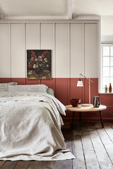
Go for a softer shade
If you’re after something soft, go for a purple with pink tones rather than blue. The cupboard here has been painted in an elegant shade that sits on the edge of the colour spectrum between deep pink and purple. It’s an interesting shade that transforms this cabinet from a beautiful piece of furniture into something a little bit different.
If you’re after something soft, go for a purple with pink tones rather than blue. The cupboard here has been painted in an elegant shade that sits on the edge of the colour spectrum between deep pink and purple. It’s an interesting shade that transforms this cabinet from a beautiful piece of furniture into something a little bit different.
Try a feature wall
For a smart shot of purple that doesn’t overwhelm a space, go for a feature wall and keep other elements neutral. In this living space, the back wall has been given a few coats of a deep purple. The bold colour looks stunning with the white sofa and line of monochrome prints. For an extra layer of interest, the designers have added orange tones with some carefully chosen accessories.
For a smart shot of purple that doesn’t overwhelm a space, go for a feature wall and keep other elements neutral. In this living space, the back wall has been given a few coats of a deep purple. The bold colour looks stunning with the white sofa and line of monochrome prints. For an extra layer of interest, the designers have added orange tones with some carefully chosen accessories.
Warm it up with naturals
Still think purple’s too harsh for you? Tone it right down by adding natural materials like wood, wicker, rattan, sisal and wool. Here, the translucent blind also helps to lighten the bold shade of purple on the walls.
What do you think of purple in interiors? Share your opinion in the Comments section.


Sponsored
Reload the page to not see this specific ad anymore
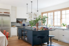
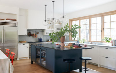
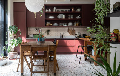
This stylish cookspace has incorporated just the right amount of purple to make a low-key statement. The beautiful aubergine units that line the back wall are bold, yet elegant, and are tempered by the subtle shades of the wood shelving, grey worktop and the nearby white cabinets.