How to Mix Colours and Make It Work
Don’t want to confine yourself to neutrals but lack the confidence to embrace colour? Check out this expert advice

White on white, white mixed with beige or grey and, hmm, maybe a little more white? It’s certainly an in-demand look, but some people want a bit of bold colour in their palettes.
To help you mix colour with more colour to get the look you crave (without going totally overboard), here are some of my top tips for which hues to mix, how to combine them, and how to bring the whole look together.
To help you mix colour with more colour to get the look you crave (without going totally overboard), here are some of my top tips for which hues to mix, how to combine them, and how to bring the whole look together.
2. Tone on tone
An even more vibrant blue is still an easy colour to mix. It works beautifully in tone-on-tone designs to give the sense of a lot of colour, even when most of it is essentially the same hue.
Find an interior designer in the Houzz Professionals Directory.
An even more vibrant blue is still an easy colour to mix. It works beautifully in tone-on-tone designs to give the sense of a lot of colour, even when most of it is essentially the same hue.
Find an interior designer in the Houzz Professionals Directory.
Try combining pure, chilly blues with green-blues or blue-indigos to get subtle variation while keeping the hues tied together. Include a few hot accents, such as flowers, coloured pottery or even books, to add a red or violet counterpoint.
Warm colours also can make for engaging tone-on-tone looks, although with hot hues, it’s usually safer to stick to lighter shades for walls and large pieces to avoid colour overload.
Soft pink walls paired with vivid accents creates a strong colour statement, but the punchy focal pieces, such as a patterned rug, make the walls feel less dramatic by comparison. The central pure pink is offset by shades that are more orange and purple to give variety while staying grounded.
Soft pink walls paired with vivid accents creates a strong colour statement, but the punchy focal pieces, such as a patterned rug, make the walls feel less dramatic by comparison. The central pure pink is offset by shades that are more orange and purple to give variety while staying grounded.
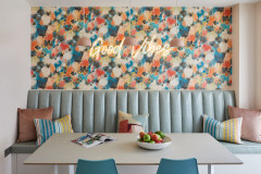
3. More is more
Another approach is to use a bit of every colour imaginable so no one hue feels too overpowering. Try choosing a very colourful piece of art to use as inspiration for your palette. Then pick up fabric accents that echo a similar palette, such as on the striped ottomans seen here.
Another approach is to use a bit of every colour imaginable so no one hue feels too overpowering. Try choosing a very colourful piece of art to use as inspiration for your palette. Then pick up fabric accents that echo a similar palette, such as on the striped ottomans seen here.
4. Wallpaper
Another way to get a rich palette is to choose a bold wallpaper print that has a pleasing colour combo already assembled for you.
This colourful bathroom’s features and materials pick up on the pastel shades found in the delicate butterfly wallpaper. The vibrant purple of the painted claw-foot bath and the light blue of the tiled wainscoting and porcelain tiled flooring are echoed in the paper’s butterflies. Brass fixtures and hardware nod to the yellow wings.
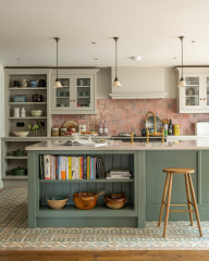
5. Patterns with solids
Notice how this room uses a mix of small-scale patterns and chunky solids. Specifically, each piece either carries many diverse hues or just one (or just one mixed with a little white).
Keeping each piece to this rule of extremes isn’t necessary, but it does make it easier if you’re not confident about mixing. The very colourful pieces combine well because they don’t have a singular hue that stands out (which might clash with another), and the solids are drawn from the wallpaper and fabric, so they have something to relate back to.
Tip: When pulling colours from art and other graphic elements to use as wall hues or solid fabrics, it’s generally safest to pick slightly greyer or paler versions to keep them from looking overly vibrant. However, some of these looks ignore that rule, and if you’re feeling bold, you certainly can, too.
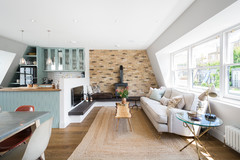
6. Breaking it up
When you mix colour with colour, often the neutral elements end up becoming emphasised. In this room, the splashback and the white background in the artwork break up the blue wall and cabinets, providing a bit of visual breathing room.
You can achieve a similar visual break by adding a framed photo with a deep white mount, or even many in a grid. That the cabinets and wall are a colourful hue makes the room feel alive, but you can use this trick to introduce as much white as necessary to tame the look.
7. White woodwork
Thick white architrave, and similar elements such as doors, ceilings and even white floors, can eat up a lot of wall space. When you paint walls in a case like this, the amount of square footage painted is balanced out, or even low. The result feels very colourful, but in an easily livable way.
More: 7 Ways to Add Character to a Plain Living Room
8. Wood
Another great way to diffuse a colourful look that may be starting to feel overwhelming is to add wood. A wooden dining table, worktops, side tables, chairs, exposed floors or coffee tables can break up a vivid colour combo and add natural warmth to balance out powerful hues.
Another great way to diffuse a colourful look that may be starting to feel overwhelming is to add wood. A wooden dining table, worktops, side tables, chairs, exposed floors or coffee tables can break up a vivid colour combo and add natural warmth to balance out powerful hues.
9. Cushions
If you don’t want to invest in art or upholstery just yet, you can inject colour with cushions. You can easily mix in many colours, building the look up or down by moving pieces around until it feels just right.
Tip: You can find fabrics to use as a colour palette inspiration by borrowing a swatch from a fabric showroom or simply taking a photo of one you like. Even if you don’t end up using that particular fabric in the space, it can beautifully guide your other colour choices.
10. Small splashes
You may not have a pile of cushions in every room, but you can still add lots of playful colour. Eclectic art, pottery and other collected objects can provide lots of colour. Try printing interesting images from your computer or clipping out great magazine photos to fill a gallery of frames. You can change them if you get tired of the look.
You may not have a pile of cushions in every room, but you can still add lots of playful colour. Eclectic art, pottery and other collected objects can provide lots of colour. Try printing interesting images from your computer or clipping out great magazine photos to fill a gallery of frames. You can change them if you get tired of the look.
11. Texture
When working with lots of colour, don’t forget to add interesting texture. This is especially true if the colourful surfaces are mostly painted, and therefore flatter, or if they are brightly lacquered pieces. A bit of rich or rough texture lends depth, which keeps the look feeling sophisticated.
Don’t have a stone wall handy? Try a concrete-effect side table, linen curtains, woven baskets or anything with a rugged appeal to balance out pristine pretty colours and bring your dreamy palette back down to earth.
Tell us…
Which colours have you combined in your rooms? Post a photo and tell us about your favourite colour combos in the Comments.
Which colours have you combined in your rooms? Post a photo and tell us about your favourite colour combos in the Comments.

Sponsored
Reload the page to not see this specific ad anymore
Sponsored
Reload the page to not see this specific ad anymore
In recent years, the trend of embracing semi-neutrals has returned. These are colours that can’t be considered true neutrals, but are still easy to combine and work with. Blues and greens, being such natural hues, tend to be the most cooperative of colours, and this is especially true when you choose mid-tone shades with a hint of grey.
When combined, such hues feel lively, but as neither is very aggressive on its own, the resulting pairing isn’t over the top.