How To Decorate With Dulux's Colour of The Year 2018 – Heart Wood
When the world is full of uncertainties, let this soft muted mauve hue create a soothing mood in your home

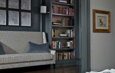
A sort of gentle grey-pink tone, Heart Wood, the shade picked by Dulux as its Colour of the Year 2018, is described by the paint brand as a hue that “represents the warmth of natural wood – the warmth that consumers turn to during times of flux”. As our homes become sanctuaries to retreat to in unstable times, there can be comfort in room schemes that welcome us in and nurture. For inspiration on how to make your home feel more cocooning and comforting, be inspired by these interiors that embrace subtle mauves, soft heathers and moody greys.
Go cool and contemporary…
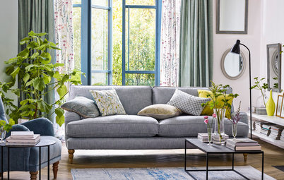
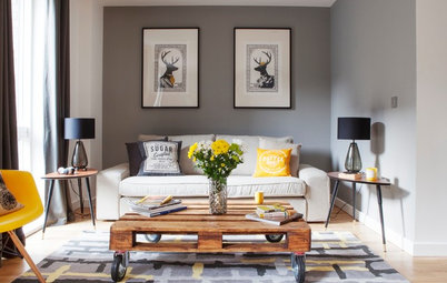
Use the colour as part of a muted pink-grey palette. Although pastels might be considered to be spring-like, even pale neutrals can feel cosy when shades and textures are layered up, and it will work especially well in rooms that get plenty of light all year round. You can instantly cosy up a neutral sofa – without making it heavy and wintry – with a selection of cushions in different tones of mauve. Alternatively, make more of this warming hue and choose a loose cover for your sofa in the shade, as seen here. Relaxed linens are instantly welcoming. For winter, just add blankets or cushions and a thick rug or two in natural materials.
If you prefer blinds to curtains but like the luxury of tactile textiles at your window, then soft but simple Roman blinds can also play a role in heightening the comfort factor over roller blinds.
10 ideas for brightening a dark living room
…or traditional and rustic (with a twist)
Go a touch deeper with your core shade of mauve and autumnal or less well lit rooms will shine, too. Think shades of heather, soft checks, and cream and natural stone as a backdrop. If you’re brave enough to go for a pale rug or carpet underfoot (and don’t have dogs or small children and do have a dreamy boot room), it’s a lovely way to lighten up a dim room and gives a traditional country interior a bit of a twist.
Again, layers and texture – from the subtly different colour tones to the bare stone fireplace, log basket, gleaming wood lintel and soft upholstery – are the key here to a warm and inviting interior. Just go for plenty more if your look is more country cool than contemporary townhouse.
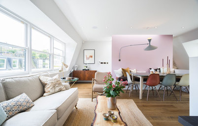
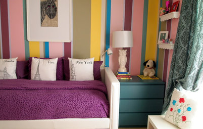
Dial down the sorbet pastels
For a more muted take on pink and mint (a popular combination on Houzz with a lovely 1950s ice-cream parlour feel), try switching your blush pink for something muddier, like Heart Wood.
Pulling off the perfect combination is all about pairing depth and tone of colour in the two shades, so before you get the paintbrushes out, test, test and test again in different lights. Here, the cupboard has been painted with an underplayed pistachio green with a distressed finish. For the ultimate in well-coordinated walls and furniture, you could give your painted piece a first coat in the wall colour and, as you rub down the edges and corners, little flashes of it will show through.
Why pink and mint tones are the perfect colour pairing
Bring out its pink…
Dulux’s Heart Wood is a versatile colour, and it can be warmed up or cooled down. Want to know how? This room will show you. Here, the gentle putty colour used on the floor-to-ceiling shelving provides a neutral backdrop – but what you put next to neutrals can really alter the colour they appear to be. See this in action: use your hand to cover half your screen, taking out those pink chairs and the sofa, and suddenly the backdrop is a blank canvas, neither warm nor cool. The seating really heats things up and pinkens the colour of the shelves rather than enhancing its grey tones.
Charcoal or pale grey sofas with more blue than red in the mix would have the opposite effect and cool things down.
…or its grey
And here exactly the opposite is at play. The cool grey tones in the marble are mirrored in the vanity unit doors for a cool effect. Warmth is still present, however, thanks to the hot pink orchids – again, cover these with your hand and see how much difference to the overall palette they make.
Take this tip and run with it in your own room colour schemes – something as small as a vase, a cushion or an artwork punctuating a palette can make a big difference.
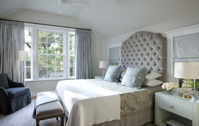
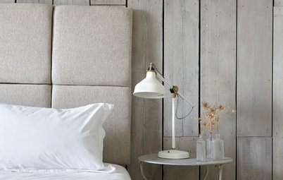
Introduce tactile textures
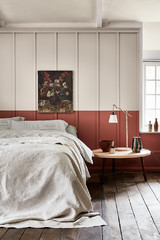
Heart Wood, thanks to its warm, cosy undertones, has a natural affinity with tactile textures. Try creating a cocooning effect in your bedroom with plenty of touch-me-textures and fabrics in heathery hues. Layers are key in creating a sense of luxury and indulgence, so pop on a warm throw plus bundles of cushions. Then accessorise with a few glamorous hints of silver and glass and you’ll elevate the luxe look.
Heart Wood, thanks to its warm, cosy undertones, has a natural affinity with tactile textures. Try creating a cocooning effect in your bedroom with plenty of touch-me-textures and fabrics in heathery hues. Layers are key in creating a sense of luxury and indulgence, so pop on a warm throw plus bundles of cushions. Then accessorise with a few glamorous hints of silver and glass and you’ll elevate the luxe look.
You can then extend this decadent yet welcoming look into your living space by introducing more elegant fabrics, such as velvet and leather, in soothing mauve tones. Again, keep it feeling sophisticated and luxe with warming metallic touches dotted around the space.
9 ways to prepare your home for a cosy autumn
9 ways to prepare your home for a cosy autumn
Enrich your scheme…
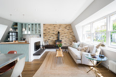
Just as this gentle pink-grey colour works well as part of a pastel palette, it also fits right in with a rich, jewel-like scheme. Just look at this glamorous teal bedroom to see how.
It would also work well with dark-wall-colour-du-jour, indigo. Bridge the gap between the two shades, if you like, with two paler partners: a soft denim blue and a barely-there mauve, something a few notches down the colour chart from Heart Wood.
…or lighten up
However, if you feel safer decorating with neutrals, soft mauves are also the perfect addition to off-whites or soft beiges. Soothing mauves instantly add warmth in an enveloping way, even if you only introduce small touches, such as a covered bedhead. However you choose to use them, you’ll immediately feel that embracing hug that welcomes you home.
However, if you feel safer decorating with neutrals, soft mauves are also the perfect addition to off-whites or soft beiges. Soothing mauves instantly add warmth in an enveloping way, even if you only introduce small touches, such as a covered bedhead. However you choose to use them, you’ll immediately feel that embracing hug that welcomes you home.
Soften cool edges
What better spot to create a visual embrace than around your bath? Painting a stunning bateau or roll-top bath in this restorative and healing hue instantly makes you want to soak away your worries in the comfort of your own haven.
Even an acrylic bath can be painted, be sure to research tips – you’ll need to sand it correctly, prime it and use an acrylic polymer paint.
Are you inspired by these room schemes and Dulux’s Colour of the Year 2018? Let us know in the Comments section.


Sponsored
Reload the page to not see this specific ad anymore
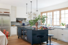
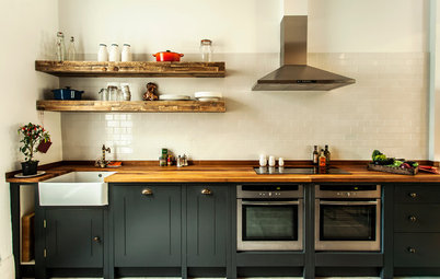
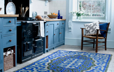
Mauves, or lilacs subdued with grey tones, become a super match with warm timbers. Try teaming Heart Wood, or a similar shade, with unpainted wood – perhaps in a kitchen if you have the opportunity. Here, a band of colour has been introduced behind the worktops for interest. You could then continue the eye-catching touch by painting wall shelves in the same tone.
Equally, you could paint the legs of an oak or pine kitchen table with the colour. In other rooms, an oak sideboard against a mauve-ish wall or even a vintage wood chair with a pink-grey cushion are both good small-scale alternatives to consider.