Decorating
How to Successfully Use Coral Hues in Your Home
This warm yet fresh tone is having a moment. Check out these ideas for inspiration on how to use it in your home

With Living Coral being named Pantone’s Colour of the Year 2019, this uplifting hue is firmly on the style radar. Its warm tones are ideal for adding a cosy feel to any interior, and you might be surprised at how versatile it can be. Whether you go for an earthy palette, mix it with grown-up pastels, or bring in a zingy feel with red, there are plenty of ways to use coral in your home, as these schemes demonstrate.
Bring out its sunny side
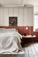
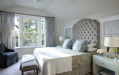
For a brighter look, bring out coral’s yellow undertones. In this bedroom, the quilt has been paired with straw-coloured curtains, which have given it more of a pale pastel look.
The grey walls and bed work well as a backdrop and give the whole space a mellow feel.
Here’s how to create a healthier bedroom.
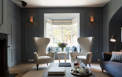
Embrace the dark side
In an all-grey room, consider using coral to liven things up. Choosing a deeper tone will add an elegant note to the space.
In this living room, the silver shades have been energised by the simple addition of a coral pouffe and throw. By going for a rich version at the darker end of the spectrum, the designers have made quite a strong statement.
Pair with a cool partner
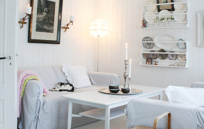
Create an inviting feel by mixing coral with soothing shades of green and cream, as in this scheme.
Here, the designers have added interest by incorporating various patterns. Each element has a different design, which gives the space a textured, layered look. However, the cohesive colour scheme keeps the room looking harmonious.
Need to spruce up some furniture? Find upholsterers and furniture restorers in your area.
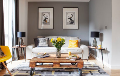
Get cosy
A monochrome colour palette is a good choice for a child’s bedroom, as it will allow the space to grow with them. If black and white feels too cold, however, add some coral elements to warm it up.
This bedroom is full of fun pattern, but the overall scheme is quite uniform. The addition of a coral armchair and throw gives it just enough colour to make it feel snug and welcoming.
Ramp it up with red
Bring out coral’s vivid side by mixing it with red pieces. An injection of a bright primary colour like this can totally transform a space.
In this kitchen, the coral wall peps up the scheme, but it could have looked a little lost on its own. The two pillar-box red bar stools are a surprising, playful addition that chime nicely with it.
Let it shine
At the other end of the scale is this moody space, surrounded by charcoal panelling. The dark background is a striking foil against which to set the bright stool and cushions.
The coral shade is ideal, as it’s bold enough to form a contrast, but soft enough to maintain the calm feel of the room.
Tell us…
Would you consider using coral in your home? Share your thoughts in the Comments section.


Sponsored
Reload the page to not see this specific ad anymore
Sponsored
Reload the page to not see this specific ad anymore
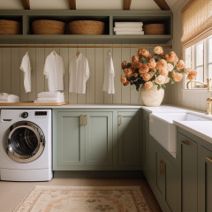
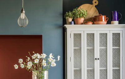
Embrace coral’s cosy feel by teaming it with similar earthy tones. Here, a collection of accessories in shades of copper, coral and beige have been lined up along distressed wood shelves.
Together, the items create an overall russet colour scheme that’s balanced out by cooler green and blue accents.