

Houzz Tour: A Calming Victorian Terrace With Grown-up Appeal
This timeless, tranquil haven is an exercise in how to do simple and neutral beautifully

When Georgina Turvey of PEEK Architecture was brought on board to tackle this tall Victorian terrace in Fulham, London, it hadn’t been touched since the 1980s. She swiftly set about transforming it into a modern, light-filled space, working closely with interior designer Natasha Hamilton-Dick of Compass & Rose.
Now it’s a sophisticated home with an elegant but relaxed feel – and a fantastic lesson in how to do neutrals brilliantly. While it perfectly suits its bachelor owner’s needs down to the ground, this is also a versatile home that can easily adapt and grow as life’s demands change.
Now it’s a sophisticated home with an elegant but relaxed feel – and a fantastic lesson in how to do neutrals brilliantly. While it perfectly suits its bachelor owner’s needs down to the ground, this is also a versatile home that can easily adapt and grow as life’s demands change.
This home has a lovely, relaxed feel – calm and modern without being cold. “We wanted to keep the design young but sophisticated,” says Turvey.
A neutral, monochrome palette – lots of smoky greys, creams and whites – coupled with a flowing, open-plan design means this is very much a home with potential to grow and adapt. “Our client has recently become engaged, and even though the house was designed as a bachelor pad at the time, it was important to future-proof it for when he started a family,” says interior designer Natasha Hamilton-Dick.
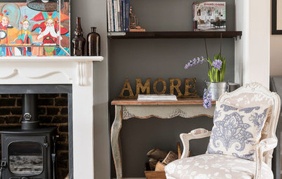
This is the snug at the back of the house on the lower-ground floor. The doors to the garden are different colours inside and out. “They had to be white on the outside to satisfy planning, but we wanted a darker finish on the inside. It’s quite simple to get suppliers to do this, and you can ask for samples of finishes prior to placing an order,” says Turvey.
Aluminium bifold doors, Solarlux. Outline coffee table with shelf, Richard Taylor. Armchair, India Jane. Pall Mall sofa, Andrew Martin. Lamps, Porta Romana.
A neutral, monochrome palette – lots of smoky greys, creams and whites – coupled with a flowing, open-plan design means this is very much a home with potential to grow and adapt. “Our client has recently become engaged, and even though the house was designed as a bachelor pad at the time, it was important to future-proof it for when he started a family,” says interior designer Natasha Hamilton-Dick.
This is the snug at the back of the house on the lower-ground floor. The doors to the garden are different colours inside and out. “They had to be white on the outside to satisfy planning, but we wanted a darker finish on the inside. It’s quite simple to get suppliers to do this, and you can ask for samples of finishes prior to placing an order,” says Turvey.
Aluminium bifold doors, Solarlux. Outline coffee table with shelf, Richard Taylor. Armchair, India Jane. Pall Mall sofa, Andrew Martin. Lamps, Porta Romana.
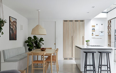
The snug leads into the open-plan kitchen. “We designed a low-level TV unit for storage in the same dark walnut finish as in the dining area [just visible at the far end of the room],” says Hamilton-Dick.
Using the same finishes throughout in this way is a subtle trick that visually helps to interlink different living zones in an open-plan space.
The dark grey rug here is, in fact, a patchwork made from offcuts of old carpets that have been stitched together.
Using the same finishes throughout in this way is a subtle trick that visually helps to interlink different living zones in an open-plan space.
The dark grey rug here is, in fact, a patchwork made from offcuts of old carpets that have been stitched together.
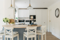
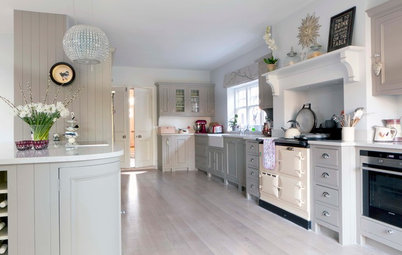
The contemporary kitchen manages to pull off being simple and chic without feeling too minimal.
PEEK and Compass & Rose designed it together. “Natasha had ideas on the finishes and look, and we pulled our ideas together. We then commissioned Blueridge Joinery to build it bespoke; it was less than half the cost of a ‘kitchen shop’ kitchen.”
The worktop is back-painted glass, and the units, which feature flat-fronted doors, are a mixture of oak veneer and pale grey spray lacquer.
“The worktop was an excellent choice. It’s very hard-wearing in comparison to a natural marble and looks elegant with the other finishes in the kitchen,” Hamilton-Dick says.
All the appliances are Siemens. “They are very stylish to look at and work very well,” Hamilton-Dick continues.
A pale tiled floor keeps the room light and airy. “Porcelain tiles were used in the kitchen, as they are hard-wearing and easy to keep clean,” says Turvey.
Eyeris pendant lights, National Lighting. Floor tiles, European Heritage. Units spray-painted in Cornforth White, Farrow & Ball.
The kitchen features well-thought-out lighting, giving it a bright, uplifting feel any time of day or night. In general, lighting was crucial in this home, and carefully designed throughout. Hamilton-Dick previously worked as a lighting designer, so she used her expertise to get it just right.
“In my opinion, light is fundamental and it’s very important to use fittings correctly to accentuate design details,” she says. “Using multiple circuits, we created layers of light all set on dimmers, so levels can be adjusted to the mood of the client or the activity he’s doing.
“In the kitchen, we planned different layers of light, such as downlights and under-cupboard spots, which are extremely efficient for task lighting,” the designer continues. “Linear LED strips were used under the island, and the LED shelf lights in the bar area provide a wonderful soft glow during the evening, perfect for entertaining.”
The recess in the wall is another place to showcase interesting objects.
A step leads up from the kitchen to the living area, so the spaces feel separate. The island houses an induction hob with a subtle, ceiling-mounted extractor fan above it.
Check out these 10 little details to make your kitchen sing
Check out these 10 little details to make your kitchen sing
The client wanted the lower-ground floor to work as one large, open space – potentially trickier than it sounds when incorporating cooking, dining and living areas.
When it came to planning, Hamilton-Dick explains, “We took one horizontal line set at 900mm [worktop height] from the front of the house to the back, and created a mix of joinery that related to one another, but also stood on their own.”
When it came to planning, Hamilton-Dick explains, “We took one horizontal line set at 900mm [worktop height] from the front of the house to the back, and created a mix of joinery that related to one another, but also stood on their own.”
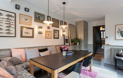
A warm, grey-green paint demarcates the dining area from the kitchen, while vintage Beatles posters add colour and personality.
The panelled wall in the dining room is black-stained walnut veneer. “We used 40mm thick shelves to create a bar area with an integrated fridge underneath,” says Hamilton-Dick. “The shelves are backed with mirror and we lit each shelf to create an interesting feature. The top is Arabescato marble, which creates a lovely light contrast and suited the client’s monochromatic brief.”
Chairs, Robert Langford. Bespoke banquette, Compass & Rose. Capricorn dining table, Tom Faulkner. Bar fridge, Siemens.
Chairs, Robert Langford. Bespoke banquette, Compass & Rose. Capricorn dining table, Tom Faulkner. Bar fridge, Siemens.
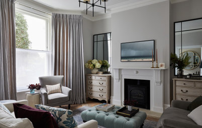
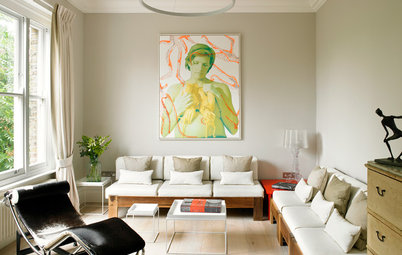
One level up, on the upper-ground floor, is the main living room, where green cushions add a rare shot of colour. Mirrors and glass, and textures such as the shimmery rug, add light and a real luxury feel to this room.
“Comfort was important to the client, hence the use of soft textures and subtle, soothing tones,” says Hamilton-Dick. “He really wanted a place to offer respite from the outside world, so our aim was to create a tranquil haven as well as a stylish home for entertaining and making the most of being in such a cosmopolitan city.”
Arty touches, such as this iconic picture of Marilyn Monroe, lift the space and add personality. “The owner has a wonderful selection of art that he’s curated over the years and it was important to find a place for it all to go,” she adds.
Chair, India Jane. Coffee table, Porta Romana.
Long drapes were chosen over blinds in this room. “Curtains soften the space and are much cosier than blinds in the winter,” says Hamilton-Dick. “Curtains can be extremely stylish, depending on which heading you chose and the type of poles you use. They’re also easier to operate than blinds.”
Ceiling light, Richard Taylor Designs.
Ceiling light, Richard Taylor Designs.
Adjacent to this sitting room is a TV room, visible in the background. Internal bifolding doors are a great compromise – and solve that modern interiors dilemma of whether to knock through or not.
“It’s nice to have the flexibility to open and close spaces off from each other,” says Turvey. “And if you’re watching a film on this floor, you can shut the street away.”
The wooden flooring is smoked oak. “We had to use engineered boards here due to the underfloor heating,” she says.
Engineered wood floorboards, Treehouse Flooring.
In the TV room, PEEK decided to get rid of the usual corridor often found next to the stairs in Victorian terraces, and use this space as part of the living room instead. An ingenious shelving unit sits where the wall might have been. This helps open up the room and prevent the narrow or poky feel some terraces of this era have.
“We separated the stairs and TV room with a dark oak shelving wall, which has a mix of mirror and glass panels, so there are views through it,” Turvey says.
The result is unconventional, but works beautifully, adding dark drama, a sense of space and, of course, lots of practical shelving.
“We separated the stairs and TV room with a dark oak shelving wall, which has a mix of mirror and glass panels, so there are views through it,” Turvey says.
The result is unconventional, but works beautifully, adding dark drama, a sense of space and, of course, lots of practical shelving.
The display shelves add a backdrop to the comfy white sofa. “The shelves were important to the client, as he had a large selection of ornaments and family photographs, and it helps create a home, not just a house,” says Hamilton-Dick.
The display shelves are made from natural oak stained a dark black to tie in with the walnut veneer on the opposite wall.
“They were also integral to the stairs and created additional light onto what had been a dark stairwell,” says Hamilton-Dick.
The display shelves are made from natural oak stained a dark black to tie in with the walnut veneer on the opposite wall.
“They were also integral to the stairs and created additional light onto what had been a dark stairwell,” says Hamilton-Dick.
This is a great home for parties and having guests over. “The client is quite sociable and has friends around a lot, so spaces to congregate in were important,” says Turvey. “He also likes his big TVs, so we had to find ways of housing them without them feeling as if they were just stuck on the wall. There’s also lots of storage planned in throughout, so it’s easy, hopefully, to keep the place tidy.”
The back of the living room has plenty of light thanks to the skylight. “This was a bespoke, timber-framed, glazed extension, leading out to a small adjacent terrace. It’s very important to get someone who knows what they’re doing and to hire a glazing installer who’s Fensa registered,” says Turvey.
Hamilton-Dick adds, “Getting the window treatments right in this area was extremely important. Having a large glazed area really brightens up the space and floods the room with lovely light at most times of the day, but the disadvantage is managing the solar gain, especially in summertime, as well as glare and lack of privacy. Using an electric voile blind alleviated these issues and added a softness to the space that provided an excellent contrast against the dark timber.”
Sofa, Andrew Martin. Desk, Julian Chichester. Lamps, Porta Romana. Voile blind, Silent Gliss.
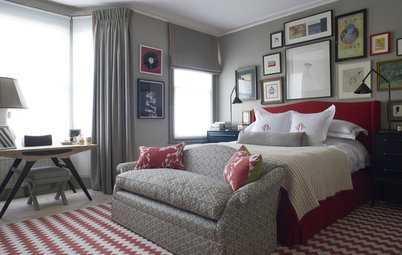
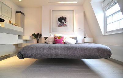
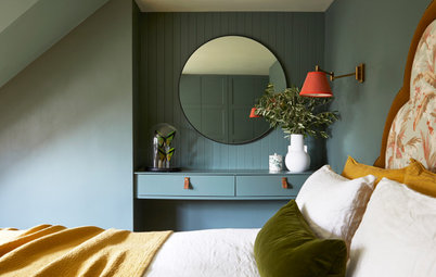
The main bedroom has a luxe hotel feel that’s deliciously opulent.
“It took a while to convince the owner to go with a silk wall covering in charcoal with a hint of plum,” Hamilton-Dick says, “but after we teamed it with light curtains and a velvet carpet in a thick pile, it became a very decadent space – perfect for relaxing and unwinding after a hard day at work.”
Discover 10 stylish ways to give your home a luxury hotel look
The second of the three bedrooms is decorated in a paler palette of greys.
The bathrooms have been kept light and simple.
The cabinets in the top floor bathroom have a walnut veneer that’s slightly less black than downstairs. “It’s a lovely contrast with the beige porcelain tiles in the bathroom without being overdramatic, which might have been overpowering in a small space,” says Hamilton-Dick.
Taps, Crosswater. Sanitaryware, Duravit.
Taps, Crosswater. Sanitaryware, Duravit.
The downstairs cloakroom has a sleek, glam atmosphere. “The owner wanted a dark and moody loo, not dissimilar to a nightclub! Metallic metro tiles were laid brick bond on one wall to provide a dramatic feature,” says Turvey.
Metro tiles, Fired Earth.
TELL US…
What do you think of this home? Share your thoughts in the Comments section below.
Metro tiles, Fired Earth.
TELL US…
What do you think of this home? Share your thoughts in the Comments section below.

Sponsored
Reload the page to not see this specific ad anymore

Sponsored
Reload the page to not see this specific ad anymore
Who lives here An “entrepreneurial bachelor”
Location Fulham, London
Property A four-storey Victorian stucco and yellow London stock brick terraced house
Size 3 bedrooms, 2 bathrooms
Architect Georgina Turvey of PEEK Architecture & Design
Interior designer Natasha Hamilton-Dick of Compass & Rose
Photographer Alex Maguire
When the team at PEEK Architecture were hired, the brief was simple: a top-to-toe makeover. “Our client bought the house to refurbish it, and it needed a complete overhaul. It was evident from the first visit that it had great proportions and ceiling heights and was structurally sound,” says architect Georgina Turvey.
As well as revamping the existing space and defining the big structural changes, PEEK also helped with the nitty-gritty of planning applications. “Planning was obtained to create a rear extension to the lower and upper ground levels, as well as new windows and roof lights,” says Turvey.
In terms of structural changes downstairs, going open-plan was key. “Most of the walls were removed on the lower-ground floor to create an open-plan kitchen/dining/living space,” Turvey continues. “We also lowered the structural slab to give more head height down there. On the upper-ground floor, a spine wall [the load-bearing wall separating the front and rear living rooms] was removed.
“The changes to the upper floors were more minor, as the rooms were already quite well suited as bedrooms and bathrooms.”