

6 of the Best Before and After Kitchen Transformations
These clever schemes show how poorly designed existing spaces can be reworked to look beautiful and function brilliantly

Whether magicking a cooking area out of an empty space or making brilliantly effective tweaks to a 50-year-old layout, these designers have used their skills to create stylish, well-functioning kitchens in existing spaces. Take a look and let us know which one’s your favourite in the Comments.
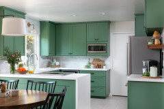
The solution was to combine the two larger areas to create a kitchen-diner-living space, which benefits from two sets of French windows. Designer Anne Chemineau then turned the former kitchen into a bedroom, which negated the need for the former access door and freed up the left-hand wall for a bank of units, painted in a calming grey-green.
Key to the open-plan design is a unit that forms an island for the kitchen, a space-saving bench seat for the dining area, and a visual barrier to zone the room and hide the kitchen hub from the relaxed seating. Anne asked her carpenter to fit battens to the unit to add interest. “I wanted something eye-catching going on,” she says.
Zellige splashback tiles bring depth to the end of the room and subtly enhance the natural light, helping to give the new space an open, welcoming feel.
The ‘after’ floor plan shows the new layout, with the spacious kitchen-diner-living room across the top, and the former kitchen (seen on the left) turned into a child’s bedroom.
Explore the whole of this flat and see a ‘before’ floor plan.
Explore the whole of this flat and see a ‘before’ floor plan.
2. Incorporating a cloakroom
Having a downstairs loo is a boon, especially in a family home. So when opening up this London space – a dark kitchen and a badly planned extension – architect Gemma Fabbri of Studio Fabbri had to find a way to incorporate the cloakroom (the red area seen here) elsewhere.
Having a downstairs loo is a boon, especially in a family home. So when opening up this London space – a dark kitchen and a badly planned extension – architect Gemma Fabbri of Studio Fabbri had to find a way to incorporate the cloakroom (the red area seen here) elsewhere.
Within the same footprint, Gemma cleverly slotted in a cloakroom under the stairs, as you can see from the ‘after’ floor plan (right), stealing only a narrow slice from the original kitchen. She then used the remainder of that room and the whole of the existing extension to create an airy kitchen-diner.
Central to the design was incorporating a skylight, which brightens the whole space, making it much more inviting. While most of the scheme is white to maximise the light, Ikea base cabinet carcasses have been fitted with oak-faced ply fronts and brass handles. “The wood brings in a bit of warmth,” Gemma says.
A bank of units holds masses of storage, meaning Gemma could leave the main kitchen area open and uncrowded. The island separates the galley kitchen from the dining/relaxing/play area, which is perfect for young family life.
Discover more about how Gemma transformed this kitchen-diner.
Discover more about how Gemma transformed this kitchen-diner.
3. Merging into the living room
A series of small rooms off a dark corridor, seen here on the ‘before’ plan (left), chopped up this Madrid flat and made it awkward to use. Moving the bathroom into the former kitchen at the back, then opening up the rest of the space, gave the owners a lovely sociable living area.
A series of small rooms off a dark corridor, seen here on the ‘before’ plan (left), chopped up this Madrid flat and made it awkward to use. Moving the bathroom into the former kitchen at the back, then opening up the rest of the space, gave the owners a lovely sociable living area.
The new kitchen is where the old bathroom was, again making use of the existing plumbing. The U-shaped layout includes a peninsula that visually separates the kitchen from the living area and features an expansive worktop that doubles as a breakfast bar.
The wood and cashmere colour combination was chosen to help merge the kitchen and living area. “We wanted it to blend in with the living room furniture and not look like a typical kitchen,” designer Nora Zubia of Slow & Chic - Interiorismo says, “so we went for unusual colours and added black taps and appliances to make it look very elegant.”
Take a look around the whole of this flat and its renovated roof terrace.
4. Unblocking sightlines
The transformation of this kitchen in California is a masterclass in making the most of available space and improving flow. Designer Megan Paulson of 22 Design House cleverly opened up the room without sacrificing functionality.
The transformation of this kitchen in California is a masterclass in making the most of available space and improving flow. Designer Megan Paulson of 22 Design House cleverly opened up the room without sacrificing functionality.
Megan kept the same layout and salvaged some of the 50-year-old units, painting them the same green as the newer cabinets. She took out a soffit from over the window, which had made the sink area feel oppressive.
She also widened the peninsula to fit a new range cooker, which allowed her to replace the wall ovens with drawers.
She also widened the peninsula to fit a new range cooker, which allowed her to replace the wall ovens with drawers.
The game-changer, though, was taking out these suspended cupboards containing a large extractor fan. As the new range cooker has an integrated downdraft extractor, having one above became unnecessary.
The difference opening up has made is huge. The kitchen gets to share more of the light coming in through the patio doors in the dining area, and the two spaces feel connected.
“It’s so warm, comfortable and inviting,” the owner says. “The remodel has really made the kitchen the centre of our home.”
Learn more about this space-smart renovation.
“It’s so warm, comfortable and inviting,” the owner says. “The remodel has really made the kitchen the centre of our home.”
Learn more about this space-smart renovation.
5. Turning a cupboard into a kitchen
Here’s what could safely be described as a ‘blank canvas’ – a cupboard in an empty, 19 sq m room in Paris. The room was a former concierge’s lodge and the owners hired Margaux Carnevali of NEVA Architecture Intérieure to turn it into a flat.
Here’s what could safely be described as a ‘blank canvas’ – a cupboard in an empty, 19 sq m room in Paris. The room was a former concierge’s lodge and the owners hired Margaux Carnevali of NEVA Architecture Intérieure to turn it into a flat.
White walls and units and a gleaming sage splashback make the most of the light. Three base cabinets squeeze lots of function into the limited space: the fridge, the corner unit – which contains the sink – and the unit with the cooker.
To incorporate all the essentials, Margaux chose clever combined appliances – a combination oven-dishwasher and a microwave-extractor (both now sadly out of production).
To incorporate all the essentials, Margaux chose clever combined appliances – a combination oven-dishwasher and a microwave-extractor (both now sadly out of production).
The kitchen is open-plan to the living room, allowing both spaces to benefit from having two windows, but is tucked neatly away next to the bathroom (under the mezzanine) and bedroom (on top).
Read the full story of how this abandoned room was transformed beyond recognition.
Read the full story of how this abandoned room was transformed beyond recognition.
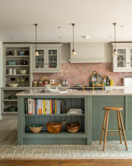
6. Connecting the kitchen to the garden
Here’s a brilliant example of hugely improving a layout within an existing footprint. This house in London had a large dining room, a conservatory that wasn’t really being used, and a tiny kitchen (seen through the hatch to the right).
Here’s a brilliant example of hugely improving a layout within an existing footprint. This house in London had a large dining room, a conservatory that wasn’t really being used, and a tiny kitchen (seen through the hatch to the right).
The ‘before’ plan shows not only the cramped kitchen, but the wasted opportunity to have the whole space open to the garden.
Designer Claudia Urvois created one open room within the same footprint, giving it a pitched roof, which makes it feel more spacious, and glazed sliding doors onto the garden.
The angles also contribute to the excellent light. “The space faces north, so the windows on the back and sides, plus the two angled skylights, allow the sun to come in at different times from different directions,” Claudia says.
Merging the spaces meant the loss of a utility room and cloakroom, but Claudia fitted these in behind the dining area wall, accessed from the hall.
For the kitchen cabinets, Claudia chose a mix of oak and deep forest green. She’s maximised every inch of space. Because it’s a sloping roof, the top cupboards are small inside, but Claudia had them made bespoke to ensure they still offered some useful storage.
Similarly, there’s an extractor fan in the two cupboards above the hob, but Claudia utilised the space that was left. “When you open the doors, there are four very slim shelves in front of the extractor that hold herbs and spices,” she says.
Read about the whole of this project and see the clever utility room.
Tell us…
Which designer has impressed you most? Share your thoughts in the Comments.

Sponsored
Reload the page to not see this specific ad anymore
Sponsored
Reload the page to not see this specific ad anymore
This apartment in Paris had a large, open-plan dining and living area, seen here, plus a tiny kitchen, accessed through the door with the porthole.
The owners wanted a more family-friendly space and to create two additional bedrooms.
Find local kitchen designers and architects on Houzz.