webuser_548523461

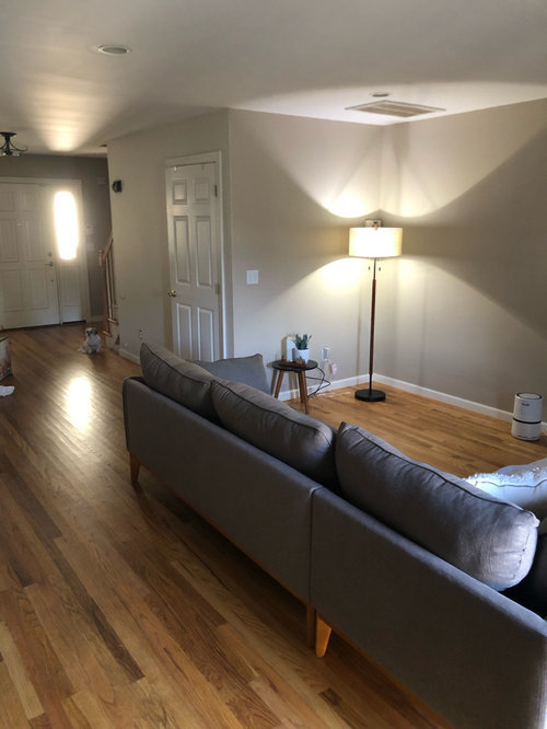
Design pros please help w/ wall color + space?

9 months ago
last modified: 9 months ago

Hi friends-

It’s been 1.5 yrs of living in this space after buying & I’m depressed with this wall color!!


My challenge has been the lack of lighting, with the lighting that DOES come in, IN TERMS OF how it makes the space look, Which is glowing yellow .


The biggest challenge would be the sliding glass door that they put here, (old owners) that from the time the sun comes up until it goes down, my house, glows yellow, unless I keep up these blackout curtains closed. It washes out my entire living space, that the brown gray sofa turns dark gray, and everything just looks horrible in my opinion.


For reference. The only light that comes in would be south Facing.

They put this dingy Benjamin Moore color that I don’t even believe is available or they changed the name, to a taupey beige, on the walls.


Down the road we plan on getting our kitchen cabinets remodeled, and we will have the original floors redone to ‘take out’ the yellow.

But for now, I really need to live in this space as is, MINUS, The wall color. We are finally having somebody come in, during the month of August. But I have nothing to give him in terms of any possible idea. I know my style, but it’s very hard to explain.


I don’t like things if that makes any sense. Im a TRUE minimalist.. To give an idea of my bedroom, I would say a little modern Scandinavian maybe? I have a bed, a candle, lamp and a plant that’s basically my style. I like warm earthy colors, that aren’t dark, nor dingy.


I tend to like Natural earth toned furnishings with lighter walls.

I would be so grateful if somebody would help me choose a wall color that is neutral. Would go with nearly anything. Would not make my space look like a doctors office, but not make it look as though it’s a dingy 😔😔😔

I’m already upset with the color of the couch that arrived but that I could live with. When everything is lit up, you can see the sort of brown in it so I would call it a graige. But when the sun comes in and or night falls, the couch looks dark gray.

Because the whole downstairs is an open concept, I would ultimately like to find a nice white tone that is warm without yellow, and that again is not cold like a doctor’s office.

I APPRECIATE so very much any advice that you may give.


Comments (87)

  • 9 months ago

    @Jennifer Lynn obviously bringing Alabaster out here is an option, if so I would put it on the walls and trim. If you decide you want a little contrast between your walls and trim, but still want a light near neutral or off white; consider the following colors-

    Sherwin Williams:

    Benjamin Moore:

    Not sure if you’re familiar with full spectrum colors. They are described as ”Unique colors that respond beautifully to light. A series of striking hues crafted to take on different appearances as the light changes.” Might give some visual interest to your otherwise minimalist palette. If that interests you, check out these:


  • PRO
    9 months ago

    SW Emerald Collection is also a full spectrum paint so if you like one of their colors, go with their Emerald line. For a minimalist look do the trim and walls in the same color as well as ceiling. Just use a flat finish for walls and a satin finish for woodwork. That will give a subtle change but keep things smooth looking. I have SW Alabaster in our whole house except for dining room and powder room where I have BM Van Deusen Blue. White trim. In north east rooms it goes very warm but hints of gray shadows. In south west areas at peak sun it can go a tad yellow. So I chose BM Chantilly Lace for your lighting to avoid yellow look.

  • Related Discussions

    Help me to choose a colour....please!!
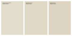
    Q

    Comments (3)
    Hi elconno, Not sure if you are in USA but I would suggest two colors by Sherwin-Williams called Upward and Wallstreet. The pic doesn't do the colors justice but the dark one I would put only on the wall your fridge is on - that includes the little strip above the cabinets. This will make the fridge disappear a little and it will be a great wall for a piece of art with a lot of color - it will really pop! The lighter color will go well with any teal accents you want and brighten the space.
    ...See More

    Need colour help for white kitchen

    Q

    Comments (12)
    I really like the clean lines of your kitchen , it's beautiful and I would not add to much colour but you could use some accessories with green and white that would compliment this minimalistic kitchen. For example adding a bright green plant/s or an accessory the same colour as the clock on your top wall can put everything in a nice perspective!
    ...See More

    living room in need of makeover!! please help!!

    Q

    Comments (17)
    You can paint the inside of FP opening charcoal and then I would go for a blue/grey and not greige. Those colors tend to be very dark. You have black furnishings and a blue/grey would look very fresh. Your art above FP has blue in it, so replace rug and get some pillows for sofa that will bring in the colors of the painting. Why not just put in some shelves, one big enough to hold tv. That would give a more open concept to room. If you need one enclosed to store components, that would fit also. I would not build up too high on the wall.
    ...See More

    Wall needs something - help!

    Q

    Comments (12)
    I added a canvas to your pic so you can see what a long thin one looks like. I think that canvas would be at least 5' long and not sure how I feel about the distribution on the wall..it looks a little like a smile face :). But I do think maybe 3 square ones would work. They would be smaller and I would center it on your space and under the windows. I did yellow and an orange color so you can see the difference. If you are looking for abstract art feel free to check out my profile. Also for my two cents I put shelves where people are not standing and bumping against :)
    ...See More
  • 9 months ago

    @tex, I LOVE THOSE and wanna hear something funny? My one wall here? Was my ‘experiment’ wall and guess what color? One I rarely ever heard about & you mentioned it 😃 ‘Olympic mountains’.

    I LOVE that color in here, but it’s in the area of the northern light, so I didn’t pull the trigger. Those are definitely some great color options that I will look into. I had never heard of full spectrum until now and I appreciate that help.

    QUESTION for you both. The only reason I was hesitant about doing the open concept in my photos the same color on the ceiling, was, I wasn’t sure how it would look when I opened up all the bedrooms and the laundry room, and saw a different colored ceiling. Meaning, a few of the other rooms are getting actual ‘colors’ and BM ceiling white. My daughters bedroom is getting sohji (sp) white, so wouldn’t it look funny hypothetically if I were to put alabaster down here and on the ceilings, but then we opened up to go into the laundry rooms, the bathrooms and the bedrooms and they had ceiling white? I kind of wanted everything to flow so I might do the walls and the trim the same but I think the ceilings will be ceiling white because I have ceilings going up the stairs that aren’t shown here and I’m not sure how that would look.

    Flo I love Chantilly lace too.

  • 9 months ago

    Olympic mountains 😄

  • 9 months ago

    I was playing around here. I found these two rugs and leaning towards the one. Any thoughts? My husband is getting on me to please get anything for now

  • 9 months ago

    I was playing around and picked out two rugs. There are others that I like and that’s a bit difficult as well. My husbands on me just to get anything for now. Any thoughts on either of these?

  • 9 months ago

    You say you want a warm off-white that is not yellow. So that leaves off-whites with red or orange undertones. Some people say they hate off-whites with red undertones or, since light red is pink, they hate off-whites with pink undertones. Off-white with red-oranges undertones can look peachy. I've been living with an off-white with orange undertones for over 20 years now. It looks wonderfully warm in my south-facing rooms, but dirty and dull in my north facing rooms.

    I think the lighter you go the better, if you don't want yellow undertones. Your floor is golden yellow and will reflect yellow, so you are fighting that. The opposite of yellow is purple to tone down the yellow. But obviously you don't want your room turning to mud like my north-facing room with orange undertones bathed in blue light.

    What is your reaction SW Heron Plume? Have you started collecting colors of interest from Sampelize?

  • 9 months ago

    I like the rug you chose with texture, the second or bottom one on my screen.

  • 9 months ago

    And if you like that rug, maybe you should look into an off-white color in a taupe with pink undertones.

  • 9 months ago

    Maybe SW White Flour?

  • 9 months ago

    Maybe SW White Truffle?

  • 9 months ago

    Shoji white - I have this in an ESE room and it definitely has a yellow cast particularly in the morning. My floors have some pink in them so this is better than a pink tinge but I’d like something a little whiter. I also have it on the ceiling and it doesn’t read yellow there. With your yellow floors you probably don’t want this color.

  • PRO
    9 months ago

    Two heights in rugs tend to gather dirt on highest level. Harder to clean too so of those two #1. But keep looking. Buying under pressure almost always leads to regrets. 🥹

  • 9 months ago

    Flat rug ideas. Flo is right - textured = unsafe.

  • 9 months ago

    @Jennifer Lynn to touch on your comment; I personally like a cohesive ceiling, trim and doors throughout my home. But as @Flo Mangan mentioned, she has Alabaster trim throughout most of her home and a brighter white in some rooms (I don’t think she mentioned her ceilings). Point is, it’s really a personal preference. It will be helpful for us to know though, because alabaster on trim will direct what you can use on your walls.

  • 9 months ago
    last modified: 9 months ago

    I also wanted to touch on something @kl23 said in regards to color theory. It is in my opinion that pairing complementary colors next to each other brings out those tones, not dulls them. If you are mixing paint and are looking to reduce yellow, you can add purple; but putting a purple NEXT to something that is yellow will make the purple and yellow both stand out. Think red and green holiday ribbons, they are complementary but don’t dull each other.

    Typically, if you don’t want to bring out the yellow in a floor or cabinet, you would pair it with a paint in the same hue family so everything plays nicely together.

    Alabaster and Olympic Mountains are both in the yellow hue family; but they are all closer to the green end rather than the orange end.

  • 9 months ago

    I really liked the first rug you posted yesterday, but I don’t think it was flat.

  • PRO
    9 months ago

    Let me clarify. I have SW Alabaster flat on walls, ceiling white on ceiling and SW Pure White semi-gloss on trim. But I als have very high ceilings.

  • 9 months ago

    @Flo Mangan is Pure White used on all your trim throughout your home?

  • 9 months ago

    White Truffle is pink, so don't go with that unless you want pink walls. We used it in my daughter's playroom. It's a classic case of looking very different on the chip than it does on the walls.

    We have pure white trim which I think is slightly warm but you'd never notice unless you put it next to Extra white. We did drift of mist on the walls since DH refused to let me do white. I think it's a nice very light greige.

    Here's white truffle:


  • PRO
    9 months ago

    That blurb from Benjamin Moore is interesting.


    1. I wonder if they could qualify "amber cast".

    2. I wonder what source they're referencing in order to state "naturally amber cast to a southern exposure" as if it were a fact.

  • PRO
    9 months ago

    Anew gray in my Family Room and GV in my sun porch.

  • 9 months ago

    @texmax13 I agree pairing two objects in complementary colors augments both. I was talking about blue light being cast on my pale orange-undertone off-white painted north wall turning the wall color to mud. I was trying to figure out if outdoor light being bounced off a yellow wood floor would cast yellow light onto the walls. I was cautioning against my own suggestion to look at an off-white with purple undertones when looking at a variety of off-whites with different undertones. Not disagreeing with you at all. Trying to encourage trying Sampelize and looking at a wide spectrum of undertones and suggesting that when one is looking at an off-white with purple undertones, just pay attention to whether or not that might be a problem. Who knows, it might not. And it might provide the desired warmth.

  • 9 months ago

    I’ve actually decided ‘Against’ painting for now and we’ve decided on the refinishing of the hardwood floors first. In speaking with the painter and the floor guy and just doing my own little research it just seems the plausible way to go.

    It’s funny because the walls once the carpet and little things came in, really made the light from the sliding glass door, bounce and appear a little less yellow. The carpet did arrive and I opted for the second one I believe. The first was not really the vibe that I was going for in this room. But it is pulling together nicely. I’m just a little upset as I searched high and low for a 7 x 10 but they were on back order until October or November. So I believe this one is a 6 x 9.

  • 9 months ago

    I have a lined linen curtain in my one card and a pair of crushed velvet in the other. We shall see :-) you guys have been such an awesome source of information and I think you.

  • 9 months ago

    Typically paint is chosen last :)

  • 9 months ago

    @Jennifer Lynn that bouncing yellow light is exactly what I was thinking about as the challenge you were handed! I'm so glad you found that the rug contained it. I am guessing you are dealing with a south or west facing room because of the glare you reported. I beg you to watch this before you go any further, especially before refinishing your floor. I think when you do, you will opt for a satin finish instead of high-gloss. https://youtu.be/lHk7yRu7_K4


    I like your textured area rug very much! And thanks for the photo showing how it neutralizes the reflected yellow light to a nice diffused neutral glow on the walls nearby. It also makes your sofa color look really nice! A lesson for everyone.

    I'm curious about what all you are going to do to refinish the floor. Are you thinking about changing color to a less yellow? Perhaps a taupe, a taupe-grey, or maybe a chocolate? Or will you just freshen the top coat?

  • 9 months ago

    I do love the rug too ☺️ Do you all think the size is ok, or would you have gone bigger. I didn’t think that I wanted to spend the money to get the biggest one say an 8 x 10, and have the sectional sitting on top of it. Or if I wanted just the legs on it?

    YES ABSOLUTELY about satin on the floors. Funny story. The floor guy that came in and that I chose, actually was the Same gentleman who laid the floors when the house was built. How funny 😄

    They’re red oak 🙈 Runs everywhere, including bathrooms. It’s actually the OIL finish that causes the yellowing. I think the color is just natural he mentioned, that was put on here. But it will be the same except it will look like this picture below. And without oil based.

    About that alabaster, paint color that I was speaking about away above. This is One of the bathrooms that I refinished by myself. I did everything in alabaster, put some trim around the base of the cabinet, painted the cabinet and swapped out the toilet. As you may notice, I like spaces that lack alot of pattern & color. I think it’s my heightened sense of getting overwhelmed very easily. At any rate. Would love to know if it were your space, would you have gone bigger with the rug?

    Floors when refinished…

    Bathroom with that alabaster

  • 9 months ago

    The painted cabinet & trim

  • 9 months ago
    last modified: 9 months ago

    I think the rug size is fine, I would just pull it a little further back on this side; making the amount sticking out on each end even and leaving a little more space between the wall and rug. I think Alabaster looks nice in the bathroom, up to you if you want to switch it up out here or keep it all the same. Either way, I would keep the same trim and ceiling throughout. Oyster White pairs beautifully with Alabaster trim.


  • 9 months ago

    If it was my space and my bank account, yes, I would have got a larger rug. BUT I don't think it looks bad at all. Don't beat yourself up.

  • 9 months ago

    Lovely that you are going to work with the man who installed the floors originally. Glad you are going with satin.

    By the way, I don't think the yellow floors are bad. You didn't like your yellow walls and I was just trying to help with what you didn't like. We now know the yellow from the walls came from the floor, but you know that a cream rug will stop that. Your floors are nice. 

    I like what you did with your bathroom: wood, white, green...always a nice calming color scheme. I bet if you added a little bit of a nice calm evergreen in your living/dining/kitchen space you would like it, and it would help tie together your neutrals. What do you think?

  • 9 months ago

    Absolutely! I do have a beautiful Z plant in front of the slider. I most definitely will be adding more. This guy has a crazy tail. Hence, the minimalism that will be happening down here lol.

    I have an idea of some thing like this, but on a much smaller scale that’s off the floor for that big tail, but slow & steady over here. I’m still working on my daughters bedroom. So many projects 🙈

    I am so oddball out when it comes to shopping for things. It will take me a super long time to find one thing at a time to make something come together. I find it so hard to just go out and decorate if that makes any sense? Like something has to mean something to me? And I searched high and low for a rug that I liked and of course found this that I absolutely fell in love with and wouldn’t you know. It’s just been on back order. I do think that I will ultimately get this rug when it does come available in a larger size….

    Here’s that big girl with the crazy tail 🤪

  • 9 months ago

    Oh and the big Z plant back there

  • 9 months ago

    @tex. Thank you!!!

    Are you saying that if I choose to do alabaster in the open concept that I should put the oyster on the ceiling and trim?

  • 9 months ago

    Here’s just (one) idea for that wall space. Again. On a much smaller scale. And then I’d be able to hide a few plants away from her.

  • 9 months ago

    @Jennifer Lynn nope. I’m saying if you decide against Alabaster on the walls out there, you can use it on the trim (like in the bathroom) and the same bathroom ceiling paint but with Oyster White on the walls.

  • 9 months ago
    last modified: 9 months ago

    “It will take me a super long time to find one thing at a time to make something come together. I find it so hard to just go out and decorate if that makes any sense? Like something has to mean something to me?”

    I completely relate to this. I don’t like unnecessary clutter, so I have to truly like everything I end up using. I have been slowly decorating the shelves on my built-in’s since they got finished January of 2022 lol

  • 9 months ago

    @Jennifer Lynn there's nothing oddball about what you described. You're doing fine. And I wouldn't label you a minimalist either. Nothing extreme about your style.

  • 9 months ago

    @Jennifer Lynn I invite you to read and add to a post on whole-house color schemes:

    https://www.houzz.com/discussions/6392803/great-how-to-articles-on-whole-house-color-schemes

    When I first read your post and understood your desire for minimalism, I thought you would be liking all neutrals. Now I see you as making room for neutrals with very different undertones and even welcoming green into your home. So I hope you find a discussion on whole-house color schemes to be of use, as it enhanced the uncluttered feel.

  • PRO
    9 months ago
    last modified: 9 months ago

    Like something has to mean something to me

    Makes perfect sense. Backing up the car up to a Home Sense and filling up the trunk in order to populate a space with stuff has a certain look and feel that's easy to identify.

    Well-designed is a different category and worth waiting for.

  • 9 months ago

    Ditch my green shower curtain you mean? 😳 Oh gosh no. It’s stunning. To myself & most anyway ☺️

    The rug went down. I loath scatter rugs

  • PRO
    9 months ago

    As to family room rug, size seems ok but position needs tweaking. Pull back toward kitchen about 6” under legs of sectional. You need more floor showing on long wall and room for some wall unit. The one you posted or something similar would look great. Since your walls are in family room and extend into kitchen, and possibly that hallway, just do everything in one color. The eye will love it. Flat finish and “satin” finish for trim. It will look calm and uncomplicated.

  • PRO
    9 months ago

    Having trouble posting.

  • PRO
    9 months ago

    Well, it popped up! Crazy Houzz.

  • 9 months ago

    I like your green shower curtain.

  • 9 months ago

    @tex love love love the oyster 🦪 color a lot!!! Ordered a swatch. @flo thank you 😊

    I pulled the rug back and agree! Much better! Sometimes it takes more eyes 😊😊 We enjoy this cozy space so far, where we hadn’t before. I know it’s very hard looking at pictures. But it does look so inviting in person, especially when you walk in the front door or just having the front door open in general.

    So far I’ve heard many ‘gee. It’s so CALM in here’ comments ☺️

    Definitely will not be a TV in here, as the very large upstairs is the ‘cave’ if you will. Well, I’m just sitting around reading a book, having coffee and talking. I’m excited to get going on getting the floors and the walls done and searching for a smaller unit for that wall.

  • 9 months ago

    We live in a beach town and the gal we purchased the house from actually designed it, and had it built herself. She was a single woman who traveled a lot. So the architecture/ style is interesting, as it seems to have ‘single’ in it 😉 but it works.

  • 9 months ago

    @KL I saved the link to my reading list. Thanks so much for sharing that!!!

Sponsored

Reload the page to not see this specific ad anymore

Ireland
Tailor my experience with cookies

Houzz uses cookies and similar technologies to personalise my experience, serve me relevant content, and improve Houzz products and services. By clicking ‘Accept’ I agree to this, as further described in the Houzz Cookie Policy. I can reject non-essential cookies by clicking ‘Manage Preferences’.