jeannie_nguyen

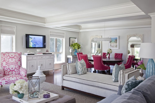
Shades of Sunday: Color VS Neutral

Jeannie Nguyen
10 years ago
last modified: 10 years ago
Hi Houzzers! Let's dive right into another Shades of Sunday discussion!

Today's Topic: Color VS Neutral. Now, we know this can cause a heated debate, but it will be interesting to see what side you pick! Or, if you have creative ways to incorporate both into your home, let us know!

I personally love adding color every time I get the chance! However, I like to mix neutrals with bright bold colors to not strain the eyes. I've learned my lesson after having a bright yellow room with bright furniture. Hey, can you blame me? I was 15! :)

Emily Ruddo Design · More Info


Share your experiences, thoughts, and photos below or tweet us on Twitter!

Twitter: @houzz
https://twitter.com/houzz

Comments (49)

  • Lori
    10 years ago
    love it!
  • decoenthusiaste
    10 years ago
    Just posted this very pic for someone with a gray/pink living room dilemma! Hot!!!
  • Related Discussions

    Re doing my kitchen area

    Q

    Comments (17)
    I personally like the kitchen, kind of a Scandinavian modern look. leave the skirts, doors and trims as is. Paint wise, I am going to invite you to a kitchen gallery that I think works well with the existing aesthetic you have now. I like the "Melrose Kitchen" in this instance, as an example of wall color. The trim is painted here, but leaving yours as is, I believe, would be fine! Happy Houzzing.
    ...See More

    I need help with paint colour for my living room and kitchen walls

    Q

    Comments (15)
    We just painted a color called "Latte" over the dark red walls in our place and we keep thinking that someone left the light on! It adds that much light to the place as the red was just sucking out any light in the place. Find a color you like more for that wall and repaint...and/or maybe add a ceramic tile backsplash? It will make it feel brighter in there immediately as you will get a lot of light reflection. I love the idea of sage green with your cabinets.
    ...See More

    Which frames for above the bed?

    Q

    Comments (103)
    Hi snan - to address your questions: 1 - yes, the lamps work very well. With regard to the height of the larger lamps: do you know how high they would be? If the bottom of the lampshade is even with the top of the pillows that should work. If they are taller than that I think you will be okay with the smaller lamps. Look back again at some of the pictures above to see what I mean. The thing that will look odd would be if the top of the lamps were taller than your headboard. The idea is that when you are in bed reading a book that you want the light to be able to reflect down. As far as the lampshade size goes on the smaller lamps I'm thinking the shorter ones since they don't seem to drop down as far as the larger ones. 2 & 3-Definitely chair by the mirrored bedside locker with one white locker on the other side. Without question. The chair to the left of the bed gave the room life. Use the extra white one in a closet or another room. You don't want to overcrowd your room when you are going for a tranquil setting. 4-Absolutely okay to have bedside tables that don't match and look good in the room. Whether or not you like that is a personal preference though. I would only put the mirrored one next to the bed though if you have the chair next to it. It's how they play off each other that makes it work. If you don't keep the chair next to the bed then I would use both white tables beside the bed. It is also fine that the pictures are off-centre to the wall as long as they are centered to the bed. :)
    ...See More

    Advice on colours to bring a room together

    Q

    Comments (24)
    Susiem14, I think this room looks lovely and cosy and like your fireplace. I would add a few bits in cream and fawn/grey. Please don't be offended by the comment above... Everybody is different and we all have different budgets! I have recently changed my lounge to be neutral tones - still working on the cushions but sending you a photo of my new rug - was from Dunelm Mill - not expensive at all but v pleased with it.
    ...See More
  • Jennifer Warren
    10 years ago
    Beautiful!!!
  • jossiehk
    10 years ago
    I love the furnishings but the walls and ceiling from the top line of the TV and art has a bare look. Amy's suggestion of a subtle color to the flat ceiling would enhance the over-all effect methinks.
  • Janice Sweeney
    10 years ago
    I agree with Amy. Subtle color would greatly enhance the space
  • Miranda Wagner
    10 years ago
    I would paint the cabinet underneath TV so it doesn't blend in so much, love the room, and the pink chair needs a deep shade to bring in dining chair depth. Good job!
  • PRO
    Klein Kitchen and Bath
    10 years ago
    Fab! I love it cuz you can easily change it if you want as the funky colours are only really in the furniture so if you want to change to a more tradititional or neutral look you don't need to repaint or do anything other than ne chairs
  • hammerhugger
    10 years ago
    Where does one watch tv in this room........from the dining room table?
  • PRO
    Studio East Construction & Design Inc.
    10 years ago
    hammerhugger has a point... this room may be beautful but has a major flaw. It doesnt work.
  • Madelain Kitshoff
    10 years ago
    I would swap dining room with sitting area and move tv and cabinet to solid wall. I love the clean and fresh colours.
  • Kathy
    10 years ago
    Does it seem we pick colors based on our location? In the more tropical areas bright colors work great, but in colder climates we tend to use darker colors? It is also dictated by the retail stores in the area. Sadly!
    I prefer a neutral base for expensive upholstered pieces because I cannot change them on a whim. Then I pick a favorite color to build a theme around. The theme is hardest for me because I like so many types of furniture.
    I find the neutral colors easiest to live with long term but I also love people who have the expertise to decorate with color as long as its not a jumble of colors.
    You have made me think about this. I think I prefer the orderliness of neutrals.
  • Kathy
    10 years ago
  • User
    10 years ago
    Now me... I would actually paint the ceiling turquoise like the lamps ;)
  • oddduck25
    10 years ago
    last modified: 10 years ago
    I prefer color. My family room is painted a color called golden coast. It's a warm, rich mustard color. The back hall is done in brown basket. I tease that I wanted it the color of dirt, as it's the main way we enter the house. I really love fall colors, and we have a long fall here.

    Too much neutral, to me, makes a room sophisticated but not warm. I prefer having neutral furniture. That's expensive to change. Paint and accessories are much easier to swap out.
    Jeannie Nguyen thanked oddduck25
  • feeny
    10 years ago
    I love color, but usually only use it in my rugs, throw cushions, and artwork. I prefer neutrals for walls and larger pieces of furniture. It gives me more flexibility.
    Jeannie Nguyen thanked feeny
  • Sylvia
    10 years ago
    Personally I love using colour! But I also like change! So I always try to keep my walls and the bigger pieces of furniture neutral. That leaves me free to change the toss cushions and accessories with the seasons. In summer I go brighter and in winter I go with deeper colours. All good!
    Jeannie Nguyen thanked Sylvia
  • PRO
    Infusion Home Design
    10 years ago
    Color is everything.Color must be right to go with the theme of the house then magic happens.
  • xes2u
    10 years ago
    Love your design style and I think your white / lighter colored decor + trim is great and would stand out better with darker walls; gray, taupe, green. Same reason for an accent color for the ceiling so that those beautiful decorative beams are more noticeable.

    I love the orange wall shade that "sharpkl" has in her picture however it may not meld with your color scheme.

    Here is the gray I picked for my living room.
    Jeannie Nguyen thanked xes2u
  • tennisanyone
    10 years ago
    I could easily move into the room. I love everything about it including the pink chairs which could be changed. Everything else is neutral.
  • Greg the PAINT-IT! guy
    10 years ago
    I'm going to apologize way in advance, because the only thing I like in these rooms is the color infused pink chairs. I've NEVER been a fan of white (or ultra-bland) or unimaginative color palettes. This one is possibly one I would dislike most. Sorry. From my perspective it needs a LOT more color!!!! Doesn't mean the owner has to adopt my view, though.
  • bubblyjock
    10 years ago
    Definitely brighter colours - nothing too whacky or sharply contrasting, though! There are too many grey days and dark nights here in our part of Canada to stick with neutrals, imo, although they do look lovely when well-photographed.
  • PRO
    Donna Walker, Artist
    10 years ago
    Always color for me! I love the neutral walls with pops of bright color in your photo. What I do in my home, is use color on the wall, but make sure the artwork and furniture complement or sets them off. For example, my kitchen is cornflower blue with an original painting that has mostly reds and oranges. Looks fabulous. Our soft green living room painted walls, have an orange sofa and a turquoise blue chair.

    But I understand that for a lot of people, color is scary, so the best way to go is neutral walls, then the accessories can bring in the color, and be easily changed over time.

    All neutral does look chic, but empty! I would get tired of it very quickly. I want to see life in someone's living areas!
  • motownmom
    10 years ago
    I agree with above regarding locale.I have found a lot of times it depends on the geographic area, the layout of the house and how much light it gets, and personal taste. Homes that have mutliple levels, ie a split level home where part of the house is below ground, even with windows I prefer white on the walls to brighten it up. I also prefer neutral walls & decor with pops of color in rooms that flow into each other, like a family room/kitchen/entry/dining area. These are also rooms that guests tend to visit and where the family spends a lot of time. It wears out more than other rooms like bathrooms and bedrooms, so the need to change it more often means, to me, a neutral backdrop allows for easier changes in rugs and furniture.

    Like feeny, in neutral rooms I use a LOT of color in pillows, rugs and artwork. In colorful rooms I'll match the walls with the decor in a more subdued way.
  • cmckamie
    10 years ago
    I love color, but as a lay person who loves design, and looks at it daily, I''m a little tired of it right now. I think most of us love drama, and the general public is obsessed with color right now as a cheap way to get it. I have helped several friends with their design choices, and they are all loving bold color and basically just want me to validate their choices as being okay. The result is that I am now craving rich, sophisticated neutrals. I am doing a gut remodel on a 2800 sq.foot foreclosure we bought. It will be a collection of neutrals, gray, taupe, cream, white, brown, black, and silver. I will lightly sprinkle a little color here and there. That amount of neutral, if done well, is dramatic in itself.
  • Margery
    10 years ago
    last modified: 10 years ago
    Totally disfunctional! First, I love color, I am an artist. I agree with another reply, that geographical location does effect design...so where is this and what happens in the unseen side of the room? Two things bother me especially, I do not like a TV in a living room and this one is, well, do you stand in front of it to watch HGTV? The other thing that is just too 'decoratish' is the daybed seating. It's too 'clever'...yes, you can see over it but why? Not necessary! Who in his right mind wants to sit upright on such a gimmicky piece? A comfortable low back couch would be way more welcoming and would not interfere visually. Some thought the walls were white? I don't think so! To me, a neutral room usually indicates a 'neutral personality', someone who is afraid of using color, a 'safe solution', though there ARE rooms that need a calming effect, maybe a bedroom, though in Florida I had a guest room with all white furniture, rug, plantation shutters, but the walls were a bright orange! I loved sleeping in the room! It was a surprise to guests but they all loved it!
    I think wall/ceiling color needs strengthening. It will show off the very nice woodwork far better than the anemic shade it is! I love the hot pink chairs that could easily be slipcovered for a change of seasons, and the coordinating fabric on the wing chair. A pink/blue color scheme is hard to use but works here, but I'd prefer a different choice. My own just redecorated living room has medium dark grey walls and ceiling (two story) with lots of nice woodwork, and a lighter grey Stark area carpet. The couch is a strong yellow, two antique frenchchairsare hot pink patterned fabric interiors with purple velvet backs and off white wood trim, and a wing chair has a soft yellow background with purple, white and blackfloral pattern (Manuel Canovas). One tall wall is covered with art work, one wall is all glass paned doors and opposite is the stairway. The 4th wall is all white, book case and fireplace. The room is comfortable and spectacular!

    My family room connects through a doorway and it, the breakfast area and kitchen are all one. It is cream color with a pale blue ceiling that is coffered...white woodwork... It has one wall over the long bar that is bright orange and has one of my paintings of a huge orange tiger lily. Plantation shutters all around. The insides of all the cupboards that show are the same orange. The painters thought I was nuts until the saw the results and love it! Furniture is tan leather, beige couch and a pair of rattan chairs with blue and white trellis patterned seats and blue Potttery barn back cushions.. This is the dog's room so it has an area rug in hemp also PB and hoseable.
  • summgardner
    10 years ago
    I just don't like bright colors. I like soothing neutrals and white that never goes out of style. I am not "scared" of using color, just get tired of it quickly. I think artsy people like bright, bold color and respectively so. Changing out pillows, area rugs and accesories is far less expensive than changing upholstered chairs and sofas. With a neutral background, one could change these accessories frequently and save money and labor. I think a neutral or mostly white background is more mentally soothing than jarring colors. At the end of the day, it is what makes you happy, color or neutrals.
    Jeannie Nguyen thanked summgardner
  • LINDA mccaughey45@gmail.com
    10 years ago
    go to a furniture store and search for a couch that isn't brown, tan or some neutral color. infuriating!! here's one that i just found in the basement of an estate sale, all dirty and gummy. it cleaned up great, though, and is an authentic mid-century piece of fabulous color when we weren't afraid of color!
  • cgrma
    10 years ago
    We are moving into a very generic ranch. Walls are white with wallpaper ceiling border. That will soon be gone! We now live in a beach house on the gulf. We are moving to the mountains of TN. I will be taking my beachy looking couch just because it is new and rarely sat on and because I like it. It is nuetral yellowish tan with subdued green and red/rust palms on it. I want to add some bright colors. Suggestions? wall color, area rugs to go on the oak hardwood, other pieces of furniture. We are very casual people and comfort is what we aim for.
  • LINDA mccaughey45@gmail.com
    10 years ago
    live there awhile, and listen to your surroundings. they will be the final arbiter of what will work and what will not. we live in the Missouri Ozarks, deep in a mixed oak-hickory woods. i have wanted to do a holographic foil wall here, for instance, ever since we got here. very contemporary/cool; the world outside my windows clashes with it too jarringly and just won't allow it. sigh. i've found that you must let your surroundings lead you in your interior choices for the effect to be successful!
  • cgrma
    10 years ago
    thanks. I definitely plan to do some of that. The first thing we will do is to replace some windows. The windows are much too small and not 'friendly'! I want more light.
  • Elise Carow
    10 years ago
    Very pleasing to look at. To enhance what you have, perhaps pillows in colors of the pink chair, a shade lighter of the lamp (blue) on the ceiling, and the grey color of the sofa on the walls to show off the trim, the mirrors and the picture. Perhaps a light blue insert in the picture to make it more Beachy.
  • PRO
    Pacific Paintworx, Inc.
    10 years ago
    Walls are the largest element in any space. I prefer to let the walls represent the mood or feeling I typically want from that space (consult your 'mood ring').. Similar to how the sky, landscapes or seascapes affect us.
    If you're unsure of your space and what you want from it, or if you want your guests to decide for themselves - such as in a museum or gallery - then you may go neutral or white
  • Michelle Chumsae
    10 years ago
    Loving the hot pink, but the pale blue accents don't work for me here. There overall palette isn't fitting together. I'd go with another intense shade--could be neutral, like slate gray or chocolate brown--or vivid leaf green.
  • Sheila
    10 years ago
    I could move right in but my husband and family would leave me. The room doesn't have any room for Labradors
  • ruaware
    10 years ago
    Why must one watch TV in such a lovely setting?!
  • Jill Barklow
    10 years ago
    Because even people who don't "watch TV" ~"watch TV" am I right? I don't like having a TV in the living room, but, if you don't have a den/family room what are you to do?
  • 1970raeann
    10 years ago
    I love both bold and neutrals. My living room is soft tan with purple accent walls, classic but a pop of fun. I love your room. To bring out the wonderful architecture I would leave ceiling and that white. But I thing that the walls would look great in a nice midtone gray. Would really set off furniture nicely. Especially the white piece under the TV
  • magspag
    10 years ago
    Not a fan. Too many things going on and not in a good 'we live here and are having fun' kind of way. Contrived and busy.
  • pamsmith
    10 years ago
    Color keeps us from going to sleep in a neutral room. Unless it's a bedroom, bold colors are wonderful for accents. Decide what the room will be used as, then add touches of color to create mood.
  • dawnbc1
    10 years ago
    Please excuse me but I'll just be honest and recognize that we don't all share the same taste. Hate the pink. Hate pink in general but don't think another bright of any color would look good there either. I think the Walls need a deep warm neutral because it looks clinical. If the walls have a warm, neutral color then you can layer the turquoise (bright) with a deeper neutral (navy? brick?). Here's a picture of a room with similar floor and rug color so you can see what I mean about the wall. In theory your picture has color but to me it looks stark. I do like the floor and the rug.
  • dawnbc1
    10 years ago
    sorry forgot attachment.
  • PRO
    OTM Designs & Remodeling Inc.
    10 years ago
    Amazing!
  • hammerhugger
    10 years ago
    Odduck25, what brand is the paint you have that is called "Golden coast"? It looks green but I like it!
  • skmom
    10 years ago
    I like both... As long as its not too bright. I'm not afraid to paint color on walls, I don't have a single white wall in my home, but hubby and I prefer cool and calming colors. Blues and greens with taupes. I like for white woodwork to pop out. I like to mix wood colors. When I use red its a cooler red and I use it in accessories. We once painted hubby's office red. We had SO many compliments on it, but neither hubby or I ever felt comfortable in the space. We then painted the walls a deep, dark, rich green shade and we loved it! I like to paint ceilings, but not all of them.
    We have 5 children, all close in age... We gravitate towards calming spaces and cool colors. Except in our children's rooms, those have vibrant themes. :)
  • nickymiddleton
    10 years ago
    Too many lines and the scale seems off. So cluttered. The position of the settee is awkward and the tv over the cabinet isn't right... The ceiling is gorgeous but competes with the hundreds of lines in the room. Chaos.
  • PRO
    TAPROOT
    10 years ago
    last modified: 10 years ago
    i say there must be contrasts, i am the kind of person who would love to see every color clear , not too much colors ofcourse but i can't paint all the walls of one room with one color (except if it was a small one)
  • Isabella Hoveka
    10 years ago
    It's a beautiful room, but I think it has too much white, one could soften it a bit with colorful window treatment and other decors. Hummerhugger really has a point and I also think the tv is up too high. The pink to me is too strong I could have gone for dark brown.
  • oddduck25
    10 years ago
    Hammerhugger, it's Valspar in an Allen + Roth color, golden coast ar726. Oddly enough it looks greenish under a flourescent light, but it's beautiful in the day. That was a pretty bad pic, on an overcast day, but I wanted to share. :)
Ireland
Tailor my experience with cookies

Houzz uses cookies and similar technologies to personalise my experience, serve me relevant content, and improve Houzz products and services. By clicking ‘Accept’ I agree to this, as further described in the Houzz Cookie Policy. I can reject non-essential cookies by clicking ‘Manage Preferences’.